16 Warm Neutral Color Schemes for Home That Feel Timeless

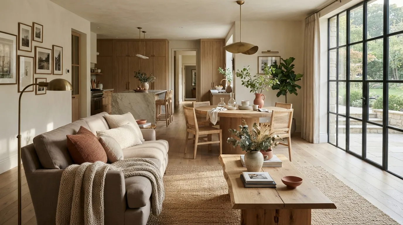
Discover 16 warm neutral color schemes for home that combine timeless shades, natural materials, and inviting layers. From creamy beige to warm gray, these palettes make rooms feel polished, comfortable, and easy to live with. Explore each idea for practical color combinations and simple details that bring lasting warmth to your space.
1. Creamy Beige Layers
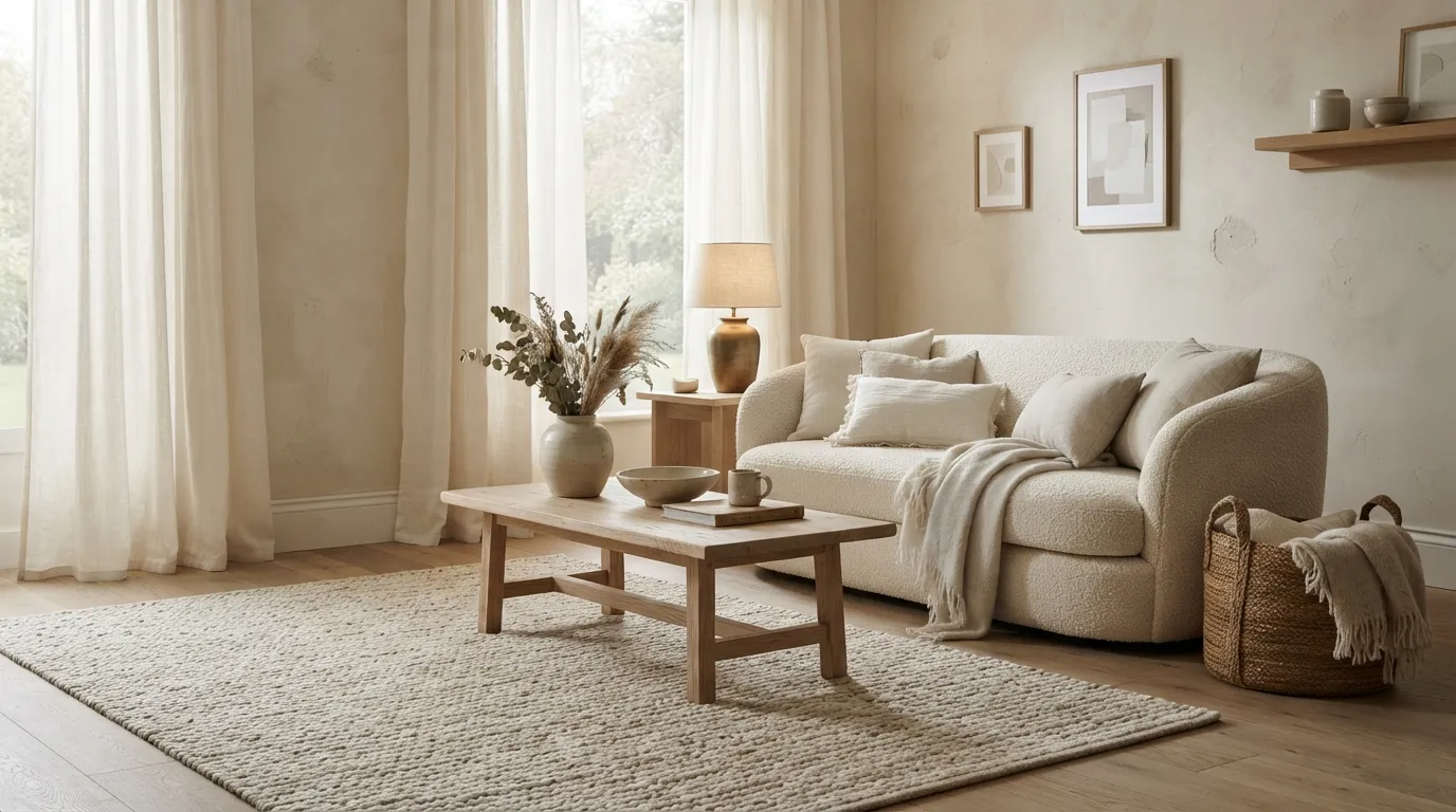
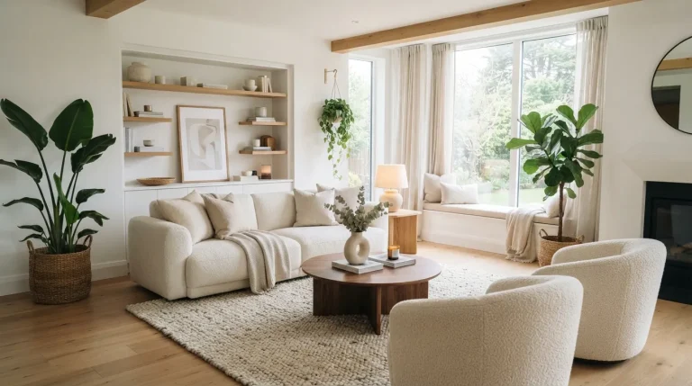
This palette works beautifully when you want warmth without committing to strong color. I’ve noticed that creamy walls look especially polished when upholstery is slightly deeper or lighter rather than an exact match, giving the room subtle contrast while keeping the overall effect serene.
2. Taupe and Soft White
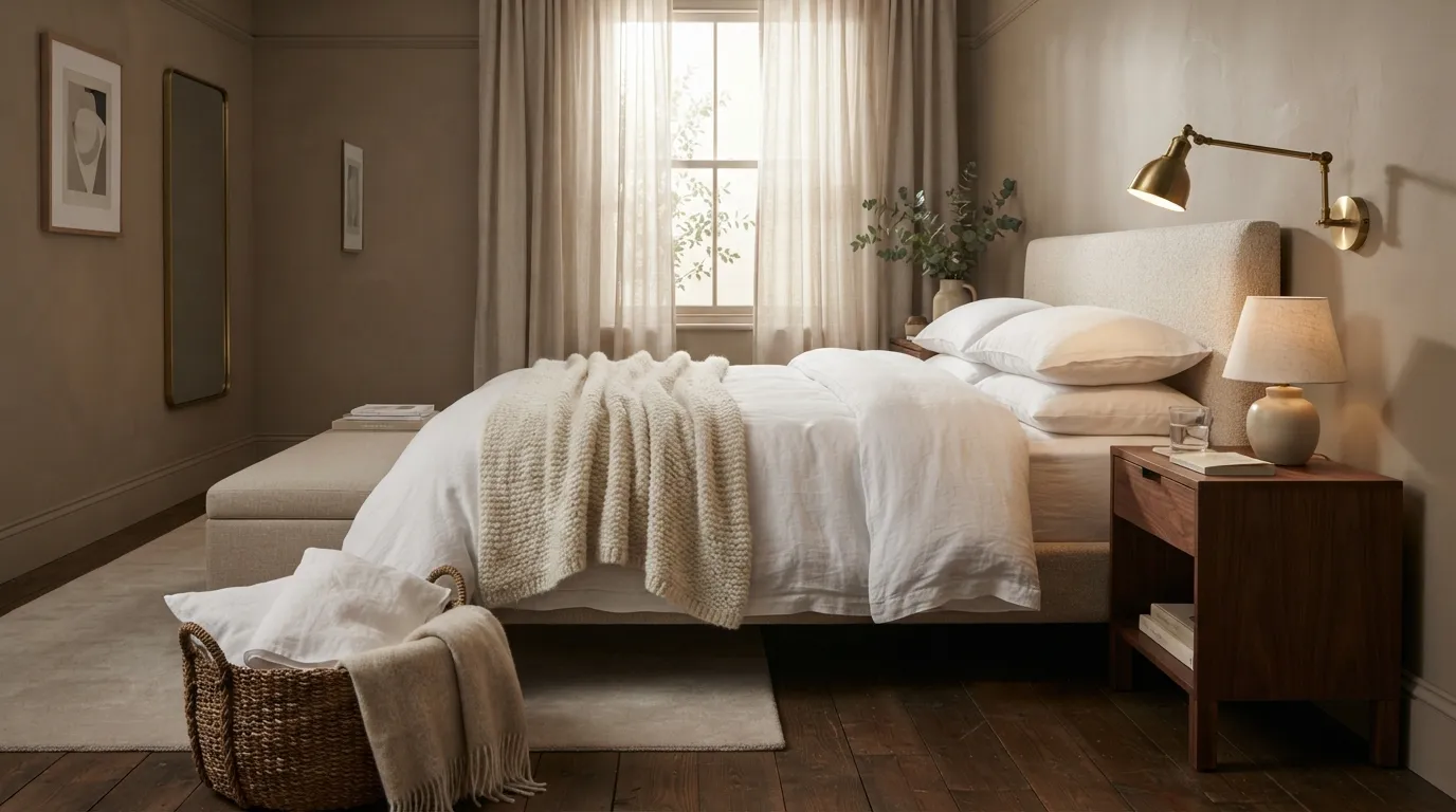
Taupe and white are ideal when you want a room to feel polished but still comfortable. The key is choosing a taupe that leans warm rather than gray; otherwise, the same white bedding can suddenly appear cooler and less inviting under evening lighting.
3. Sandstone and Caramel
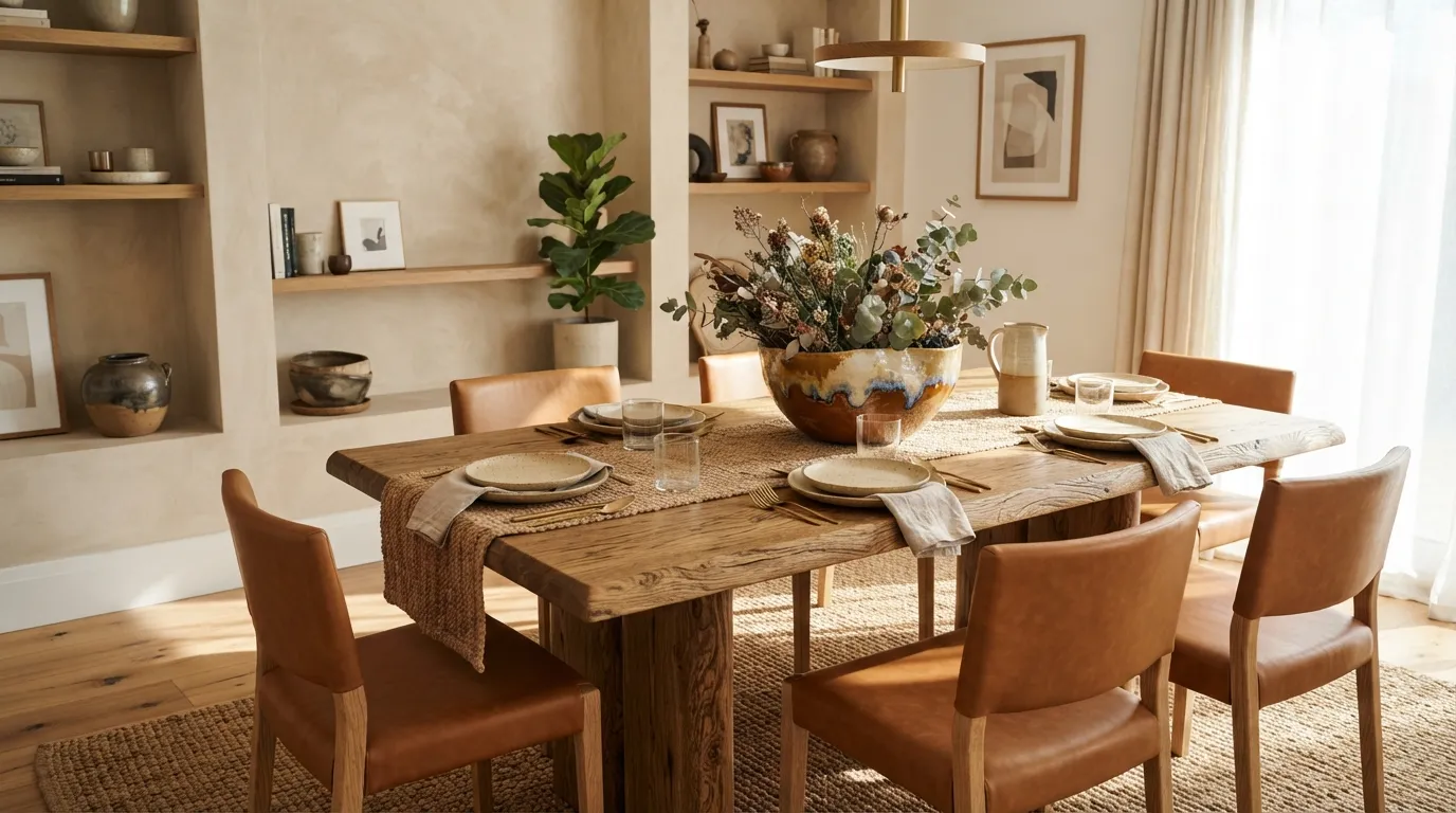
The combination feels naturally sunlit even on a cloudy day because the caramel accents provide visual warmth against the lighter sandstone foundation. For dining spaces, I’ve seen this pairing work particularly well when the chairs are darker than the tabletop, making the furniture arrangement easier to read.
4. Oatmeal and Walnut
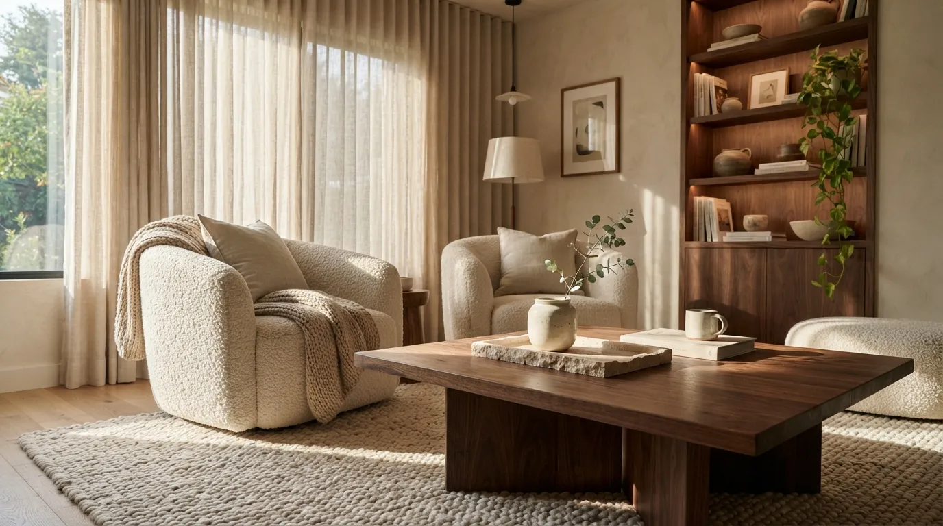
Oatmeal and walnut make a room feel grounded without becoming visually heavy. The trick is to let walnut appear as a deliberate anchor rather than repeating it everywhere; this creates contrast while preserving the relaxed, collected feeling that makes neutral interiors so appealing.
5. Greige and Terracotta
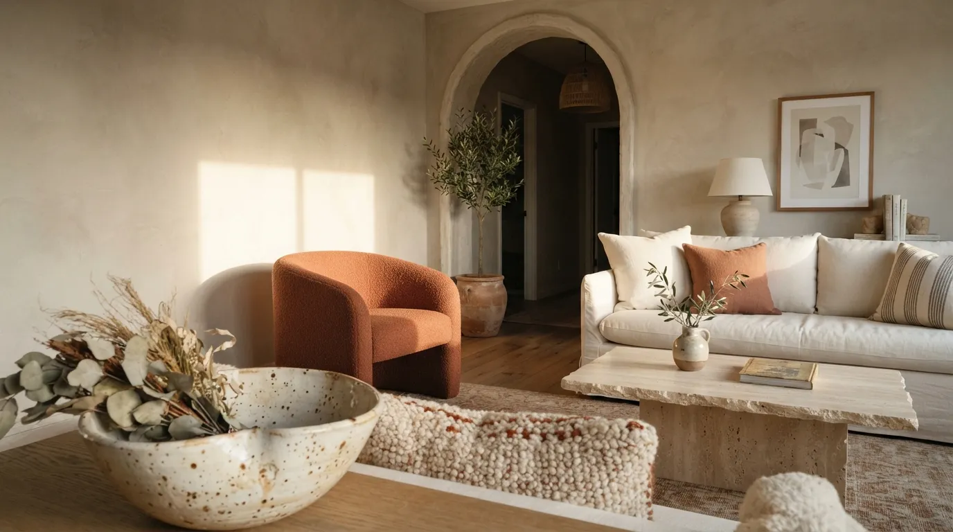
This pairing is useful when a neutral room feels too predictable but you still want it to age gracefully. A small amount of terracotta can bring warmth and personality without forcing you into a strongly colored decorating scheme.
You may also want to read Home Color Palette Ideas.
6. Ivory and Honey Oak
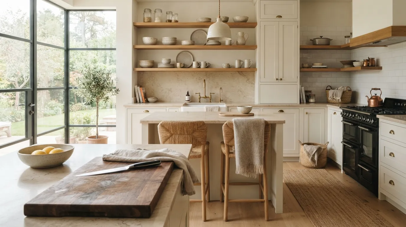
Ivory and honey oak are especially effective in kitchens because they balance cleanliness with warmth. I’ve noticed that introducing wood at eye level, such as through shelving or stools, makes an otherwise pale kitchen feel more welcoming without sacrificing its airy appearance.
7. Cream and Soft Clay
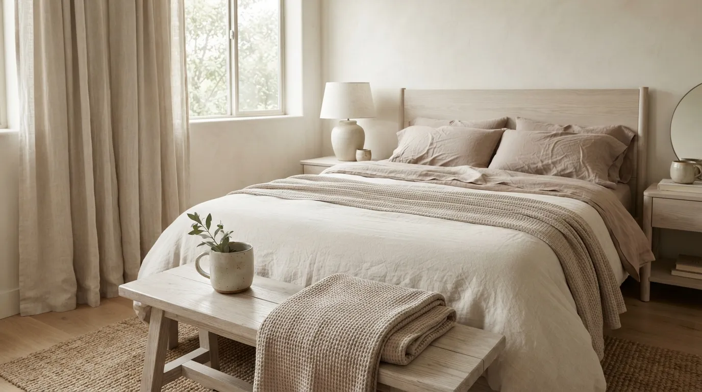
Cream and soft clay create a bedroom that feels warm without becoming overly rustic. The clay shade is particularly useful when you want a little personality but still prefer a quiet palette, and using it through bedding makes the room easy to refresh later.
8. Beige and Antique Brass
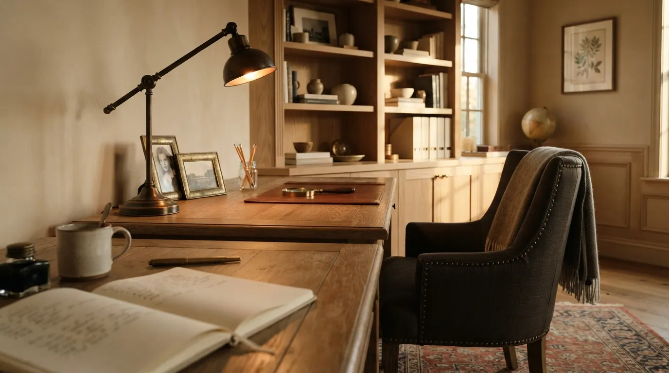
This palette works especially well in rooms where you want neutral colors to feel polished rather than plain. Antique brass catches changing daylight throughout the day, so even a simple beige office can gain subtle movement without introducing another strong color.
9. Linen and Warm Stone
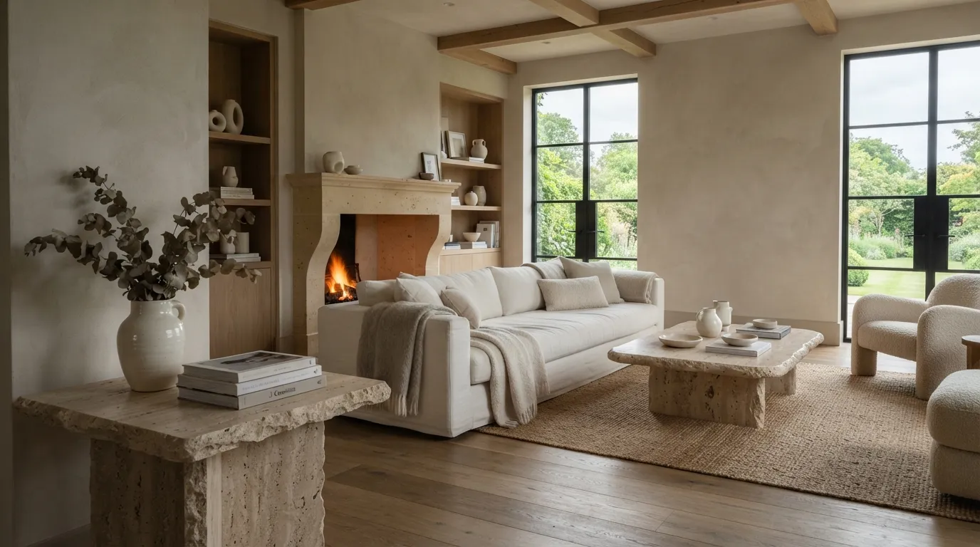
Linen and warm stone create the kind of understated richness that does not depend on trendy decoration. The secret is letting material variation do the visual work: stone veining, linen weave, and plaster texture can make a nearly monochromatic room feel layered and expensive.
10. Almond and Natural Oak
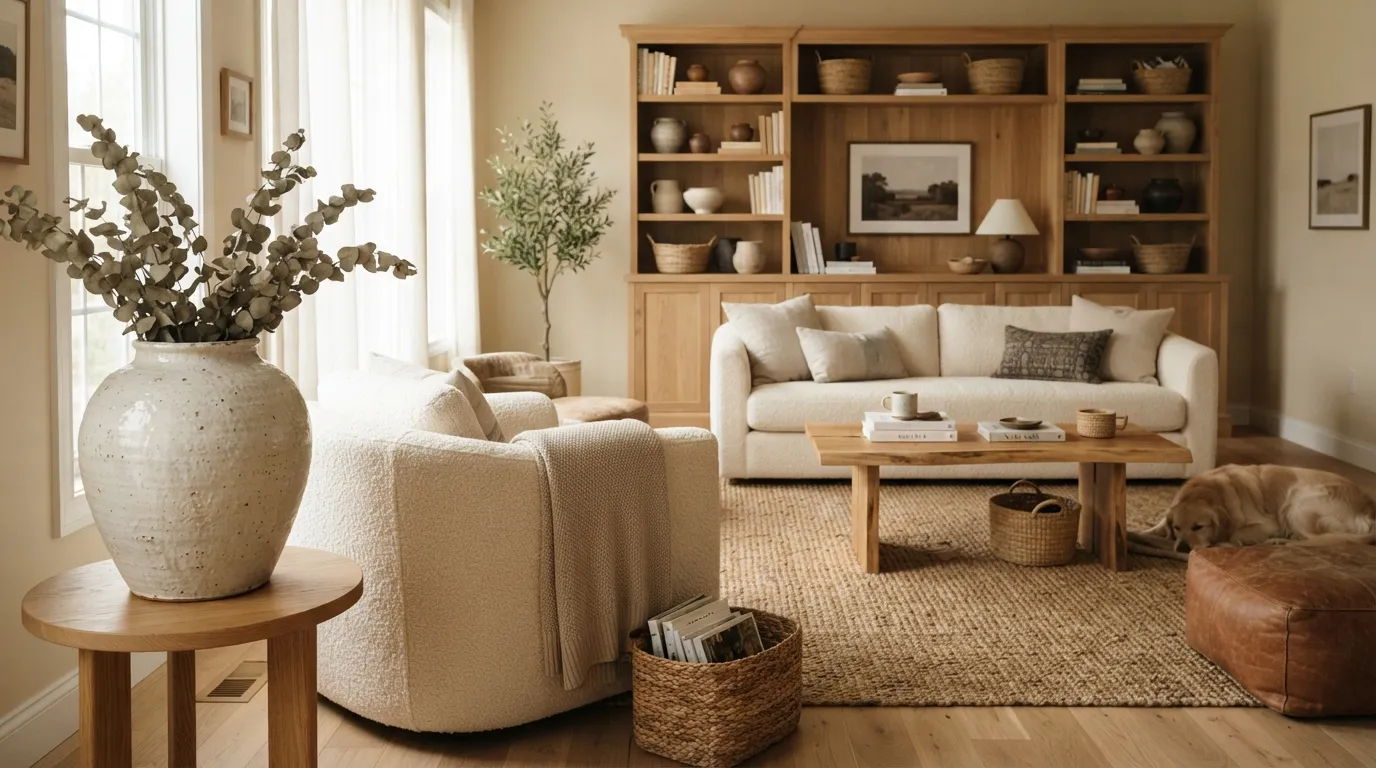
Almond and natural oak create an easygoing palette for busy family spaces because neither shade demands perfect styling. The visible wood grain also gives the room enough detail to feel finished, even when shelves and surfaces are kept relatively uncluttered.
11. Warm White and Chestnut
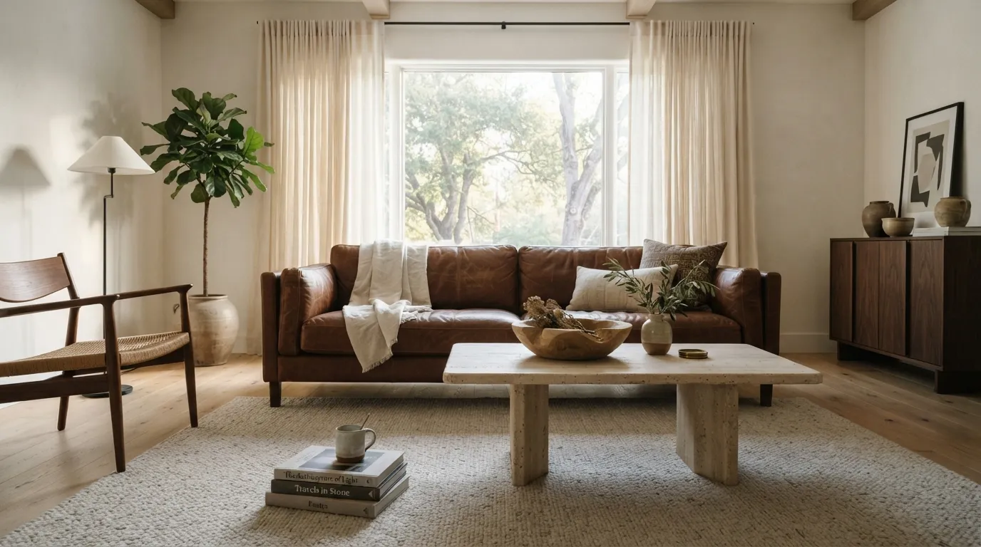
Warm white and chestnut give a neutral room a stronger sense of contrast without relying on black. I’ve seen this pairing work particularly well in living rooms where one substantial leather piece provides enough visual weight to make the rest of the furnishings feel lighter.
12. Mushroom and Cream
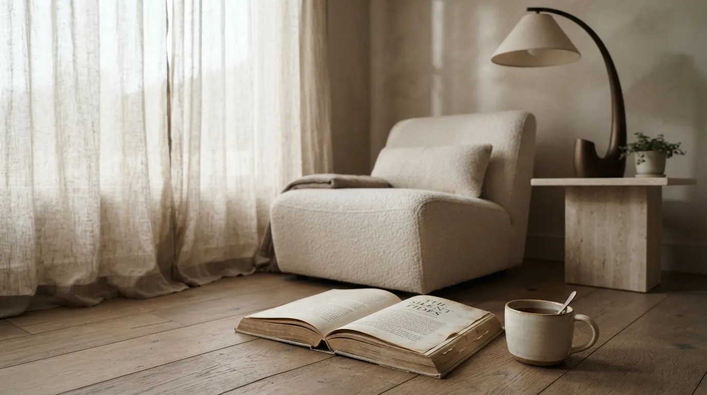
Mushroom and cream are a smart choice when you want a neutral room with a little more visual depth. The deeper wall tone makes light furniture stand out clearly, while natural stone and linen keep the overall look soft instead of dramatic.
13. Biscuit and Dark Oak
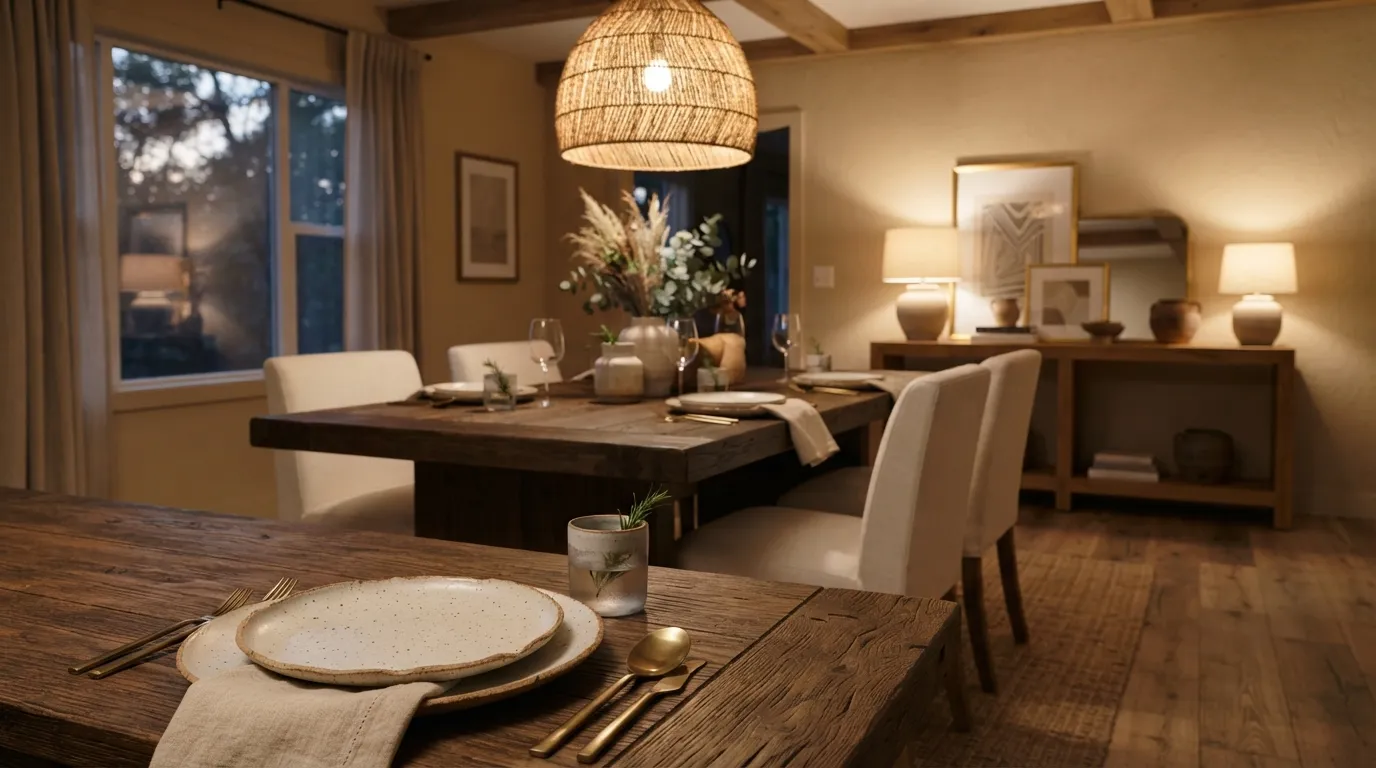
Biscuit and dark oak create a richer neutral combination that feels especially suited to dining rooms. The darker table gives the space a visual center, while the lighter surrounding surfaces keep the furniture from making the room feel too formal or heavy.
14. Ecru and Mocha
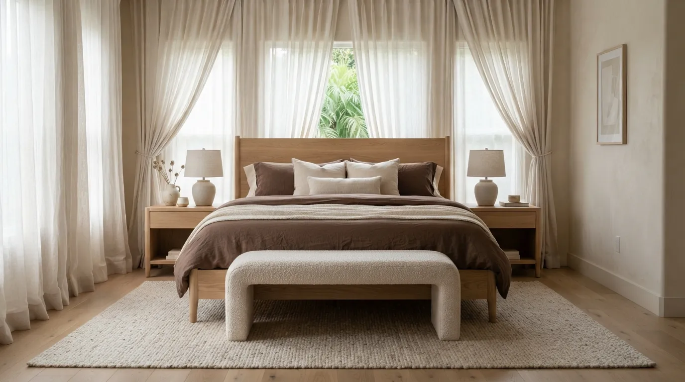
Ecru and mocha bring a calm, hotel-inspired feeling to a bedroom without making it look overly styled. I’ve found that keeping the darker shade concentrated around the bed makes the room feel anchored while the lighter walls preserve an open, restful atmosphere.
15. Cream and Muted Olive
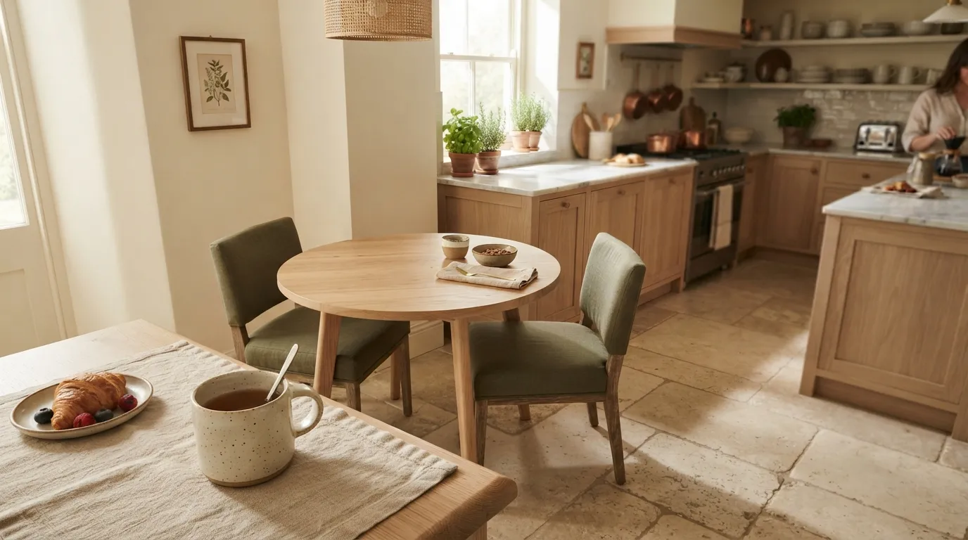
Cream and muted olive are a beautiful choice when a neutral scheme needs a hint of nature. The olive feels quieter than traditional green, so it adds personality without competing with wood, stone, or other earthy materials already present in the room.
16. Vanilla and Warm Gray
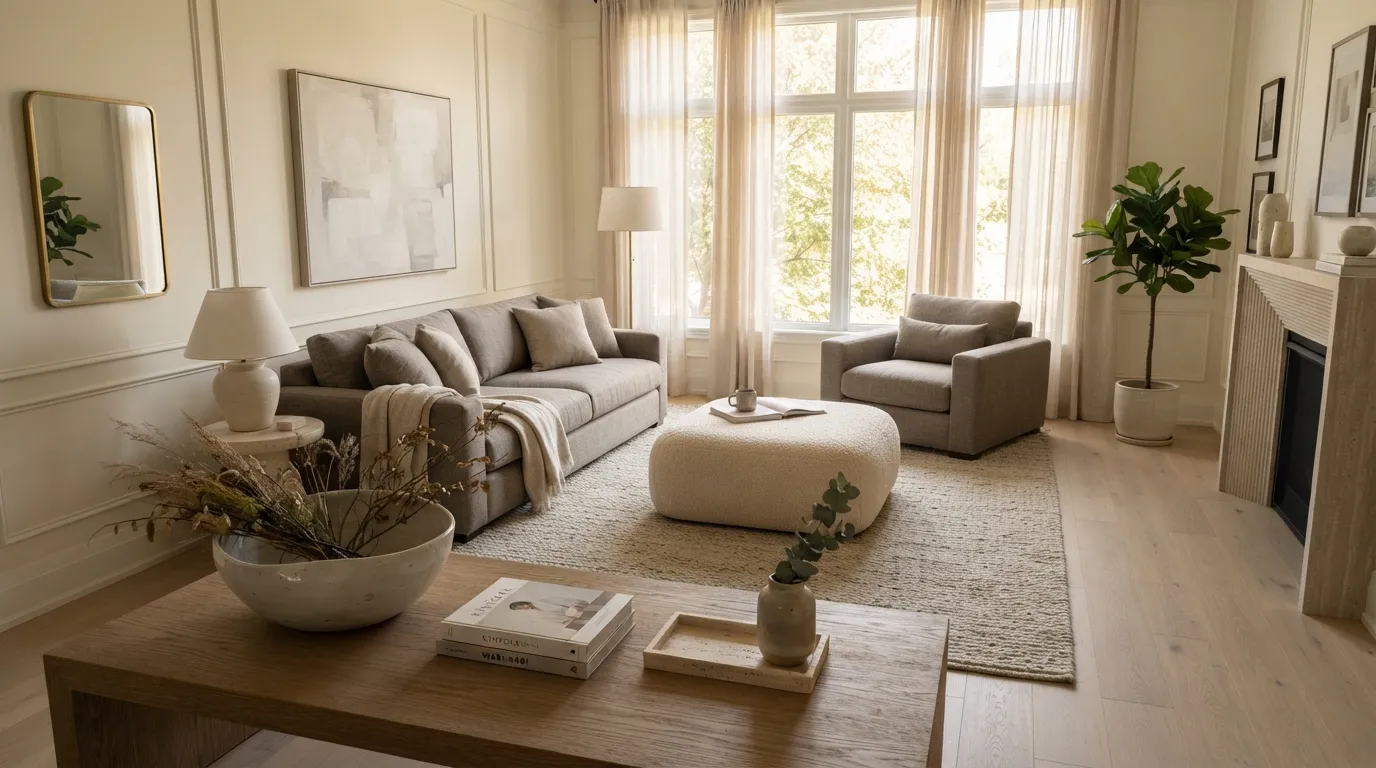
Vanilla and warm gray offer a polished middle ground between creamy traditional interiors and cooler contemporary spaces. The combination works best when the gray has a noticeable warm undertone, allowing the room to stay inviting while gaining the clean contrast needed for a modern finish.
The Bottom Line
Pair lighter walls with darker wood or earthy accents to create contrast without losing the calm neutral feel. Start with one anchor shade, then layer two or three nearby tones through furniture, textiles, stone, or accessories.
Emma Williams
Emma Williams is an interior design expert and decor editor at Lady Home Decor. She specializes in modern, cozy, and functional home styling, helping readers discover inspiring decorating ideas that are easy to recreate. Her work focuses on timeless design, practical solutions, and the latest home decor trends.