20 Bold Color Combinations for Home Decor to Transform Your Space

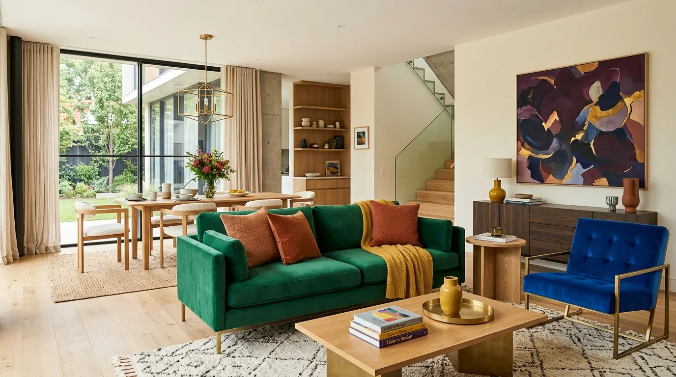
Explore bold color combinations for home decor that can instantly refresh living rooms, bedrooms, kitchens, and more. You’ll find confident palettes, practical styling tips, and easy ways to balance strong colors without overwhelming your space. Save these inspiring ideas and choose the combination that best fits your home’s personality.
1. Emerald and Blush
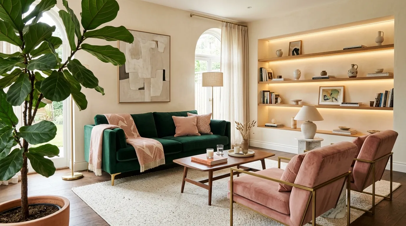
This pairing works because the colors play different roles: green supplies depth while blush adds warmth and softness. Keep the larger furniture piece in the deeper shade and use the lighter tone through chairs, cushions, or artwork for an easy visual balance.
2. Cobalt and Mustard
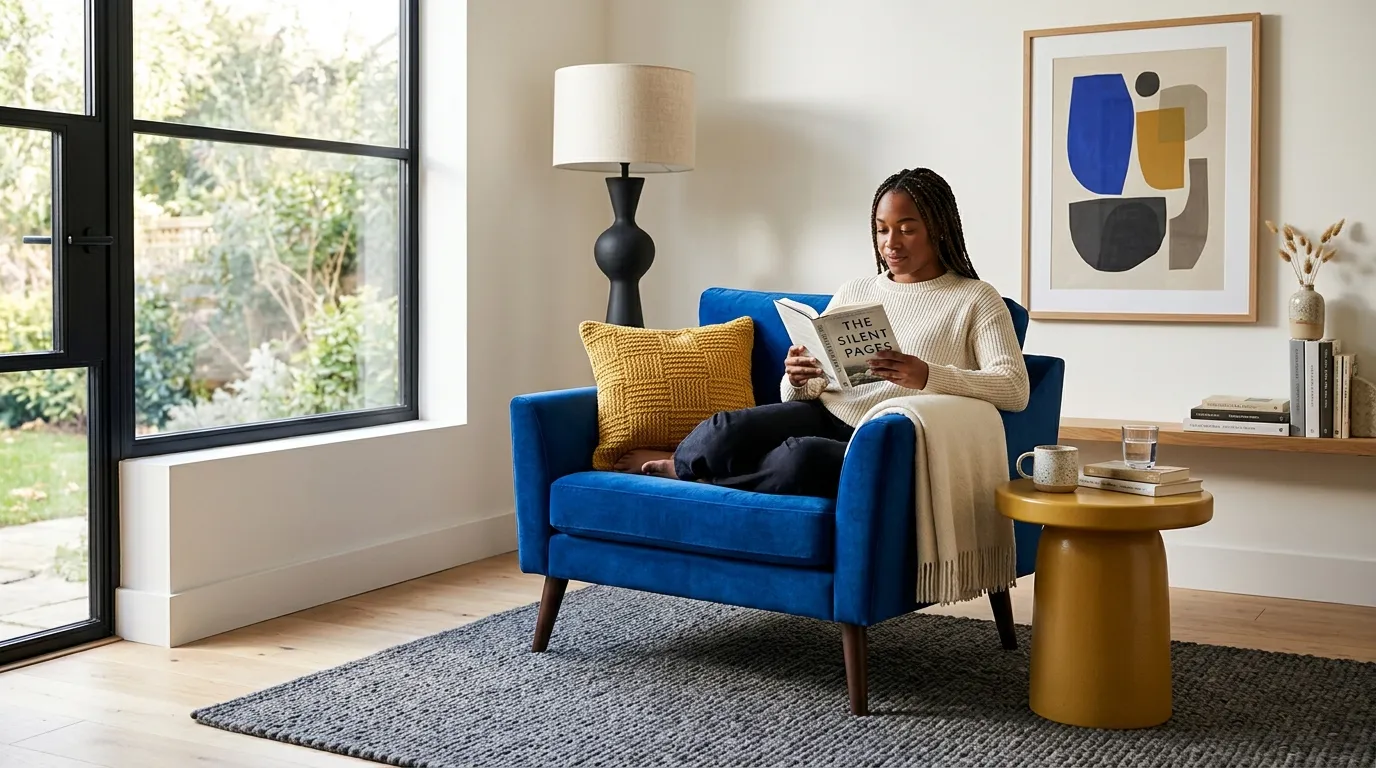
The secret to this high-energy pairing is proportion. Let cobalt occupy the dominant visual area, then repeat mustard in two or three smaller locations so the eye moves naturally around the room instead of stopping at one isolated accent.
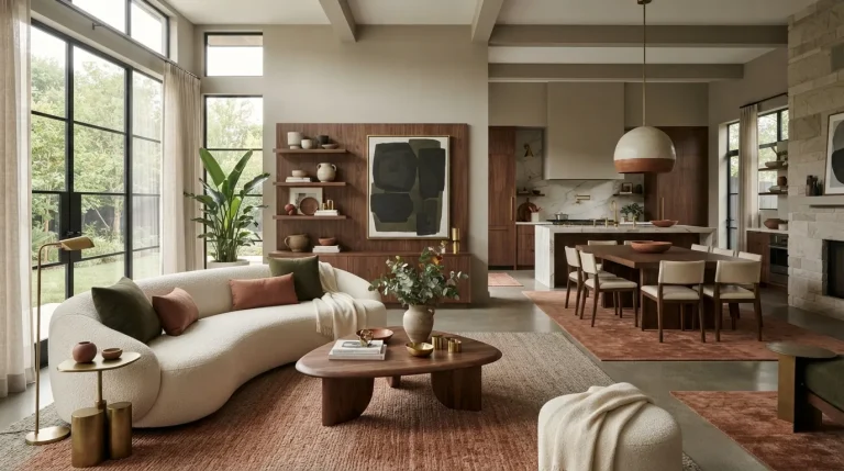
3. Terracotta and Teal
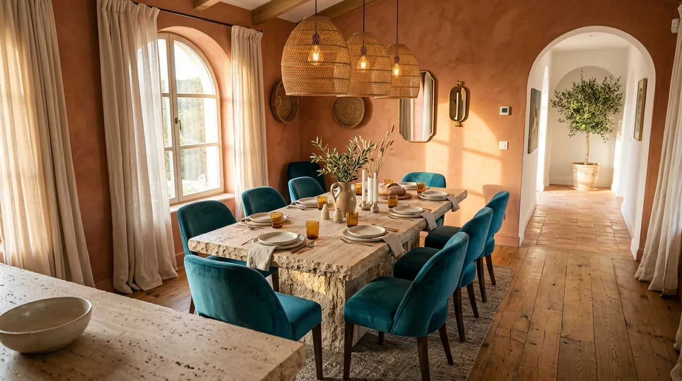
Terracotta and teal feel especially natural together because one carries warm earthy undertones while the other supplies visual freshness. If a full terracotta wall feels too dramatic, try it on a smaller architectural feature and repeat the shade through ceramics or cushions.
4. Navy and Coral
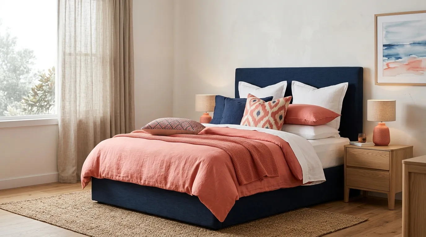
Navy and coral create a polished contrast because the cool base makes the warmer accents feel brighter. For a bedroom, repeating coral in three small places such as the duvet, artwork, and lamp usually feels more cohesive than using one oversized coral feature.
5. Plum and Olive
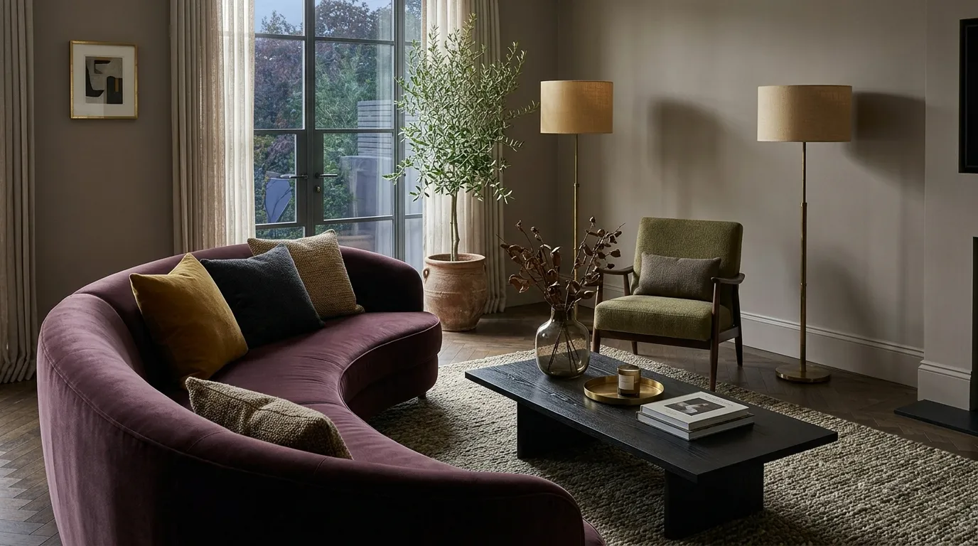
This combination is ideal when you want bold color with a quieter, grown-up mood. Use plum on the largest upholstered element and olive on a secondary chair or curtains; keeping both shades in matte or textured finishes prevents the room from looking overly saturated.
6. Rust and Powder Blue
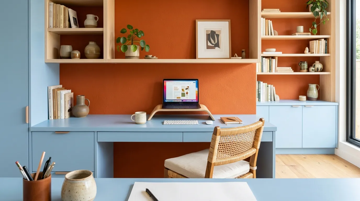
Rust and powder blue are a useful choice when a room needs both energy and calm. The warmer orange shade draws attention to the workspace, while the softer blue visually recedes, making the room feel layered rather than split into two competing halves.
This is the kind of thing you’ll also find in Home Color Palette Ideas.
7. Forest Green and Ochre
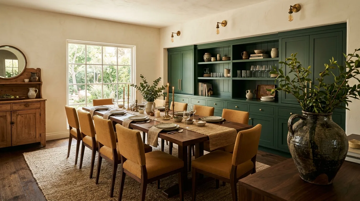
This pairing feels especially rich because both shades have earthy undertones. Let the deeper green cover the larger visual area, then use ochre on seating where its golden warmth can catch natural light and make the dining zone feel inviting.
8. Charcoal and Electric Blue
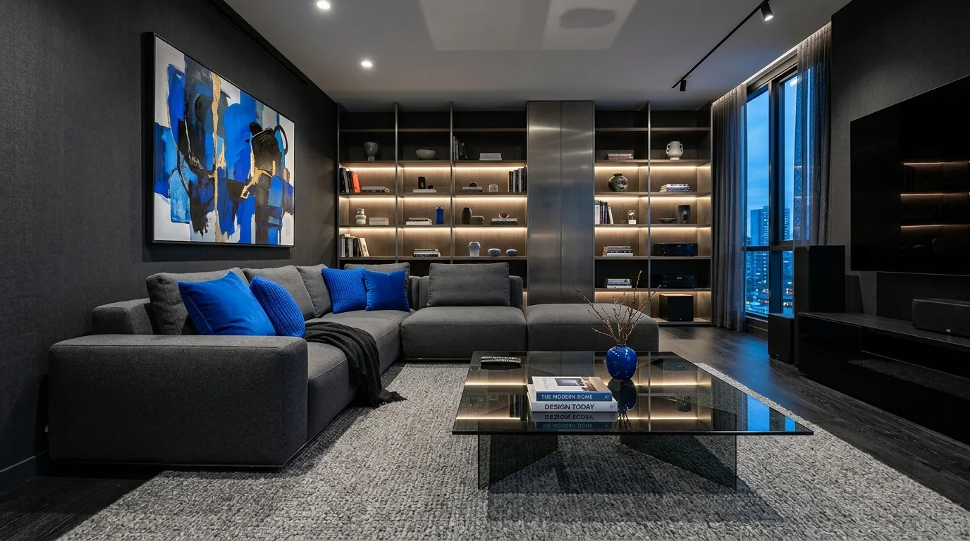
Charcoal and electric blue create instant drama, but the darker base is what keeps the brighter color controlled. Concentrate the blue around eye-level details such as cushions, art, or shelving so the room feels deliberately styled rather than randomly colorful.
9. Burgundy and Dusty Pink
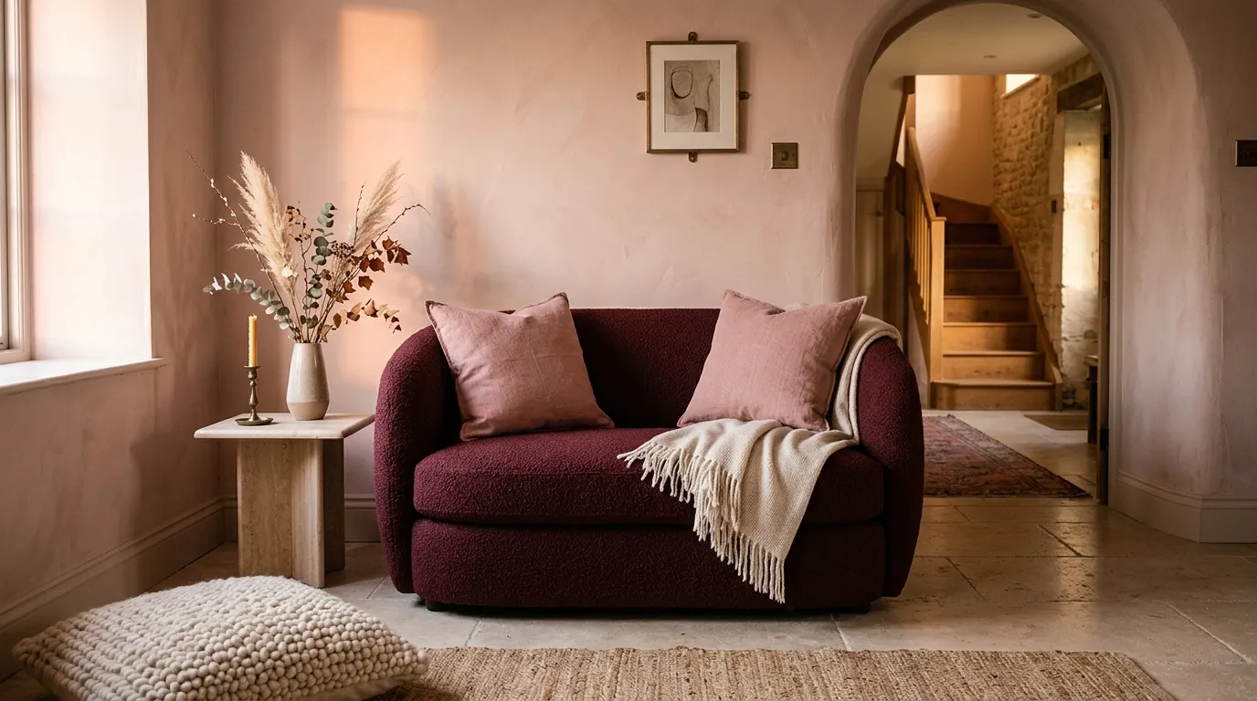
This color pairing works when you want a room to feel warm and expressive without becoming overly bright. Burgundy supplies the visual weight, while dusty pink lightens the arrangement; use cream or pale stone between them to give the eye a quiet resting point.
10. Teal and Apricot
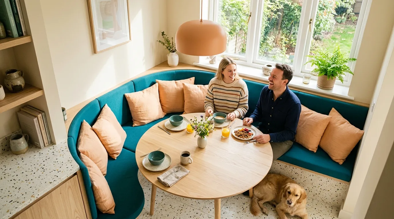
Teal and apricot bring energy without relying on primary colors. The cooler teal carries the larger visual load, while apricot works best as a supporting shade on cushions, lighting, or ceramics where its warmth can be repeated naturally.
11. Black and Saffron
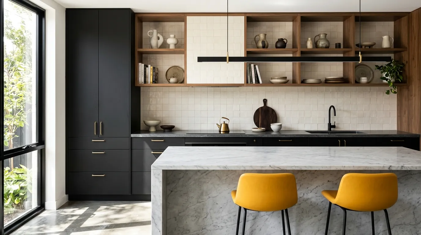
Black and saffron are powerful because the yellow instantly breaks through the dark cabinetry. If you’re testing the palette for the first time, start with two stools or a runner before committing to painted cabinetry; the effect is easier to adjust while you learn what feels right in your space.
12. Coral and Olive
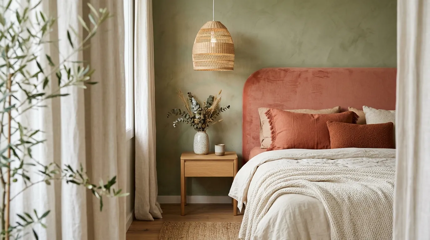
Coral and olive are surprisingly easy to live with because both can lean muted rather than neon. Use the olive as the broader backdrop and coral on one major upholstered feature, then let cream bedding or flooring separate the two tones.
13. Royal Blue and Tangerine
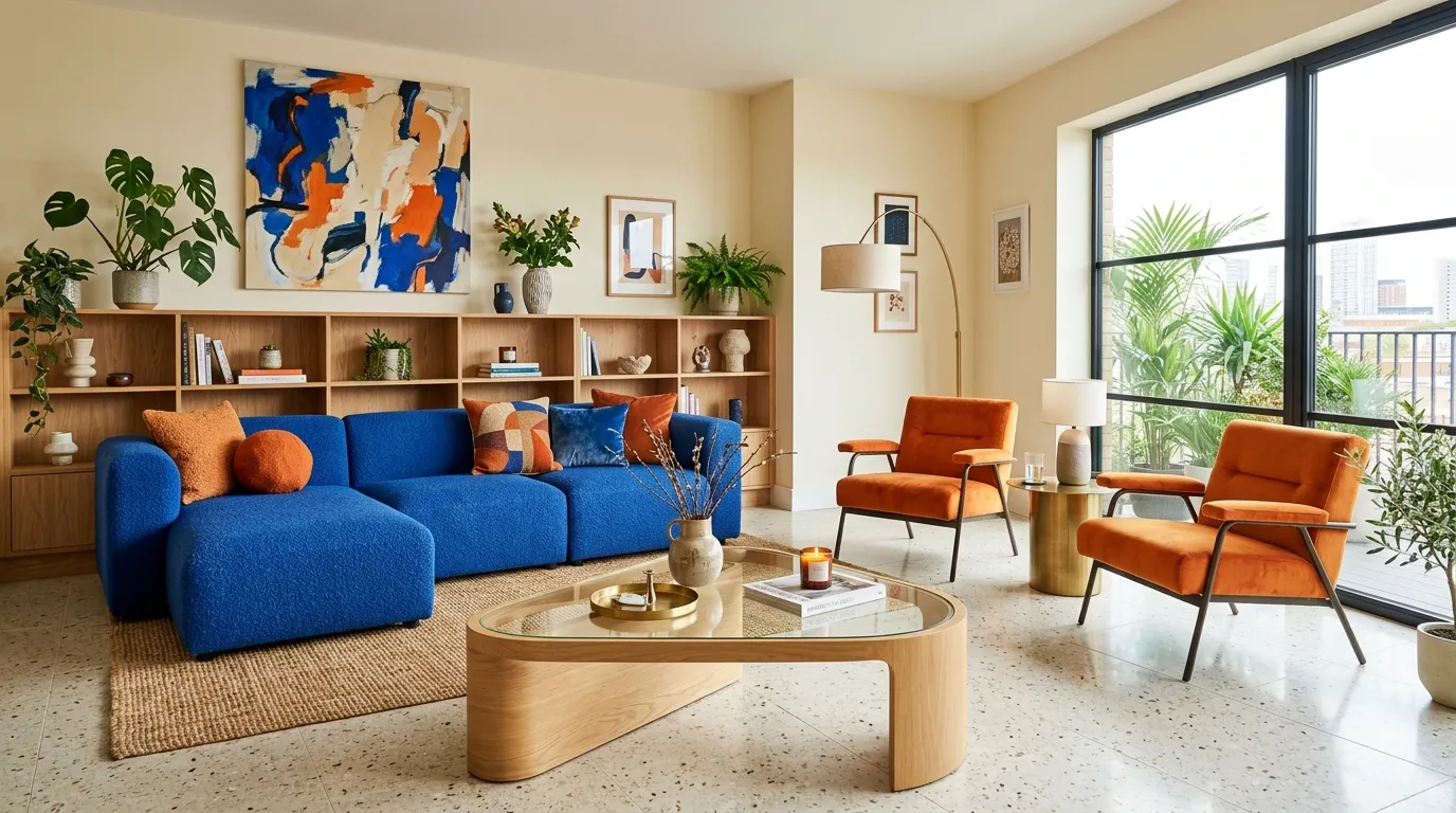
This high-contrast pairing is ideal for a room that should feel lively and modern. Let blue occupy the largest upholstered surface, then use tangerine on smaller seating and accessories so the warm shade creates rhythm without overpowering the room.
14. Deep Green and Copper
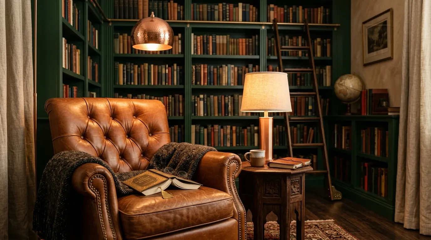
Deep green and copper create a sophisticated look because the metal introduces light into an otherwise grounded palette. Use copper selectively on fixtures or handles, where its warm reflection can be noticed without turning the entire room into a metallic display.
15. Magenta and Burnt Orange
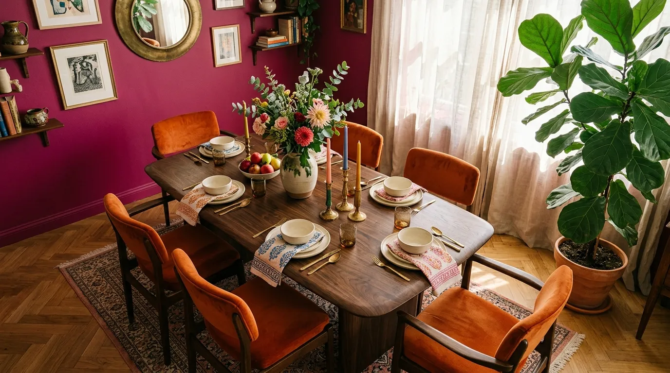
This pairing is for anyone who wants color to feel joyful rather than restrained. The trick is to give the two strong shades different jobs: let magenta define the architecture and burnt orange energize the furniture, then use cream to create visual pauses.
16. Sapphire and Lemon
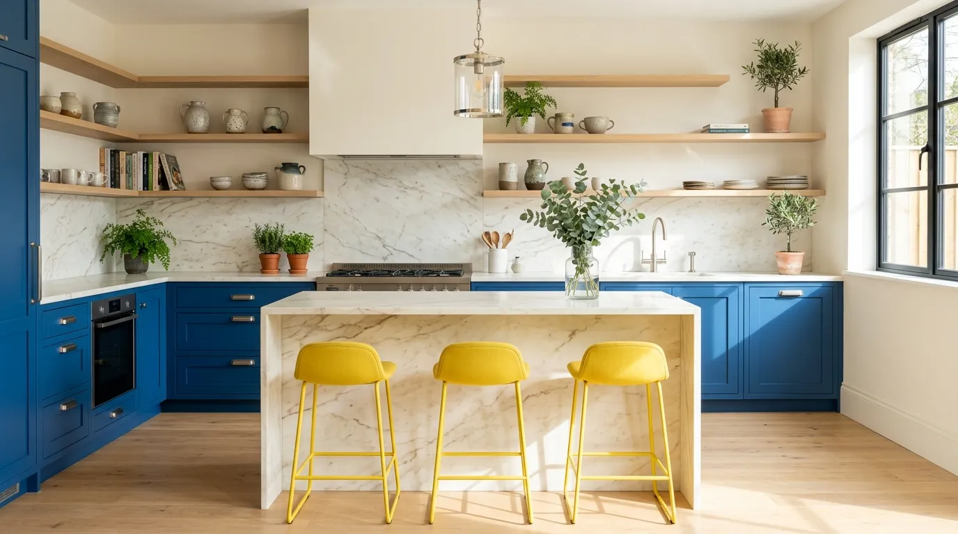
Sapphire and lemon work best when the yellow stays intentionally limited. Two or three yellow elements can guide the eye across a kitchen, while the deeper blue provides enough visual weight to keep the room from feeling overly playful.
17. Berry and Sage
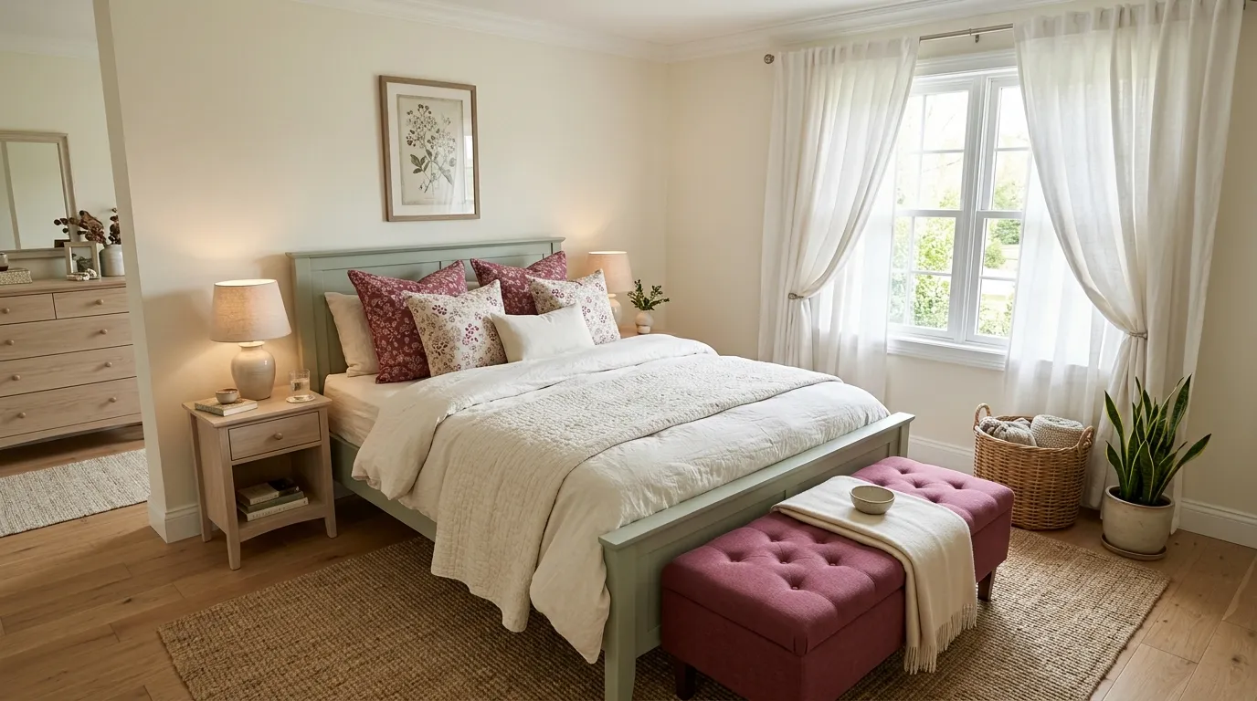
Berry and sage create a softer interpretation of bold color because neither shade needs to be extremely bright. Let sage cover the broader visual field and use berry where you want the eye to land first, such as a bench, artwork, or accent chair.
18. Turquoise and Brick Red
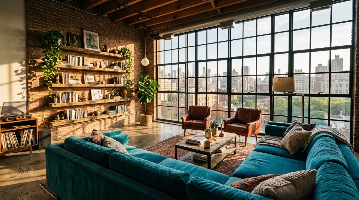
This combination feels confident because the colors are opposites in temperature but share enough visual strength to hold their own. Let the architecture carry some of the brick-red influence, then use turquoise on a major furniture piece for a fresh counterbalance.
19. Indigo and Peach
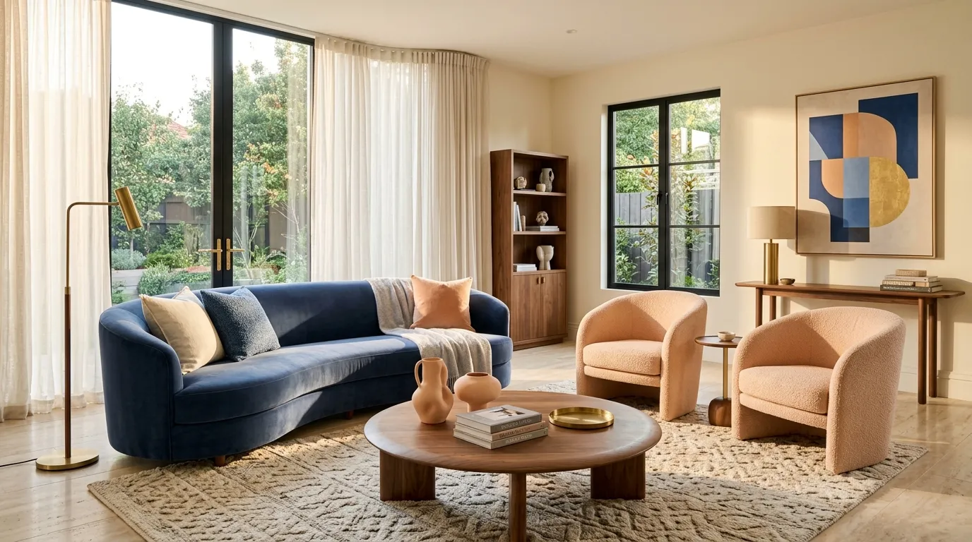
Indigo and peach create a balanced contrast that feels colorful without becoming overly loud. Keep indigo on the largest seating piece and distribute peach through two or three smaller elements, giving the room a clear focal point while maintaining visual flow.
20. Plum and Mustard
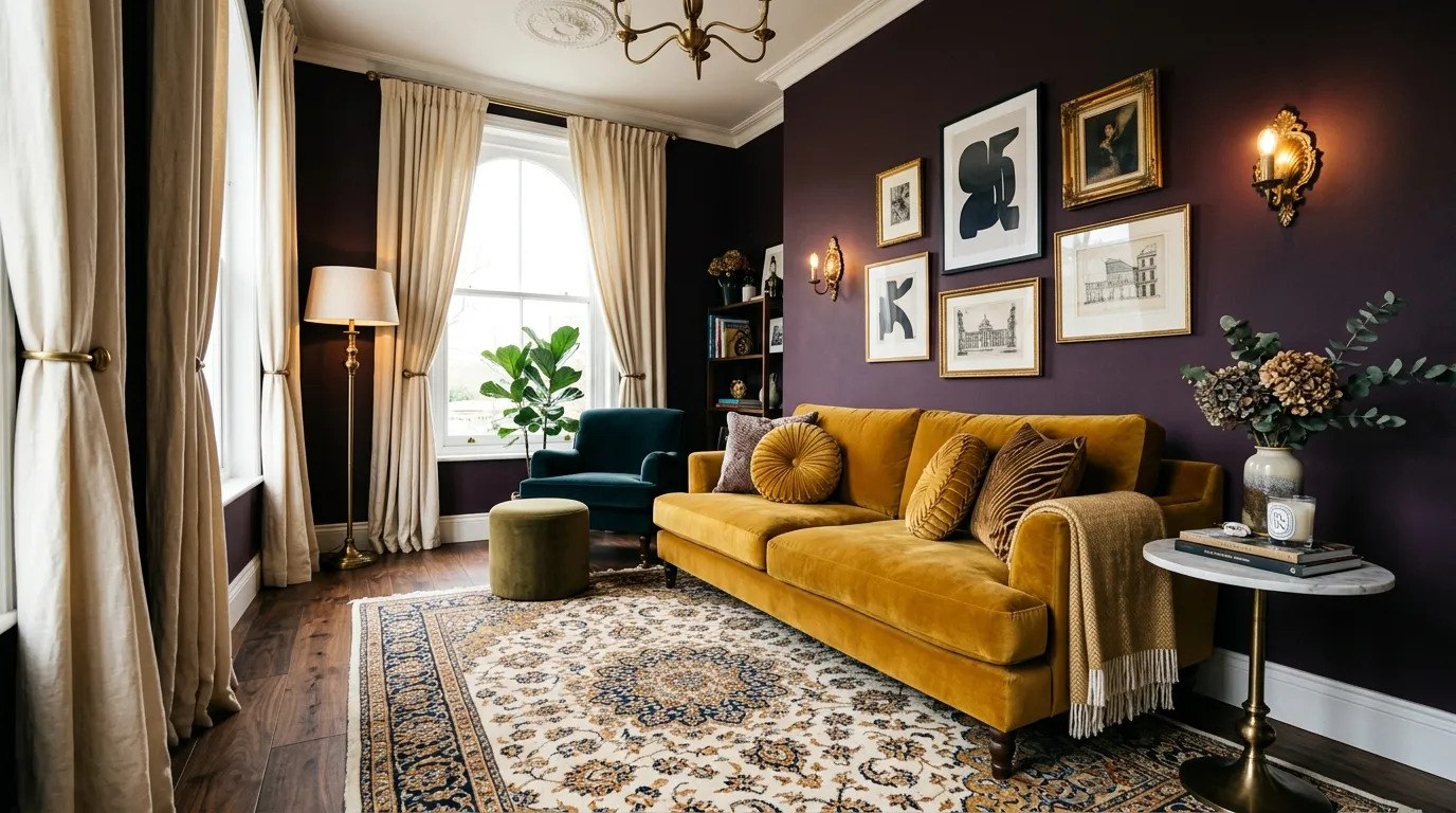
Plum and mustard work best when one shade clearly leads and the other acts as the visual spark. A mustard sofa against plum can feel especially luxurious, while ivory curtains and natural materials give the saturated palette enough breathing room.
Final Thoughts
Pair strong shades with warm neutrals, natural wood, or stone to give bold rooms visual breathing space. Start with one dominant color and add a smaller contrasting shade through furniture, textiles, or accessories.
Olivia Carter
Olivia Carter is the founder of Lady Home Decor and a passionate home decor expert. She shares practical, stylish ideas to help homeowners create beautiful, comfortable, and welcoming spaces. Her expertise covers bedrooms, kitchens, living rooms, bathrooms, and small-space decorating.