18 Beautiful Trending Color Combinations for Home Decor

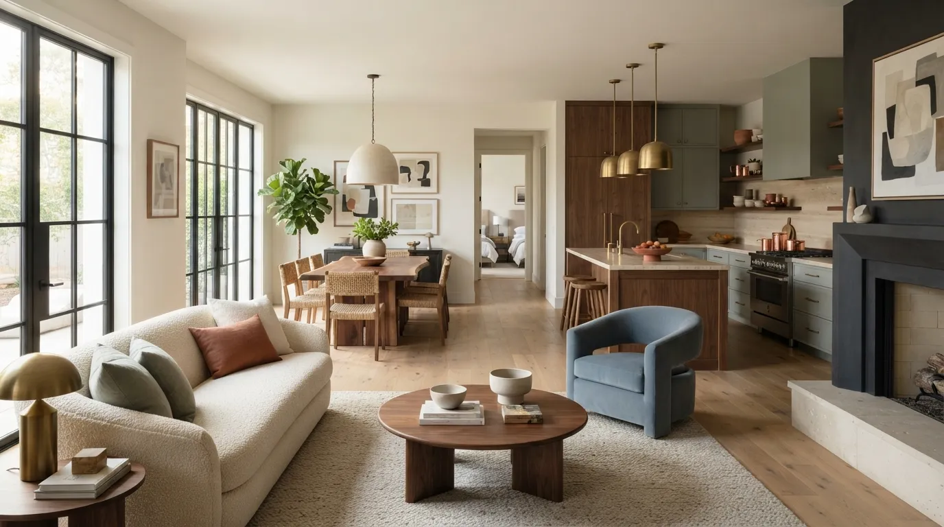
Explore trending color combinations for home that make living rooms, bedrooms, kitchens, and dining spaces feel more stylish and balanced. From earthy terracotta to rich emerald, these palettes make choosing colors easier while giving your home a polished look. Save these inspiring combinations and find the palette that fits your space.
1. Sage and Warm White
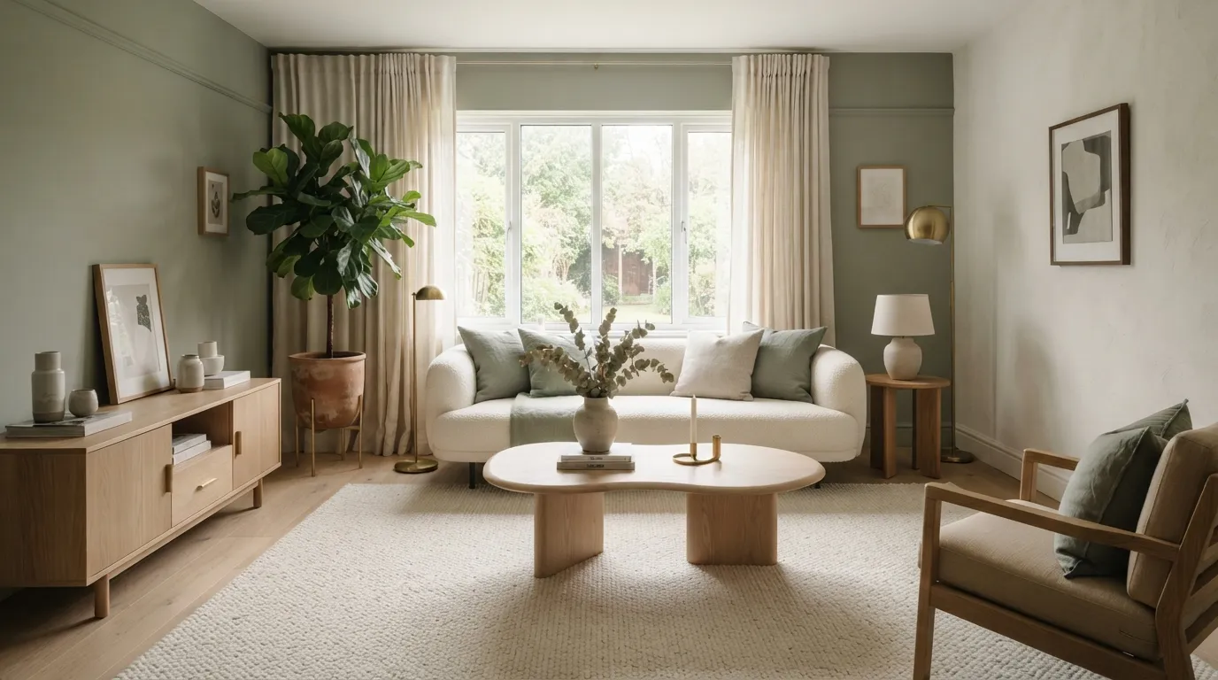
This pairing feels fresh but still grounded, making it especially useful for living rooms that need a calmer visual base. I’ve noticed sage looks most balanced when its strongest concentration stays around the walls or smaller accents rather than appearing equally everywhere.
2. Navy and Soft Beige
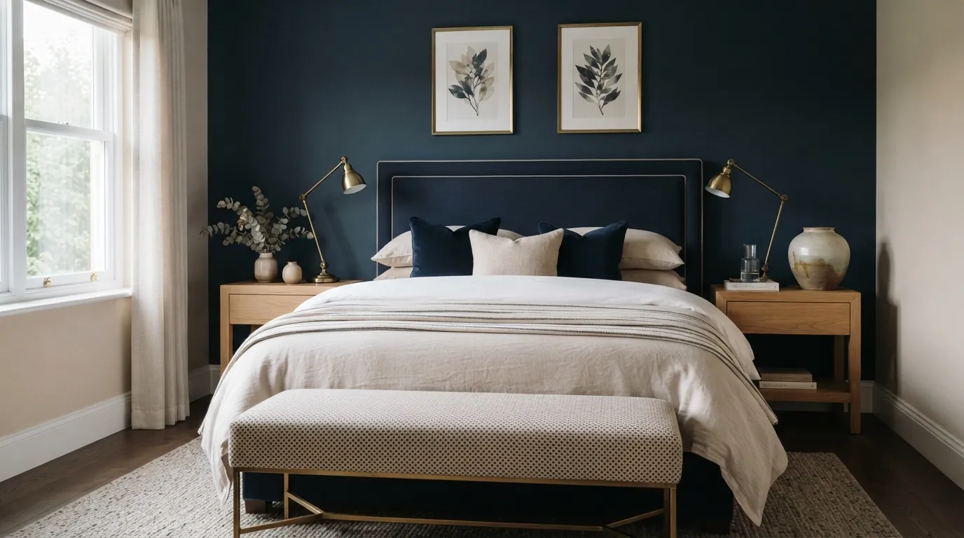
Navy and beige create the kind of contrast that makes a bedroom feel polished without becoming cold. The key is scale: a large navy headboard can establish the color story while beige bedding keeps most of the visual surface light and restful.
3. Terracotta and Cream
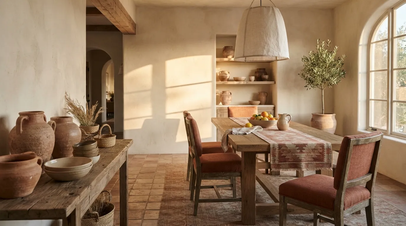
Terracotta and cream instantly make a dining area feel warmer and more collected, especially when paired with natural wood. Before committing to paint, compare your terracotta sample in both daylight and evening light because its red or orange undertone can change the entire mood of the room.
4. Dusty Blue and Walnut
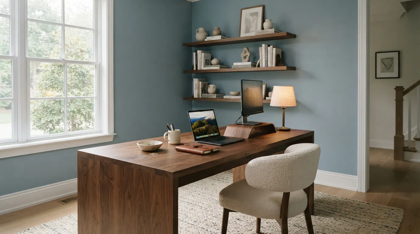
Dusty blue and walnut strike a useful balance between cool and warm, making the combination especially effective in focused spaces such as offices or reading corners. The walnut keeps the blue from feeling too pastel, while the lighter textiles give the room enough breathing space.
5. Olive and Charcoal
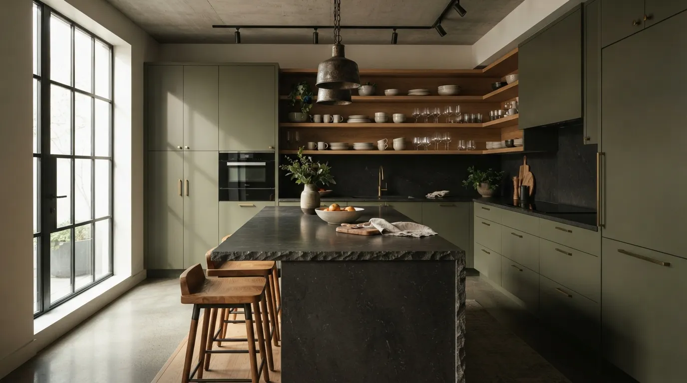
Olive and charcoal create a grounded palette that feels modern without relying on stark black and white contrast. I’ve seen this pairing work particularly well when the darker surface is limited to one architectural element, allowing the cabinetry to remain the visual star.
You might also want to read Beautiful Color Palette Ideas.
6. Blush and Warm Taupe
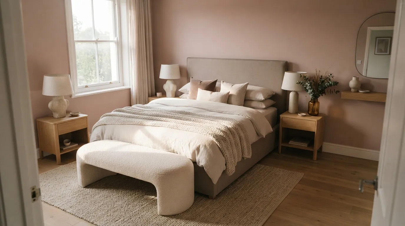
Blush and warm taupe create a softer alternative to the usual beige bedroom while keeping the overall look mature. The combination becomes especially convincing when the pink is muted and repeated through smaller details rather than competing with the room’s largest pieces.
7. Forest Green and Ivory
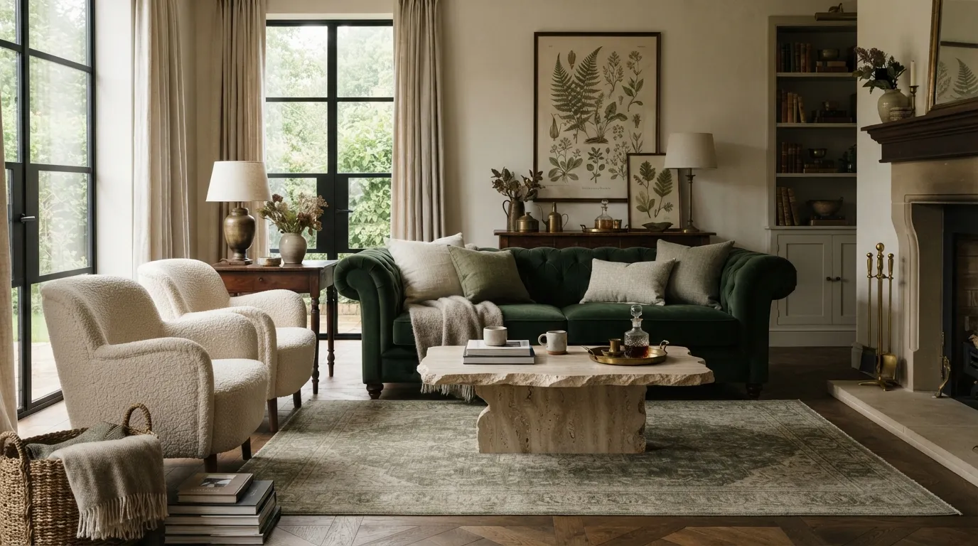
Forest green and ivory create a rich contrast that feels classic without looking dated. The easiest way to keep this palette balanced is to let green occupy one dominant piece while ivory controls the larger surrounding surfaces and preserves visual openness.
8. Rust and Dusty Pink
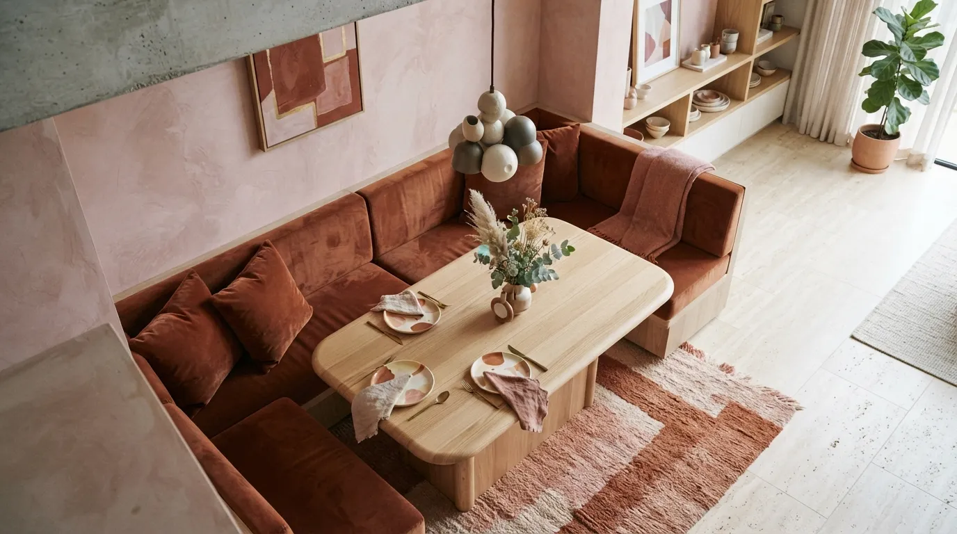
Rust and dusty pink bring warmth and personality to spaces that might otherwise rely heavily on beige. The trick is to vary their intensity: a stronger rust element can act as the anchor while the softer pink recedes into the background.
9. Cream and Chocolate Brown
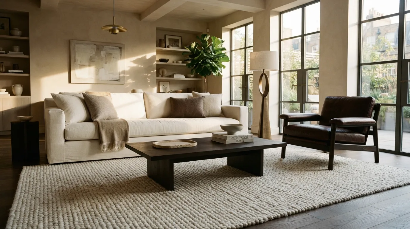
Cream and chocolate brown are an easy route to a warmer version of modern minimalism. Instead of spreading brown evenly around the room, concentrate it on one or two substantial pieces so the darker tone creates depth without making the space feel visually crowded.
10. Cobalt Blue and Sand
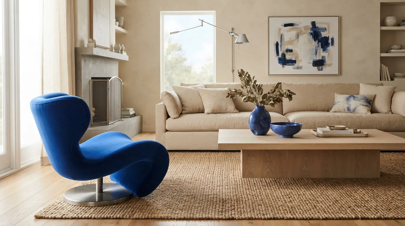
Cobalt blue and sandy beige bring more energy than a typical neutral scheme while remaining surprisingly livable. Keep the strongest blue element away from competing focal points, then echo it through smaller objects to create a deliberate visual rhythm.
11. Plum and Soft Gray
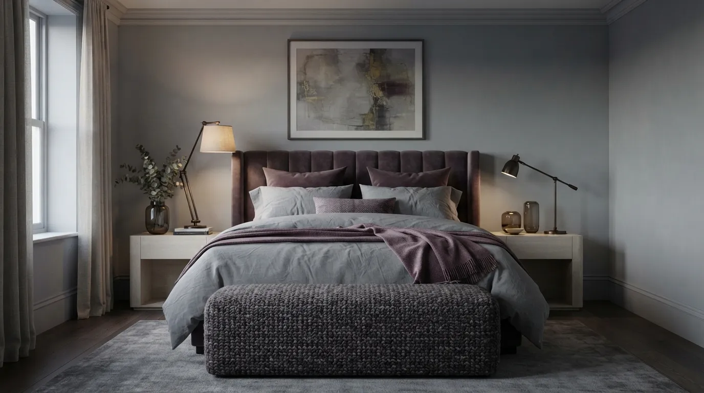
Plum and soft gray create a moody palette that feels especially suited to bedrooms, libraries, and intimate sitting areas. A useful trick is to introduce the plum through upholstery rather than paint, making it easier to soften the scheme if the color feels stronger than expected.
12. Mustard and Slate Blue
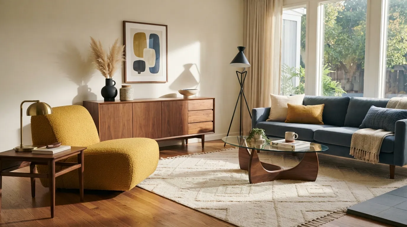
Mustard and slate blue create a confident contrast that works beautifully when one shade is clearly dominant. The walnut element is more than decoration here it acts as a warm transition between the cool blue and lively yellow, making the combination feel cohesive instead of busy.
13. Teal and Warm Ivory
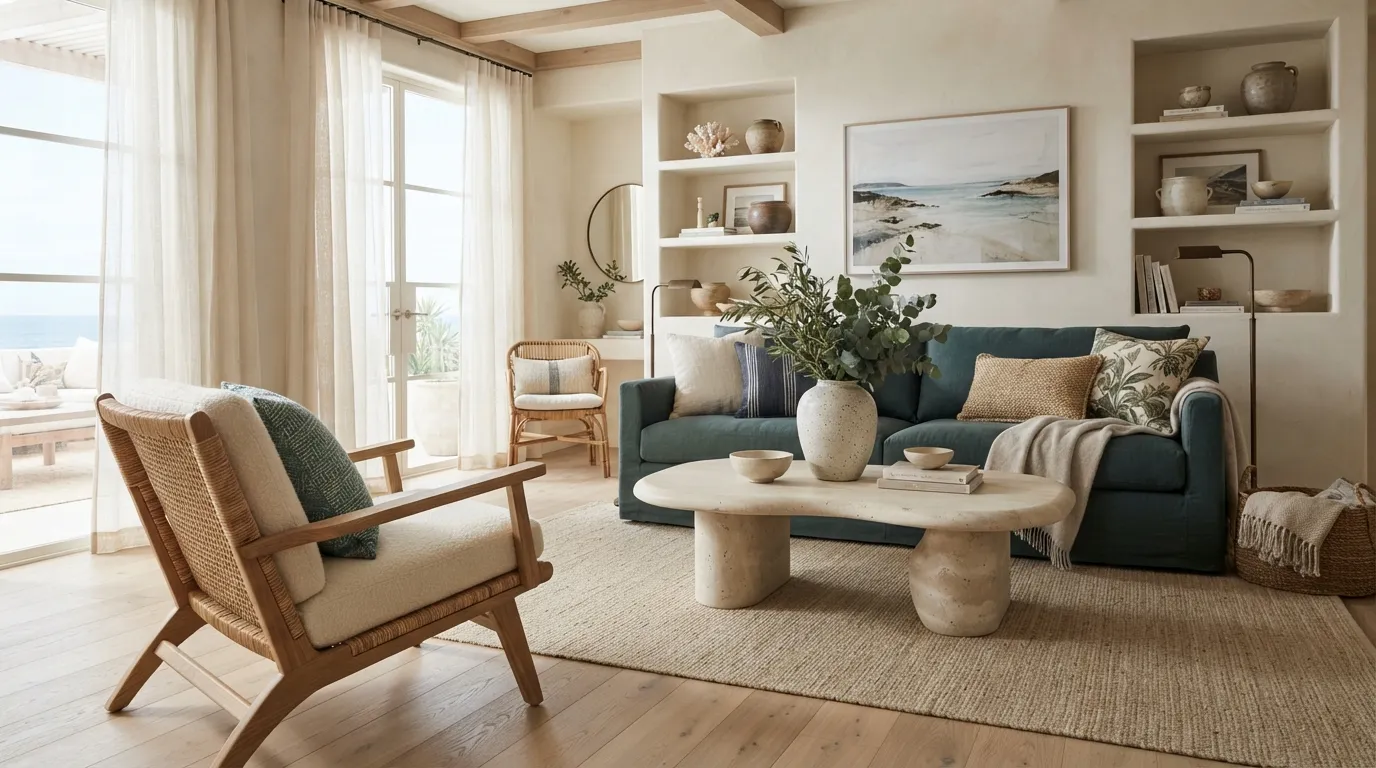
Teal and warm ivory give a room a polished coastal feeling without relying on obvious nautical details. The contrast is strongest when teal is concentrated on one substantial element, while ivory and natural materials carry most of the surrounding visual weight.
14. Black and Warm Greige
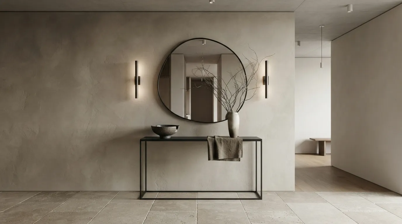
Black and warm greige create a crisp modern look without the starkness of a traditional black-and-white palette. I’ve noticed the combination feels most expensive when the greige has visible texture, such as limewash or plaster, rather than appearing as a completely flat painted surface.
15. Peach and Terracotta
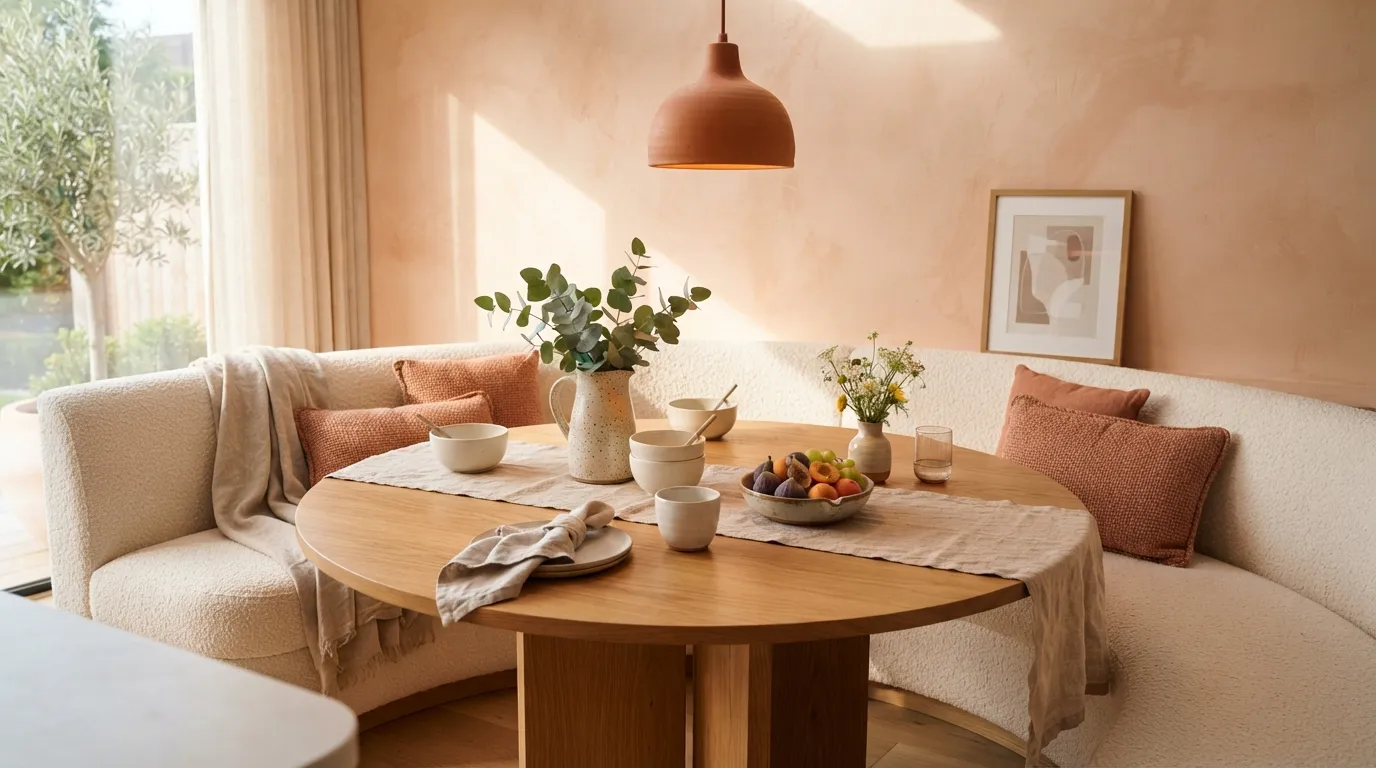
Peach and terracotta bring a sun-warmed quality to kitchens, breakfast areas, and dining spaces while staying more refined than brighter orange palettes. Keep the peach slightly muted and let terracotta appear in smaller, tactile elements for a layered look that feels collected rather than overly coordinated.
16. Emerald and Soft Beige
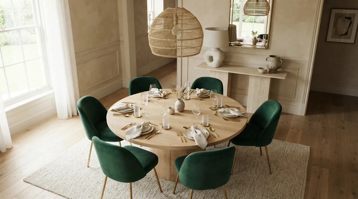
Emerald and soft beige give dining spaces a polished, boutique-hotel feeling while keeping the overall palette welcoming. Using emerald on the chairs is a practical choice because the color can later be softened with slipcovers, cushions, or a different table setting without repainting the room.
17. Mocha and Pale Blue
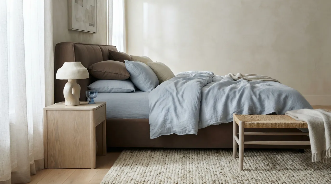
Mocha and pale blue create a surprisingly balanced bedroom palette because each color corrects the other’s extremes. The deeper brown supplies warmth and grounding, while the blue adds enough visual air to keep the room feeling peaceful rather than heavy.
18. Charcoal and Muted Green
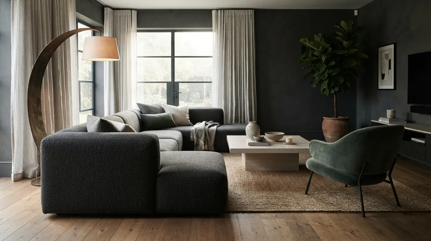
Charcoal and muted green are ideal when you want a room to feel modern, grounded, and slightly dramatic without becoming stark. The most useful balancing move is to introduce lighter natural materials around the darker furniture, giving the palette contrast while preserving its sophisticated mood.
Bringing It All Together
Pair deep colors with lighter neutrals, and test paint samples in both daylight and evening light before committing. Start with one anchor color, then balance it with natural wood, soft textiles, or warm ivory for a more cohesive result.
Emma Williams
Emma Williams is an interior design expert and decor editor at Lady Home Decor. She specializes in modern, cozy, and functional home styling, helping readers discover inspiring decorating ideas that are easy to recreate. Her work focuses on timeless design, practical solutions, and the latest home decor trends.