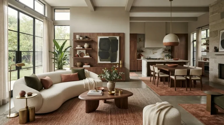
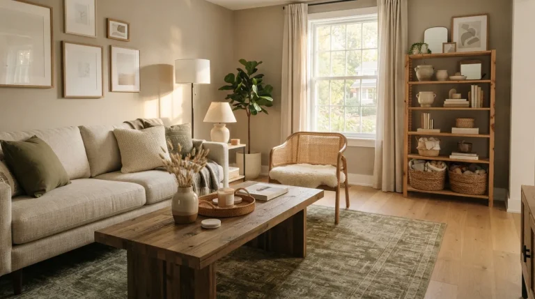
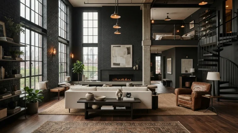
17 Amazing Aesthetic Home Color Palette Ideas for Bold Decor

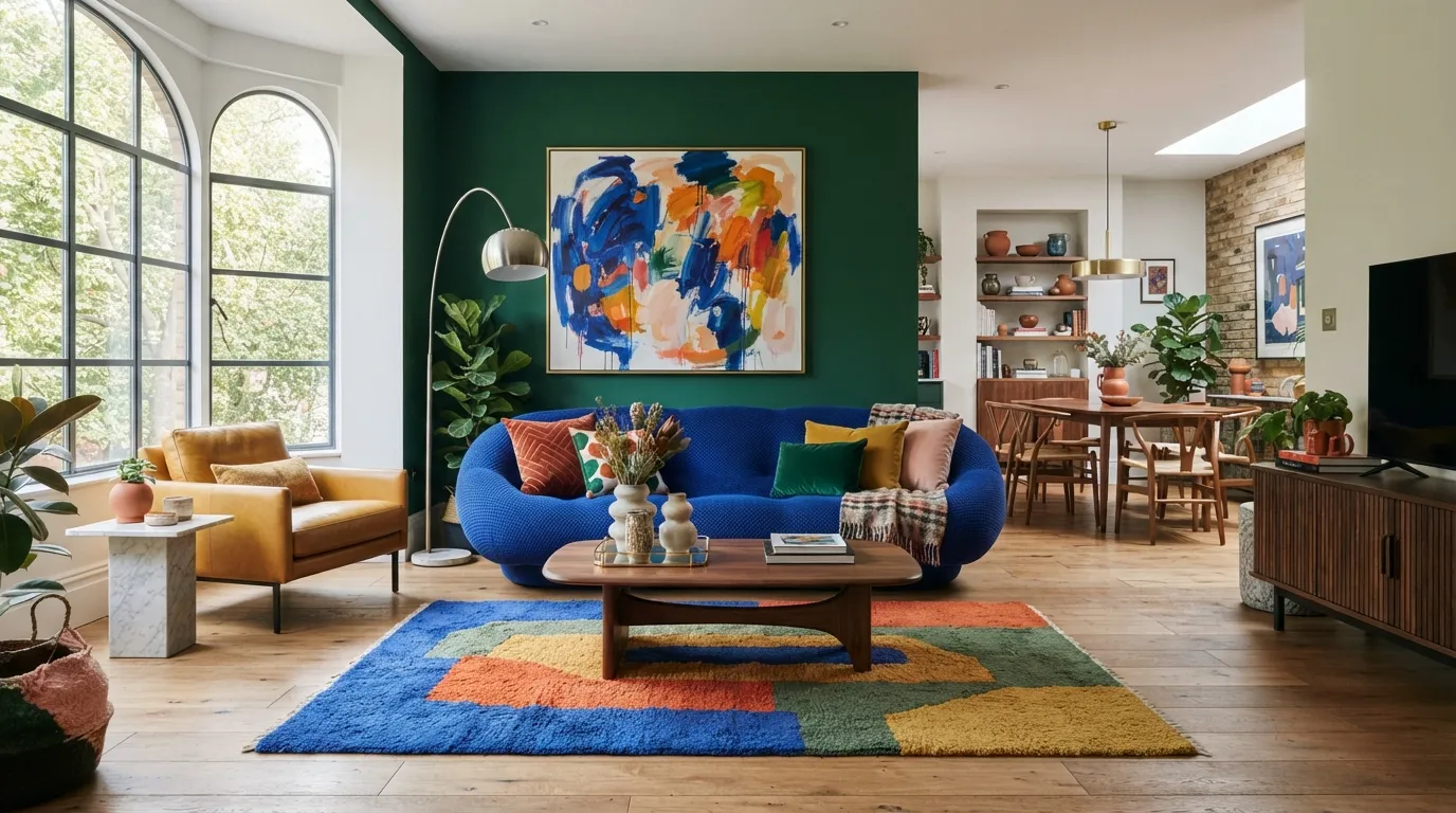
These aesthetic home color palette ideas show 17 bold color combinations for creating colorful, balanced, and stylish rooms. From cobalt and terracotta to indigo and golden yellow, each pairing gives your home a distinct visual personality. Explore the ideas below to find a combination that fits your space and decorating style.
1. Cobalt Blue & Terracotta
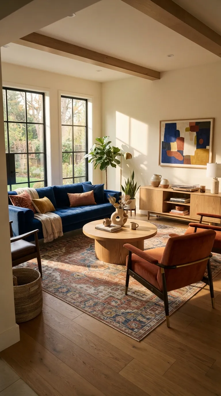
This pairing instantly makes a room feel collected rather than randomly colorful. The cool depth of cobalt works especially well against terracotta’s earthy warmth, while oak and cream prevent the contrast from becoming harsh. In my experience, keeping one color dominant and using the second on smaller furniture pieces makes this combination much easier to live with.
2. Emerald Green & Blush Pink
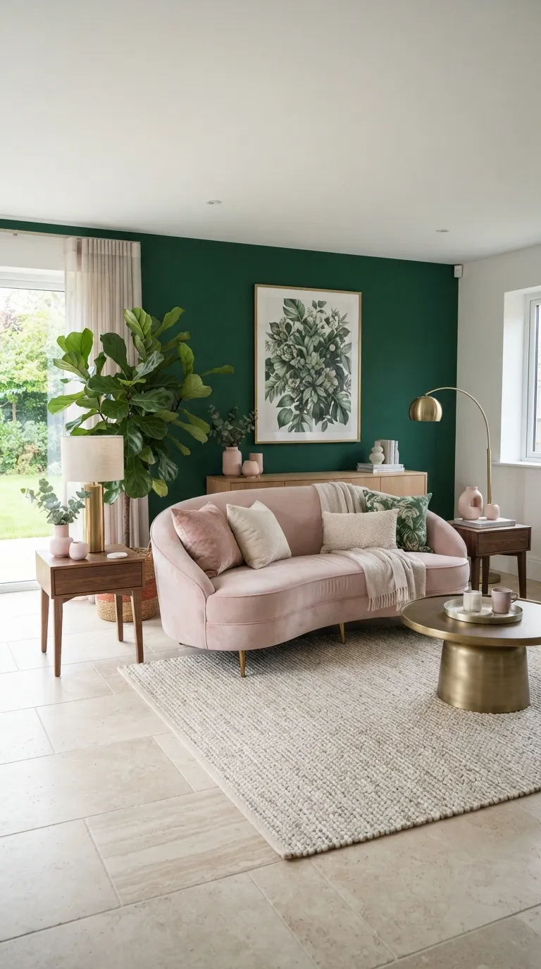
Emerald and blush create a lively contrast while still feeling surprisingly sophisticated. The trick is to let the green provide visual weight and treat pink as a softer supporting shade. For smaller rooms, painting only one wall green can deliver the same dramatic effect without making the entire space feel visually enclosed.
3. Mustard Yellow & Navy Blue
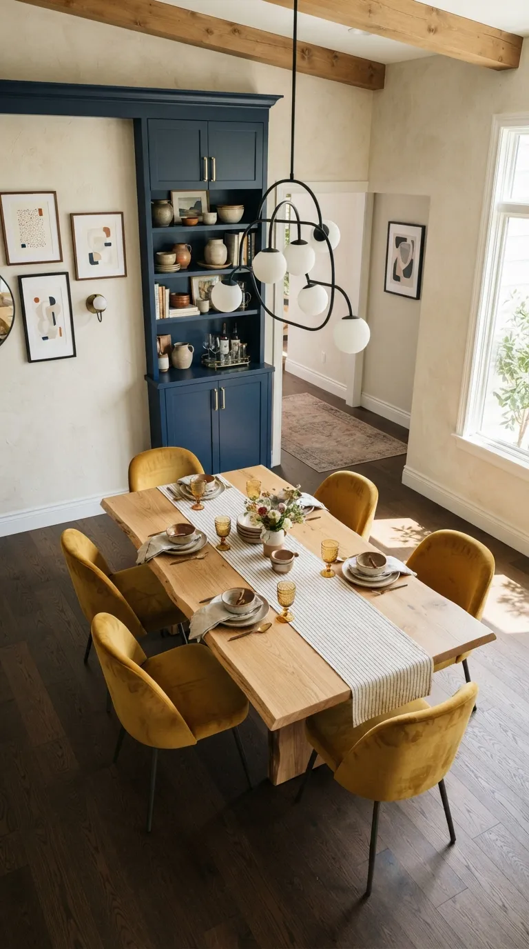
Mustard yellow brings energy to navy without creating the visual intensity of several equally bright colors. This makes the pairing particularly useful in dining areas, where chairs, artwork, or lighting can carry the brighter shade. I’ve noticed that natural oak is especially effective here because its warm undertone softens the contrast while keeping the room contemporary.
4. Coral & Teal Contrast
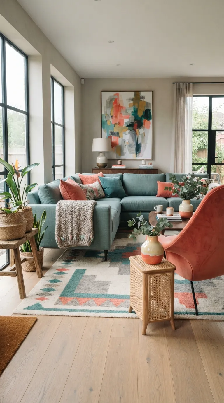
Coral and teal create the kind of contrast that makes a room instantly noticeable in a Pinterest feed. The combination feels playful, but the muted versions are much easier to use across larger furniture. Keep the strongest coral pieces at eye level or below; this prevents the warm color from visually dominating the entire room.
5. Plum & Chartreuse Accents
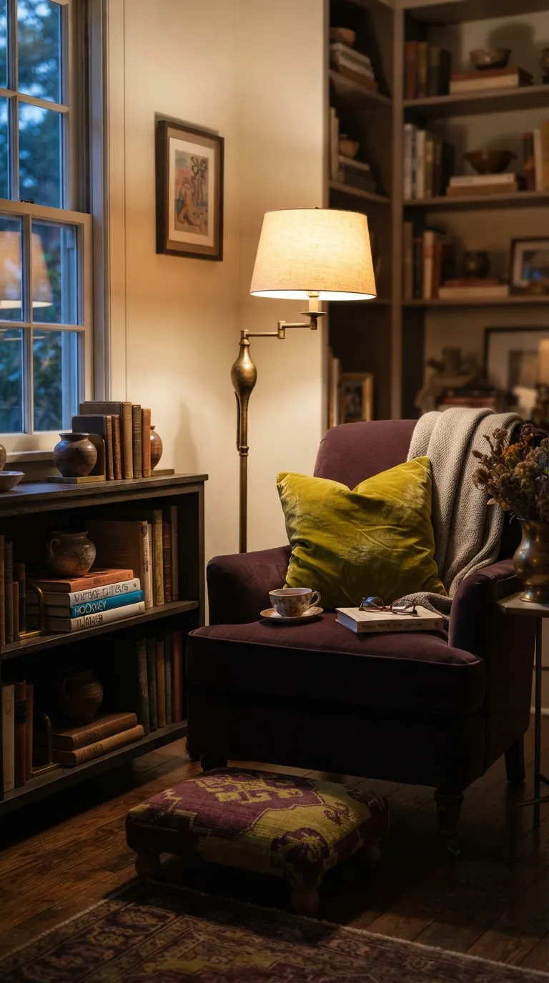
Plum and chartreuse are ideal when you want a home to feel artistic rather than simply colorful. The darker base gives the brighter accent somewhere to visually land, so the room still feels intentional. I’ve seen this pairing work particularly well in reading corners because a single bright textile can bring life to an otherwise restrained, cozy setting.
6. Turquoise & Tangerine
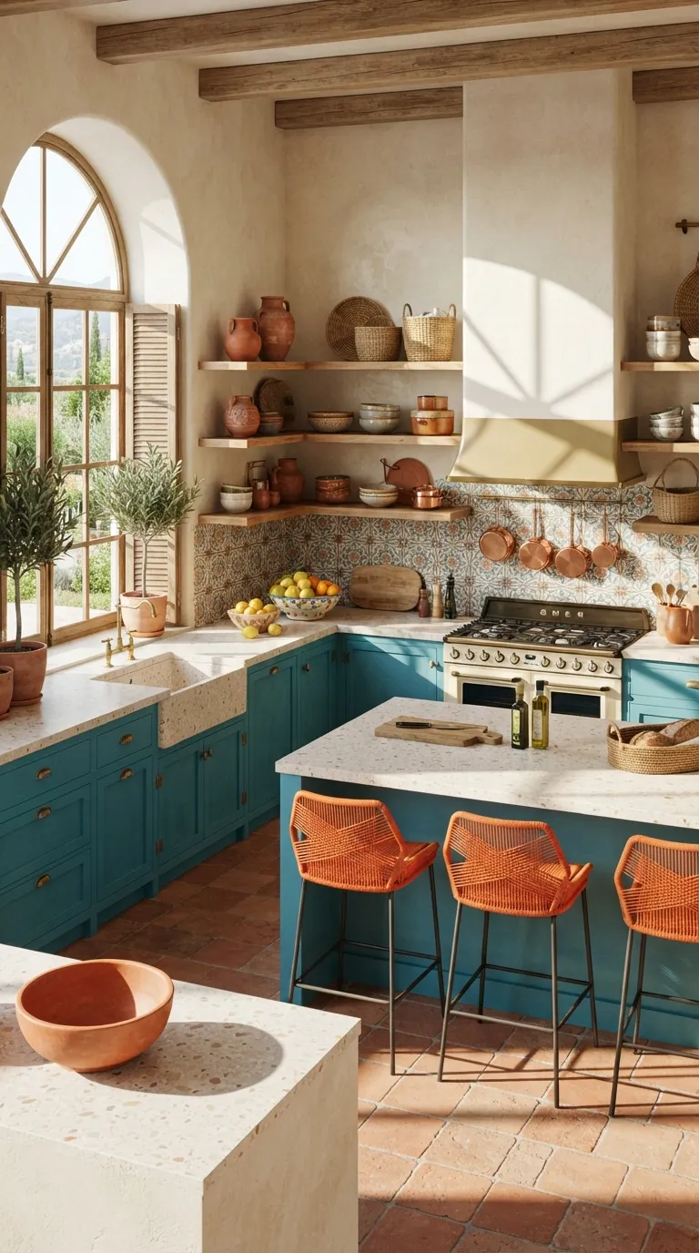
Turquoise and tangerine instantly bring a sunny, vacation-inspired feeling into a kitchen. Instead of using both shades equally, let the cabinetry carry most of the turquoise while stools and accessories provide smaller orange moments. This approach keeps the palette bold but makes the permanent design choices easier to live with.
7. Sapphire & Burnt Orange
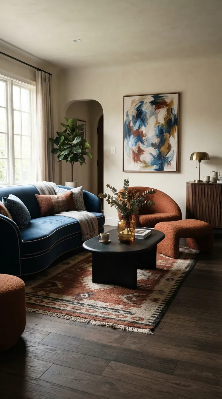
Sapphire and burnt orange bring dramatic contrast without making a room feel childish. The secret is choosing slightly complex versions of both colors, then allowing warm wood and creamy surfaces to occupy the quieter areas. If a sofa already dominates the room, using orange on one statement chair creates enough contrast without competing focal points.
8. Olive & Electric Blue
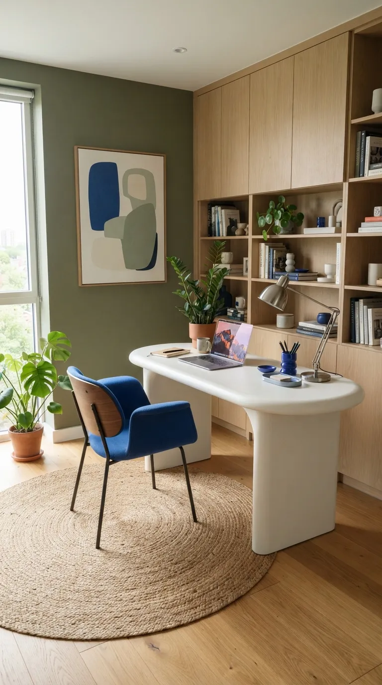
Olive and electric blue prove that a bold palette does not have to rely on warm colors. The green creates a calm backdrop while the brighter blue adds energy exactly where attention is useful. I’ve noticed this balance works especially well in workspaces because the saturated accent can define the active zone without covering every surface in color.
9. Magenta & Warm Beige
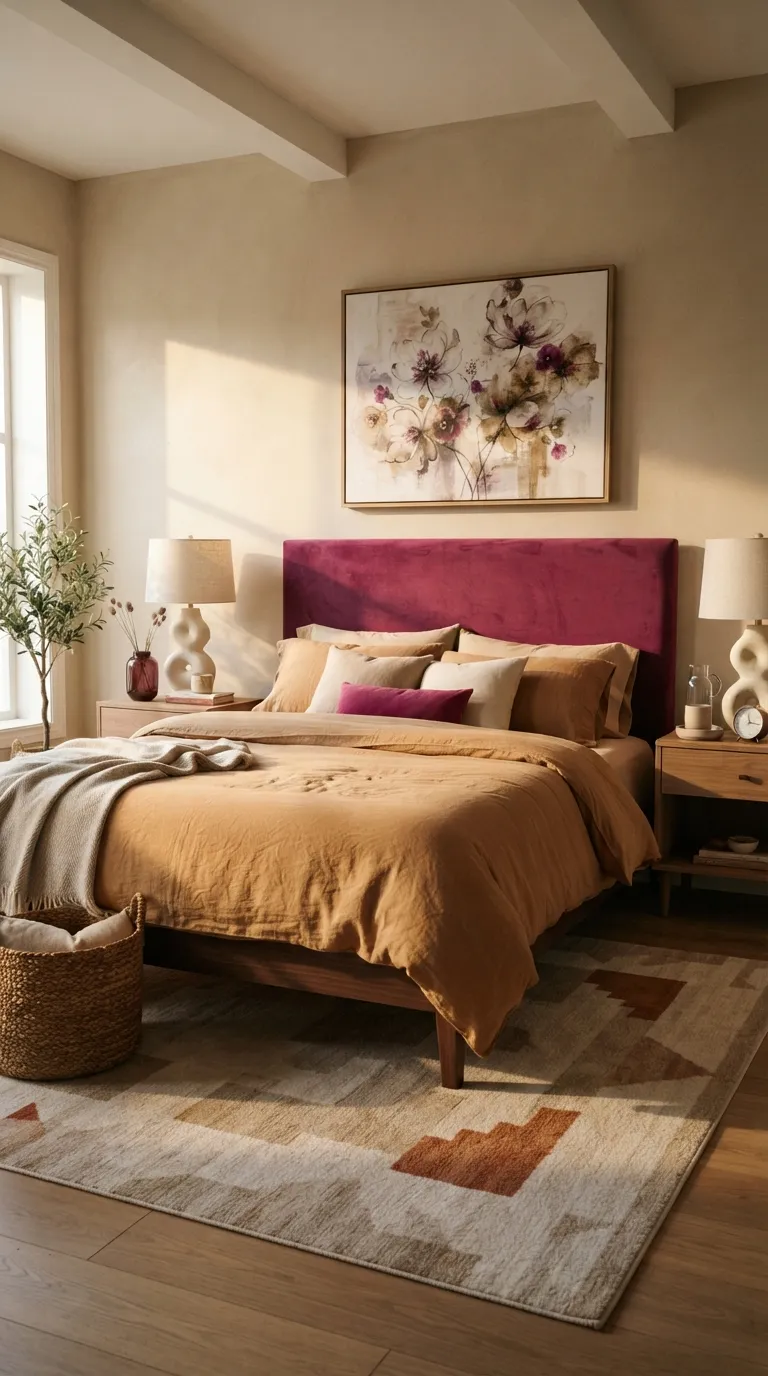
Magenta can feel luxurious rather than overpowering when it is given a warm neutral frame. A headboard is especially effective because it concentrates the strongest color behind the bed instead of scattering it throughout the room. For a softer result, choose a slightly dusty or wine-leaning magenta rather than an extremely neon version.
10. Rust & Powder Blue
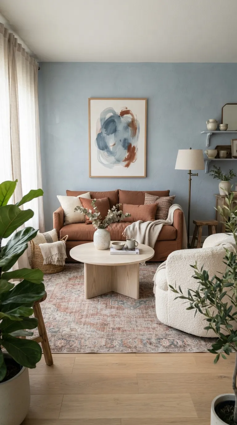
Rust and powder blue create a beautiful balance between earthy warmth and airy freshness. The contrast is strong enough to feel memorable but soft enough for a comfortable living space. If the room receives limited natural light, keeping the blue on the walls and rust on upholstery can help maintain a brighter overall impression.
11. Fuchsia & Forest Green
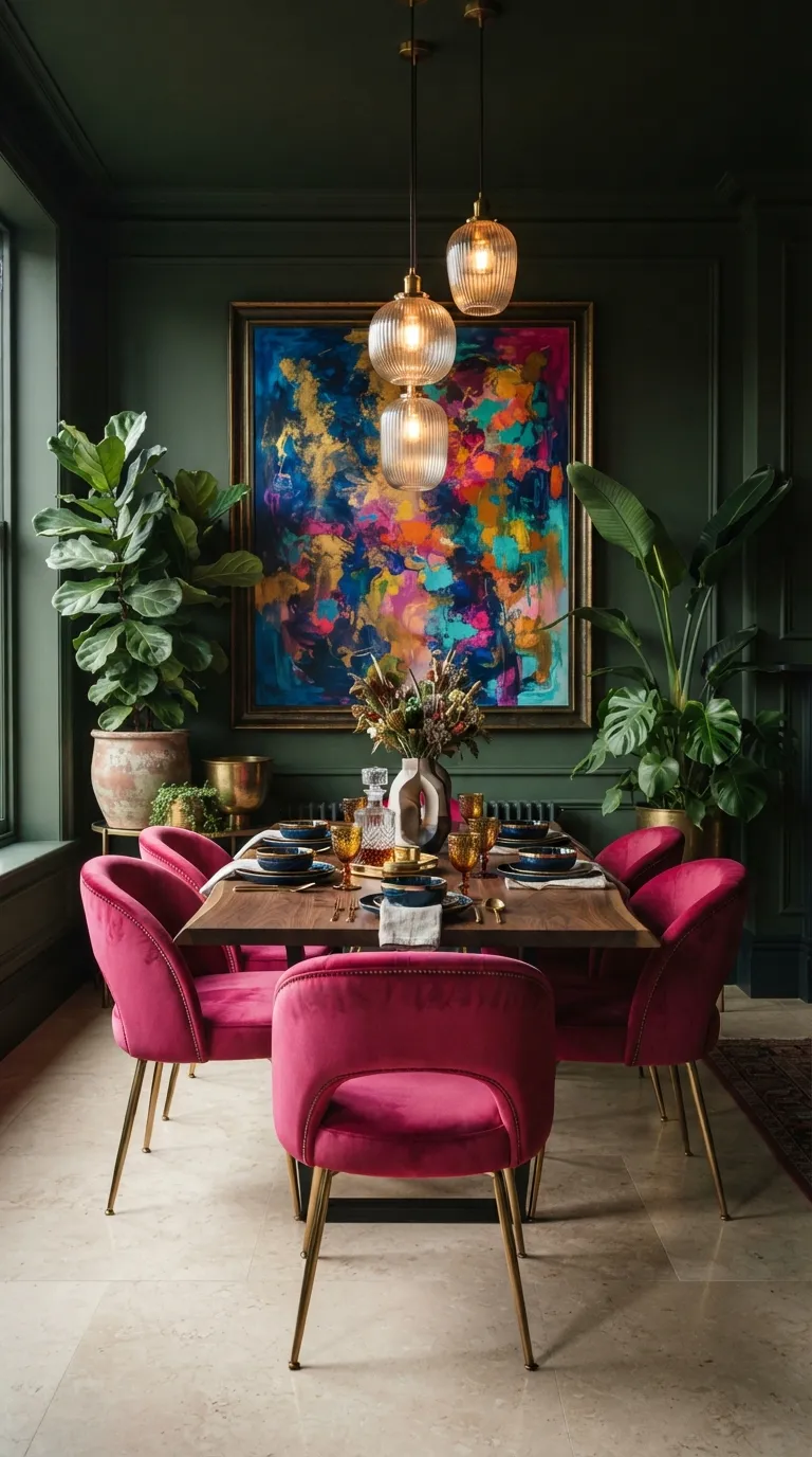
Fuchsia and forest green are made for rooms where you want personality to lead the design. Rather than spreading both colors everywhere, concentrate the pink on seating and let the green establish the architectural background. This creates a clear visual hierarchy, which is especially important in maximalist spaces with plenty of patterns and accessories.
12. Marigold & Plum
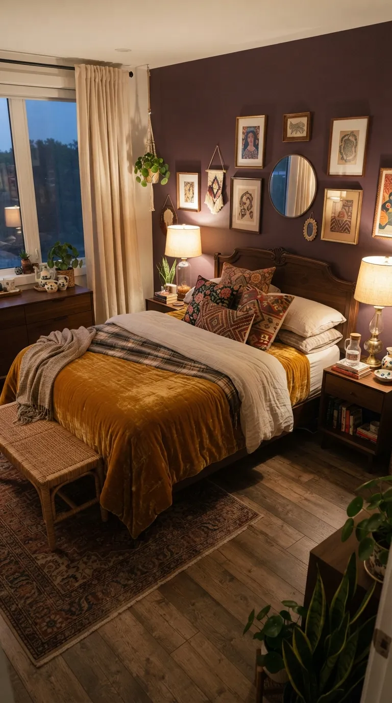
Marigold and plum create a rich, cozy combination that works beautifully in bedrooms and intimate spaces. The deeper wall color gives the brighter textile a dramatic backdrop, while cream curtains stop the palette from becoming too heavy. I’ve found that using the brighter shade in washable textiles is also a practical way to test a bold combination before committing to permanent changes.
13. Lavender & Burnt Sienna
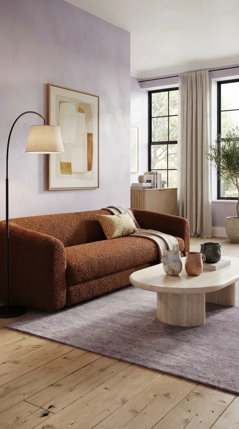
Lavender and burnt sienna offer a softer alternative to the usual blue-and-orange contrast. The cool wall color gives the earthy sofa a fresher appearance, while natural materials keep the palette connected to the rest of the home. For a balanced result, choose a dusty lavender rather than a highly saturated purple, especially in rooms with large wall areas.
If you found this helpful, you’ll probably like Home Color Palette Ideas.
14. Scarlet & Dusty Rose
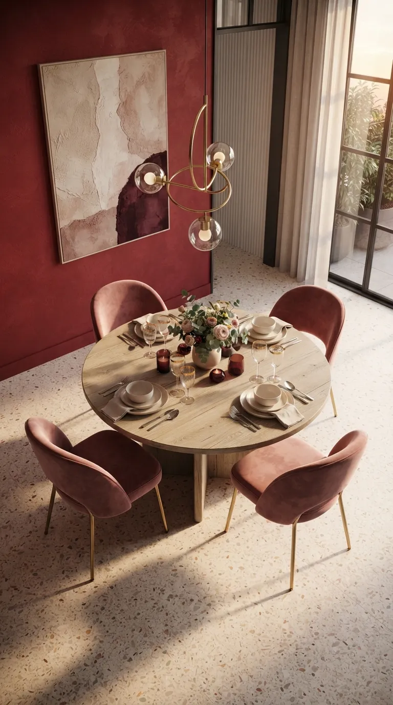
Scarlet and dusty rose show how two colors from the same warm family can still create strong visual contrast. The deeper red establishes the architectural backdrop while the muted pink keeps furniture approachable. If you want the room to feel sophisticated rather than theatrical, balance the reds with pale oak, creamy stone, or another light natural finish.
15. Peacock Blue & Apricot
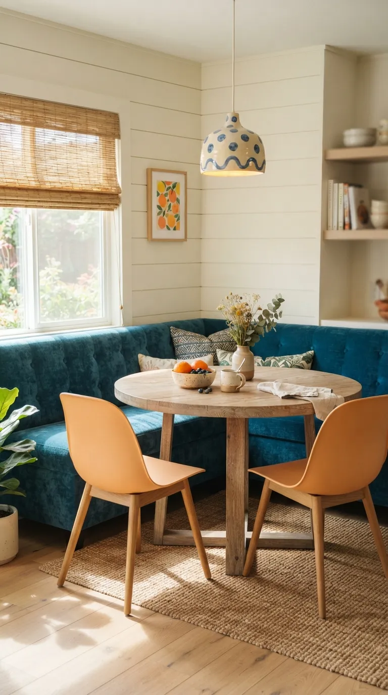
Peacock blue and apricot bring cheerful color into a smaller space without making it feel chaotic. The key is assigning each shade a clear job: blue anchors the seating while apricot creates smaller moments of warmth. I’ve noticed this approach works particularly well in breakfast nooks because the limited footprint naturally keeps bold color from spreading too far.
16. Crimson & Sage Green
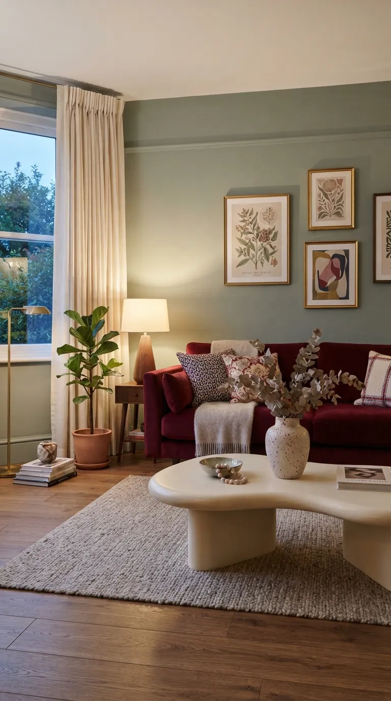
Crimson and sage create a surprisingly balanced look because the muted green takes the edge off the intense red. This pairing works especially well when the red is concentrated in one substantial piece, such as a sofa or upholstered chair. If you’re nervous about using strong color, start with removable textiles before committing to upholstery or paint.
17. Indigo & Golden Yellow
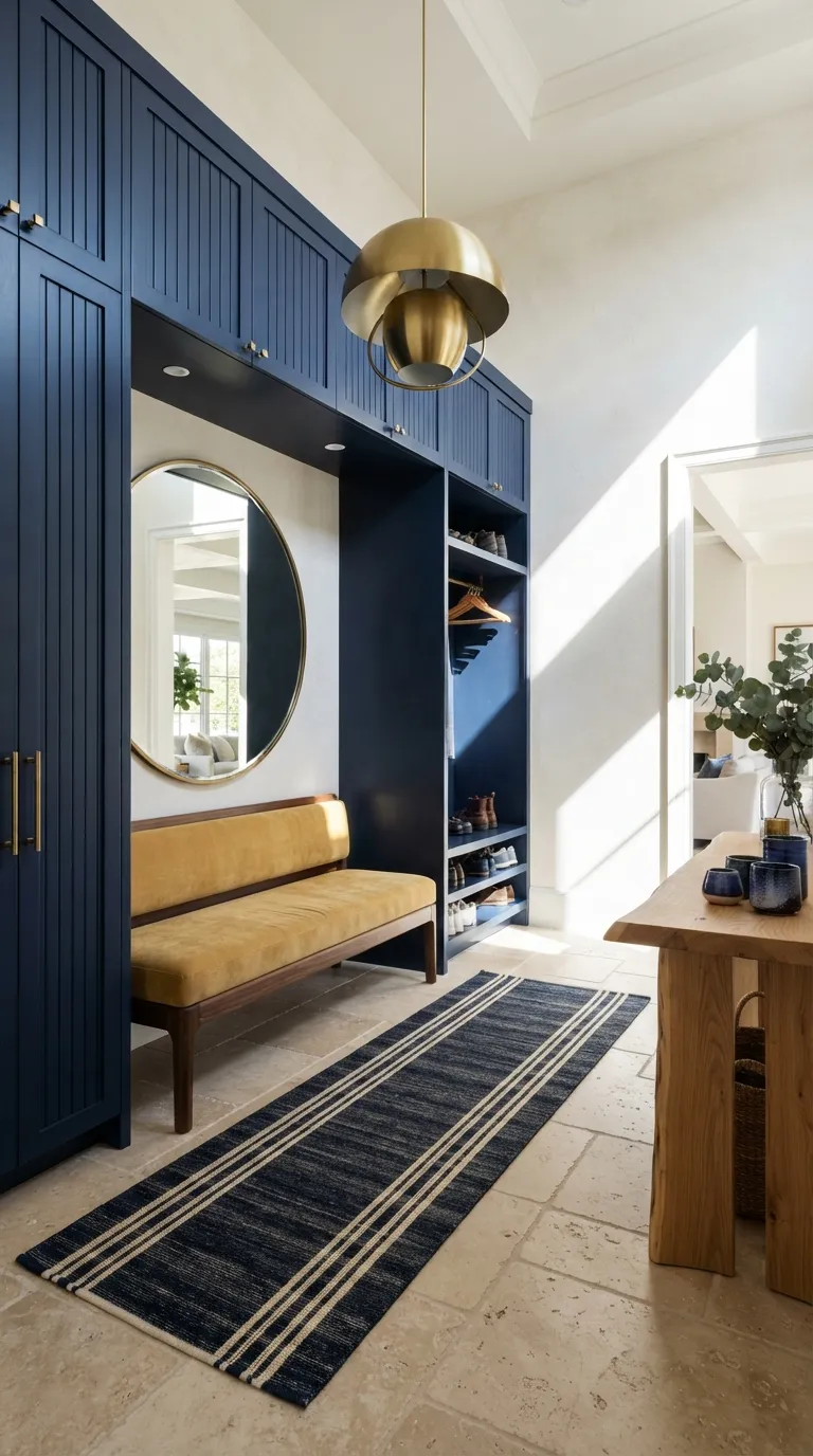
Indigo and golden yellow create a confident first impression, making them especially effective in entryways and transitional spaces. The dark cabinetry supplies structure while the yellow bench provides a clear functional focal point. For narrow halls, keep the floor and upper walls light so the dramatic cabinetry adds personality without visually shrinking the passage.
To Sum It Up
Use one dominant color with a carefully chosen accent to keep bold rooms balanced and intentional. Start with removable pieces like cushions, rugs, or chairs before committing to permanent color changes.
Emma Williams
Emma Williams is an interior design expert and decor editor at Lady Home Decor. She specializes in modern, cozy, and functional home styling, helping readers discover inspiring decorating ideas that are easy to recreate. Her work focuses on timeless design, practical solutions, and the latest home decor trends.