19 Modern Home Color Palette Ideas That Feel Expensive

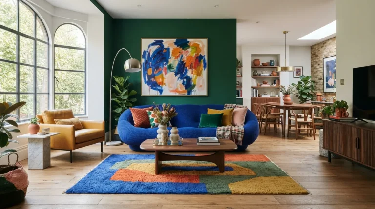
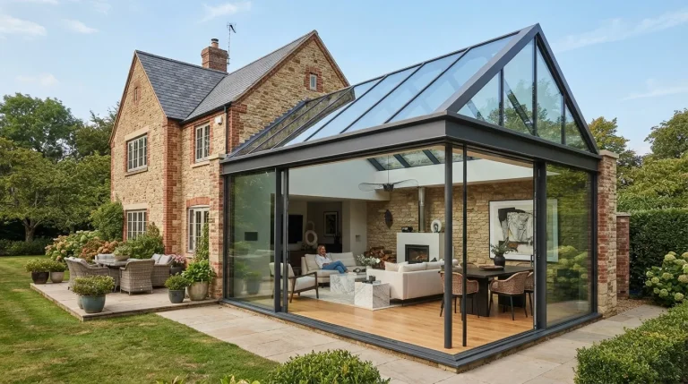
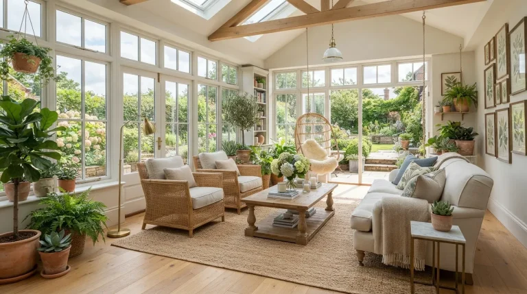
These modern home color palette ideas show you how to combine sophisticated colors, natural materials, and balanced contrast for an expensive look. From warm neutrals to deep statement shades, you’ll find practical combinations that make each room feel more polished without overspending. Explore the ideas below and find a palette that fits your home and personal style.
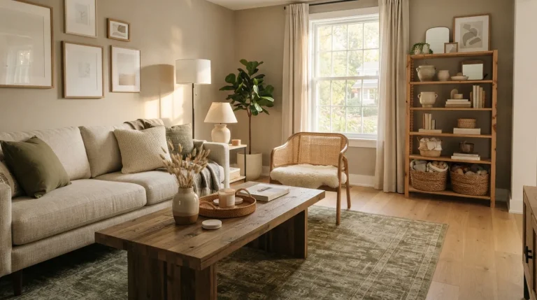
1. Warm Greige Layers
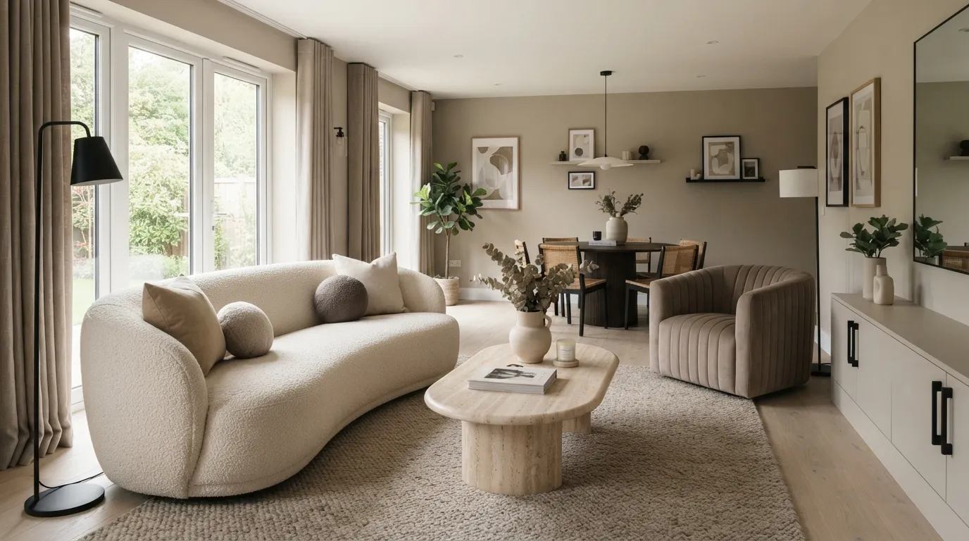
Warm greige gives a home that quiet, designer look without making the space feel cold. The key is to build contrast through texture rather than dramatic color changes, especially when combining matte walls with woven fabrics and natural wood. It is a reliable starting point for modern home color palette ideas because it works beautifully across living rooms, bedrooms, and open-plan spaces.
2. Olive and Ivory
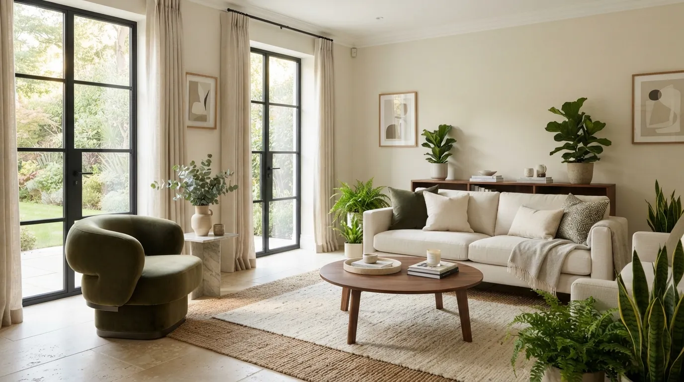
Olive and ivory create an expensive-looking contrast because the green brings depth while the ivory keeps the room visually open. Instead of using green everywhere, concentrate it on one chair, cushions, artwork, or a rug so the eye has a clear focal point. This combination works particularly well in rooms with natural light, where the olive shifts subtly throughout the day.
3. Charcoal and Cream
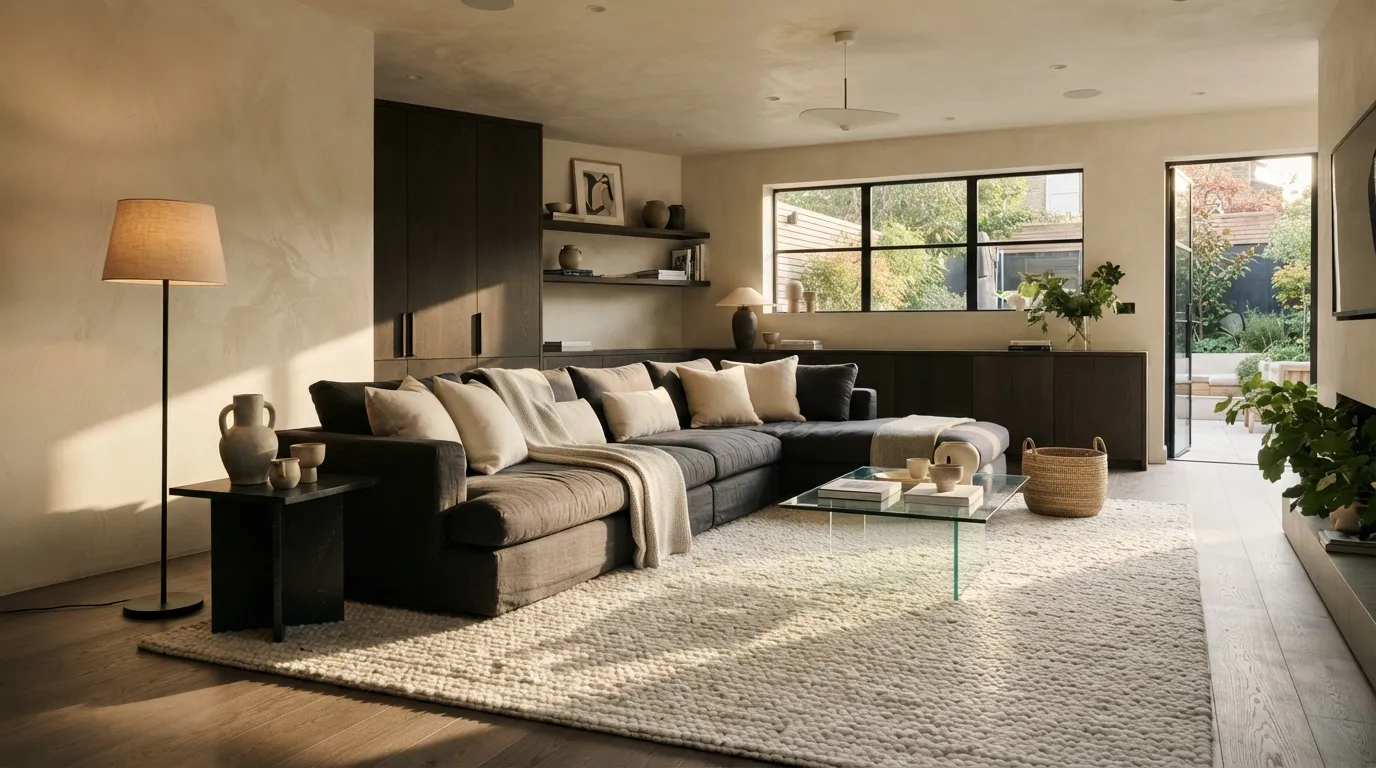
Charcoal and cream instantly give a modern room more architectural depth, especially when the darker shade is concentrated around substantial furniture. The lighter elements keep the space from feeling heavy, while smoked wood adds a softer transition between both colors. For smaller rooms, keeping charcoal below eye level can preserve an airy feeling without losing the sophisticated contrast.
4. Terracotta and Sand
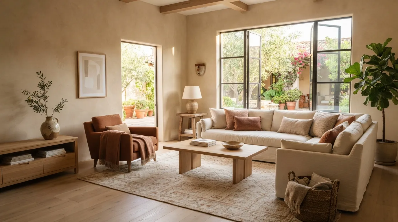
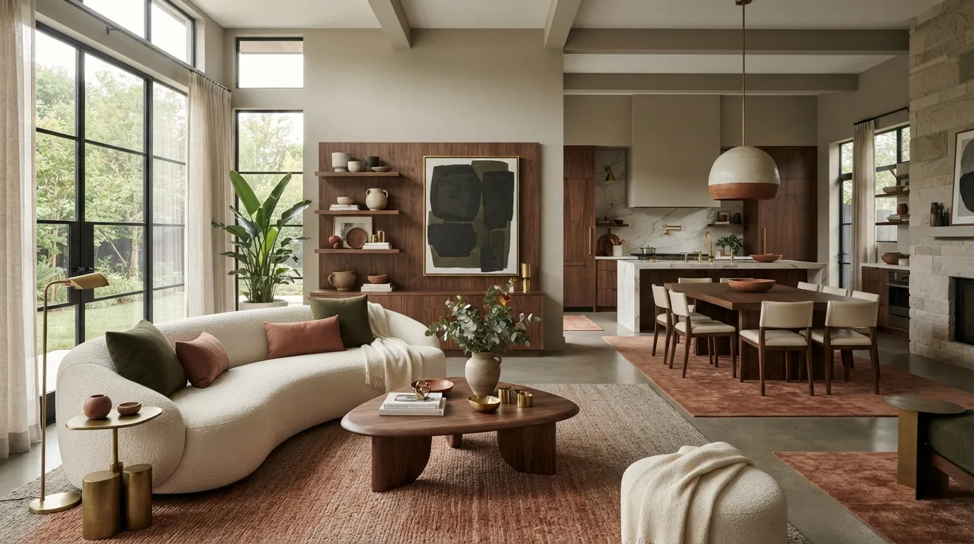
Terracotta and sand make a modern interior feel warmer and more personal without losing its clean lines. The trick is choosing dusty, mineral-like terracotta rather than a bright orange that can dominate the room. I’ve seen this pairing work especially well where sunlight already brings warmth, because the colors look naturally connected to the surrounding architecture.
5. Navy and Soft White
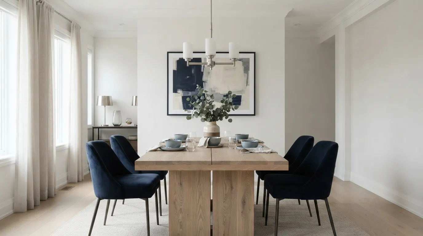
Navy and soft white give a room a crisp, tailored appearance that feels more intentional than an all-neutral scheme. The darker color is especially effective on dining chairs because it grounds the furniture while leaving the walls visually light. For a cohesive finish, repeat the navy in artwork or a small textile rather than adding several unrelated blue shades.
6. Sage and Natural Oak
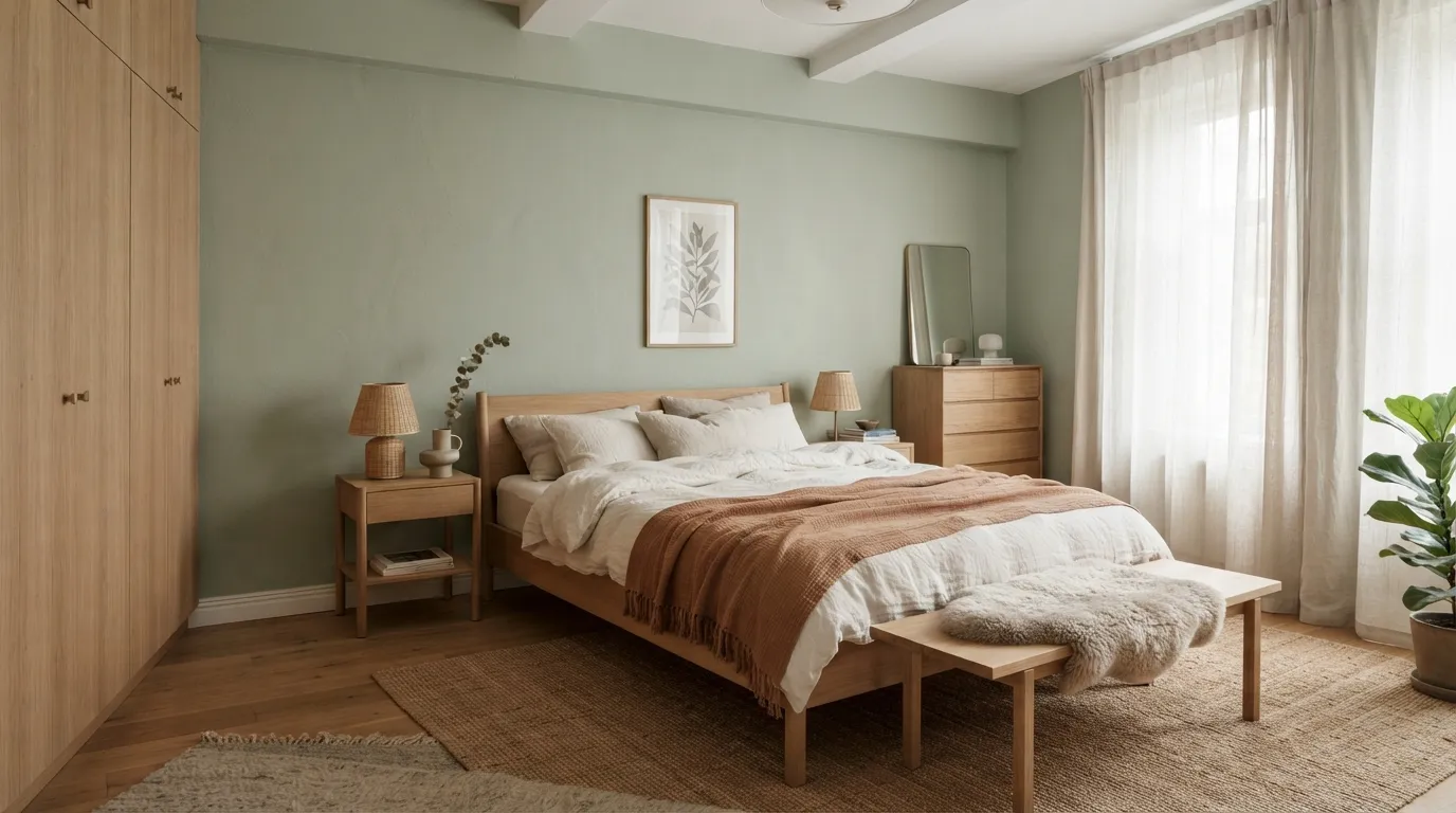
Sage and natural oak create a relaxed palette that feels modern without becoming sterile. The green gives the walls personality, while oak introduces the natural variation that flat-painted rooms often lack. If you’re testing the color first, paint a large sample board and view it morning and evening because sage can shift noticeably under different light temperatures.
7. Mocha and Ivory
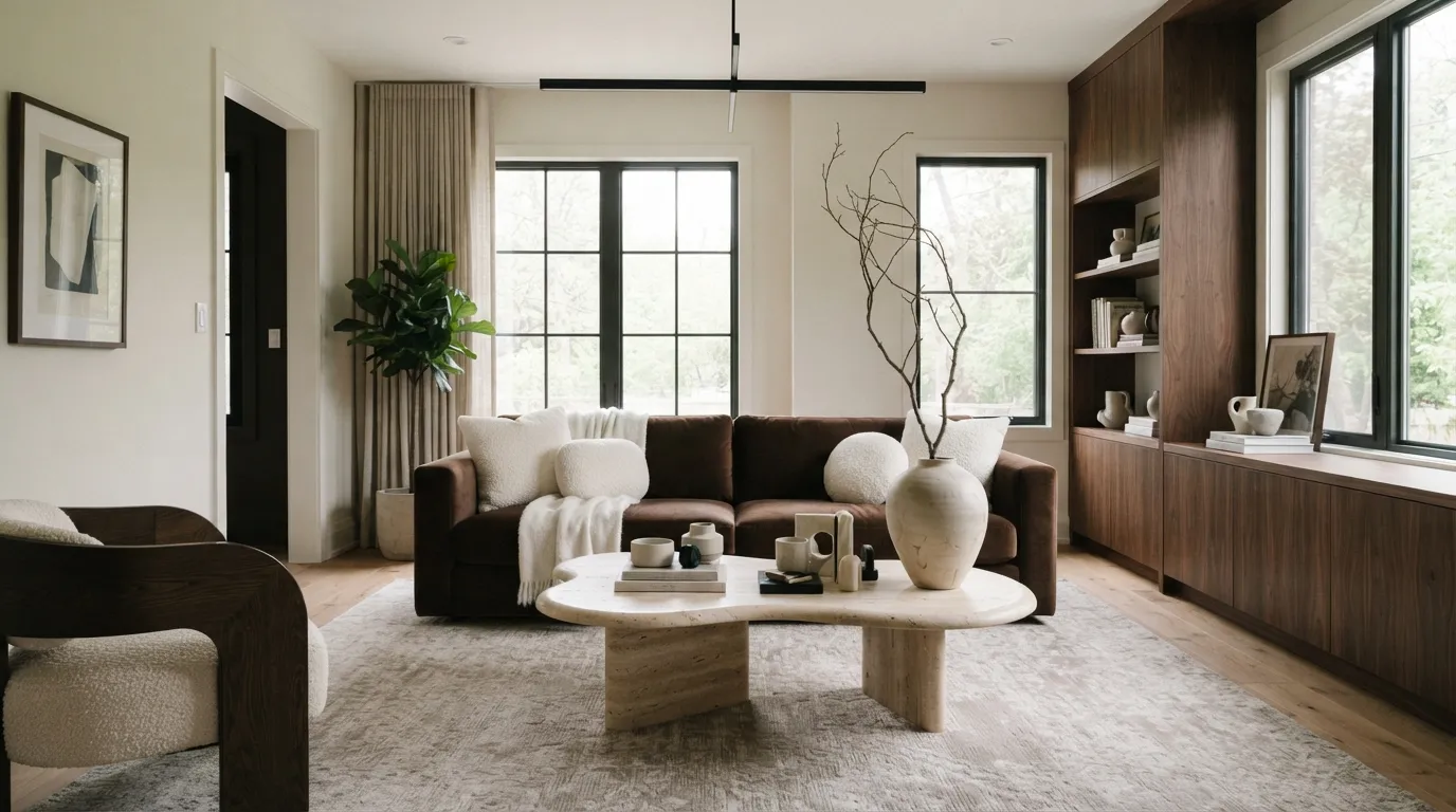
Mocha and ivory create the kind of layered neutral scheme that feels expensive because the contrast is subtle but unmistakable. The darker brown gives substantial furniture visual weight, while ivory keeps the surrounding architecture fresh. This palette is particularly effective when matte finishes dominate, allowing differences in texture to provide the interest that glossy surfaces normally create.
8. Dusty Blue and Beige
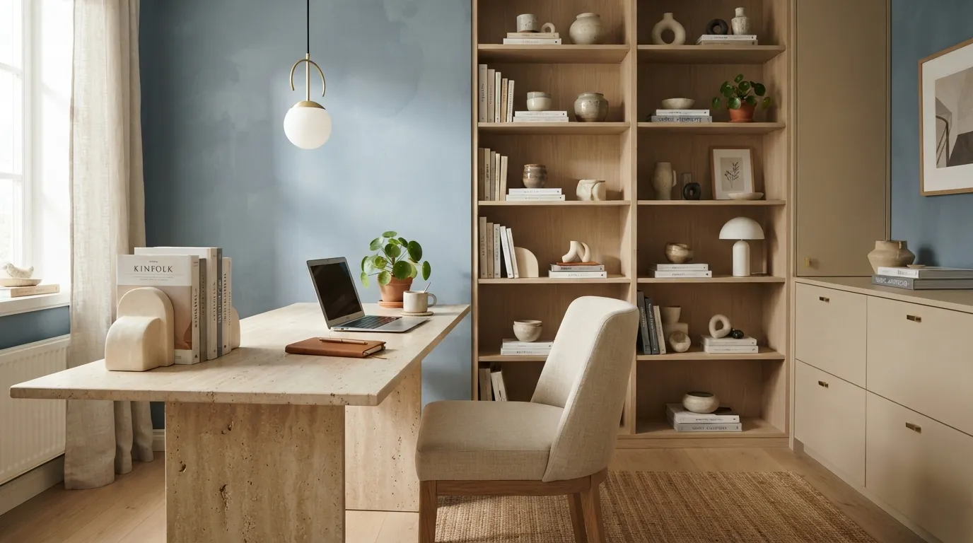
Dusty blue and beige strike a balance between calm and character, making them especially useful in rooms where you want color without visual noise. The muted blue provides enough contrast to define the walls, while beige furniture keeps the overall atmosphere warm. I’ve noticed this combination looks most polished when the blue stays slightly gray rather than leaning toward a bright coastal blue.
9. Black and Warm Beige
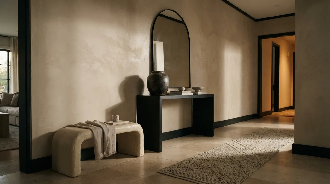
Black and warm beige make a modern home feel sharper without sacrificing comfort. The secret is controlling the amount of black and repeating it strategically so it looks architectural rather than scattered. This palette is especially effective in entryways and living rooms, where a dark console, frame, or lighting fixture can create an instant focal point against a warm neutral background.
10. Cream and Walnut
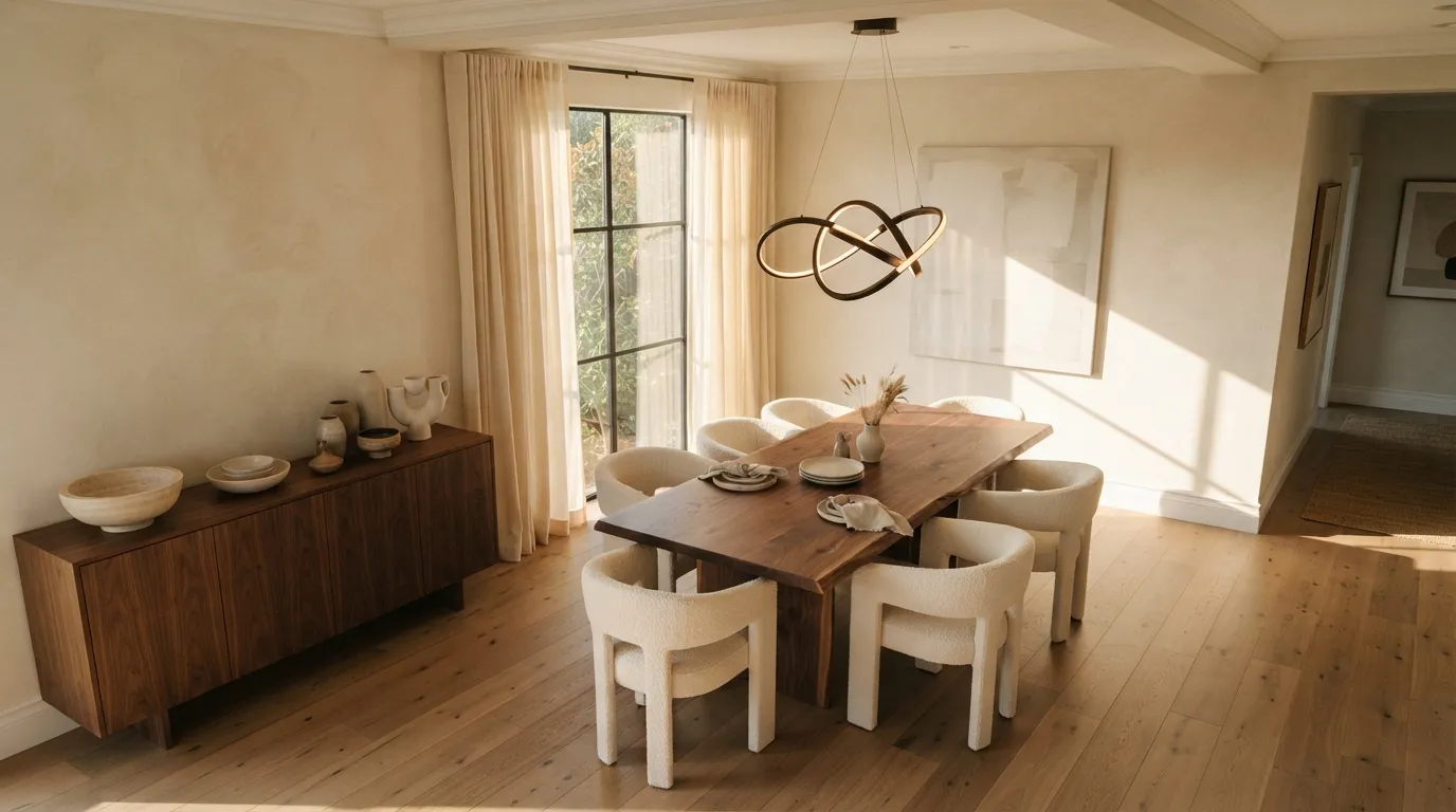
Cream and walnut create a timeless combination that feels substantial without becoming traditional. The rich wood supplies the visual depth, while cream keeps the architecture light and contemporary. This pairing is particularly useful when a room already has beautiful woodwork, because the palette enhances the material instead of competing with it.
11. Forest Green and Taupe
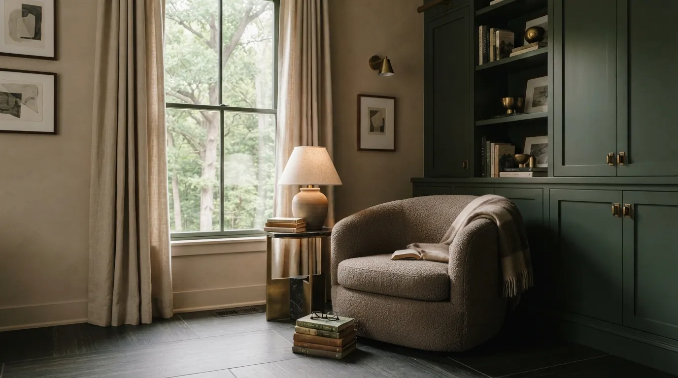
Forest green and taupe bring a deeper, more atmospheric character to contemporary interiors. The green feels especially rich on cabinetry because it gives built-in storage the appearance of custom furniture. If the room has limited daylight, use taupe on the larger wall surfaces and reserve the forest tone for one architectural feature.
12. Blush and Stone
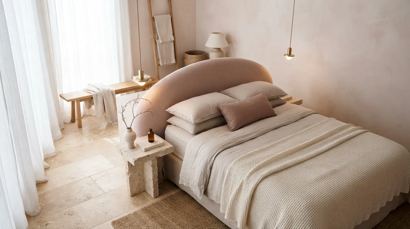
Blush and stone prove that pink can feel sophisticated when it is treated as a muted architectural color rather than a decorative accent. The stone elements add mineral texture and visual weight, giving the softer shade a more grounded appearance. This palette works especially well in bedrooms and dressing areas where a gentle color can create warmth without overwhelming the space.
You’ll probably also want to check out Beautiful Color Palette Ideas.
13. Greige and Charcoal
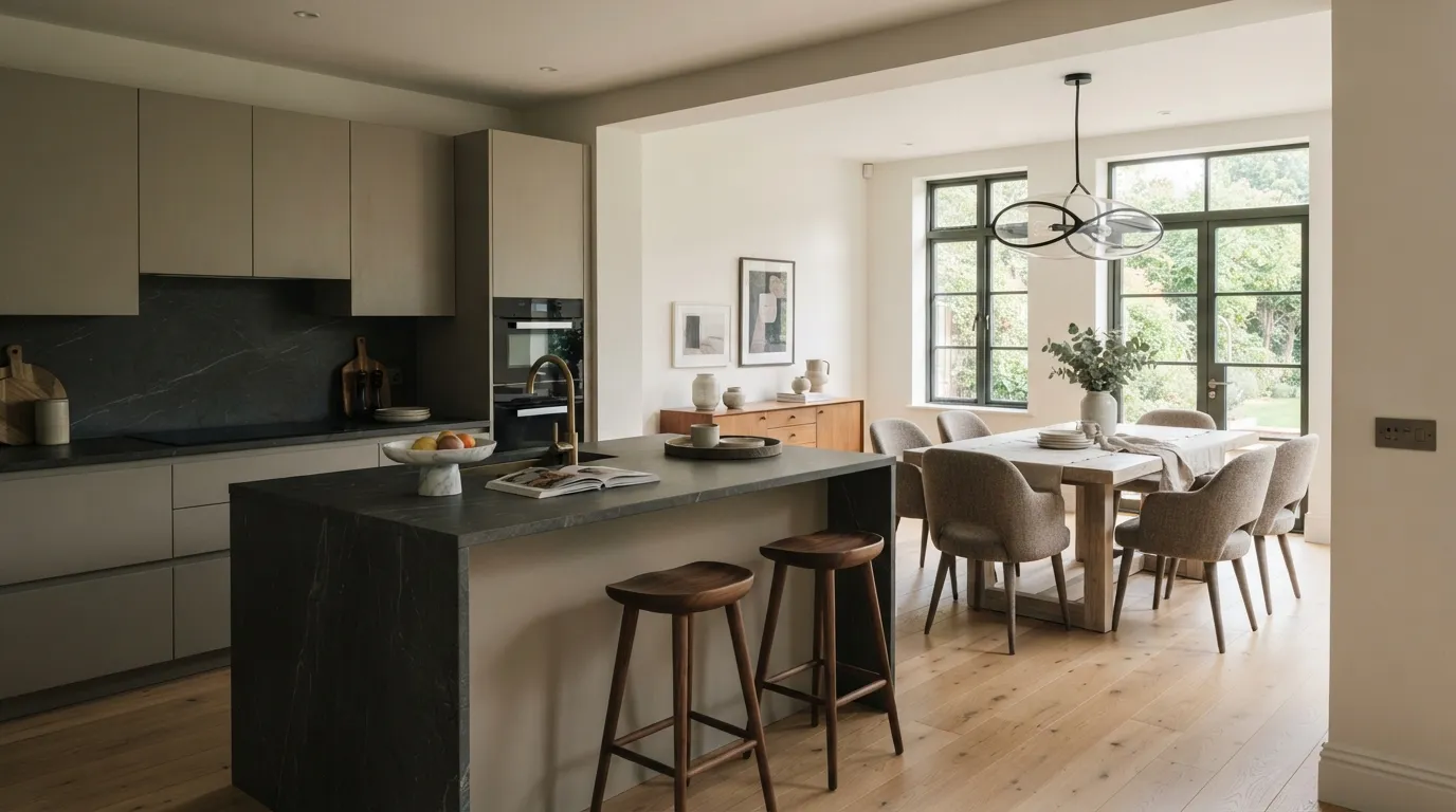
Greige and charcoal give a kitchen the tailored appearance of a high-end custom interior without relying on dramatic colors. The lighter cabinetry keeps the room open, while charcoal grounds the surfaces that receive the most visual attention. For an especially cohesive finish, choose a stone with soft gray or warm taupe veining rather than a countertop with several competing colors.
14. Deep Teal and Cream
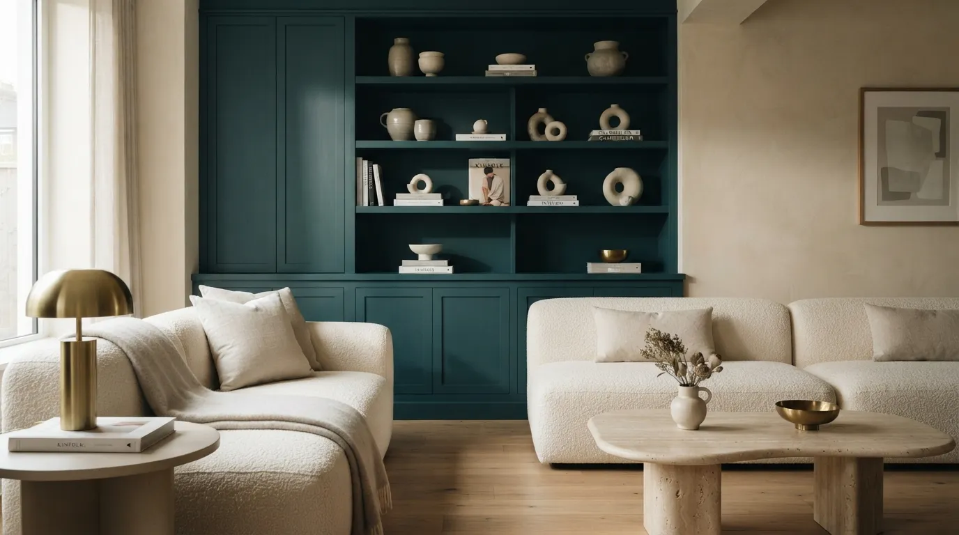
Deep teal and cream create a confident palette for homeowners who want more color without losing a refined modern feeling. Concentrating teal on built-ins or one architectural surface gives it enough visual weight to feel deliberate. The cream surrounding it acts as negative space, allowing the deeper shade to stand out instead of competing with other colorful accessories.
15. Clay and Warm White
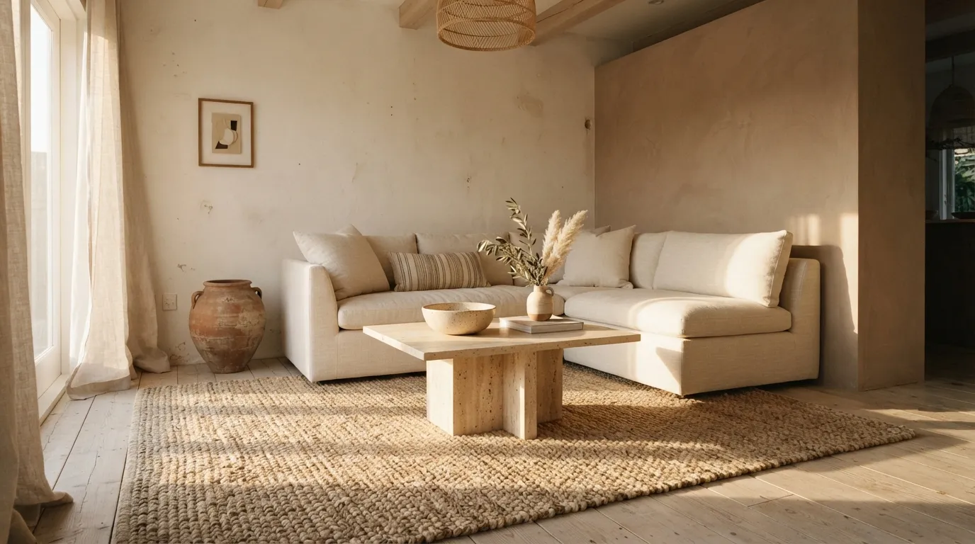
Clay and warm white make a home feel collected, tactile, and quietly luxurious. Rather than depending on lots of decoration, this palette gets its richness from plaster, linen, stone, and wood surfaces that respond differently to light. In my experience, keeping the clay slightly muted makes it much easier to live with because it adds personality without taking over the room.
16. Mushroom and Cream
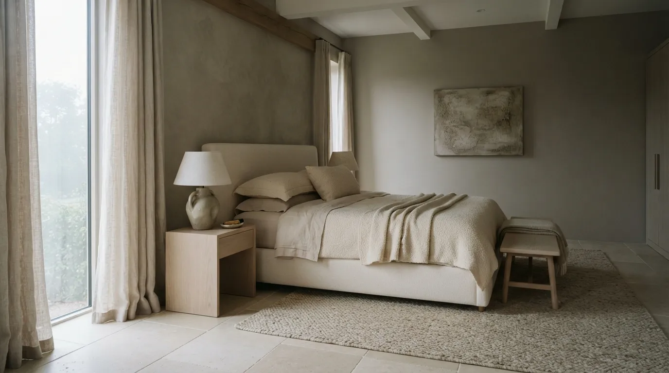
Mushroom and cream create a polished neutral bedroom without relying on plain beige. The slightly deeper wall color gives the architecture definition, while cream keeps the bedding bright and inviting. This is one of those modern home color palette ideas that becomes especially convincing when several textures share similar tones instead of introducing lots of decorative colors.
17. Rust and Pale Gray
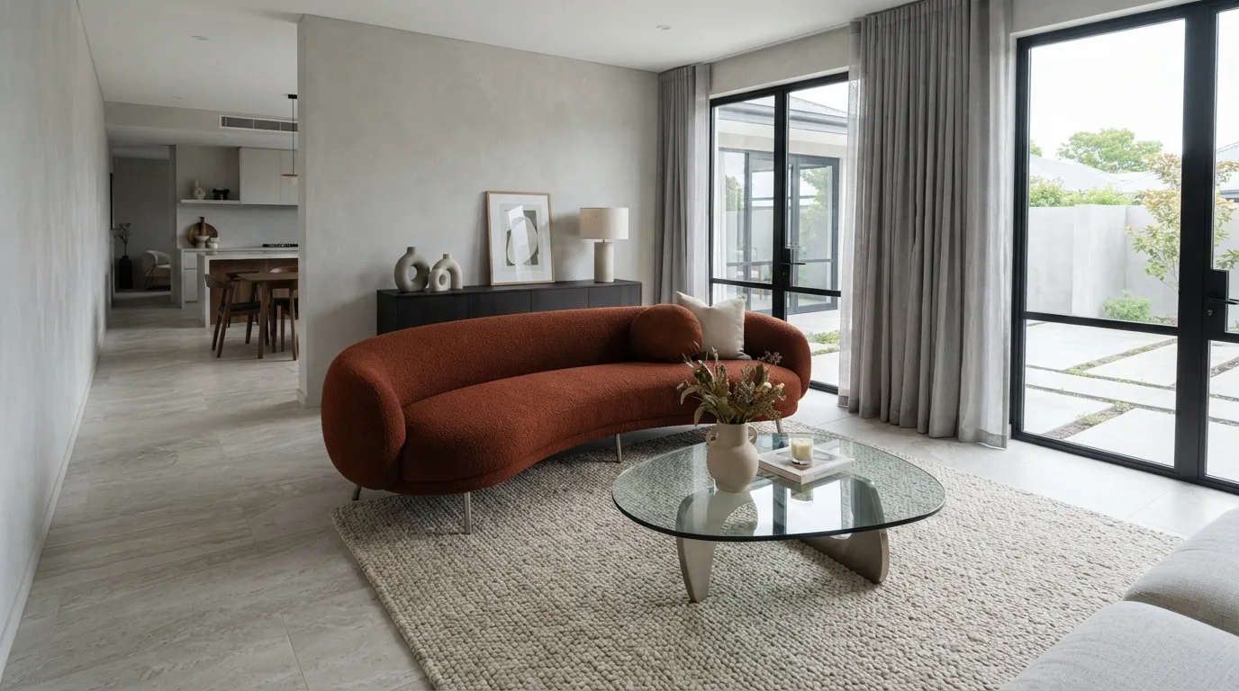
Rust and pale gray create a striking modern contrast because one color brings warmth while the other provides visual restraint. Using rust on a major furniture piece makes the palette feel intentional and editorial rather than overly accessorized. The cooler gray and stone surfaces also give the eye a place to rest, which is important when working with a stronger accent color.
18. Plum and Oatmeal
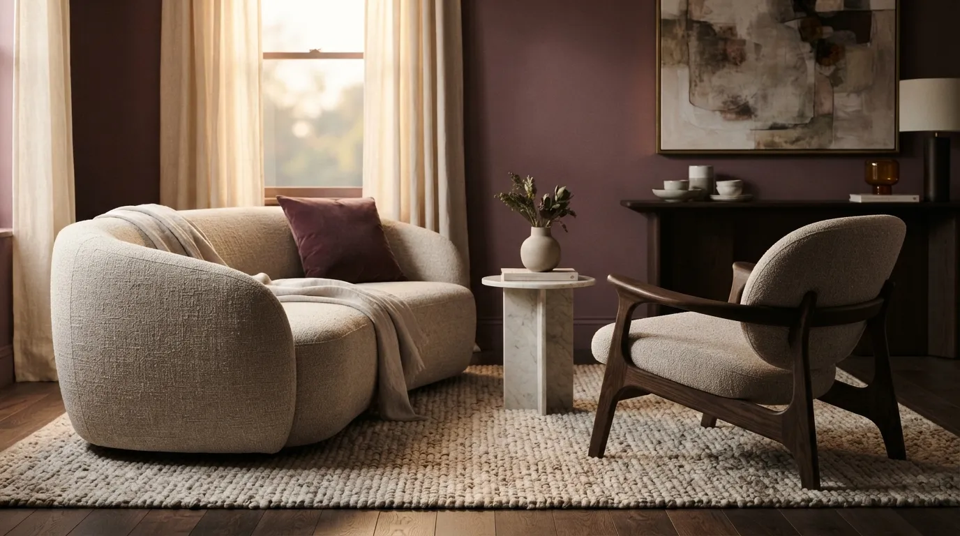
Plum and oatmeal bring a sophisticated, slightly moody character to modern interiors without making the room feel dark or formal. The oatmeal pieces soften the deeper wall color, while espresso wood reinforces the palette with a grounded natural tone. If you’re considering a dramatic paint shade, viewing a large sample after sunset can prevent surprises caused by changing light.
19. Black, Cream, and Wood
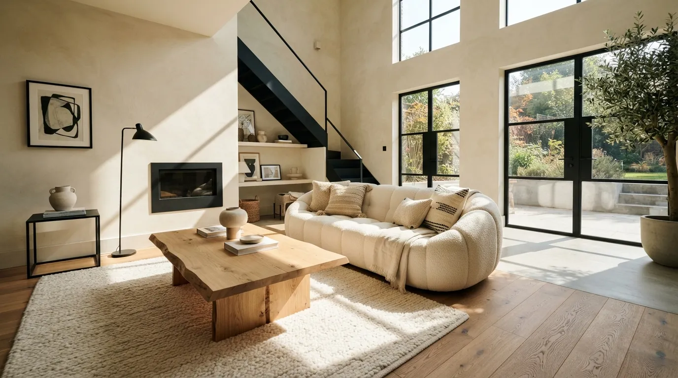
Black, cream, and natural wood create a reliable high-end combination because each element has a clear job: contrast, brightness, and warmth. The palette looks especially polished when black follows the home’s architecture instead of appearing as scattered decoration. If you’re starting from scratch, choose the large cream pieces first, then add wood and controlled black accents to build the room around them.
The Bottom Line
Start with a dominant neutral, then add one deeper accent and a natural material such as oak, walnut, or stone for balanced depth. If you try only one idea, begin with warm greige or cream and wood because both create an elevated base that is easy to build around.
Emma Williams
Emma Williams is an interior design expert and decor editor at Lady Home Decor. She specializes in modern, cozy, and functional home styling, helping readers discover inspiring decorating ideas that are easy to recreate. Her work focuses on timeless design, practical solutions, and the latest home decor trends.