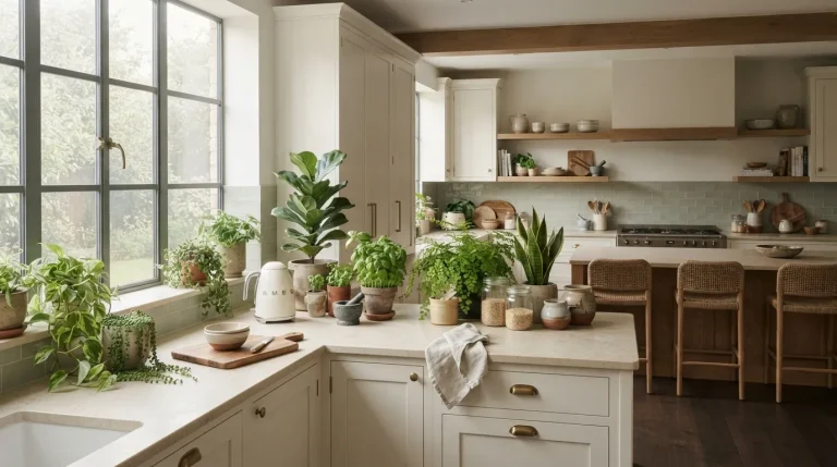
16 Amazing Modern Kitchen Color Palette Ideas for a Luxe Look

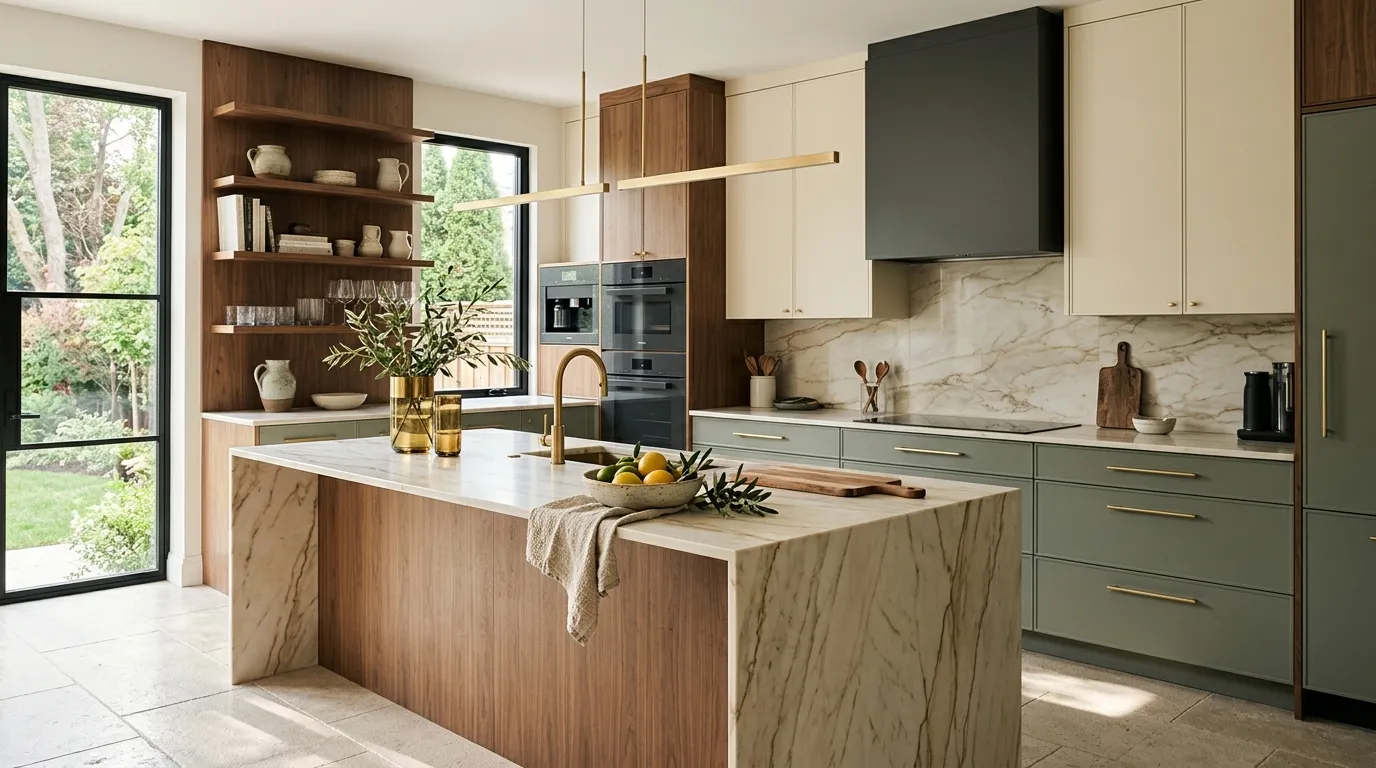
Your kitchen can feel polished without looking cold. The right colors give cabinets, counters, walls, and hardware a clear visual connection, making the room feel intentional from the first glance. These modern kitchen color palette ideas pair timeless neutrals with richer shades, natural textures, and warm finishes that suit today’s homes.
Color also changes how your kitchen feels throughout the day. Pale shades can make a compact room feel open, while deep tones add depth to larger spaces. Whether you’re planning a full remodel or simply changing cabinet paint, these palettes can help you find a look that feels stylish, comfortable, and easy to live with.
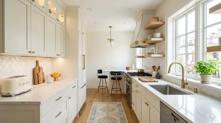
Warm White and Walnut
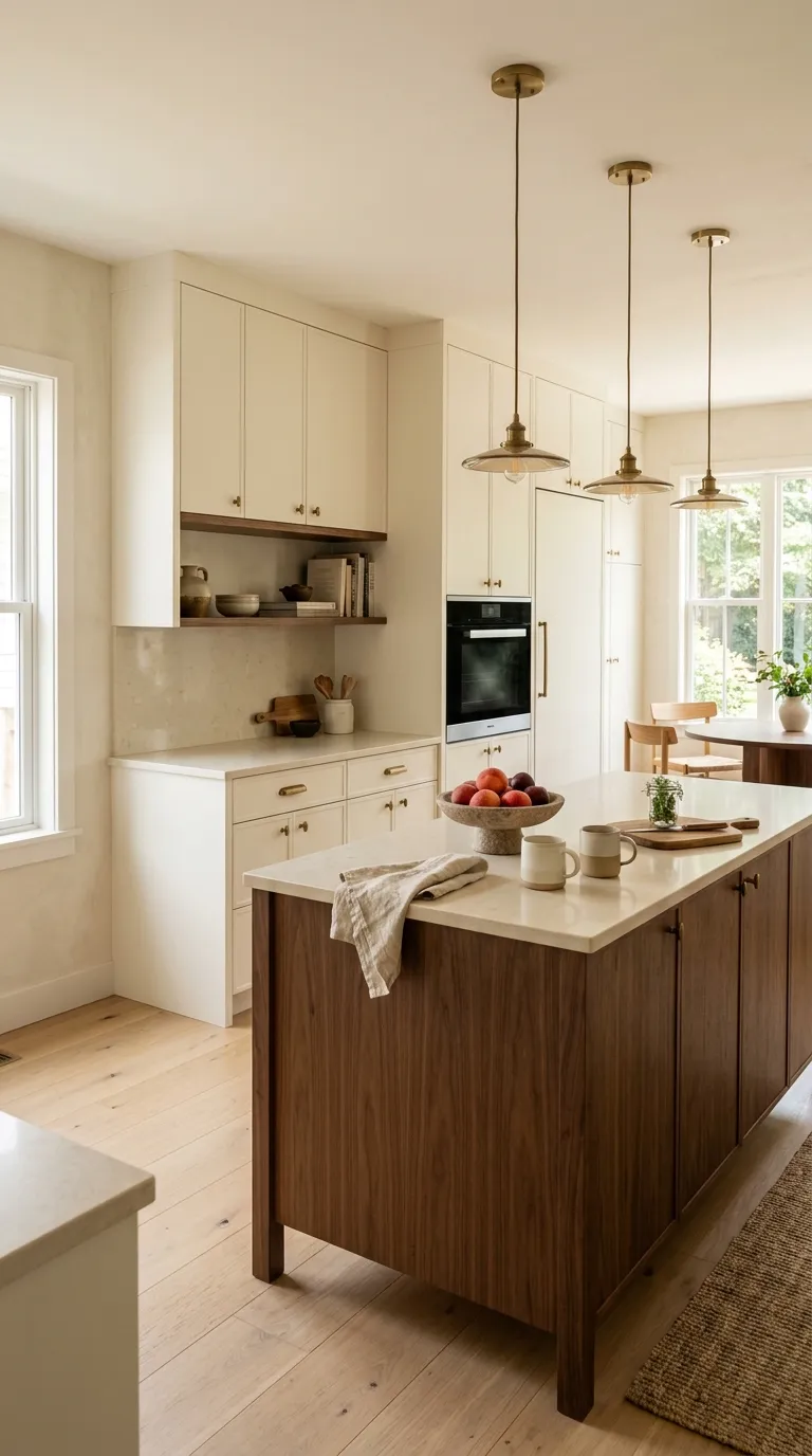
Warm white and walnut make a dependable pair when you want a kitchen that feels fresh but grounded. The creamy cabinetry keeps the room bright, while walnut adds enough depth to stop the space from looking flat.
Try this palette with pale quartz, brushed brass, and soft beige walls. Picture a white kitchen with a walnut island at the center, then repeat the wood tone through stools or open shelving for a connected look.
Sage Green and Cream
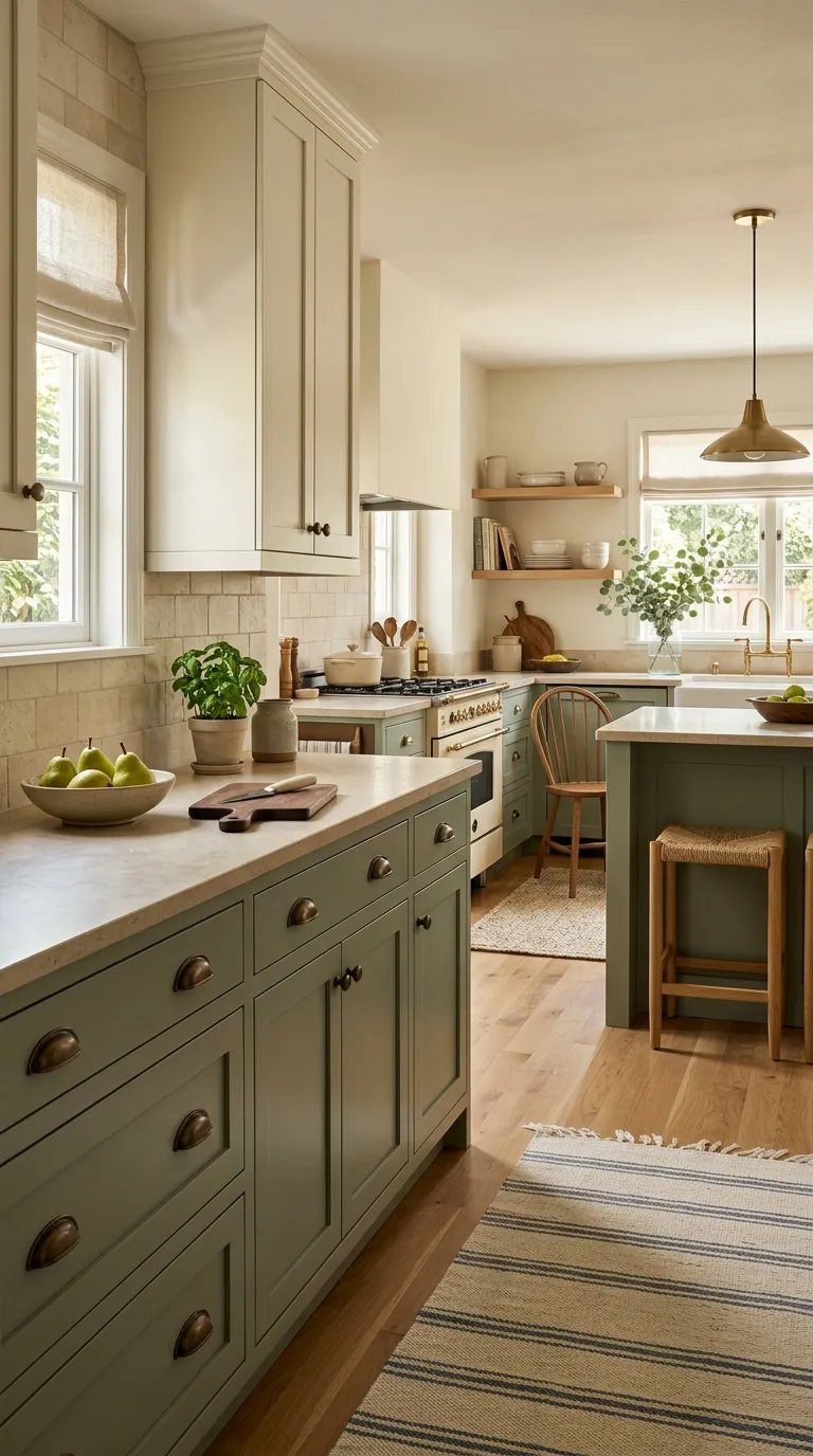
Sage green brings a gentle hint of color without making the kitchen feel busy. Pairing it with cream creates a softer look than stark white, especially when natural wood and aged metal join the mix.
This palette works beautifully for both large and small kitchens. Keep the walls light, use oak shelves for warmth, and choose stone with subtle movement so the green cabinets stay at the heart of the room.
Charcoal and Soft Beige
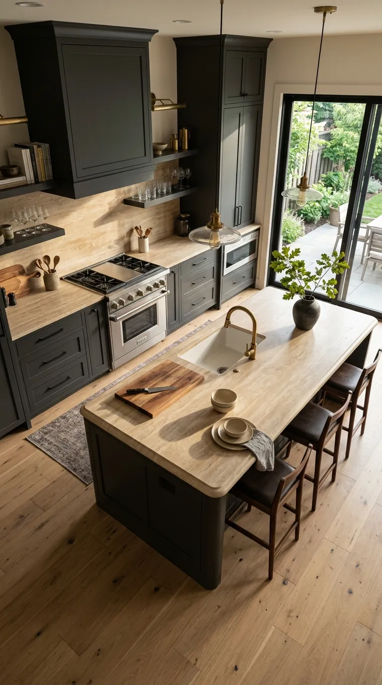
Charcoal gives a kitchen strong visual weight, but soft beige keeps it from feeling too dark. This pairing suits open-plan spaces where the kitchen needs enough depth to stand apart from nearby living areas.
Use charcoal on cabinets and reserve beige for stone, walls, or upholstery. A warm wood floor can bridge both shades, while small brass touches add contrast without taking over the room.
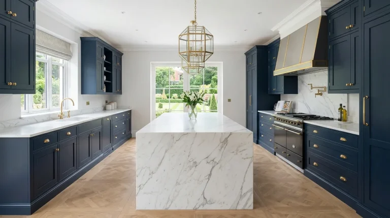
Navy Blue and Warm White
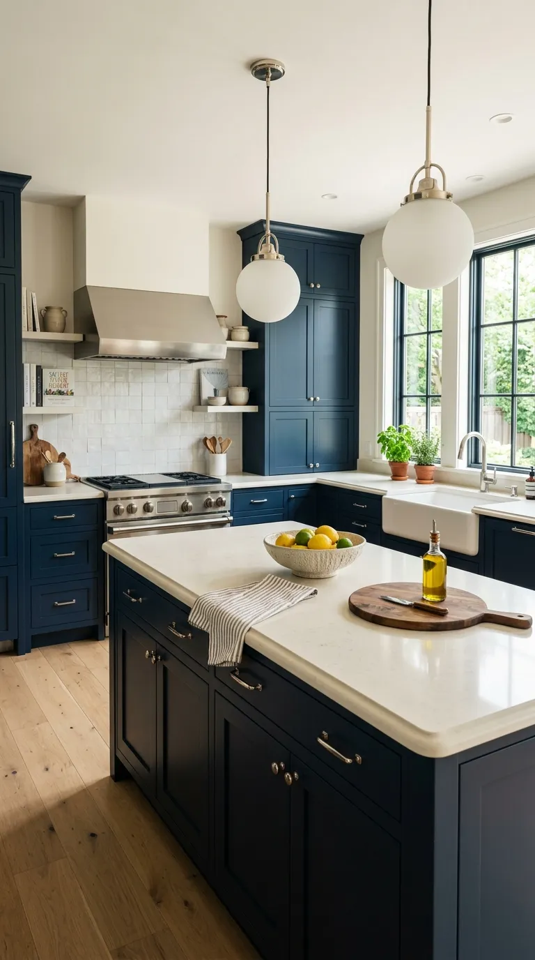
Navy gives white kitchens a richer sense of depth. The contrast feels polished without relying on harsh black, making this pairing a strong choice for cabinetry and islands.
Keep the white warm rather than icy for a softer result. Add light oak flooring, creamy counters, and polished nickel hardware to create a clean palette with enough texture for everyday living.
Greige and Natural Oak
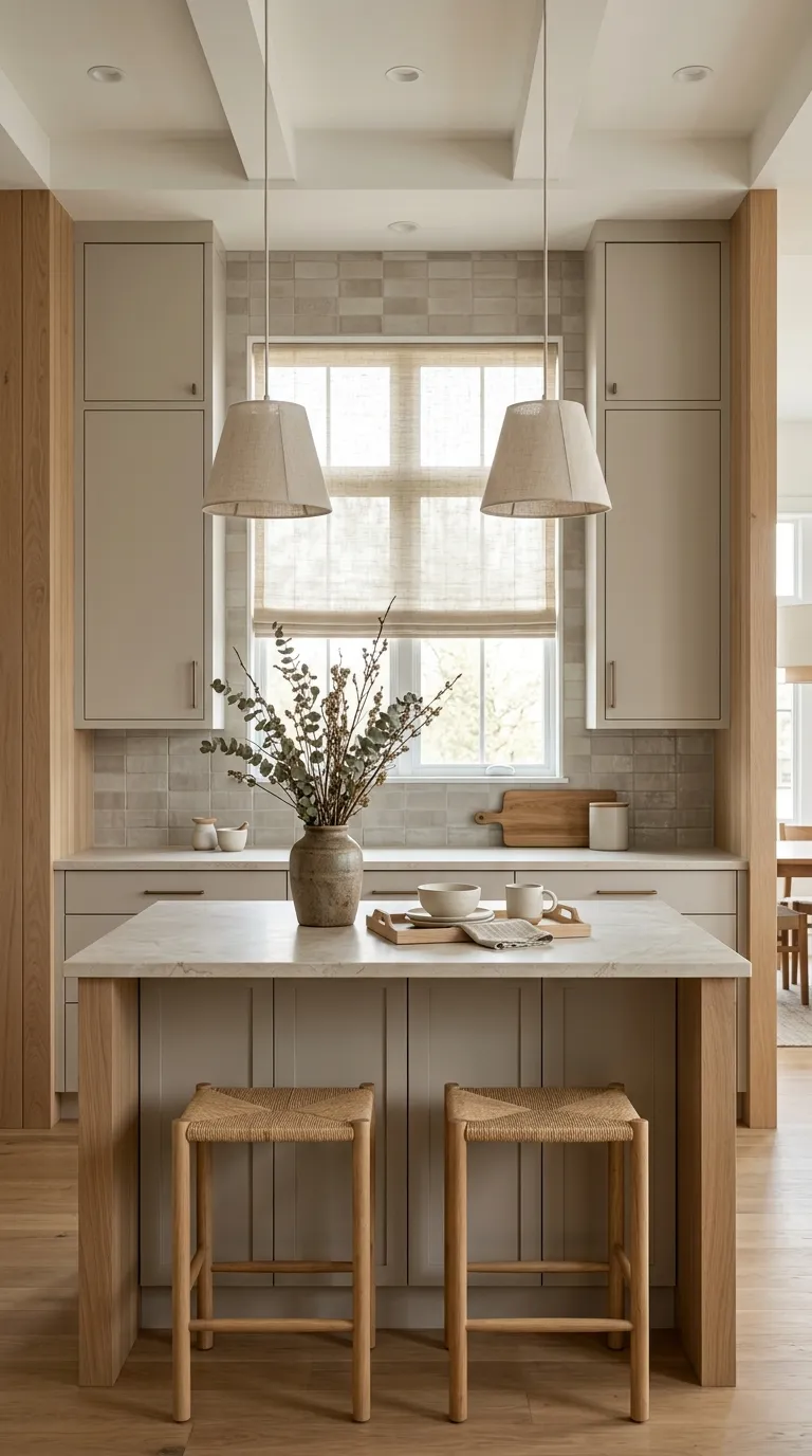
Greige sits between gray and beige, so it can work with both cool and warm materials. Natural oak adds a gentle wood tone that keeps the palette from feeling too plain.
This combination fits especially well in open kitchens with plenty of daylight. Try greige cabinets with pale limestone, oak shelving, and cream ceramics for a quiet look that still has visual interest.
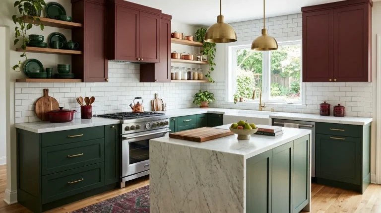
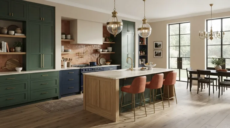
Forest Green and Brass
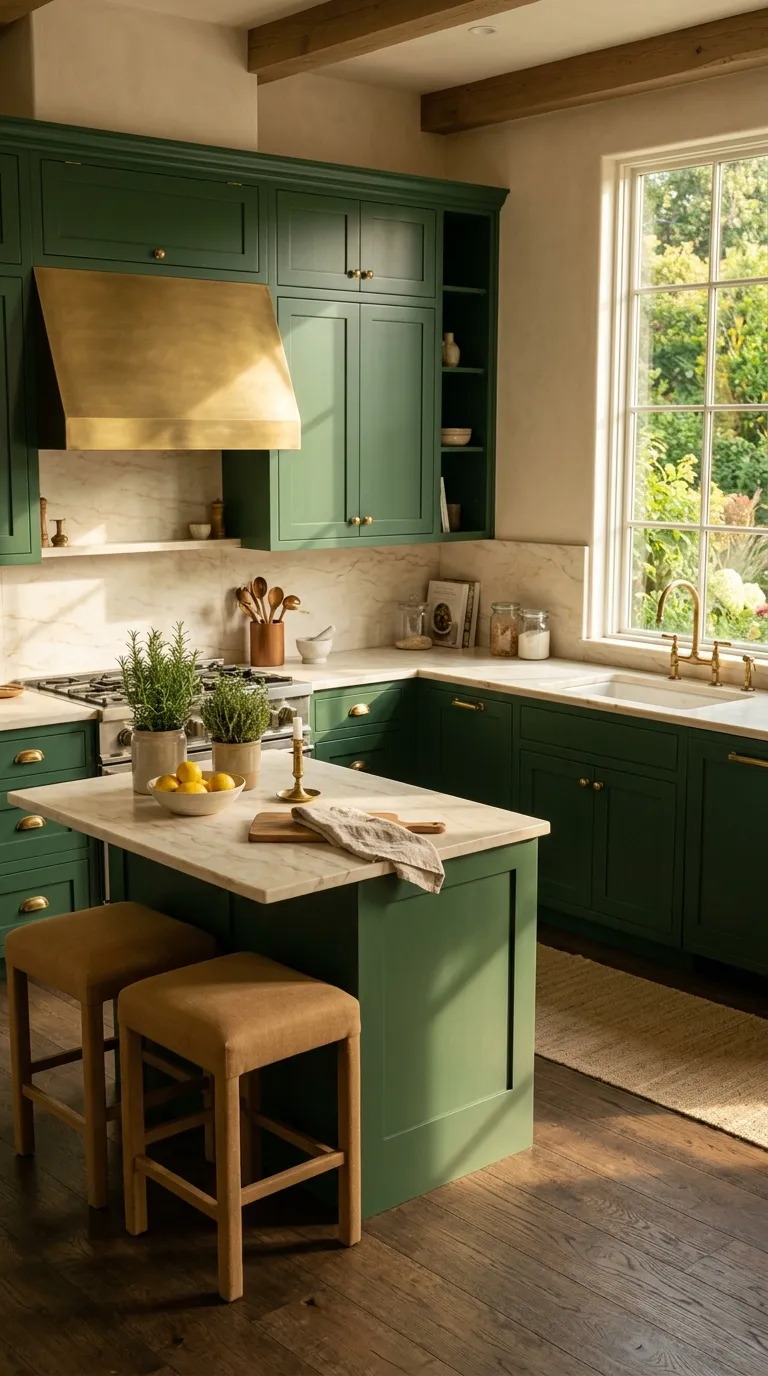
Forest green creates a rich backdrop for brass details and light stone. The darker cabinet color works particularly well when the kitchen has generous windows or layered lighting.
For a balanced finish, keep the backsplash and counters light. Warm cream marble, natural wood accessories, and aged brass hardware can soften the deep green while keeping the room tailored and current.
Soft Black and Ivory
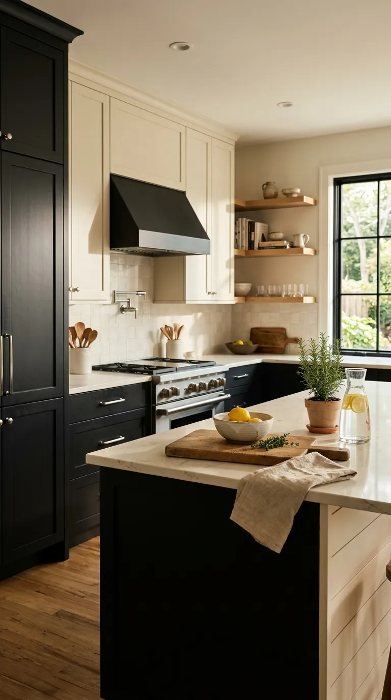
Soft black and ivory create a classic contrast with a modern edge. Ivory keeps the room bright, while black cabinetry gives the kitchen a strong visual anchor.
Use this palette when you want clean lines without a stark feel. Warm wood, natural stone, and brushed metal can soften the contrast and keep the space comfortable.
Dusty Blue and Sand
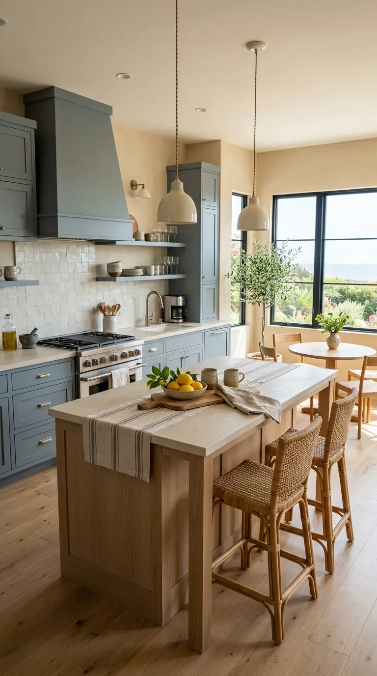
Dusty blue offers color without overpowering the room. Sand tones make the palette warmer, giving the kitchen a relaxed feel that works well with natural textures.
Choose this combination for kitchens with plenty of sunlight. Woven stools, limestone, pale oak, and cream ceramics can reinforce the soft coastal character without turning the room into a themed space.
Terracotta and Cream
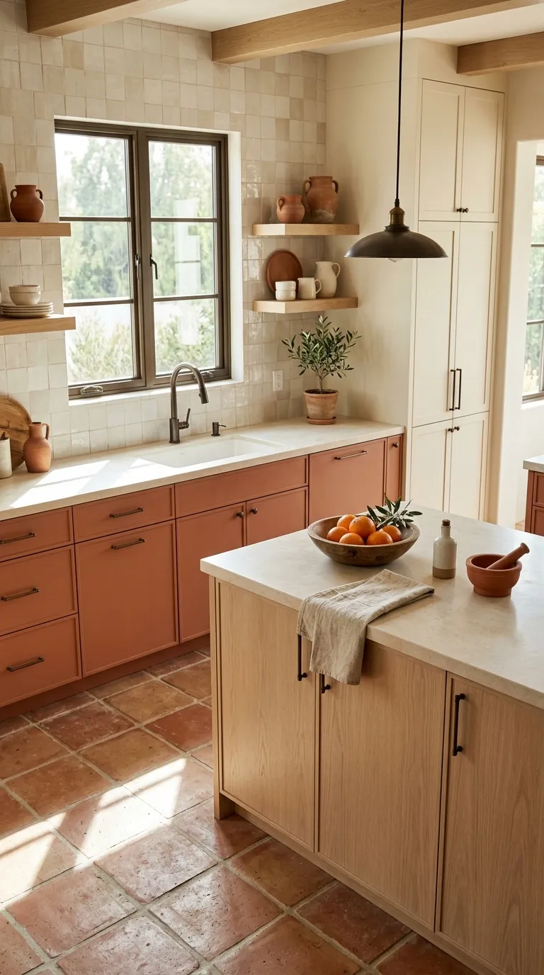
Terracotta brings earthy warmth to a modern kitchen. Cream balances the richer orange-brown tone, while pale wood helps the palette feel natural rather than heavy.
Keep the terracotta muted instead of highly saturated. Pair it with handmade tile, warm stone, and bronze hardware for a kitchen that feels inviting from morning coffee through evening meals.
This is similar to Timeless Kitchen Color Palette Ideas, which you might also enjoy.
Olive Green and Taupe
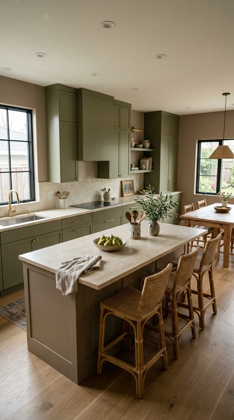
Olive green feels earthy while taupe keeps the room soft and neutral. Together, these shades create a grounded palette that suits kitchens with natural wood, stone, and woven textures.
Try olive on the main cabinets and taupe on the walls or island. Creamy counters and antique brass hardware can add warmth without making the color scheme feel busy.
Cream and Matte Bronze
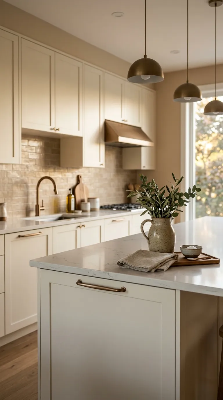
Cream creates a gentle base that lets bronze details stand out without harsh contrast. This pairing works well when you want a kitchen to feel warm, polished, and easy on the eyes.
Use bronze on cabinet pulls, faucets, and lighting rather than scattering it across every surface. Pale quartz, beige tile, and soft wood can complete the palette with a natural sense of balance.
Slate Blue and Natural Stone
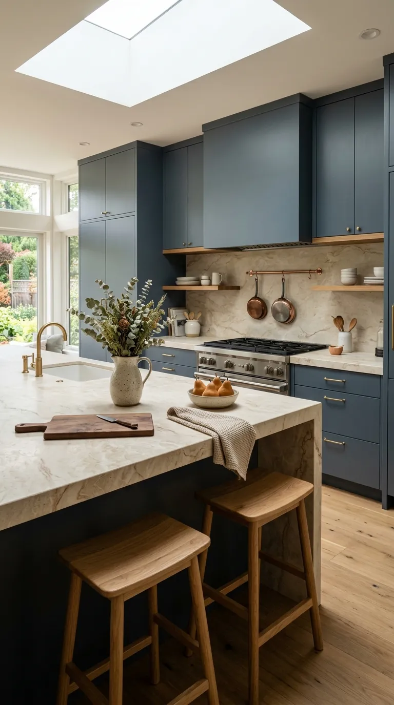
Slate blue sits between navy and gray, giving cabinets a rich tone without making them feel too dark. Natural stone adds organic movement and keeps the palette connected to the surrounding architecture.
Choose a stone with cream, beige, or soft gray undertones. Light oak stools and simple ceramic accessories can add warmth while keeping the cabinet color as the main visual feature.
Blush Beige and Warm Gray
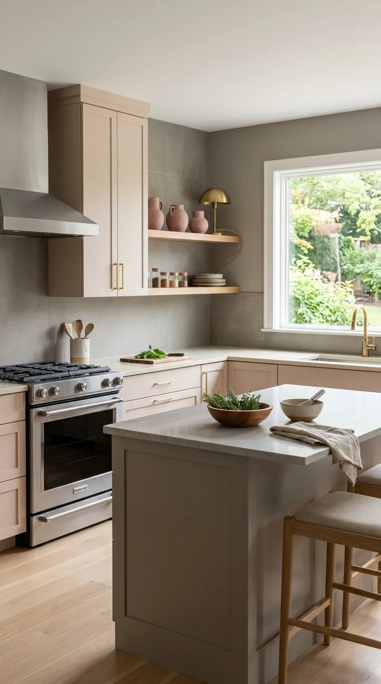
Blush beige adds a quiet hint of warmth without making the kitchen feel overly pink. Warm gray gives the softer shade a mature backdrop, creating a palette that feels calm and polished.
This pairing works well with pale oak, cream stone, and brushed brass. Keep the blush tone muted, especially on larger cabinet surfaces, so the room stays versatile as your decor changes.
Espresso Brown and Cream
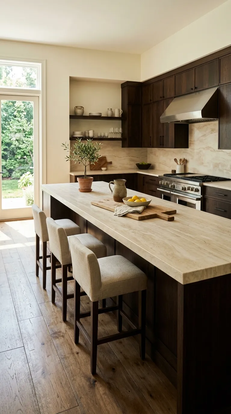
Espresso brown gives a kitchen the richness of dark wood without relying on painted black cabinetry. Cream surfaces keep that deep shade from making the room feel closed in.
Use this palette when you want warmth and depth in a larger kitchen. Creamy travertine, linen seating, and natural greenery can soften the darker wood while keeping the overall style clean.
Pale Gray and Brass
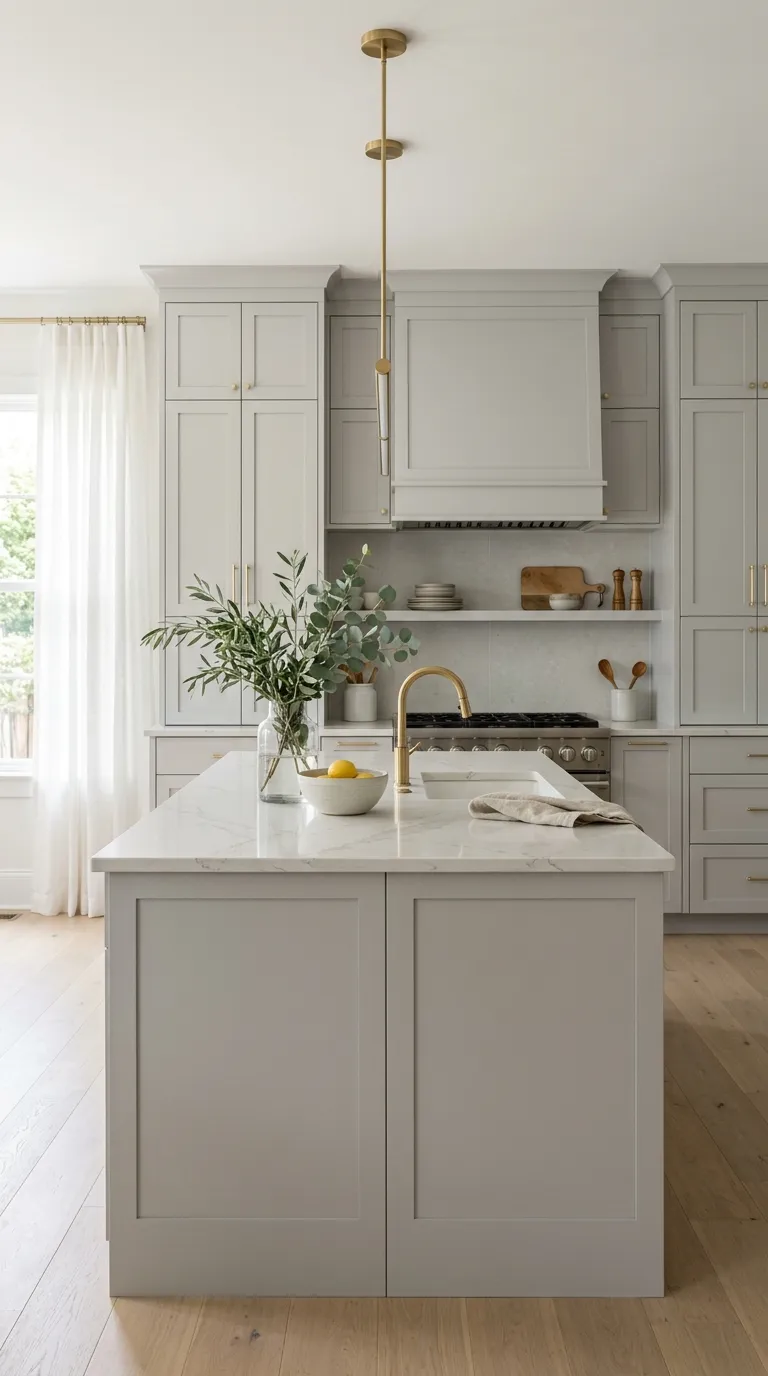
Pale gray is a useful choice when you want a neutral kitchen with more depth than plain white. Brass adds warmth and gives simple cabinet fronts a refined focal point.
Keep the gray light and slightly warm for the best balance. White quartz, soft textiles, and natural wood accessories can prevent the palette from feeling too cool.
Deep Teal and Warm Ivory
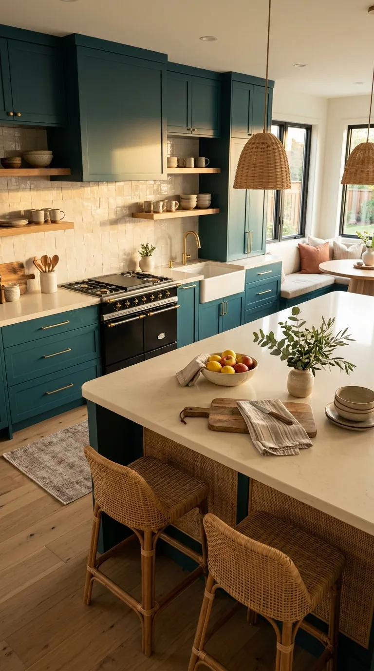
Deep teal adds personality while warm ivory keeps the room light and inviting. The contrast works especially well when you want cabinetry to become the main feature of the kitchen.
Use ivory on the backsplash and counters, then bring in rattan, pale wood, or natural ceramics for added warmth. A few green plants can tie the teal shade into the rest of the home.
Your Next Step
Your kitchen color palette should work with the room’s light, flooring, counters, and nearby spaces. Start with one main cabinet color, then choose a supporting neutral and one accent finish to keep the design focused.
Think about how the kitchen will look at breakfast, afternoon, and night. A palette that feels balanced across different lighting conditions will be easier to live with and simpler to decorate around. Pick the combination that fits your home’s character, then repeat its key colors through hardware, textiles, wood, and small accessories.
Emma Williams
Emma Williams is an interior design expert and decor editor at Lady Home Decor. She specializes in modern, cozy, and functional home styling, helping readers discover inspiring decorating ideas that are easy to recreate. Her work focuses on timeless design, practical solutions, and the latest home decor trends.