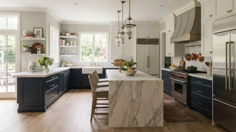
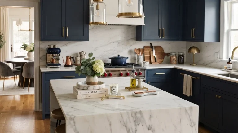
23 Beautiful Kitchen Color Trends for Modern Spaces

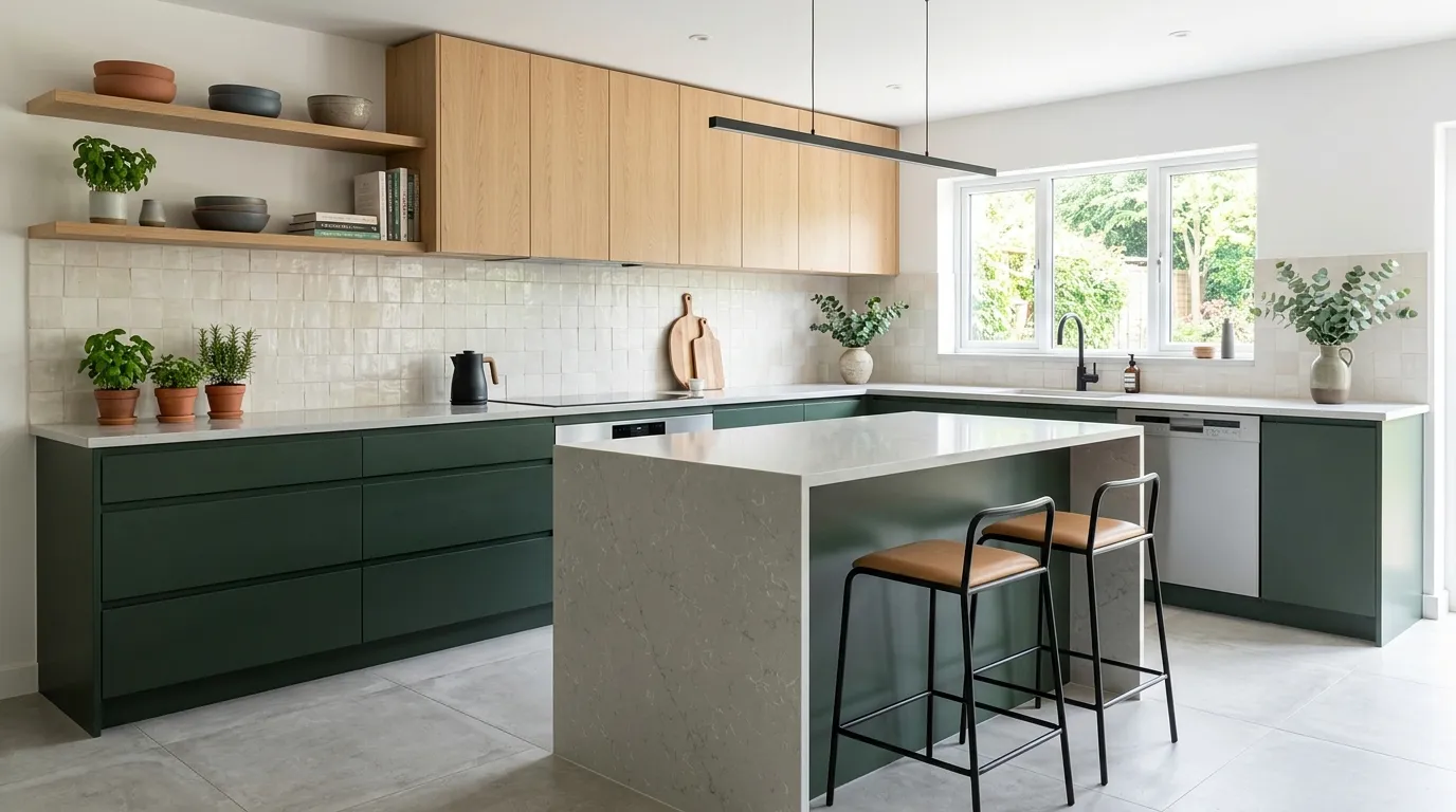
Setting the Scene
Ready to give your kitchen a stunning designer-worthy upgrade? The latest kitchen color trends for modern homes are moving beyond basic white and embracing warmth, depth, texture, and luxury-inspired palettes.
Whether you’re planning a complete renovation or simply looking for fresh inspiration, the right color choices can completely transform how your kitchen looks and feels. From rich wood tones and dramatic stone finishes to soft neutrals and sophisticated accent colors, today’s most beautiful kitchens focus on creating spaces that feel both elegant and inviting.
I’ve noticed that homeowners are increasingly drawn to colors that balance timeless style with modern personality. Instead of chasing short-lived trends, many are choosing palettes that enhance natural light, complement premium materials, and make everyday living more enjoyable. In this collection, you’ll discover 23 inspiring ideas designed to help you create a kitchen that feels brighter, more luxurious, and uniquely your own while staying relevant for years to come.
1. Warm Greige Cabinets
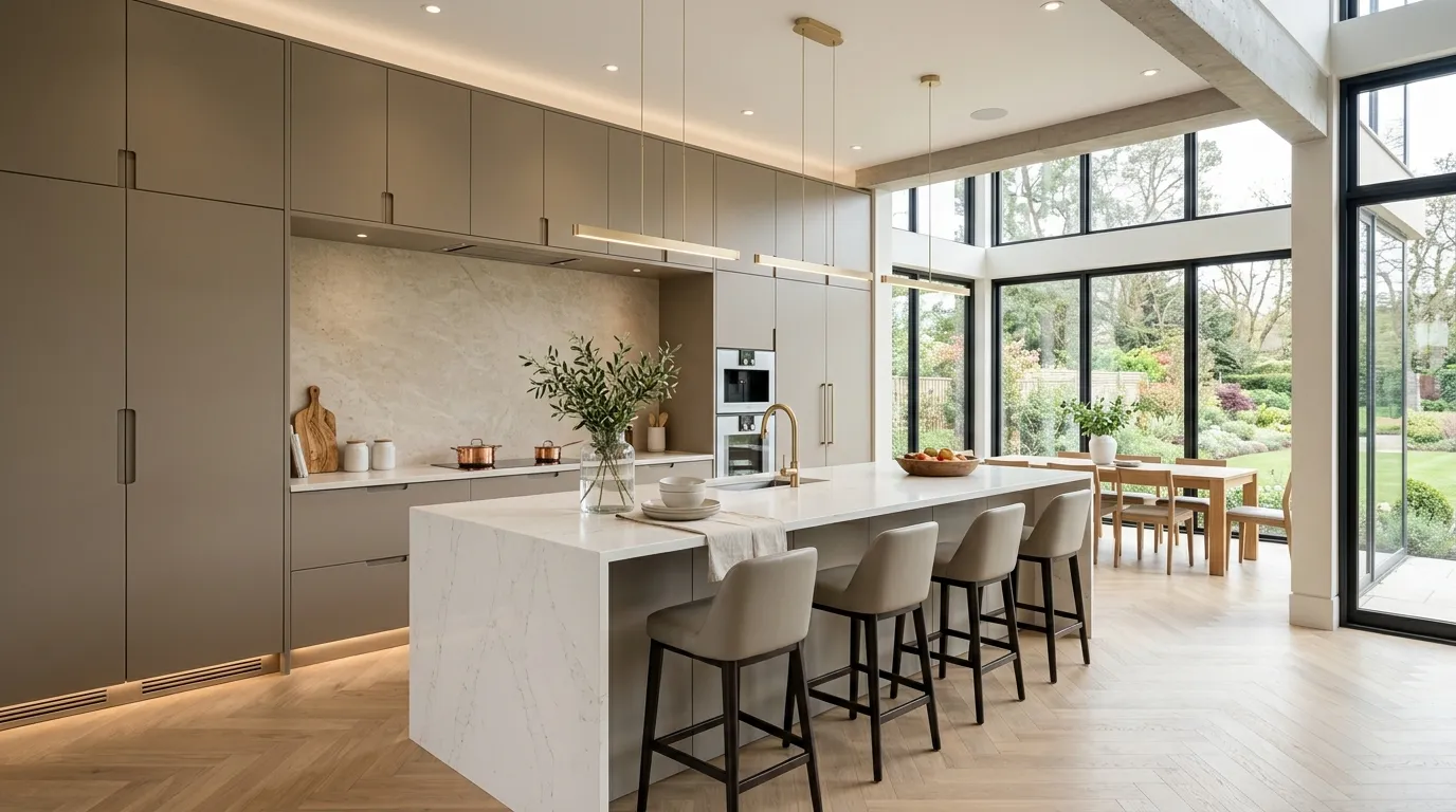
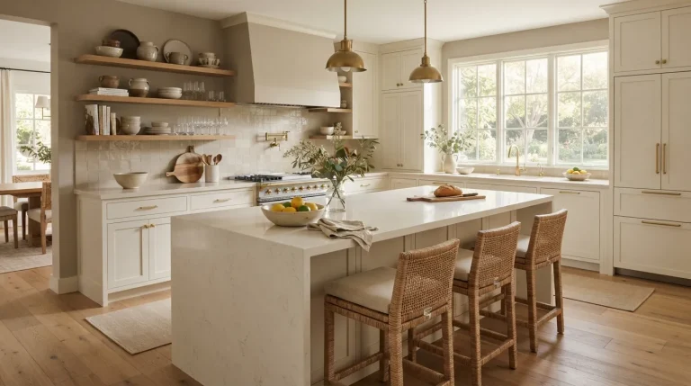
Few color choices feel as effortlessly elegant as warm greige cabinetry. This balanced shade combines the softness of beige with the sophistication of gray, creating a polished backdrop that instantly elevates the entire kitchen. The color works especially well in homes that favor clean lines and modern finishes while still wanting warmth. Large kitchens feel grounded, while smaller layouts gain visual softness. The result is a space that feels custom-designed rather than overly trendy, making it an excellent choice for homeowners seeking timeless beauty with contemporary appeal.
What makes this shade especially valuable is its flexibility with luxury materials. White quartz, marble surfaces, brass fixtures, and natural wood textures all pair beautifully with greige tones. In my experience, it also adapts exceptionally well to changing decor trends, allowing homeowners to refresh accessories without replacing major elements. The subtle warmth keeps the room inviting throughout the day while preserving a sleek designer look. This balance of comfort and sophistication is one reason neutral palettes continue dominating premium kitchen designs today.
2. Sage Green Accents
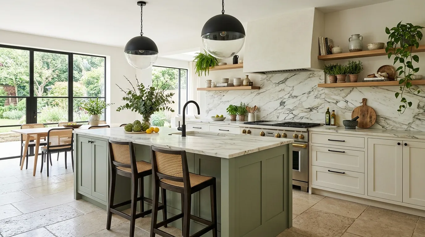
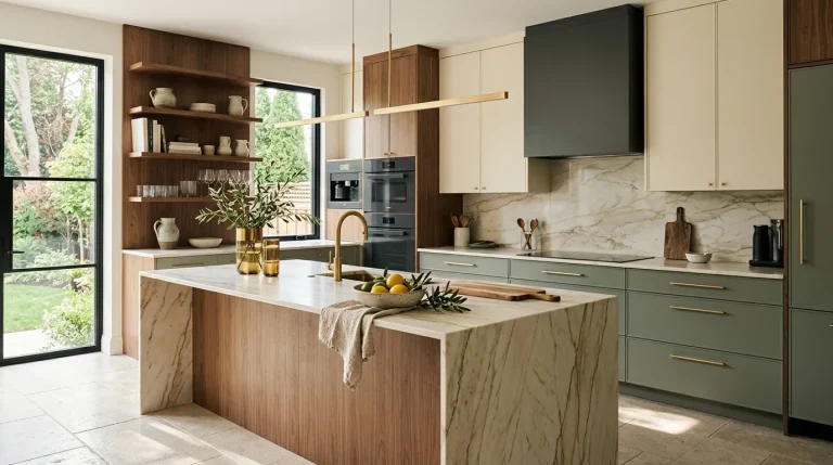
A touch of sage green can completely change the mood of a contemporary kitchen. This muted nature-inspired color introduces character while preserving the clean aesthetic modern homeowners love. Whether applied to an island, lower cabinets, or built-in storage, the shade creates visual interest without becoming overpowering. The gentle green undertones feel refreshing and calming, helping the space appear more balanced and welcoming. It is a subtle way to introduce color while maintaining the refined atmosphere that many luxury interiors strive to achieve.
Designers frequently pair sage green with marble, oak, and black metal accents because the combination feels both current and timeless. I’ve noticed that kitchens featuring this color often photograph exceptionally well, which explains its popularity across Pinterest and interior design platforms. The soft green tone also complements natural daylight beautifully, creating a fresh appearance from morning through evening. Combined with layered textures and thoughtful lighting, it helps transform an ordinary kitchen into a stylish and inviting centerpiece of the home.
3. Charcoal Contrast
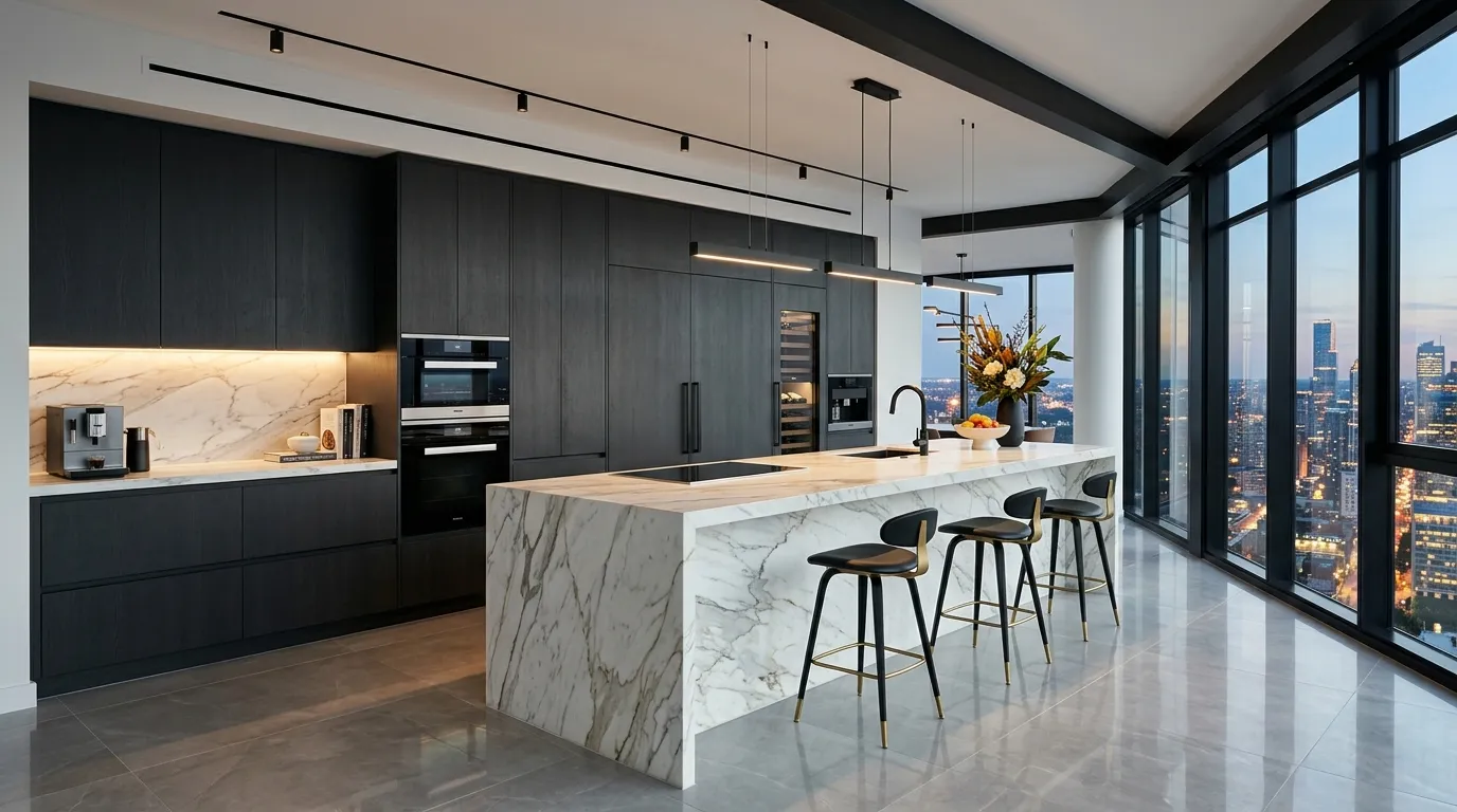
Nothing creates instant sophistication quite like charcoal cabinetry paired with lighter surfaces. The deep tone adds structure and visual weight, helping kitchens feel intentional and professionally designed. When balanced with bright countertops and reflective materials, charcoal introduces contrast without making the room feel dark. The color naturally emphasizes surrounding textures and finishes, allowing stone, wood, and metal details to become focal points. This approach works particularly well in open-concept homes where strong visual definition helps anchor the kitchen area.
That contrast is exactly why many high-end designers continue incorporating darker cabinetry into contemporary spaces. I’ve seen this work well in both large and medium-sized kitchens where natural light is available. Strategic lighting prevents the darker tones from feeling heavy while enhancing their luxurious appearance. Combined with sleek hardware and streamlined surfaces, charcoal creates a bold statement that feels modern, refined, and remarkably timeless. The finished result delivers the upscale atmosphere many homeowners want when updating their cooking and entertaining spaces.
4. Creamy Ivory Layers
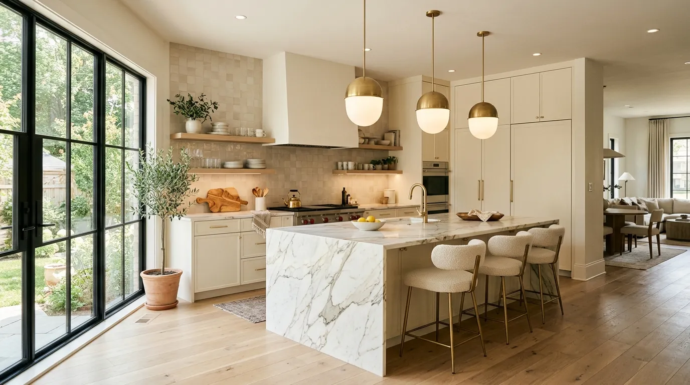
A creamy ivory palette instantly creates a welcoming atmosphere while preserving the clean look many homeowners want in contemporary interiors. Unlike bright white, ivory introduces subtle warmth that softens hard surfaces and architectural lines. This gentle tone reflects light beautifully throughout the day, helping kitchens appear larger and more open. The result feels elevated and luxurious without becoming overly formal. It is an excellent choice for homeowners who want a timeless backdrop that still feels current and designer-inspired.
One of the biggest advantages of ivory tones is their ability to highlight premium finishes. Marble countertops, brass fixtures, and natural wood accents stand out beautifully against this softer neutral backdrop. In my experience, ivory kitchens also feel more comfortable and lived-in compared to cooler all-white designs. The layered color approach creates visual depth while maintaining simplicity. This combination of warmth, brightness, and versatility continues to make ivory a favorite choice in upscale kitchen renovations and newly built luxury homes.
5. Midnight Blue Island
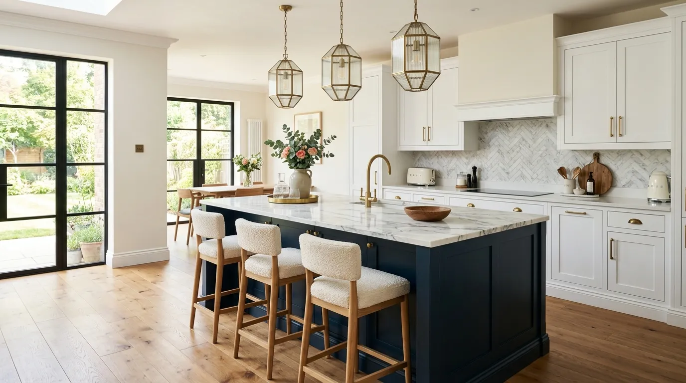
A midnight blue island can completely transform the visual balance of a kitchen. While neutral cabinetry keeps the room feeling bright, the darker island introduces contrast and sophistication. This rich color immediately draws attention and creates a centerpiece around which the entire design revolves. The shade feels bold yet timeless, making it suitable for homeowners who want a little more personality without committing to fully colored cabinetry throughout the room.
The beauty of midnight blue lies in its ability to work with both warm and cool materials. White countertops appear brighter, brass accents feel richer, and natural wood surfaces gain additional depth. I’ve noticed that this color often photographs exceptionally well because it creates strong contrast without feeling harsh. Whether paired with modern lighting or classic architectural details, a deep blue island delivers an upscale appearance that feels current while maintaining lasting appeal for years to come.
6. Natural Oak Tones
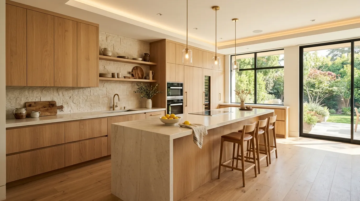
Natural oak continues to dominate high-end kitchen design because it introduces warmth in an authentic and understated way. The visible wood grain adds texture and depth that painted cabinetry cannot replicate. This natural element helps modern kitchens feel less sterile and more connected to everyday living. The soft golden undertones create a welcoming environment while maintaining a sophisticated appearance that works beautifully in both minimalist and luxury-focused interiors.
Designers frequently combine oak cabinetry with stone surfaces and subtle lighting to create an organic modern aesthetic. That’s why many designers recommend wood-inspired palettes when homeowners want warmth without relying on bold colors. The combination feels fresh, timeless, and highly adaptable to future design updates. Whether featured across the entire kitchen or used selectively on an island and storage walls, natural oak creates a rich visual foundation that enhances comfort while preserving a polished contemporary look.
7. Mocha Stone Palette
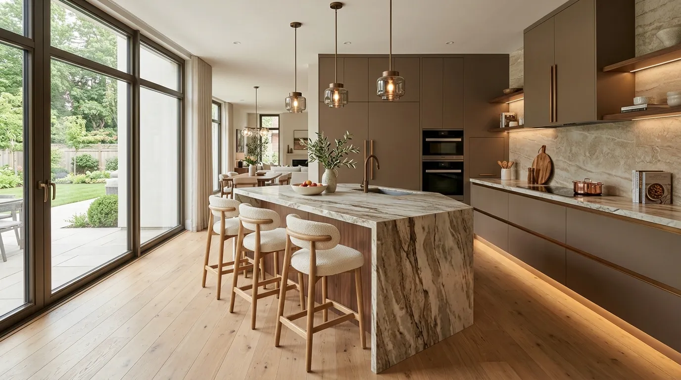
Mocha-inspired tones are becoming a standout choice for homeowners seeking warmth and sophistication. This rich neutral color bridges the gap between light beige and dark brown, creating a balanced look that feels upscale and inviting. The depth of the shade adds visual interest while maintaining a calm atmosphere throughout the space. Unlike trend-driven colors that quickly fade, mocha tones deliver timeless appeal and pair beautifully with many premium materials commonly found in modern kitchen renovations.
One reason this palette works so well is its ability to highlight texture. Stone countertops, bronze fixtures, and wood details all appear richer against a mocha backdrop. I’ve seen this work especially well in open layouts where softer earth-inspired colors help large spaces feel more comfortable and connected. Layered lighting further enhances the subtle variation within the color palette, creating a kitchen that feels elegant during the day and exceptionally welcoming in the evening.
8. Black Marble Drama
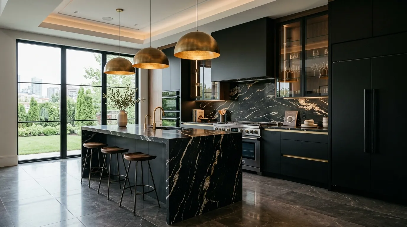
Few materials create visual impact as effectively as black marble. Its dramatic veining introduces natural artistry while maintaining an elegant and sophisticated appearance. Whether featured on an island, backsplash, or countertop, black marble immediately becomes the focal point of the room. The contrast between dark stone and lighter surrounding finishes creates a luxurious atmosphere that feels custom designed. It is a powerful choice for homeowners who want their kitchen to make a memorable impression.
Luxury interiors often rely on strong statement materials, and black marble excels in that role. The stone pairs beautifully with brass, champagne gold, and warm wood finishes, creating a balanced composition rather than an overly dark environment. In my experience, strategic lighting makes an enormous difference when using darker materials. Under-cabinet lighting and decorative pendants help reveal the natural veining and texture, allowing the stone to become even more dramatic and visually captivating throughout the day.
9. Soft Taupe Elegance
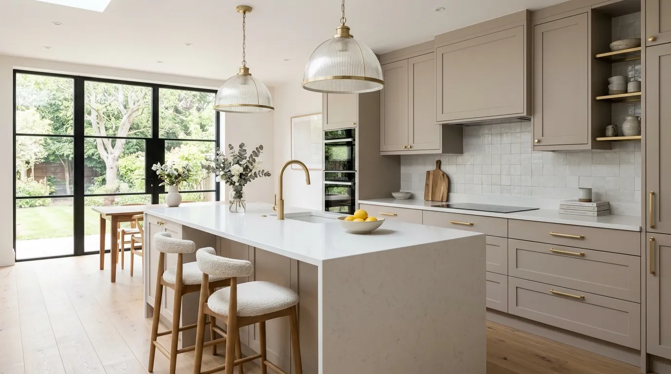
Soft taupe has emerged as one of the most versatile shades in contemporary kitchen design. It introduces warmth without leaning too beige and provides depth without appearing too dark. This balance allows homeowners to achieve an elegant look that feels both modern and timeless. Taupe works exceptionally well as a foundation color because it supports a wide variety of finishes, textures, and decorative accents while maintaining visual harmony throughout the room.
That flexibility makes taupe an ideal choice for homeowners who want lasting style. White countertops appear brighter, metallic fixtures feel more luxurious, and wood accents gain additional richness against this subtle backdrop. I’ve noticed that taupe kitchens often feel calmer and more relaxing than spaces dominated by sharper contrasts. The soft color transitions create an effortless flow that enhances both aesthetics and functionality. As a result, taupe continues to play a significant role in many evolving kitchen color trends for modern homes.
10. Walnut Wood Luxury
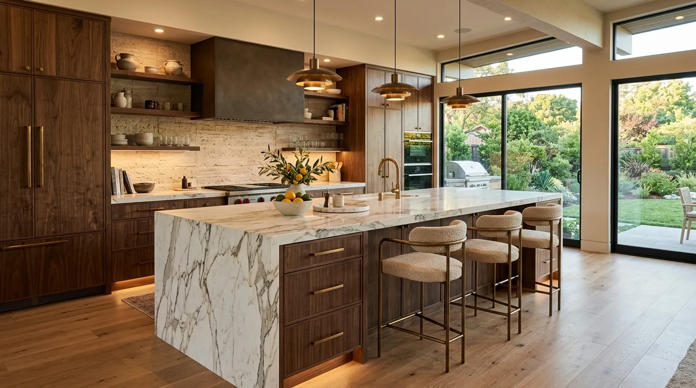
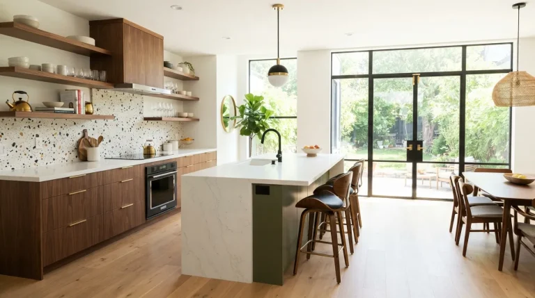
Rich walnut cabinetry brings an immediate sense of sophistication to a kitchen. The deep wood tones add warmth and character while showcasing natural grain patterns that make every installation feel unique. Unlike flat painted surfaces, walnut introduces texture and visual movement that create a more layered and expensive appearance. The richness of the wood helps balance sleek appliances and contemporary finishes, resulting in a kitchen that feels elegant, welcoming, and thoughtfully designed.
One of the reasons designers continue using walnut is its remarkable versatility. It pairs beautifully with marble, quartz, brushed metals, and soft neutral colors. I’ve seen this work especially well in open-concept homes where natural wood helps soften modern architecture. Strategic lighting enhances the grain and depth of the material, making the cabinetry become a feature rather than simply storage. The result is a luxurious environment that feels warm, authentic, and highly personalized.
11. Champagne Gold Details
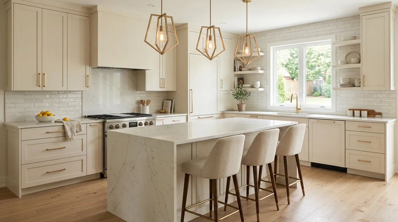
Small details often create the biggest visual impact, and champagne gold finishes are a perfect example. This warm metallic tone feels softer and more sophisticated than traditional polished gold. Whether used on cabinet hardware, faucets, lighting fixtures, or shelving brackets, it introduces subtle luxury throughout the space. The finish reflects light beautifully while adding warmth that helps modern kitchens feel more inviting and balanced.
What makes champagne gold particularly attractive is its ability to complement nearly every major kitchen material. It works seamlessly with marble, wood, quartz, and stone while creating a refined contrast against both light and dark cabinetry. That’s why many designers recommend this finish when homeowners want a premium look without making dramatic color changes. The subtle metallic glow helps tie different elements together and gives the entire kitchen a polished, professionally designed appearance.
12. Dusty Blue Cabinets
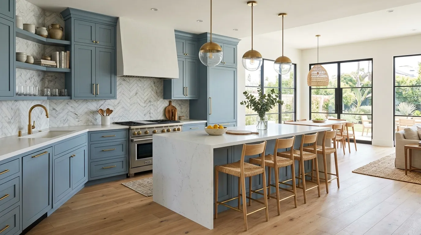
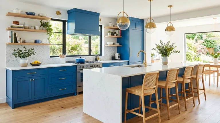
Dusty blue cabinetry offers a refreshing alternative to traditional neutrals while preserving a sophisticated appearance. The muted tone feels relaxed and refined, making it ideal for homeowners who want color without overwhelming the room. This soft blue shade creates visual interest while maintaining harmony with surrounding finishes. The result is a kitchen that feels stylish, inviting, and highly adaptable to different design preferences.
The versatility of dusty blue is one of its greatest strengths. It pairs naturally with white surfaces, warm wood tones, brass accents, and stone textures. In my experience, this shade performs exceptionally well in spaces with abundant natural light because subtle color variations become more noticeable throughout the day. The balanced tone creates a fresh atmosphere while remaining timeless enough to withstand changing design trends. This makes it a smart choice for long-term kitchen updates.
13. Olive Green Depth
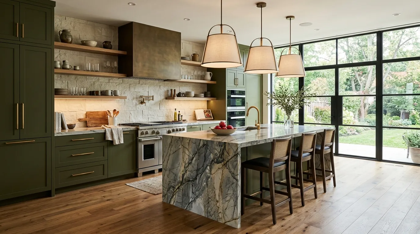
Olive green has become a favorite among designers looking to introduce color in a refined and timeless way. The deeper tone creates a sense of richness while maintaining a strong connection to natural materials. Unlike brighter greens that can feel seasonal, olive offers year-round elegance and versatility. It works beautifully on cabinetry, islands, or feature walls, creating a distinctive focal point that still feels sophisticated and balanced within a modern kitchen environment.
The beauty of olive green lies in its ability to complement luxury finishes effortlessly. Natural stone, warm metals, and wood textures all appear richer when paired with this earthy shade. I’ve noticed that olive cabinetry often creates a custom, designer-inspired look even when the overall layout remains simple. Strategic lighting enhances the depth of the color and highlights surrounding textures. The result is a welcoming kitchen that feels elevated, current, and exceptionally stylish without relying on short-lived design trends.
14. White Oak Minimalism
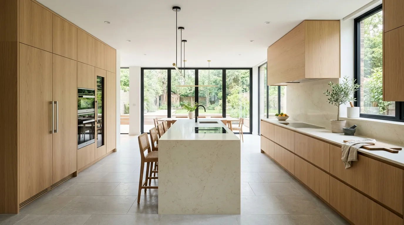
White oak cabinetry offers the perfect balance between warmth and simplicity. The light wood tone introduces natural texture while maintaining the clean aesthetic many homeowners want in contemporary interiors. Unlike stark painted finishes, white oak adds subtle visual movement that makes the space feel more inviting. Its understated appearance allows architectural details, lighting, and premium materials to become part of the overall design story rather than competing for attention.
Minimalist kitchens often succeed because they focus on quality materials rather than excessive decoration. White oak supports that philosophy beautifully by creating a soft and sophisticated foundation. That’s why many designers recommend this approach for homeowners seeking a timeless look that remains practical for everyday living. Combined with hidden storage, sleek surfaces, and carefully layered lighting, white oak cabinetry helps create a kitchen that feels spacious, organized, and effortlessly luxurious.
15. Graphite Gray Sophistication
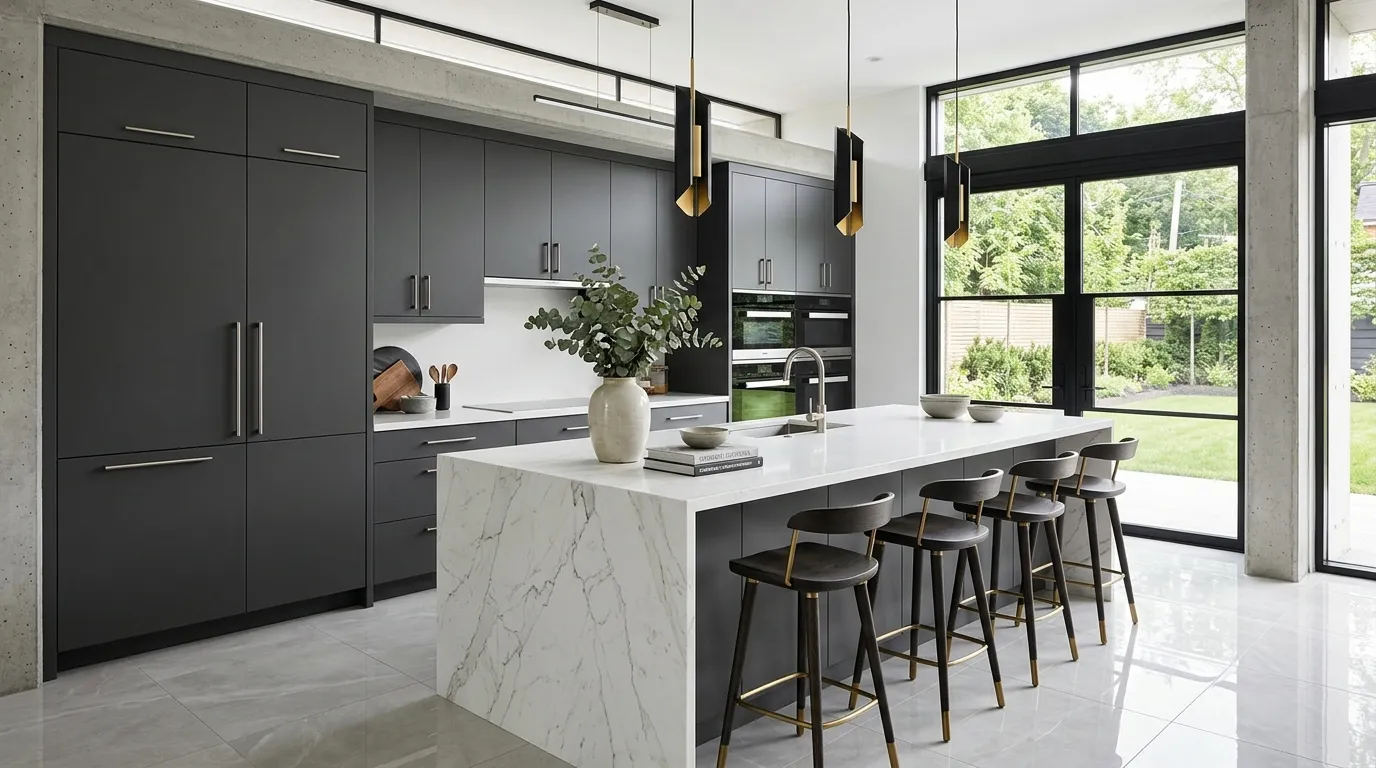
Graphite gray offers a sophisticated alternative to pure black cabinetry. The slightly softer tone provides depth and contrast while preserving a balanced appearance throughout the room. This color works especially well in kitchens where homeowners want a dramatic effect without making the space feel overly dark. The richness of graphite helps define cabinetry lines and architectural features, creating a polished look that feels intentional and professionally designed.
One reason graphite continues gaining popularity is its versatility across different styles and materials. White quartz surfaces become brighter, metallic finishes appear more luxurious, and natural wood elements gain warmth against the darker backdrop. I’ve seen this work well in both large open layouts and smaller kitchens with strong lighting. The result is a space that feels elegant and current while maintaining enough neutrality to adapt easily as design preferences evolve over time.
16. Cashmere Beige Cabinets
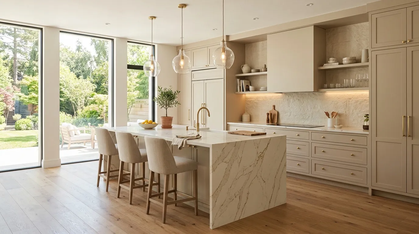
Cashmere beige is quickly becoming one of the most desirable shades for upscale kitchens. The soft neutral tone introduces warmth while maintaining a clean and sophisticated appearance. Unlike cooler grays or stark whites, cashmere beige creates a welcoming environment that feels comfortable and refined. Its versatility allows homeowners to pair it with a wide range of finishes, making it an excellent foundation for a beautifully layered contemporary design.
The subtle warmth of this color helps create balance throughout the room. Stone surfaces, metallic accents, and wood details all feel more cohesive against a cashmere backdrop. I’ve noticed that kitchens featuring this shade often feel brighter and more luxurious without appearing overly formal. Combined with thoughtful lighting and premium materials, cashmere beige creates a polished atmosphere that remains elegant year after year while adapting easily to changing decorative trends.
17. Emerald Statement Island
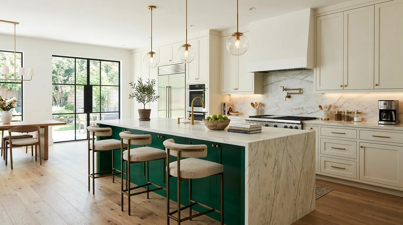
An emerald green island can instantly transform an ordinary kitchen into a striking designer space. The rich jewel tone creates depth and sophistication while serving as the room’s primary focal point. Because the color is concentrated on a single feature, it introduces personality without overwhelming the overall design. The dramatic contrast helps draw attention to the island and makes the entire kitchen feel more intentional and visually memorable.
Luxury kitchens often use statement elements to create distinction, and emerald green performs that role beautifully. Paired with marble surfaces, warm metals, and soft neutral cabinetry, the color feels elegant rather than overpowering. In my experience, homeowners who choose a statement island often appreciate how easily the rest of the room can remain timeless and versatile. The result is a balanced design that feels current, luxurious, and uniquely tailored to the space.
18. Layered Stone Neutrals
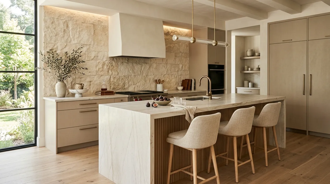
Layering stone-inspired neutral tones is one of the most effective ways to create depth while maintaining a calm aesthetic. Instead of relying on strong color contrasts, this approach uses subtle variations in beige, cream, taupe, and stone gray to build visual complexity. The result feels elegant and refined while preserving the bright, open atmosphere many homeowners desire in modern kitchen spaces.
The success of this design approach comes from combining different textures and finishes within a cohesive palette. Stone backsplashes, quartz surfaces, wood accents, and matte cabinetry work together to create richness without clutter. That’s why many designers recommend layered neutrals when aiming for a luxury look that remains timeless. This technique continues influencing many kitchen color trends for modern homes because it delivers sophistication, warmth, and flexibility without depending on bold statement colors.
19. Matte Black Accents
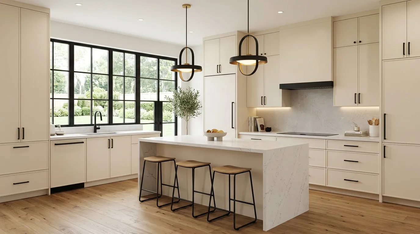
Matte black accents continue to dominate contemporary kitchen design because they create instant contrast and sophistication. Even small details such as cabinet handles, faucets, lighting fixtures, and window frames can dramatically change the appearance of a room. The dark finish helps define lines and architectural features while providing a polished, intentional look. This subtle approach allows homeowners to modernize a kitchen without committing to large-scale color changes or expensive renovations.
One of the biggest advantages of matte black is its versatility. It complements warm woods, natural stone, creamy neutrals, and bold cabinet colors equally well. I’ve seen this work especially effectively in kitchens that need stronger visual structure without sacrificing brightness. When paired with layered lighting and premium finishes, matte black accents create a refined contrast that feels modern, luxurious, and surprisingly timeless despite evolving design trends.
20. Desert Sand Tones
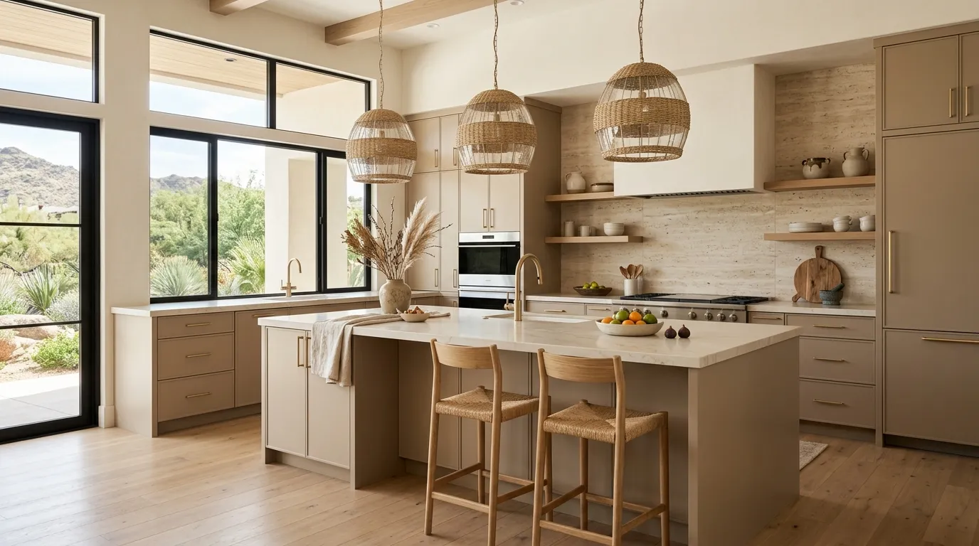
Desert sand tones offer a fresh alternative to traditional gray and white kitchens. The warm neutral shade introduces softness while maintaining the clean appearance modern homeowners love. Inspired by natural landscapes, this color creates an inviting atmosphere that feels grounded and sophisticated. Its subtle warmth helps large kitchens feel more comfortable while making smaller spaces appear brighter and more open throughout the day.
The appeal of desert sand lies in its adaptability. It pairs effortlessly with stone surfaces, natural wood textures, and warm metallic finishes. I’ve noticed that kitchens using this palette often feel more relaxed and balanced compared to spaces dominated by cooler tones. The color also provides an excellent foundation for future updates, allowing decorative accents and accessories to evolve over time. This flexibility makes it a smart investment for homeowners seeking long-lasting style.
21. Mixed Metal Finishes
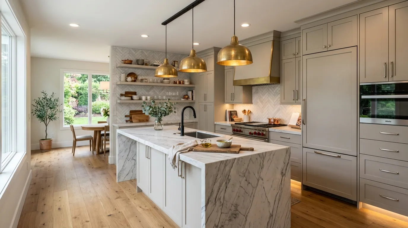
Mixed metal finishes have become a defining feature of many upscale kitchen designs. Instead of matching every fixture perfectly, designers combine complementary metals to create depth and visual interest. Brass lighting, black faucets, and brushed nickel hardware can work together beautifully when balanced thoughtfully. This layered approach feels more customized and sophisticated than relying on a single finish throughout the entire room.
The key to success is maintaining harmony rather than randomness. That’s why many designers recommend choosing one dominant finish and using others as supporting accents. In my experience, this technique instantly elevates a kitchen by creating subtle variation that draws the eye naturally around the space. Combined with quality materials and a cohesive palette, mixed metals contribute to a luxury aesthetic that feels curated, modern, and highly personalized.
22. Smoky Lavender Neutrals
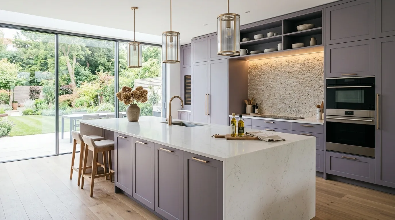
Smoky lavender neutrals are emerging as one of the most distinctive directions in contemporary kitchen design. The muted blend of gray, taupe, and soft lavender undertones creates depth without feeling overly colorful. At first glance, the shade appears neutral, yet it offers enough character to make the room feel custom and elevated. This understated approach appeals to homeowners who want something more unique than standard beige or gray while maintaining a refined and elegant atmosphere.
The beauty of this color lies in its versatility across different materials and lighting conditions. Natural stone, brushed metals, and warm wood finishes all complement the subtle undertones beautifully. I’ve noticed that smoky lavender palettes often photograph exceptionally well because they create gentle contrast while maintaining harmony throughout the room. The result is a sophisticated kitchen that feels fresh, luxurious, and perfectly suited for homeowners looking beyond traditional neutral color schemes.
23. Monochromatic Luxury Layers
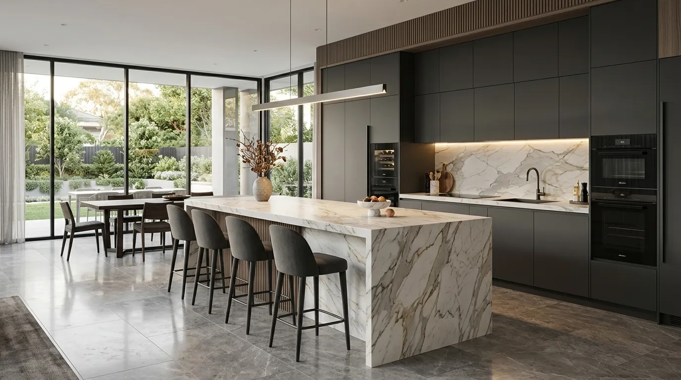
One of the most elegant approaches in luxury kitchen design is layering multiple shades from the same color family. Rather than relying on strong contrasts, monochromatic palettes build interest through texture, materials, and subtle tonal variation. Soft cabinetry, stone surfaces, flooring, and decorative elements work together to create a seamless visual flow. The result feels sophisticated, calming, and intentionally curated, making the entire kitchen appear larger and more refined.
This approach succeeds because it emphasizes quality materials and thoughtful detailing over bold color statements. Designers often use layered neutrals, stone textures, and carefully selected finishes to create depth while maintaining harmony. I’ve seen this work exceptionally well in both compact and expansive layouts because the consistent palette helps reduce visual clutter. As a result, monochromatic layering remains one of the strongest influences within kitchen color trends for modern interiors, delivering timeless elegance with a distinctly contemporary edge.
To Sum It Up
The right color palette can completely change the atmosphere of a kitchen, turning it from a purely functional space into a beautiful centerpiece of the home. From warm neutrals and natural wood tones to bold statement islands and luxurious stone-inspired palettes, these ideas offer inspiration for every style and layout. As you explore these kitchen color trends for modern interiors, focus on the options that best match your lifestyle, lighting, and design goals. I’ve seen how small changes like these can dramatically elevate a space. Save this post to Pinterest, try your favorite ideas, and share it with anyone planning a kitchen refresh.
Emma Williams
Emma Williams is an interior design expert and decor editor at Lady Home Decor. She specializes in modern, cozy, and functional home styling, helping readers discover inspiring decorating ideas that are easy to recreate. Her work focuses on timeless design, practical solutions, and the latest home decor trends.