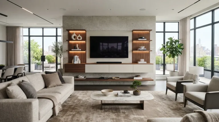
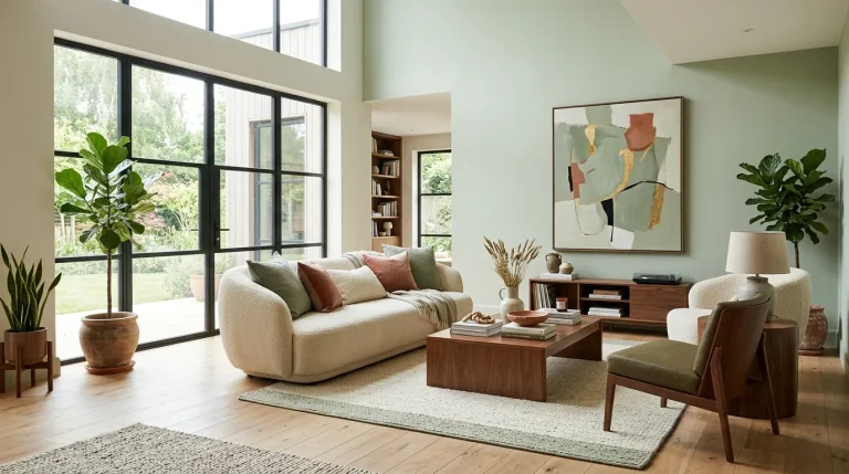
23 Gorgeous Interior Color Trends for Home Design You’ll Love

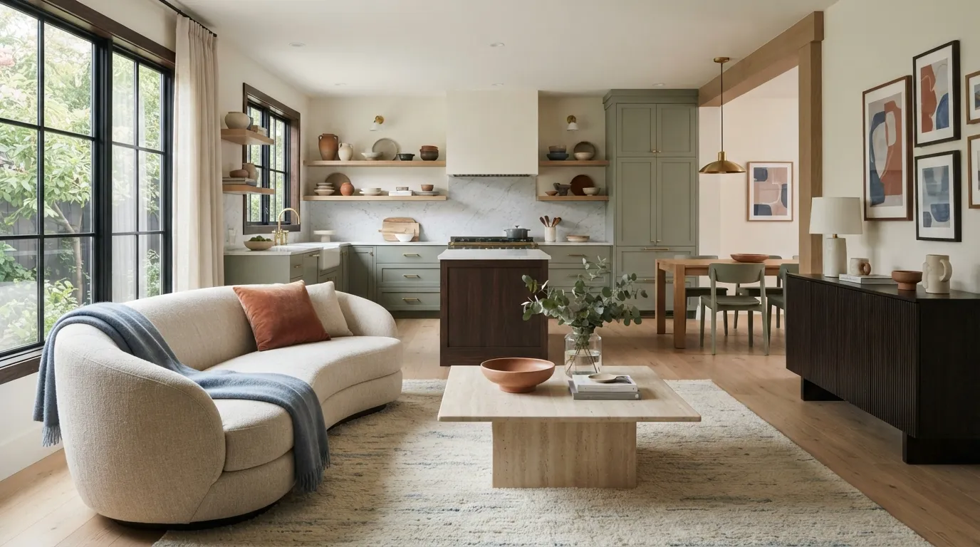
Color can change a room before you buy a single new piece of furniture. The latest interior color trends for home design mix warm neutrals, earthy shades, soft pastels, and deeper accents to create spaces that feel personal without looking overdone. From creamy walls to rich chocolate details, there’s a shade for almost every decorating style.
Pinterest-worthy rooms often work because their colors feel connected. You don’t need to repaint every wall or replace everything you own. A smart accent wall, colorful cabinet, textured textile, or small decor piece can give your space a fresh look while keeping the rest of your home calm and balanced.
1. Warm Cream Makes Rooms Feel Softer
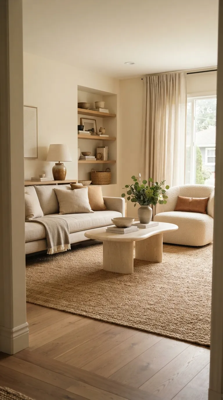
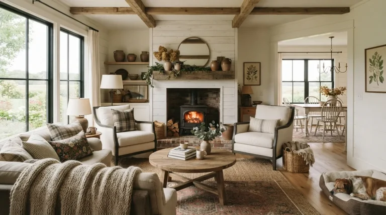
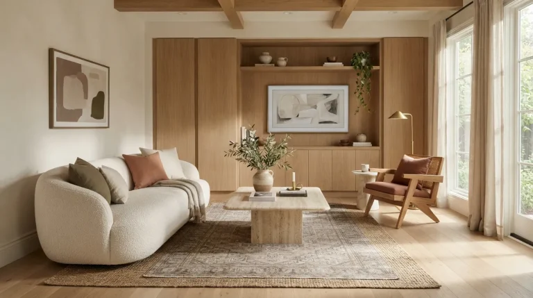
Warm cream is a strong choice when bright white feels too cold. It gives walls a gentle glow and pairs beautifully with oak, linen, stone, and woven textures. This shade also works across living rooms, bedrooms, kitchens, and entryways without feeling tied to one decorating style.
Try cream walls with darker wood furniture for contrast. If you already have white walls, bring in the color through curtains, rugs, upholstery, and ceramic pieces first. That small change can make a room feel warmer without turning the space upside down.
2. Sage Green Brings a Natural Calm
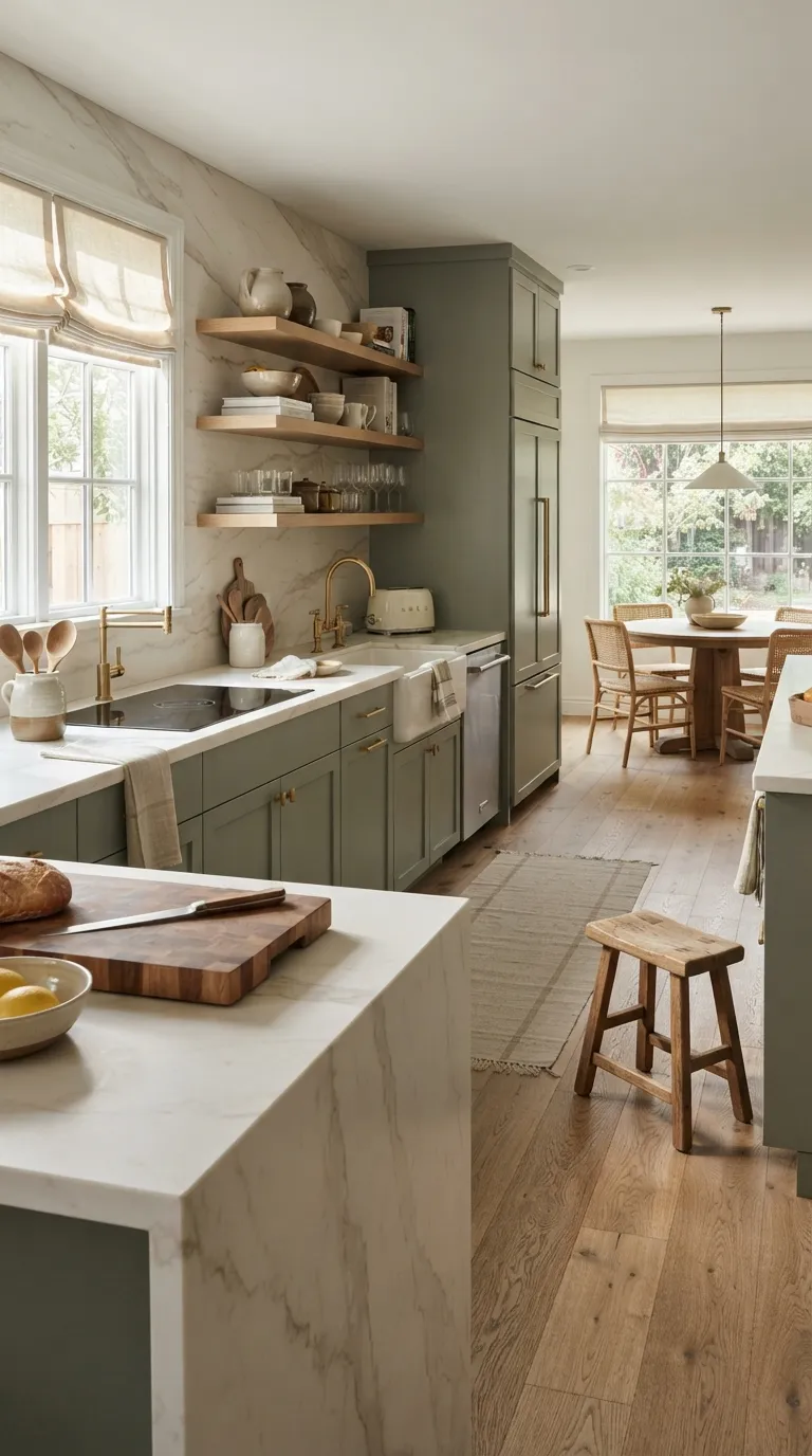
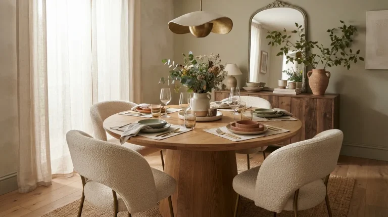
Sage green remains a favorite for anyone who wants color without a loud finish. Its soft, dusty quality works especially well with natural wood, cream surfaces, brass hardware, and woven materials. In a kitchen, sage cabinets can add personality while keeping the overall palette relaxed.
You can also use sage in smaller doses. Picture a neutral bedroom with a sage quilt, matching artwork, and a ceramic lamp. The result feels connected without making green the sole focus of the room.
3. Terracotta Adds Warm Earthy Character
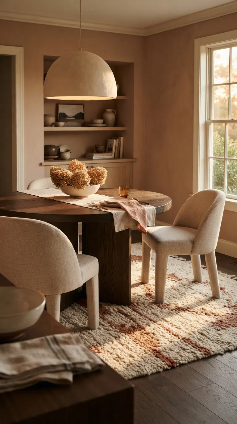
Terracotta brings a grounded warmth that suits dining rooms, kitchens, bedrooms, and cozy reading corners. The earthy red-orange tone looks especially good beside cream, dark wood, aged bronze, and natural stone. It can make a plain room feel more intentional without relying on lots of decoration.
If full terracotta walls feel too bold, start with smaller pieces. A clay-colored rug, dining chairs, pottery, or linen curtains can introduce the shade gradually. For a Pinterest-friendly look, repeat the tone in two or three places so the room feels visually connected.
4. Dusty Blue Creates a Peaceful Retreat
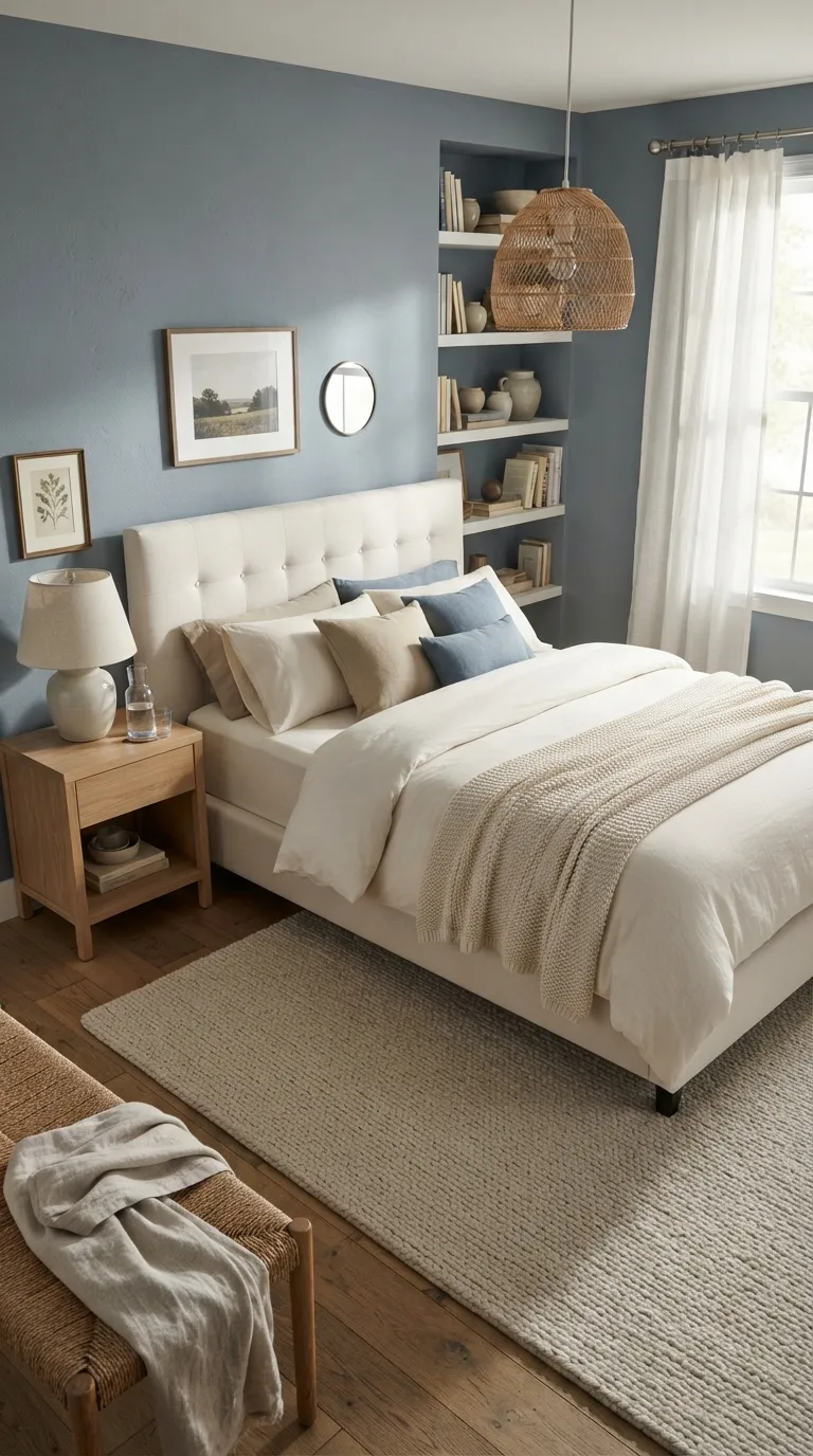
Dusty blue gives a room color without making it feel busy. Its gray undertone pairs naturally with ivory, oak, sand, and soft metallic finishes. In a bedroom, this palette can create a quiet backdrop for layered bedding and simple decor.
Use dusty blue beyond the walls, too. A painted dresser, upholstered headboard, roman shade, or area rug can bring the same mood into the room. Keep the supporting colors light so the blue stays soft rather than taking over.
5. Chocolate Brown Grounds Modern Spaces
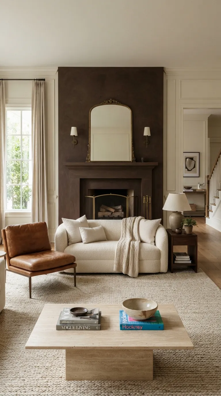
Chocolate brown adds depth to modern interiors without the heaviness of pure black. It looks especially rich beside cream upholstery, walnut, cognac leather, stone, and aged metal. A brown fireplace wall or built-in cabinet can become the room’s strongest visual anchor.
For a lighter approach, use brown through furniture and accessories. A dark wood console, leather chair, coffee table, or oversized rug can ground an otherwise pale room. Repeat the shade in small details to create a polished color palette.
6. Soft Peach Brings Gentle Warmth
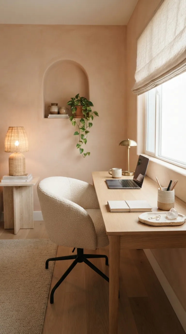
Soft peach gives interiors a warm glow while staying lighter than terracotta. The muted version works well with cream, pale wood, beige, and small dark accents. It’s a smart pick for a home office, bedroom, nursery, or reading nook.
Picture a peach wall behind a simple oak desk with cream textiles and a woven lamp. The color becomes a gentle backdrop rather than the main event. If you’re unsure about painting, test the shade on one wall first and watch it under morning, afternoon, and evening light.
7. Olive Green Gives Classic Rooms Depth
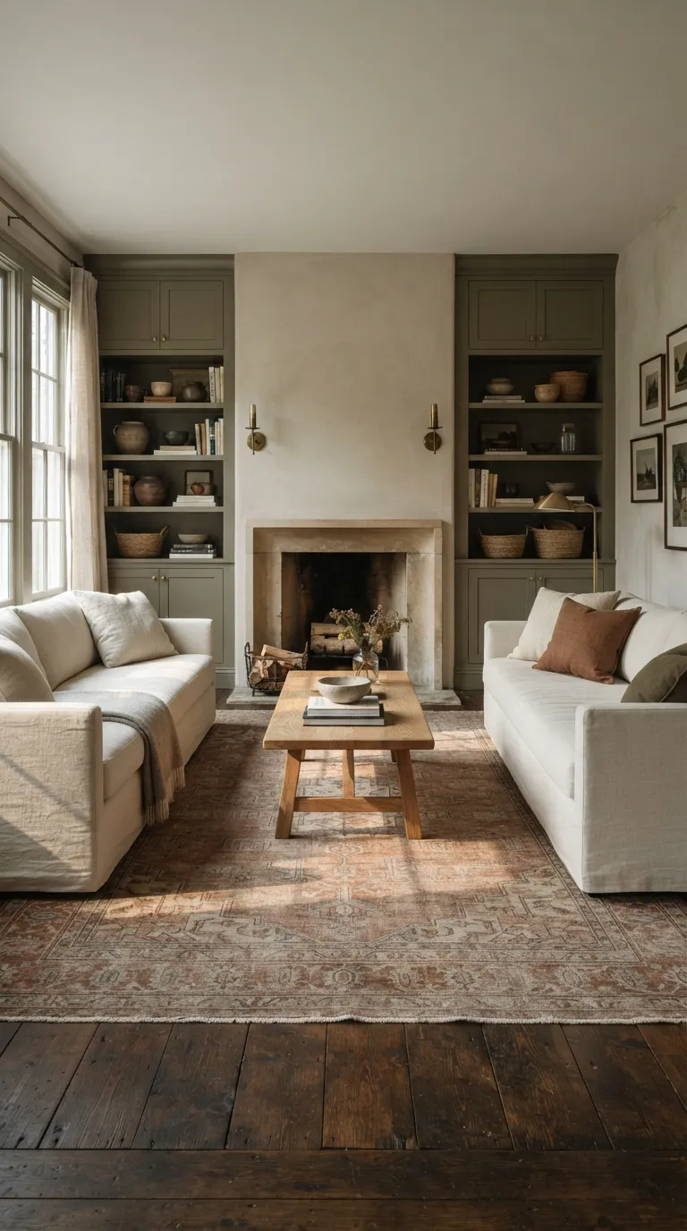
Olive green has a deeper, more classic feel than sage. It works beautifully on built-ins, lower kitchen cabinets, accent walls, and furniture because its earthy base feels connected to wood and stone.
Pair olive with warm cream instead of bright white for a softer room. Rust, tan, brass, and natural fibers can add small points of contrast without making the palette feel scattered.
8. Muted Lavender Softens Contemporary Interiors
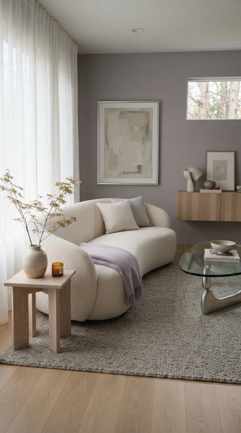
Muted lavender offers a softer alternative to stronger purple shades. With enough gray in the mix, it can feel grown-up and understated rather than overly sweet. It pairs well with ivory, mushroom, pale wood, and soft gray.
Use this color where you want a gentle focal point. A lavender bedroom wall, upholstered chair, or set of curtains can bring personality to a neutral room. Keep the rest of the palette restrained so the color has room to breathe.
9. Deep Navy Adds a Sophisticated Contrast
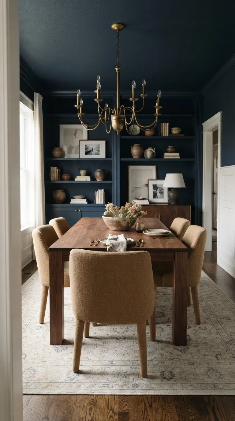
Deep navy can make a room feel grounded and structured. It looks especially strong with walnut, camel upholstery, warm white trim, and brass details. This makes it a useful color for dining rooms, offices, libraries, and accent walls.
If painting an entire room feels like too much, use navy on built-ins or a single feature wall. Navy cabinetry can also give a kitchen a tailored look while keeping lighter counters and backsplashes fresh.
10. Butter Yellow Adds a Sunny Touch
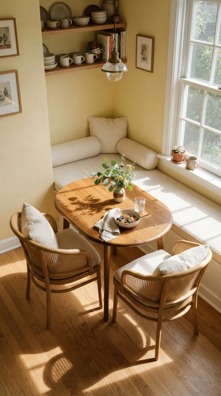
Butter yellow brings warmth without the sharpness of a bright lemon shade. It works nicely in kitchens, breakfast areas, mudrooms, and small living spaces where a little color can make the room feel friendlier.
Pair it with cream and natural wood for an easy palette. If yellow walls aren’t your style, try a painted cabinet, patterned cushion, ceramic lamp, or small upholstered chair instead.
11. Warm Taupe Creates an Easy Neutral Base
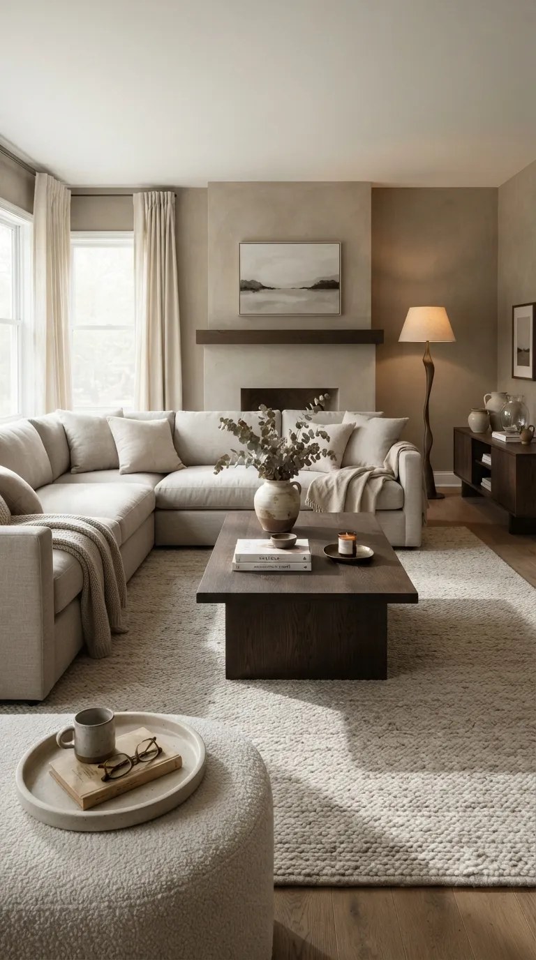
Warm taupe sits between beige and gray, making it useful when you want a neutral with more depth. It works across large surfaces and gives colorful furniture or artwork a calm background.
Try taupe with cream, dark oak, mushroom, and bronze. This combination creates a layered room without relying on stark contrasts. It’s also a practical choice if you like changing accent colors throughout the year.
12. Clay Pink Brings Earthy Softness
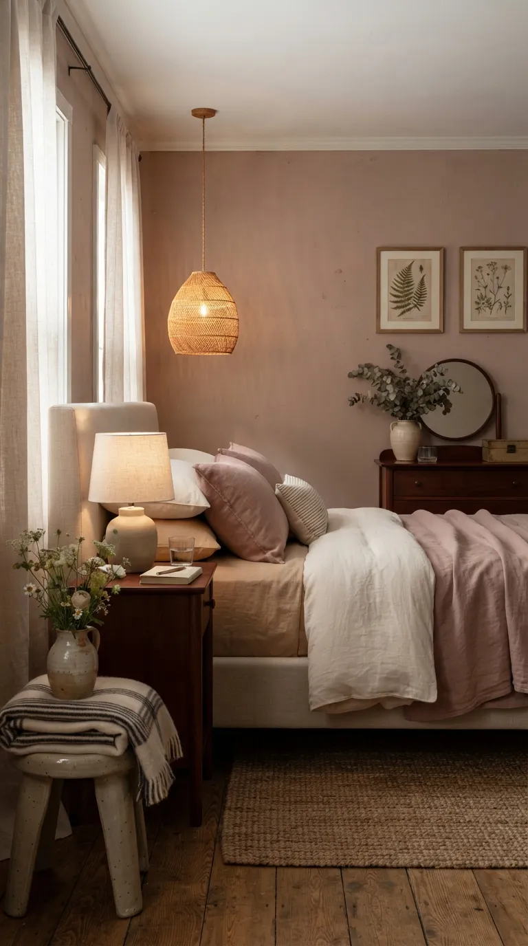
Clay pink gives pink a more earthy direction. Its warm undertone pairs beautifully with flax, cream, cherry wood, beige, and dusty rose. The color can work particularly well in bedrooms where you want softness without a sugary look.
Use clay pink on walls for a stronger effect, or bring it in through bedding and textiles. A pinkish clay throw beside cream pillows and dark wood furniture can create a balanced palette with very little effort.
13. Forest Green Creates a Rich Focal Point
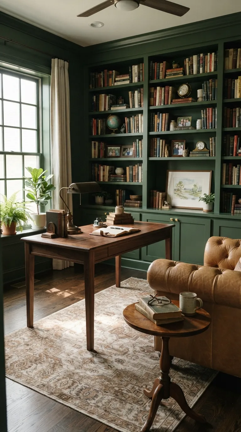
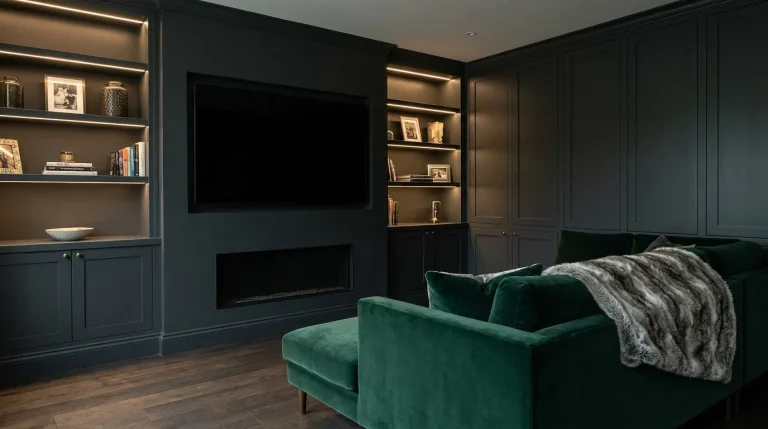
Forest green gives a room a strong sense of depth. Unlike brighter greens, this darker shade can feel collected and classic when paired with warm wood, leather, brass, and cream.
Use it on a library wall, built-in shelves, kitchen island, or small powder room. If your space gets limited daylight, balance the dark color with pale flooring, light upholstery, and reflective metal details.
14. Warm White Keeps Minimal Spaces Inviting
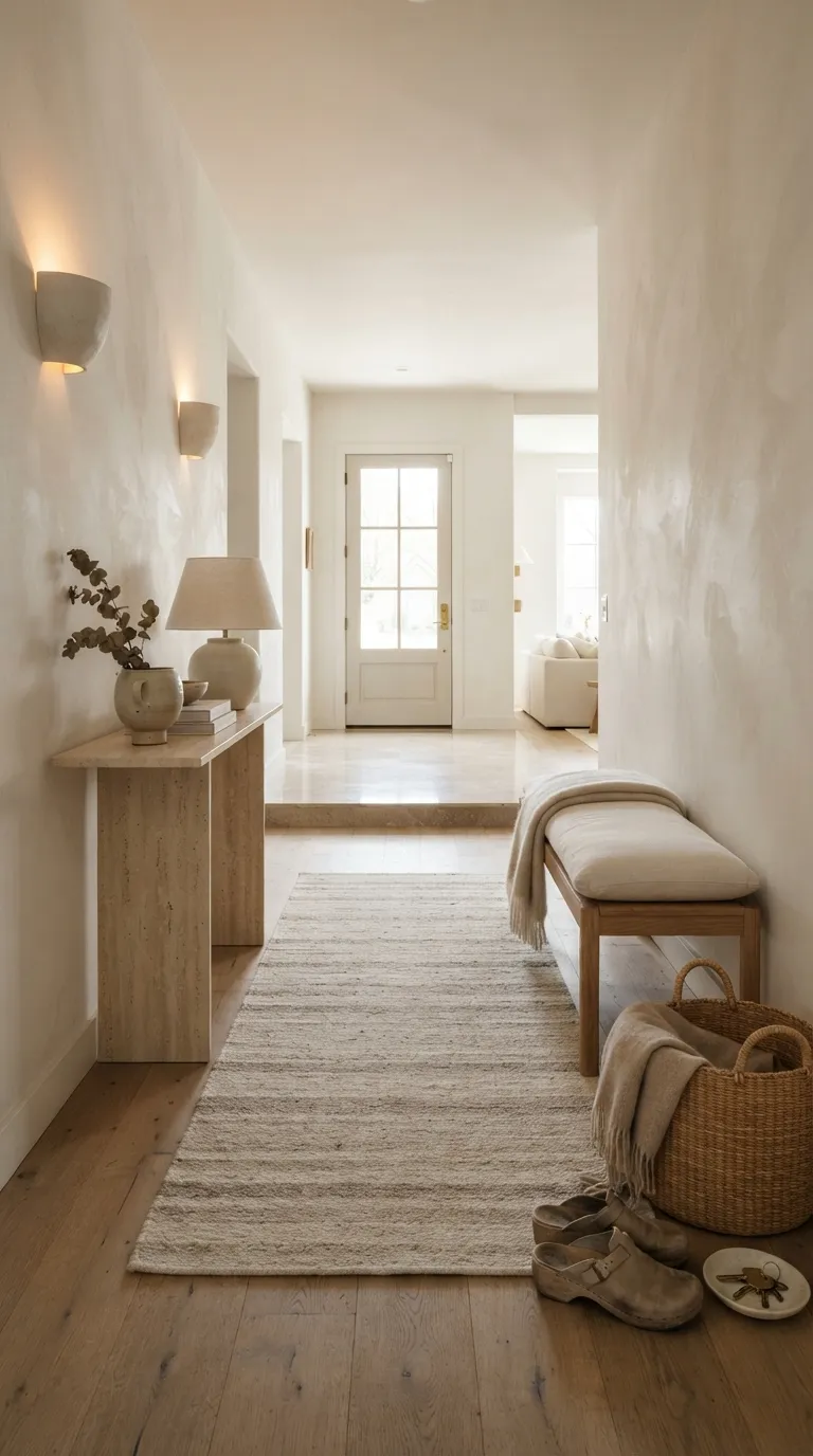
Warm white proves that neutral rooms don’t need to feel plain. Its creamy undertone gives walls more softness while keeping a clean appearance. This shade works especially well with natural materials that add visual texture.
Pair warm white with pale oak, limestone, linen, and woven accents for a relaxed look. For a little contrast, add one darker piece such as a wood bench, bronze light, or charcoal frame.
15. Rust Orange Brings Vintage Warmth

Rust orange has a warm, vintage character that works well when you want a room to feel cozy and collected. The earthy shade looks natural beside cream, teak, stone, copper, and muted beige.
You don’t need much rust to make an impact. Try one accent chair, a velvet cushion, a rug pattern, or a painted niche. Keep the surrounding colors quiet, and the rust tone becomes the room’s warm thread.
16. Charcoal Gray Adds Modern Definition
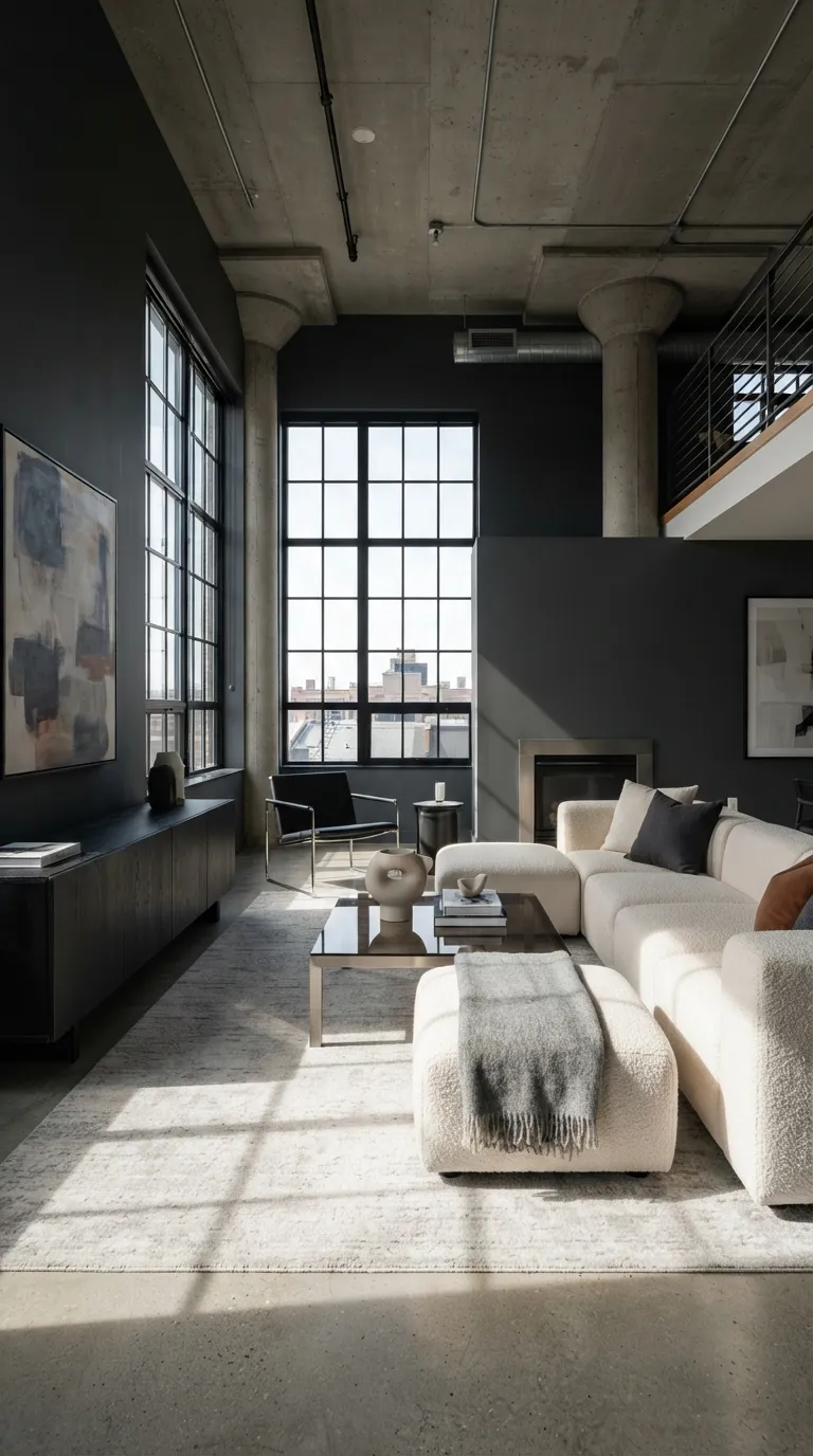
Charcoal gray gives pale rooms a clear visual anchor. It’s less stark than pure black and can create a strong backdrop for cream furniture, natural wood, stone, and soft textiles.
Use charcoal on a fireplace wall, kitchen island, bathroom vanity, or built-in cabinet. In smaller rooms, balance it with lighter surfaces and plenty of natural light so the space doesn’t feel closed in.
17. Pale Green Creates a Fresh, Airy Feel
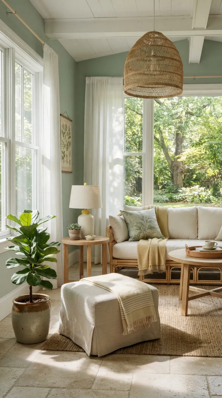
Pale green is ideal when you want color that still feels light. Its gentle botanical quality pairs naturally with white, oak, rattan, linen, and leafy plants.
This shade works well in sunrooms, kitchens, bathrooms, and bedrooms. For a simple update, use pale green towels, curtains, cushions, or a small painted cabinet before committing to larger surfaces.
18. Mocha Beige Adds Cozy Sophistication
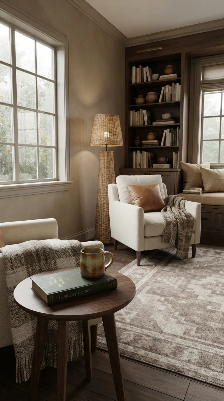
Mocha beige sits between taupe and brown, giving neutral interiors a warmer edge. It looks especially good with cream, walnut, caramel leather, and textured fabrics.
Use mocha on walls when you want a cozy room that still feels polished. It also works through rugs, upholstered seating, curtains, and bedding, making it easy to add gradually.
19. Powder Blue Keeps Classic Spaces Light
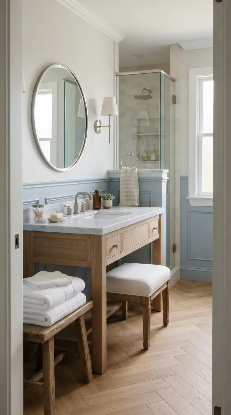
Powder blue keeps a color-filled room feeling fresh and open. Its pale tone works naturally with marble, ivory, light wood, and silver finishes, making it a useful choice for bathrooms and bedrooms.
For a classic look, use powder blue with simple trim and traditional shapes. In a more modern space, pair it with clean cabinetry, pale stone, and minimal hardware for a lighter color palette.
20. Deep Plum Adds Moody Personality
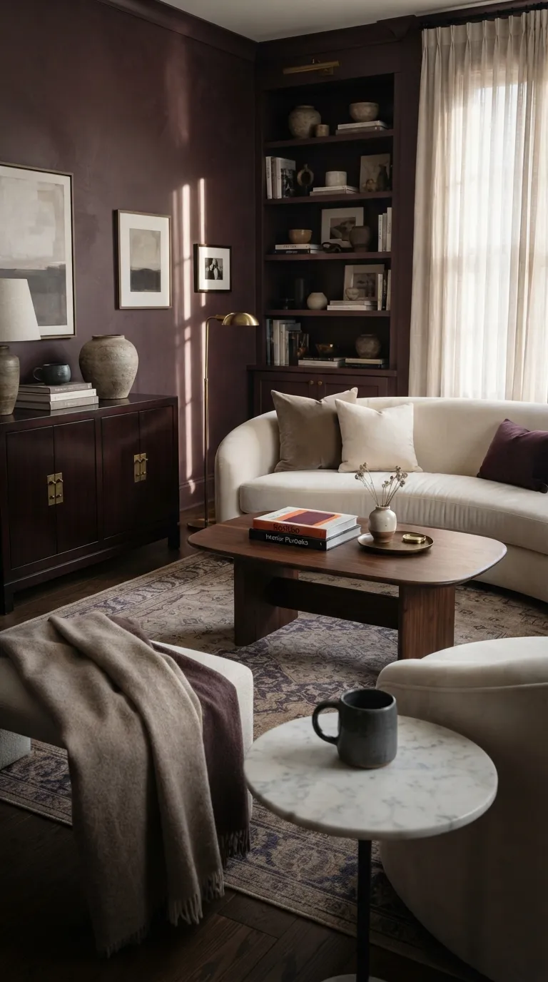
Deep plum gives interiors a rich, intimate mood. Its red-brown base makes it easier to pair with warm materials than a cooler purple. Cream furniture, dark wood, brass, and taupe help keep the color balanced.
This shade works especially well in dining rooms, libraries, bedrooms, and smaller sitting areas. If full walls feel too dark, introduce plum through velvet seating, curtains, cushions, artwork, or a patterned rug.
21. Greige Blends Gray and Beige Beautifully
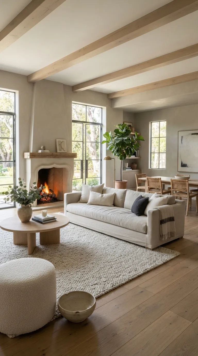
Greige combines the familiar warmth of beige with the quiet quality of gray. It’s a flexible choice for open-plan homes because it connects different areas without looking too plain.
Use greige as your main wall color, then add stronger shades through furniture and accessories. Charcoal, olive, rust, navy, and warm wood can all work against this neutral base.
22. Teal Brings Color With Plenty of Depth
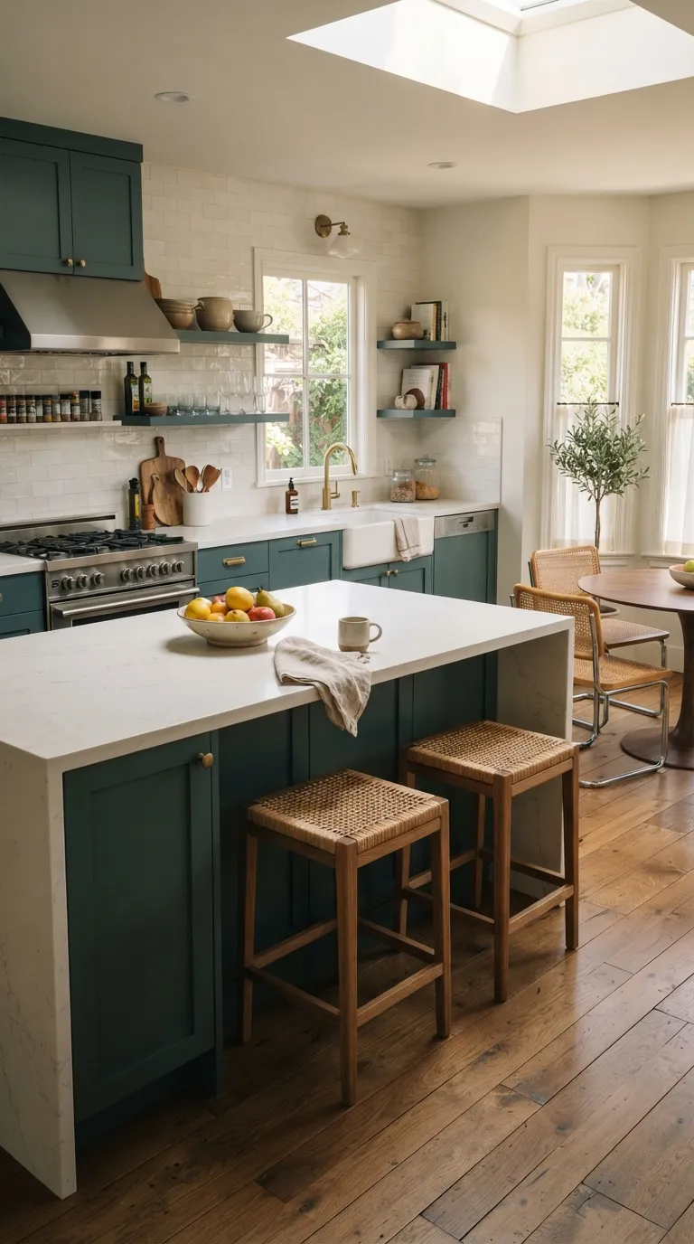
Teal sits between blue and green, giving you a color that’s bold without feeling harsh. It looks especially good with warm white, walnut, brass, and small earthy accents.
Teal cabinets can make a kitchen feel tailored and distinctive. For a smaller update, try a teal vanity, accent chair, shower tile, or set of textiles while keeping larger surfaces neutral.
23. Soft Black Creates a Bold Finishing Touch
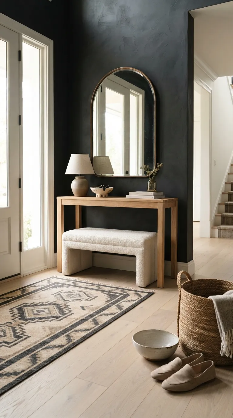
Soft black can give a room a strong finishing point without the severity of glossy jet black. Its slightly warm quality works well with oak, cream, bronze, stone, and natural textiles.
Try it on an entryway wall, interior doors, built-ins, or a compact powder room. If the color feels too strong for a large surface, black picture frames, lamps, hardware, and small furniture pieces can create the same contrast in smaller doses.
In the End
Your favorite color doesn’t have to cover an entire room. Start with the feeling you want, then choose one main shade, one supporting neutral, and one small accent color that work well together. This simple three-color approach can keep your interior color trends for home design looking intentional instead of crowded.
Before buying paint, fabric, or furniture, test your colors in the actual room. Natural light, bulbs, flooring, and nearby finishes can change how a shade looks throughout the day. Pick the palette that feels right in your space, then bring it through walls, textiles, furniture, and decor at a pace that suits your budget.
Emma Williams
Emma Williams is an interior design expert and decor editor at Lady Home Decor. She specializes in modern, cozy, and functional home styling, helping readers discover inspiring decorating ideas that are easy to recreate. Her work focuses on timeless design, practical solutions, and the latest home decor trends.