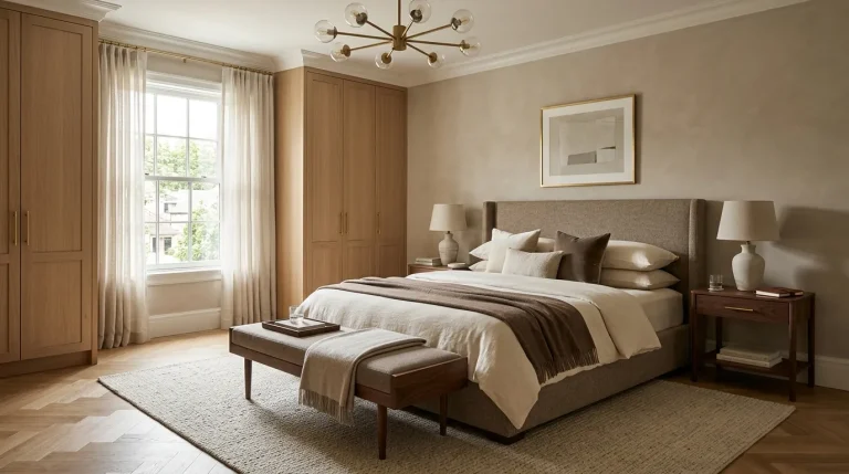
17 Bedroom Color Trends That Make Your Space Feel Luxe

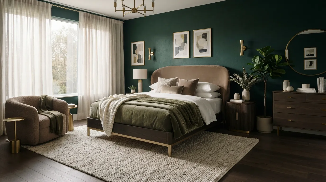
These bedroom color trends show you how to create a luxe look with rich tones, calming neutrals, and carefully layered shades. From deep olive and navy to warm white and terracotta, each palette offers an easy way to make your bedroom feel more polished. Explore the ideas below to find a color direction that suits your space and style.
1. Moody Olive Walls
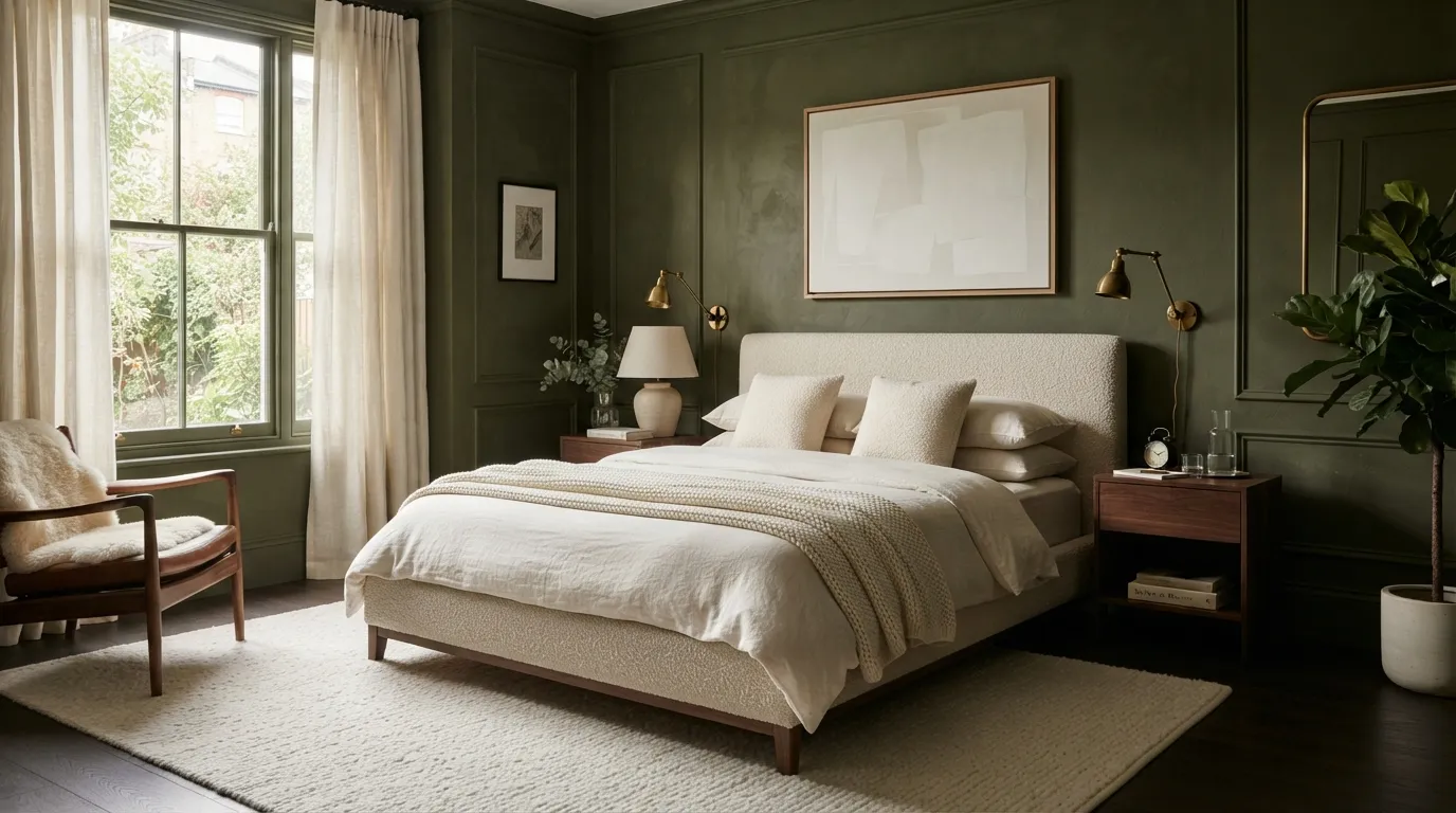
Moody olive is one of those colors that can make an ordinary bedroom feel intentionally designed. The earthy undertone adds depth while still working beautifully with wood, linen, brass, and cream accents. For smaller rooms, painting the ceiling the same color can create a wrapped, seamless effect rather than visually chopping up the space.
2. Warm Clay Accents
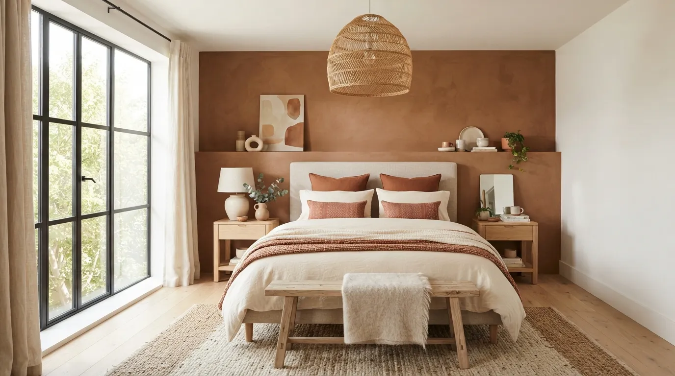
Warm clay is especially effective when you want a bedroom to feel inviting from the moment you walk in. Instead of covering every surface, use it as a controlled accent behind the bed or inside a recessed wall. The result feels richer when the surrounding fabrics stay soft and understated.
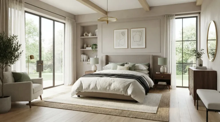
3. Soft Mushroom Neutrals
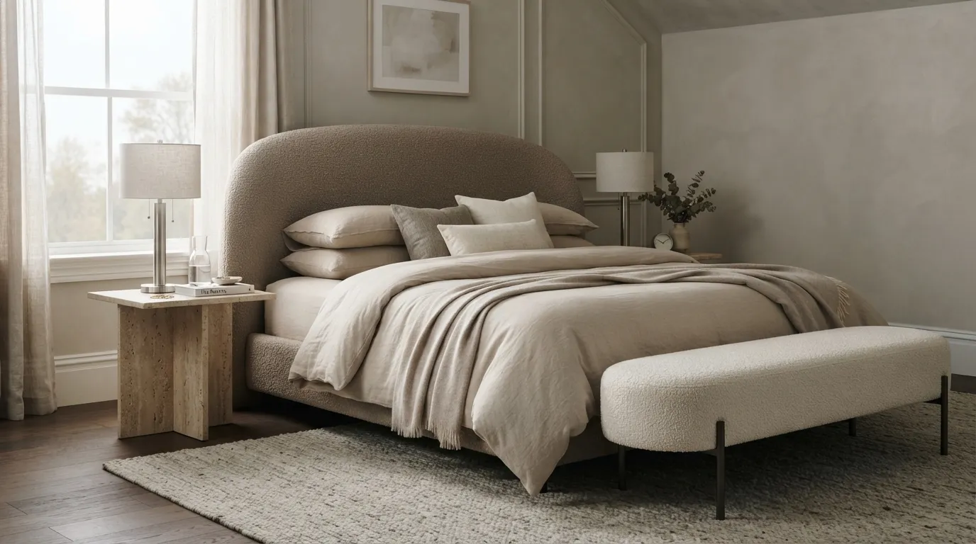
Soft mushroom tones prove that neutral bedrooms do not have to look plain. The secret is combining closely related shades with noticeably different textures, so the eye has something to explore even when the palette stays quiet. This approach is particularly useful when you want a luxe atmosphere without committing to a bold wall color.
4. Deep Navy Contrast
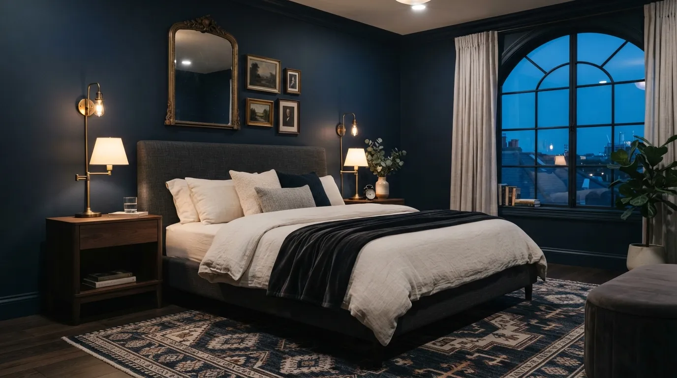
Deep navy gives a bedroom an instantly polished backdrop, especially when lighter bedding is allowed to stand out against it. The contrast feels intentional rather than stark when warm wood and aged metal are introduced nearby. For a balanced result, keep the strongest dark color concentrated around the sleeping zone instead of spreading it equally across every surface.
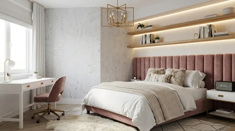
5. Dusty Rose Layers
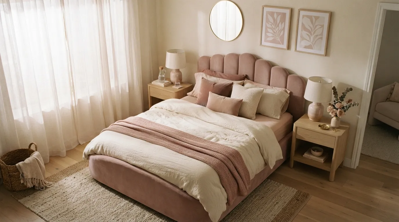
Dusty rose works beautifully when you want softness without creating a sugary-looking bedroom. Instead of treating pink as the only statement color, layer it through textiles, artwork, and one restrained furniture accent. I’ve seen this approach create a much more expensive-looking result because the color feels collected rather than overly coordinated.
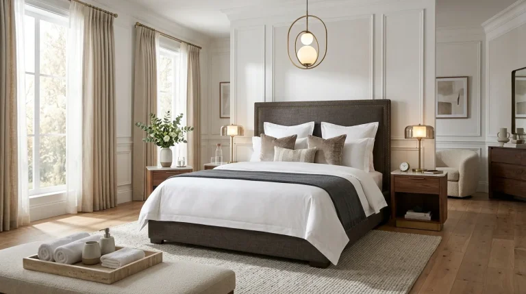
6. Charcoal and Cream
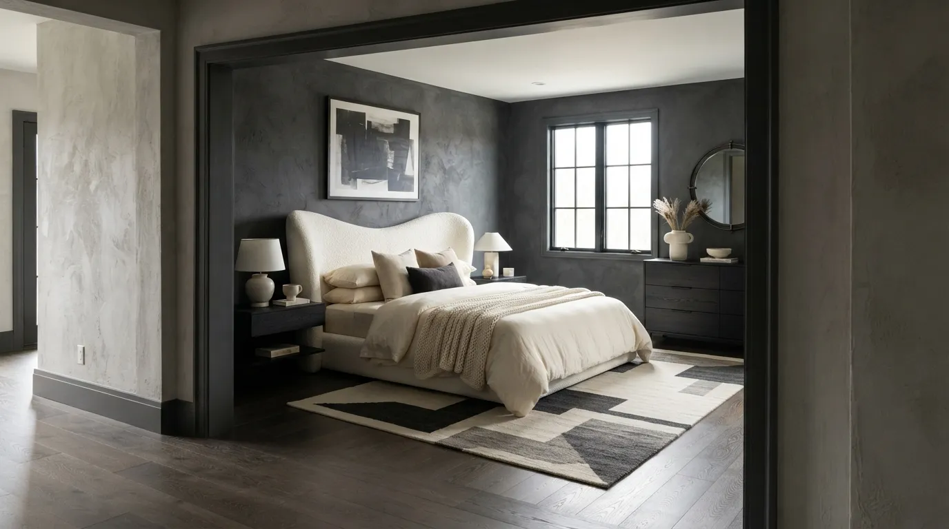
Charcoal and cream deliver a luxe look through contrast rather than excessive decoration. The dark backdrop gives architectural features more definition, while creamy bedding keeps the sleeping area visually light and comfortable. If you are worried about charcoal feeling too heavy, start with one feature wall and let natural wood provide the transition.
7. Sage Green Serenity
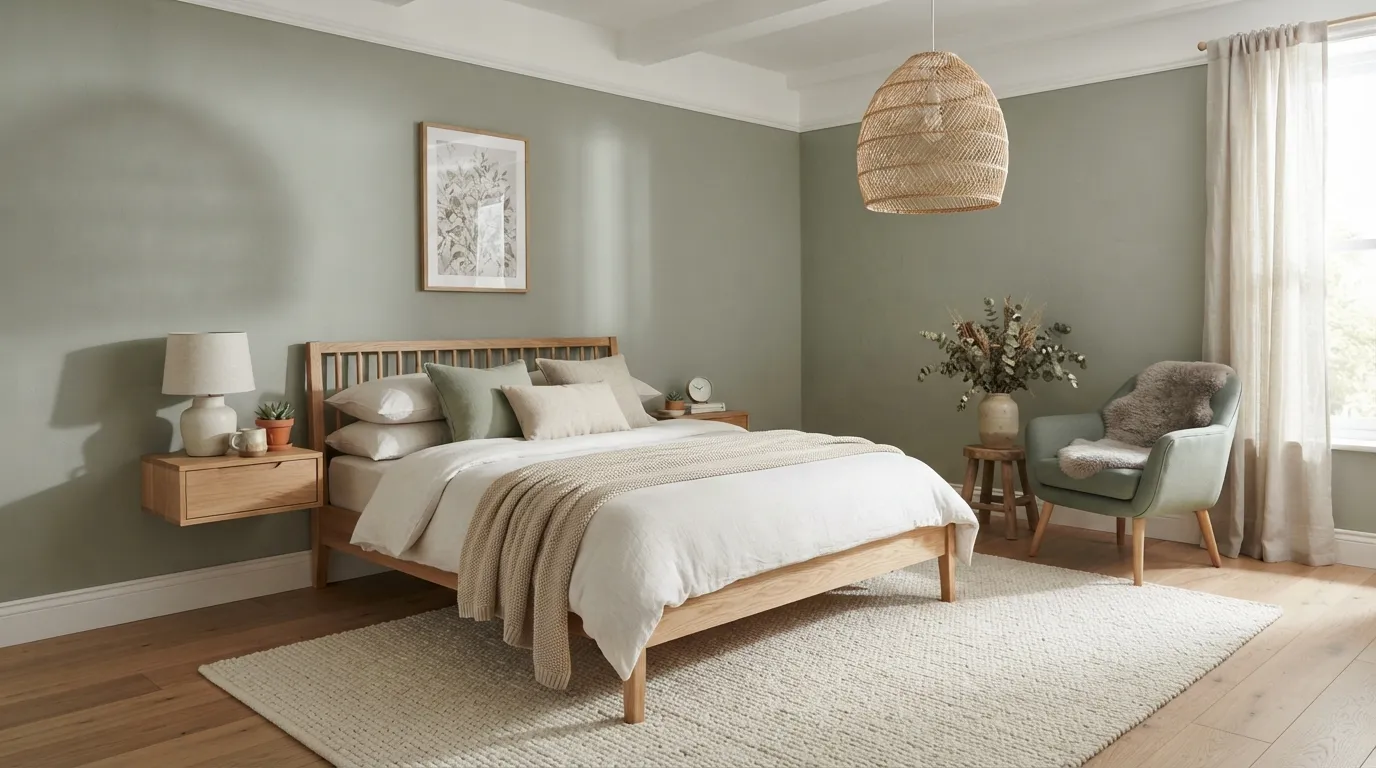
Sage green brings a quiet connection to nature while still feeling polished enough for a modern bedroom. It looks particularly beautiful beside pale timber, linen, and creamy textiles, creating a palette that feels fresh without becoming overly trendy. For the most restful effect, keep the green slightly gray and let natural materials provide the warmth.
8. Rich Chocolate Brown
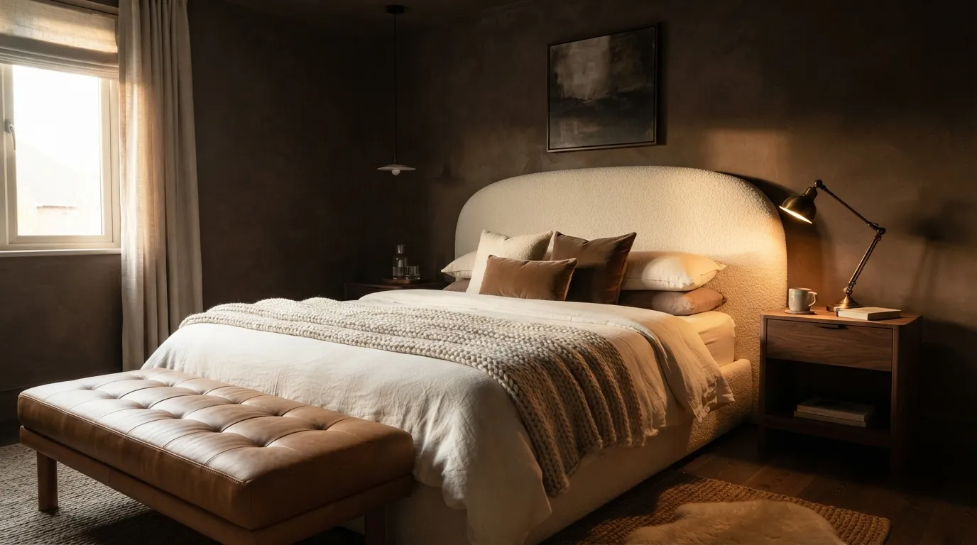
Rich brown is becoming a powerful alternative to the usual dark gray bedroom. Its warmth makes the room feel intimate, while lighter upholstery prevents the space from becoming visually heavy. The key is contrast: pair the deepest brown with pale fabrics and reflective metal details so every layer remains distinguishable.
9. Soft Blue Retreat
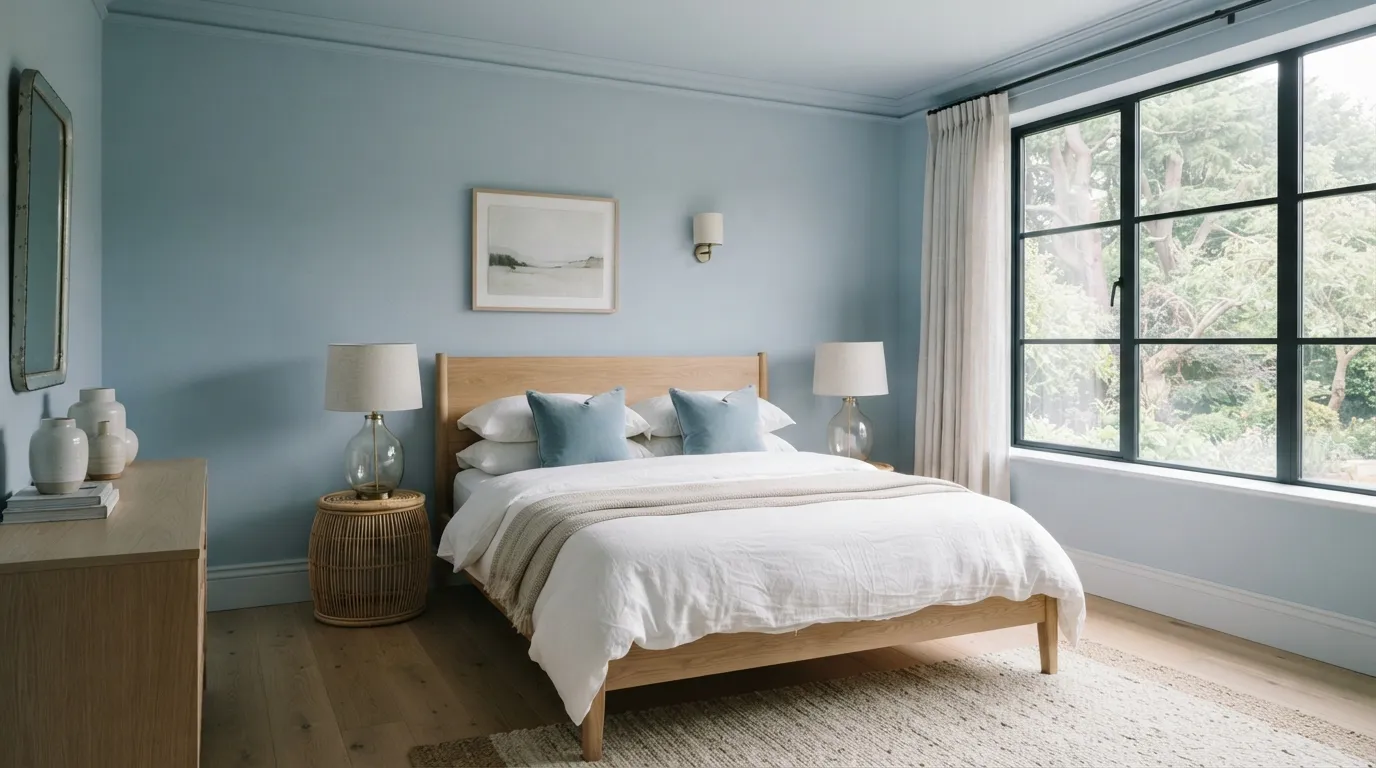
Soft blue gives a bedroom a naturally restful quality while keeping the overall design bright. A slightly gray-blue shade is especially versatile because it can shift beautifully between daylight and evening lamp light. Pairing it with white oak rather than stark white furniture adds just enough warmth to prevent the space from feeling clinical.
10. Terracotta Warmth
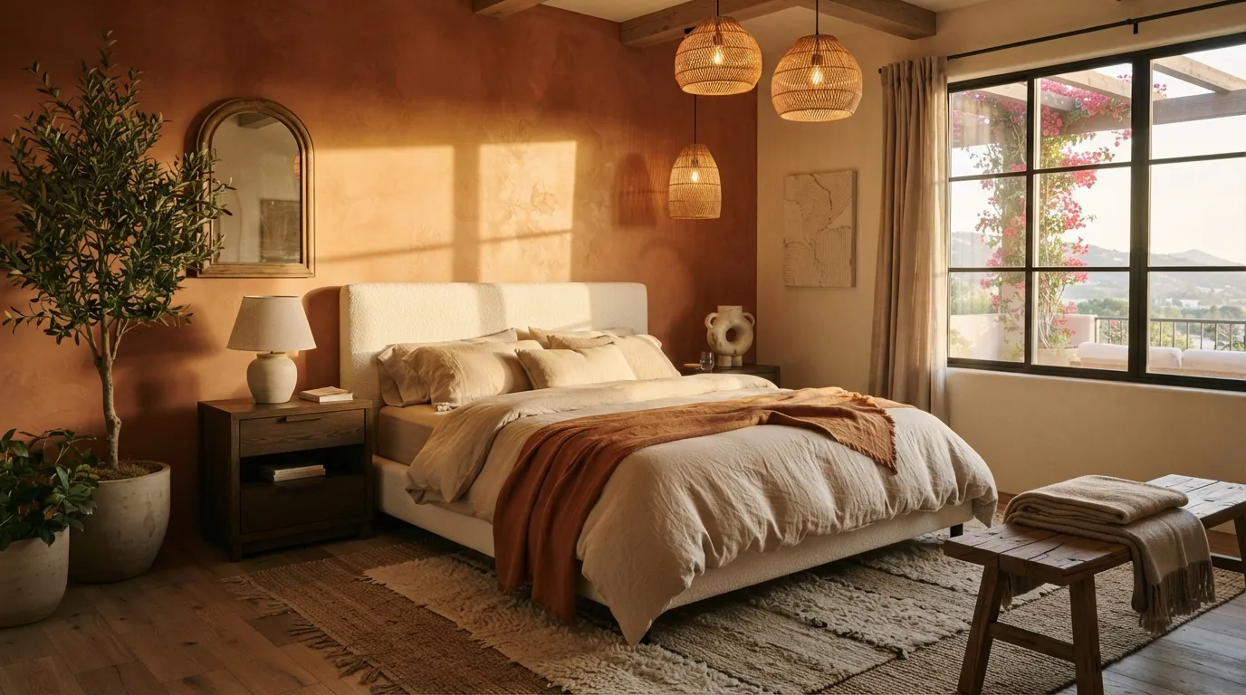
Terracotta brings an immediate sense of warmth, especially when used against natural textures. A softly textured wall can make the color feel richer because changing light reveals subtle variations throughout the day. Rather than matching every accessory, repeat the terracotta once through a throw or artwork and let the rest of the room stay quiet.
11. Creamy Butter Tones
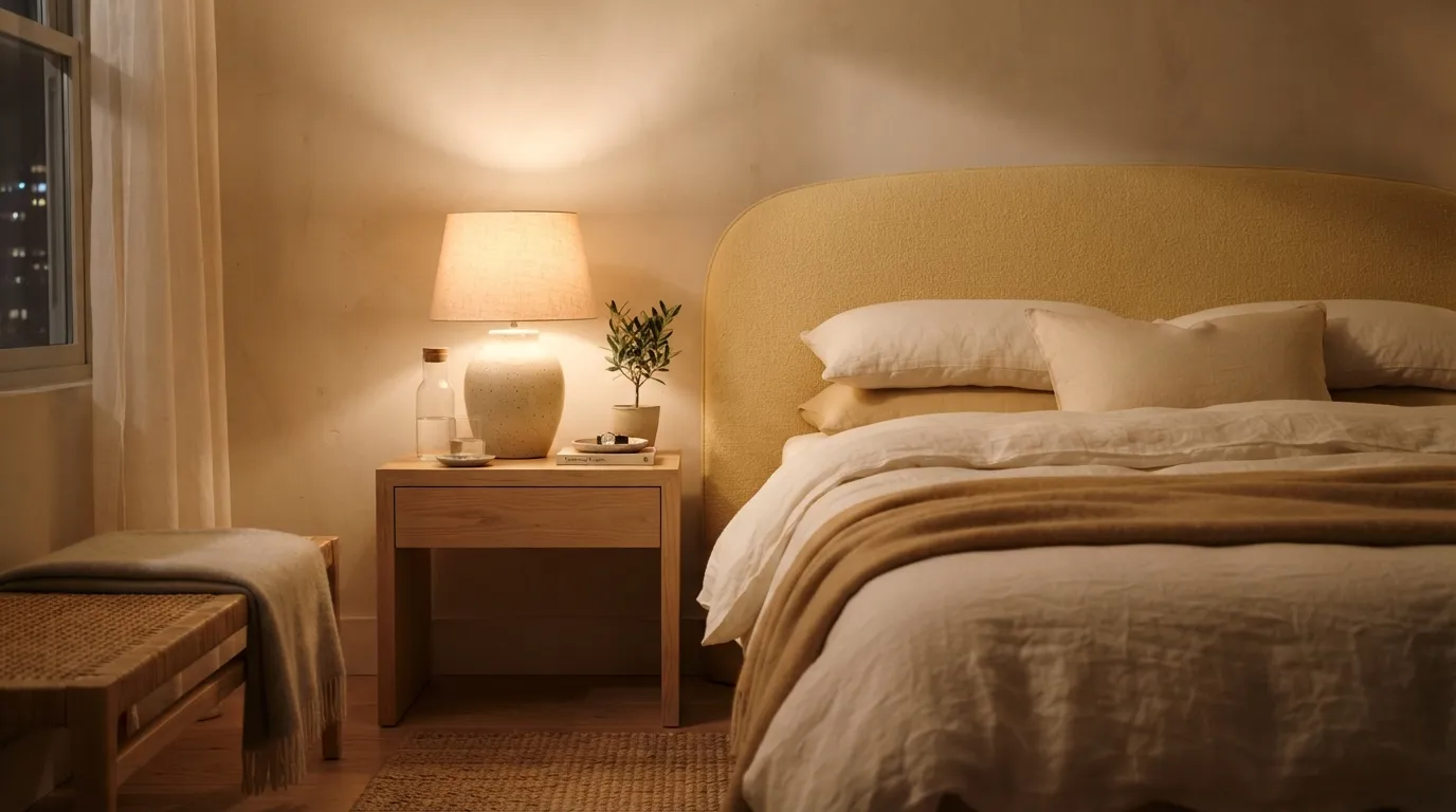
Creamy butter tones can make a bedroom feel brighter without the starkness of pure white. The shade becomes especially luxurious when paired with soft linen, pale timber, and plaster-like surfaces that give the color something to interact with. For a subtle update, introduce butter through one substantial wall or oversized textile instead of many small accessories.
12. Plum Accent Wall
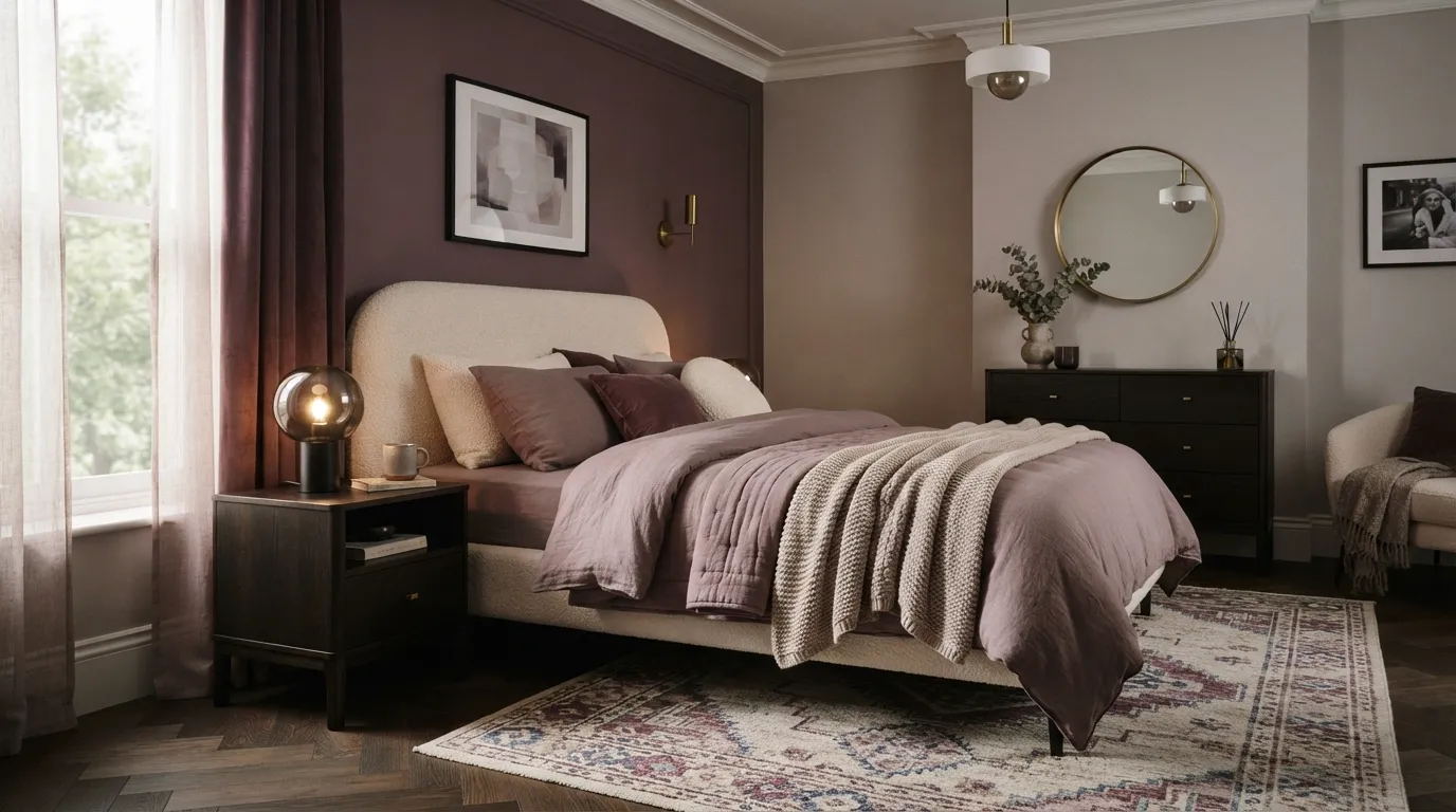
Plum is a smart choice when you want a bedroom to feel dramatic without becoming overly dark. Its red undertones give the color warmth, while muted saturation keeps it sophisticated. I’ve noticed this shade works best when the surrounding palette is deliberately restrained, allowing the wall to provide most of the visual drama.
If you liked reading this, Trendy Bedroom Color Schemes is a good next read.
13. Greige Elegance
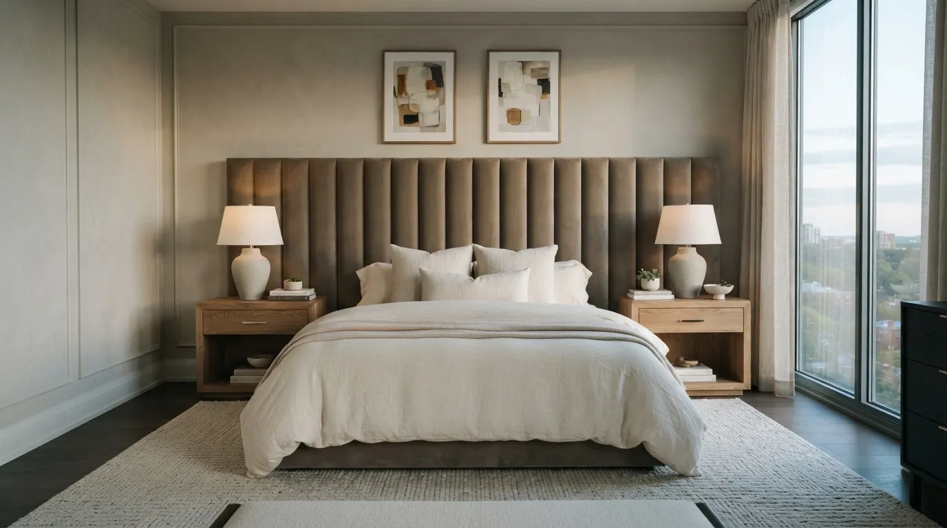
Greige remains a reliable choice because it can make a bedroom feel sophisticated without locking you into one color family. Its success depends heavily on undertone, so compare samples beside the actual flooring and upholstery before committing. Once the base is right, layered textiles and sculptural shapes can make this quiet palette feel remarkably luxurious.
14. Midnight Blue Drama
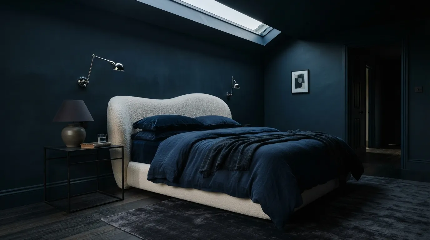
Midnight blue turns a bedroom into a dramatic retreat, especially when the color continues across the ceiling. This technique reduces the visual boundary between wall and ceiling, creating a more enveloping atmosphere. Balance the darkness with a light bed, reflective lighting, and enough practical illumination for reading and getting ready.
15. Muted Terracotta
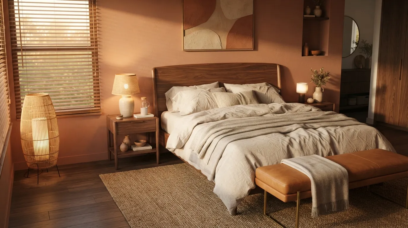
Muted terracotta gives a bedroom warmth without requiring a dramatic redesign. Its earthy character pairs naturally with walnut, leather, linen, and handmade ceramics, so even a few carefully chosen pieces can make the palette feel complete. The most polished results come from using different shades around the room instead of searching for an exact color match.
16. Forest Green Retreat
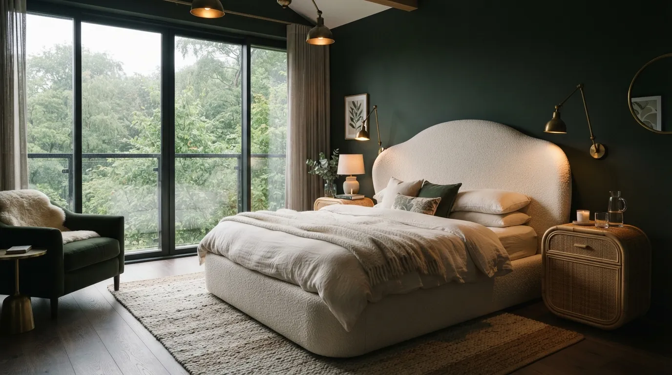
Forest green creates a rich, nature-inspired bedroom that feels especially luxurious when paired with soft cream and natural textures. The shade becomes even more effective when windows reveal greenery outside, visually extending the palette beyond the room. For smaller bedrooms, concentrate the darkest green around the bed and keep surrounding furnishings lighter.
17. Warm White Layers
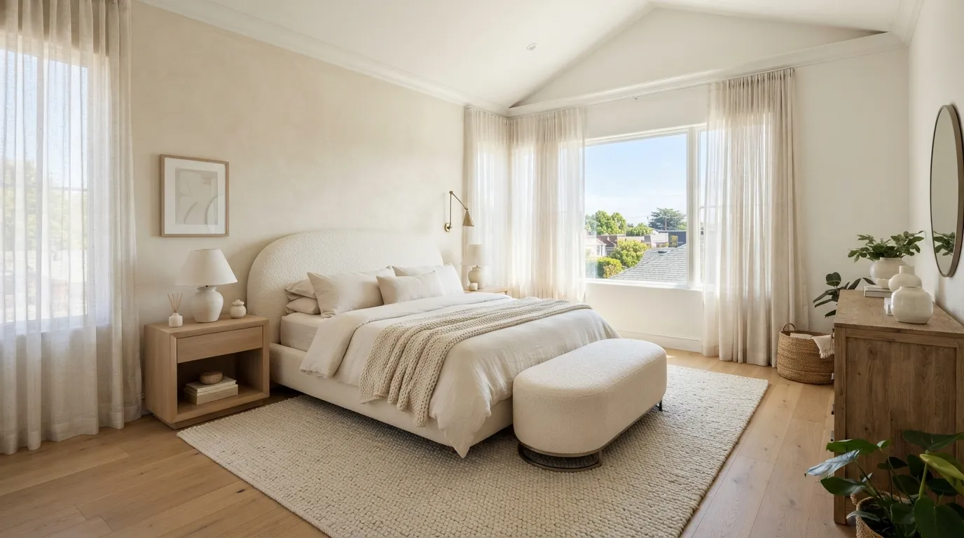
Warm white proves that a luxe bedroom does not need a bold color to make an impression. The difference comes from layering undertones and textures so the eye can distinguish each surface even within a restrained palette. If you want the safest starting point, this is an easy foundation to refresh later with seasonal accents.
In the End
Use undertones carefully, especially with greige, warm white, and soft blue, because nearby flooring and natural light can change how colors appear.
If you try only one update, start with the wall behind the bed and balance it with lighter bedding plus contrasting natural textures.
Olivia Carter
Olivia Carter is the founder of Lady Home Decor and a passionate home decor expert. She shares practical, stylish ideas to help homeowners create beautiful, comfortable, and welcoming spaces. Her expertise covers bedrooms, kitchens, living rooms, bathrooms, and small-space decorating.