18 Moody Home Color Scheme Ideas for a Cozy Modern Look

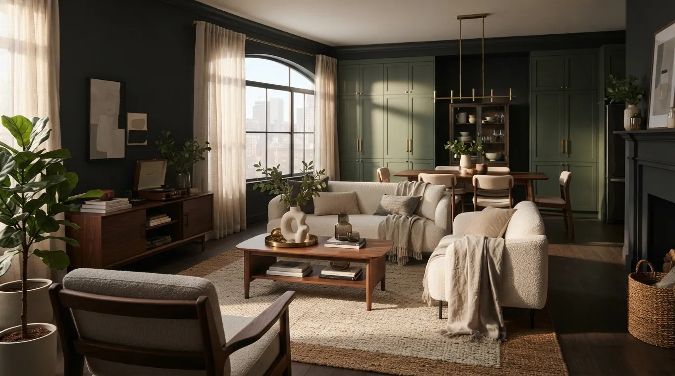
These moody home color scheme ideas show how deep shades can create a cozy, modern home without feeling too dark. From charcoal and forest green to plum and rust, you’ll find balanced color pairings that add warmth and personality. Explore the ideas below to find a palette that fits your space and style.
1. Charcoal and Cream
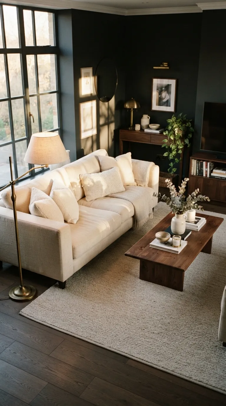
This pairing is a reliable starting point when you want a dramatic room that still feels comfortable. I’ve noticed that warm cream works especially well against charcoal because it reflects enough light to keep darker walls from visually shrinking the space.
2. Forest Green and Walnut
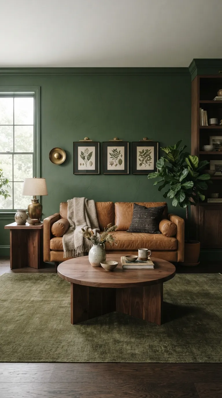
Forest green becomes especially inviting when it is surrounded by warm wood rather than cool gray furniture. The walnut tones keep the room from feeling overly saturated, while the caramel sofa gives the eye a natural resting point.
3. Navy and Warm Beige
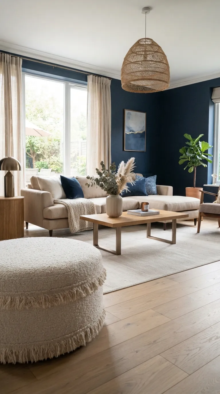
Navy and beige work beautifully when you want a moody palette with a slightly coastal-modern edge. The key is choosing a beige with warm yellow or taupe undertones; very cool beige can make navy walls look harsher.
4. Plum and Soft Taupe
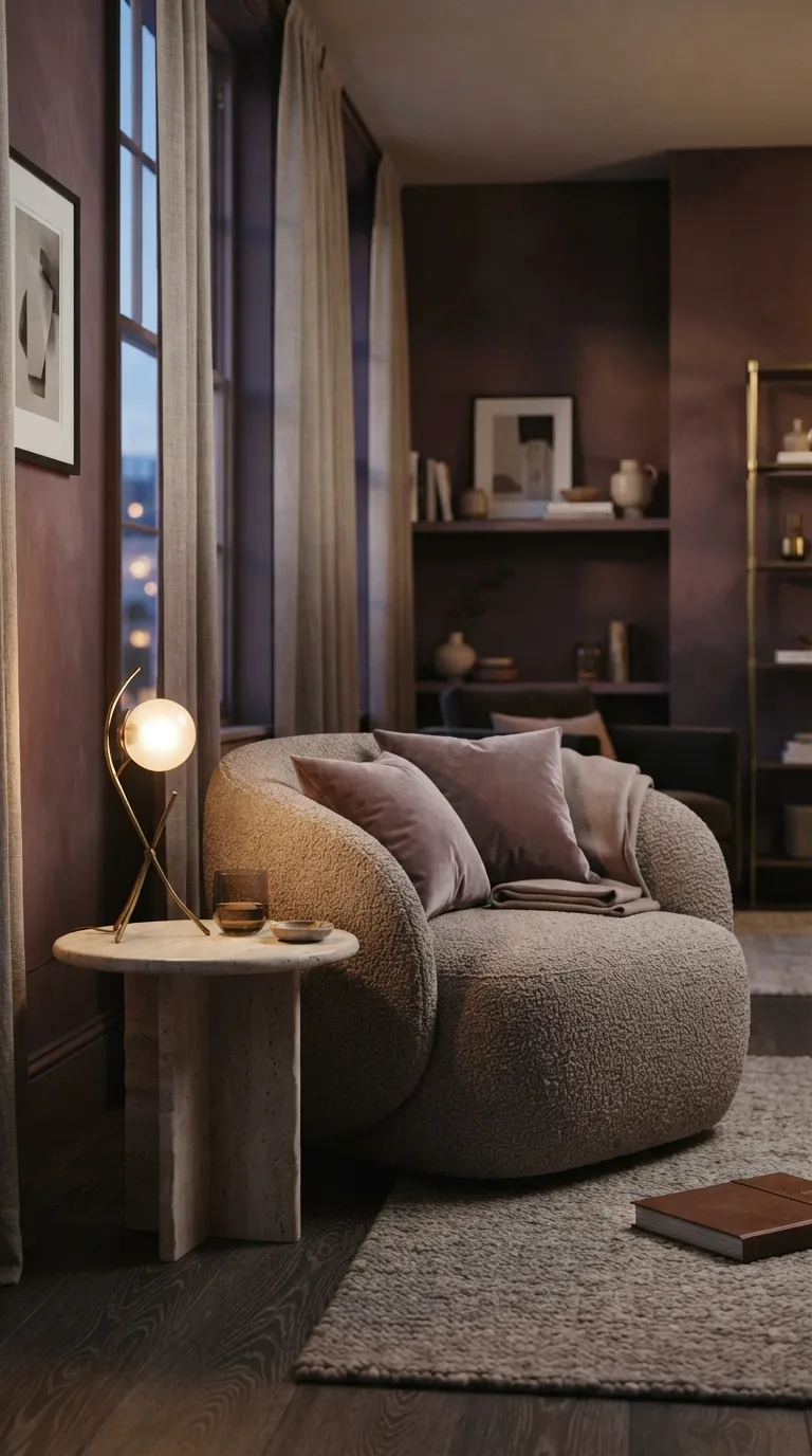
Plum works surprisingly well in modern interiors when the surrounding neutrals are soft rather than stark. I’ve seen this kind of palette feel especially polished in rooms with layered textiles, because the tactile surfaces stop the darker color from looking one-dimensional.
5. Black and Warm Oak
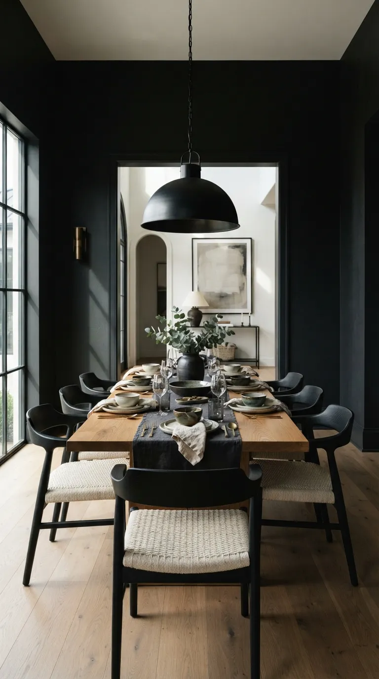
Black becomes much easier to live with when a room has enough natural wood to break up the darkness. For dining spaces, I’ve noticed that keeping the tabletop natural rather than painted creates a warmer visual center and makes everyday styling feel effortless.
6. Olive and Terracotta
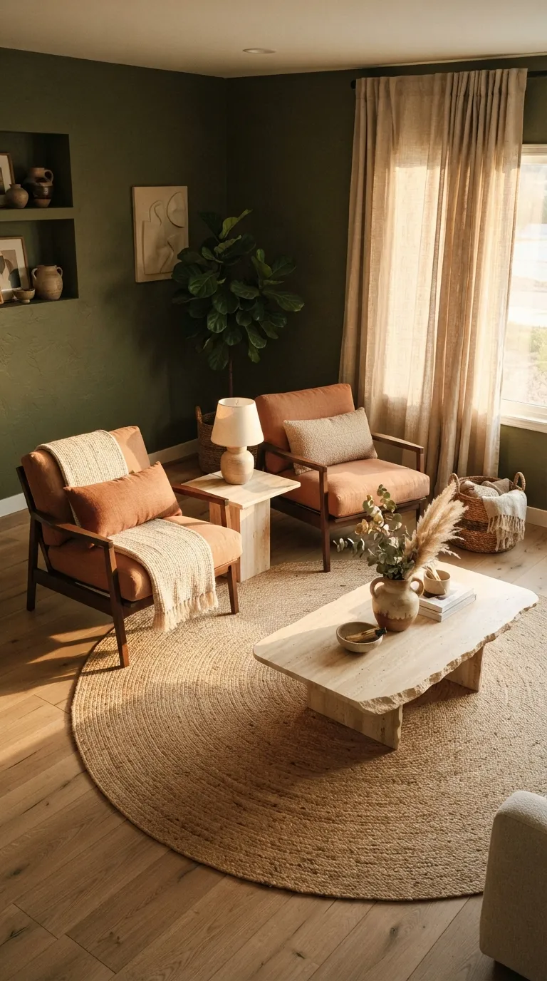
Olive and terracotta give a darker room an earthy character without depending on traditional brown tones. The trick is letting the terracotta appear selectively, while pale stone and woven textures create enough contrast to keep the palette breathable.
You might also get value from Home Color Palette Ideas.
7. Chocolate Brown and Ivory
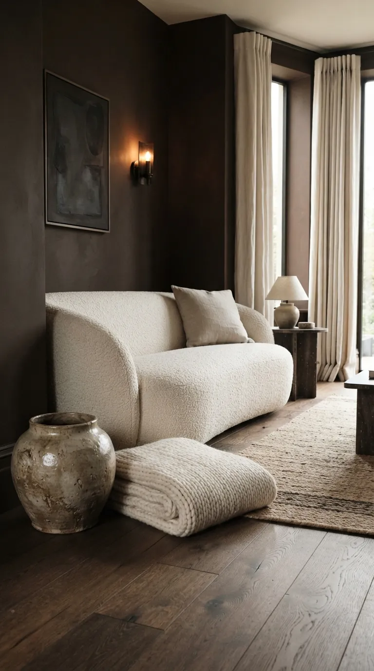
Chocolate brown has a naturally enveloping quality that makes a modern room feel more settled and intimate. I’ve noticed it looks particularly rich beside ivory because the contrast is strong enough to define the furniture without making the space feel high-contrast.
8. Slate Blue and Cognac
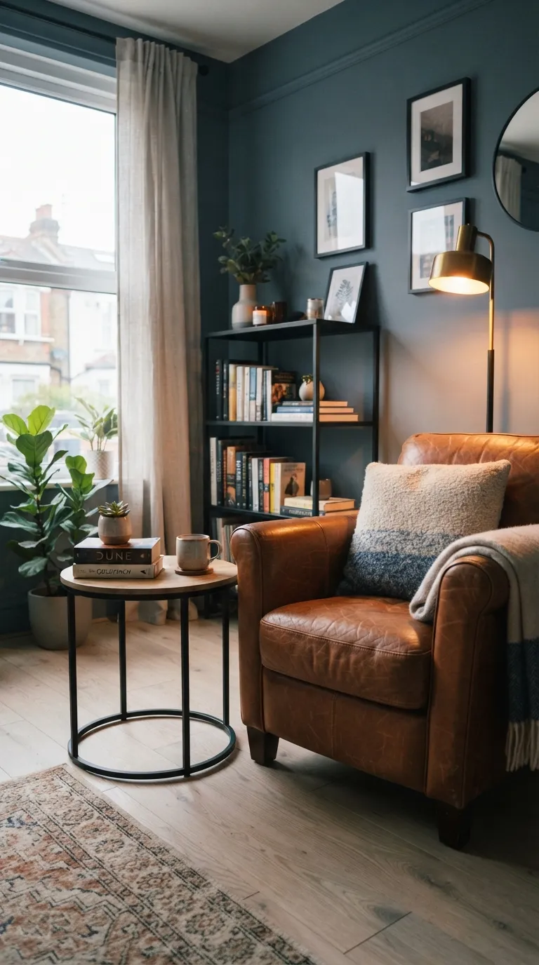
Slate blue is a smart choice when you want the drama of a dark wall without going fully neutral. The cognac accent gives the room a lived-in quality, while the pale floor creates a visual break between the deep walls and furniture.
9. Deep Teal and Sand
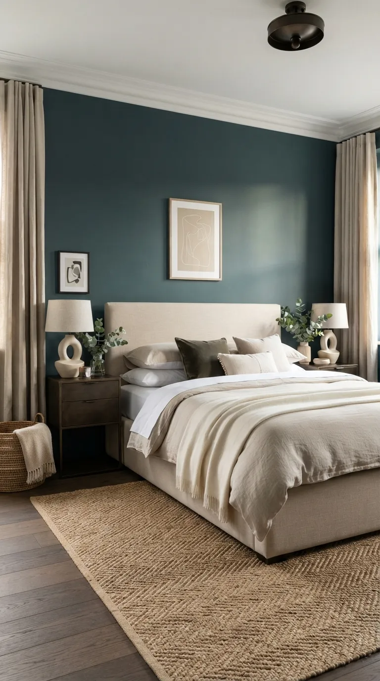
Deep teal can make a bedroom feel cocooning without becoming visually dull. The sand tones are important because they reflect daylight across the room, while the woven details add texture that keeps the darker palette from feeling too polished or flat.
10. Burgundy and Greige
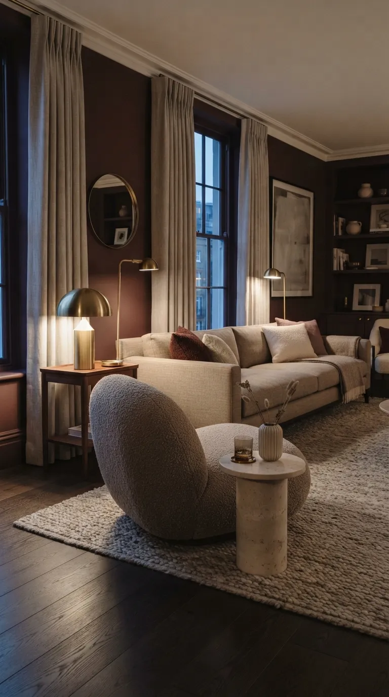
Burgundy works best when it feels softened rather than saturated. Pairing it with greige creates enough restraint for the deeper shade to become a sophisticated architectural feature instead of overwhelming the room.
11. Charcoal and Sage
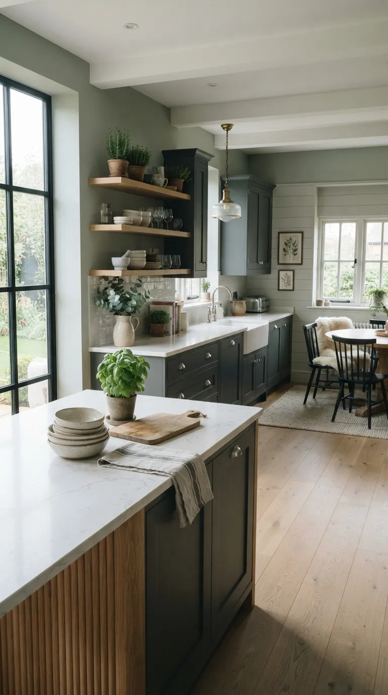
A dark kitchen does not have to feel gloomy. The sage walls soften the charcoal cabinetry, while the pale countertop provides a practical reflective surface that helps distribute available daylight throughout the workspace.
12. Espresso and Dusty Rose
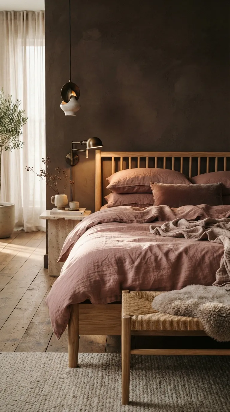
Espresso and dusty rose create a surprisingly grown-up combination when both colors have muted undertones. In my experience, natural oak is the useful middle layer here it stops the dark walls and soft bedding from feeling like two separate color stories.
13. Midnight Blue and Camel
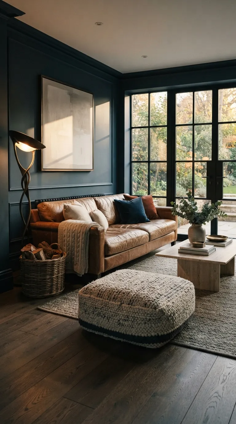
Midnight blue and camel deliver a polished look that still feels comfortable enough for everyday family spaces. The leather’s natural variation adds character, while the deep wall color makes lighter accessories and artwork stand out more clearly.
14. Moss Green and Black
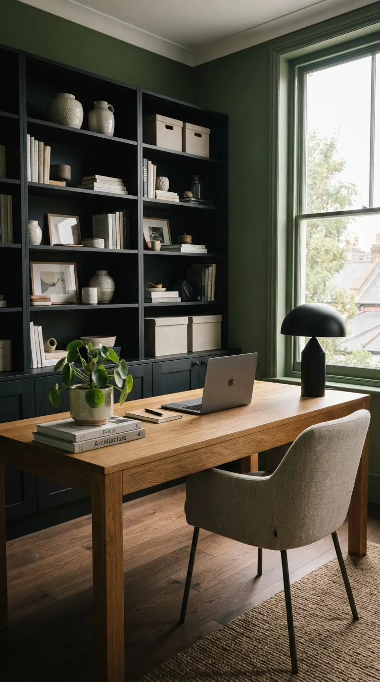
Moss green is a useful choice for a workspace because it feels visually grounded without being as severe as charcoal or black. Pairing it with black shelving defines the room’s structure, while oak keeps the overall composition approachable.
15. Aubergine and Warm White
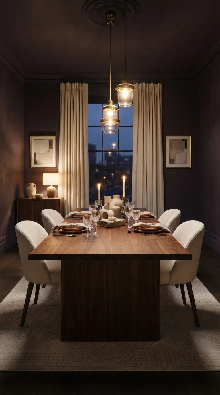
Aubergine becomes much more modern when it is paired with warm white rather than cool gray. The contrast gives the dining area definition, while walnut and brass add enough depth to make the palette feel intentionally layered.
16. Deep Rust and Cream
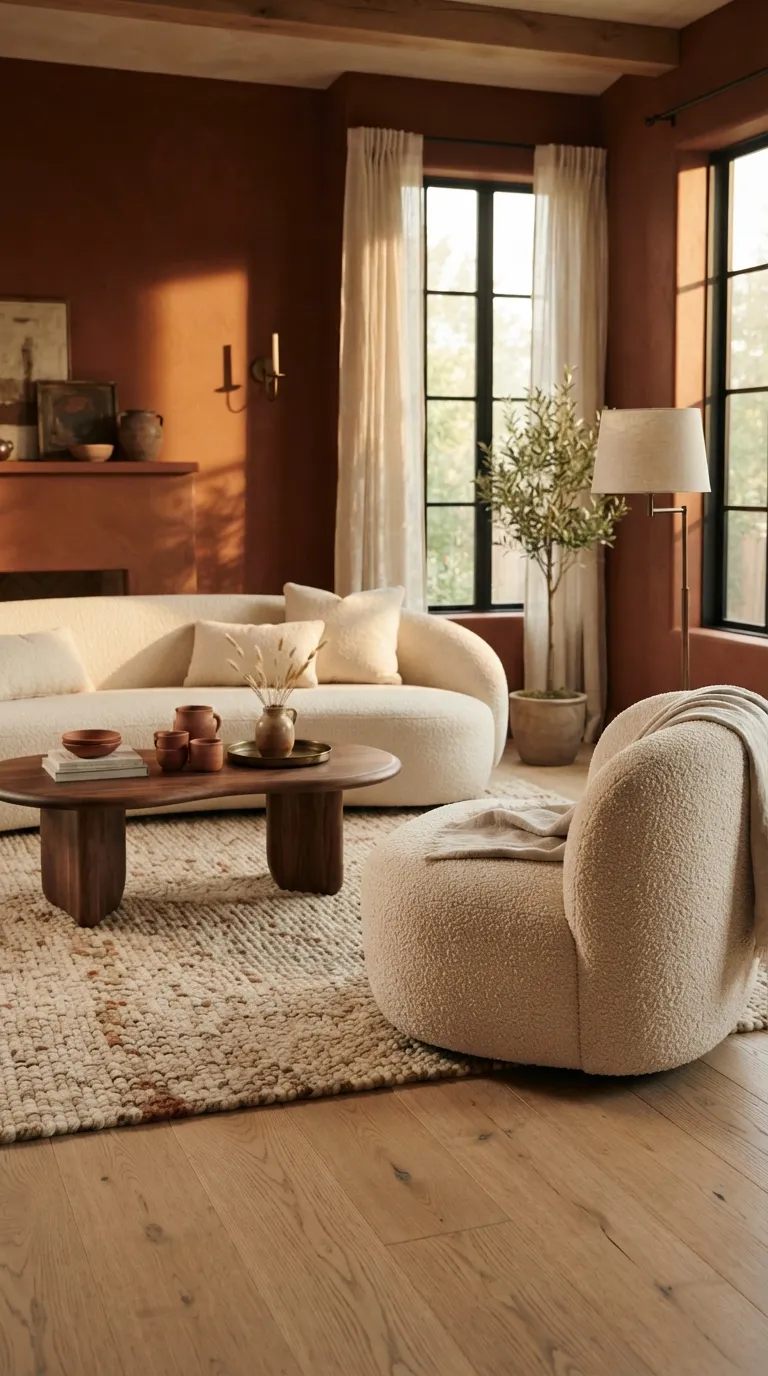
Deep rust is ideal when you want a cozy room with more personality than a standard neutral palette. The cream upholstery keeps the color approachable, while pale wood stops the warmer tones from visually crowding the space.
17. Ink Gray and Mustard
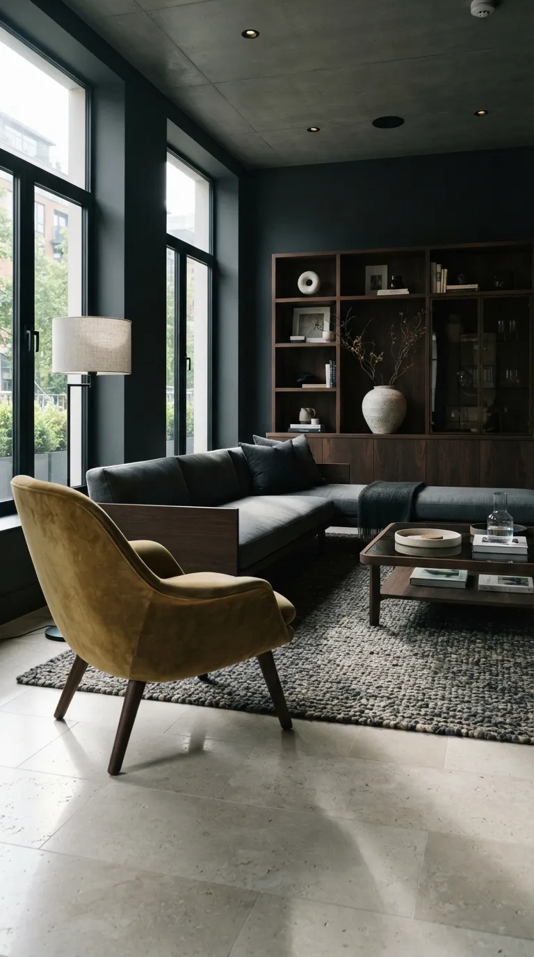
A small dose of mustard can completely change the energy of an ink-gray room. Instead of spreading the accent across multiple accessories, use one substantial piece such as a chair or ottoman so the color feels deliberate and easy to control.
18. Blackened Green and Linen
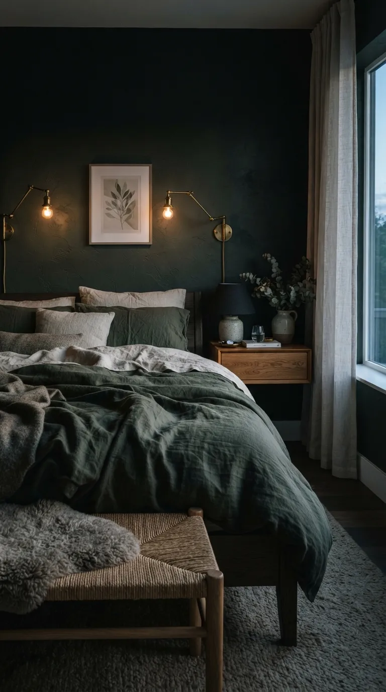
Blackened green is one of the easiest ways to make a modern bedroom feel atmospheric without relying on plain charcoal. The linen and oak introduce lighter natural textures, while layered bedside lighting keeps the deep walls from feeling flat after sunset.
Bringing It All Together
Pair dark walls with warm woods, soft neutrals, or natural stone to keep a moody palette balanced and inviting. If you’re unsure where to start, try charcoal and cream for an easy combination that works across many rooms.
Emma Williams
Emma Williams is an interior design expert and decor editor at Lady Home Decor. She specializes in modern, cozy, and functional home styling, helping readers discover inspiring decorating ideas that are easy to recreate. Her work focuses on timeless design, practical solutions, and the latest home decor trends.