21 Amazing Home Wall Colors Ideas for a Fresh Look

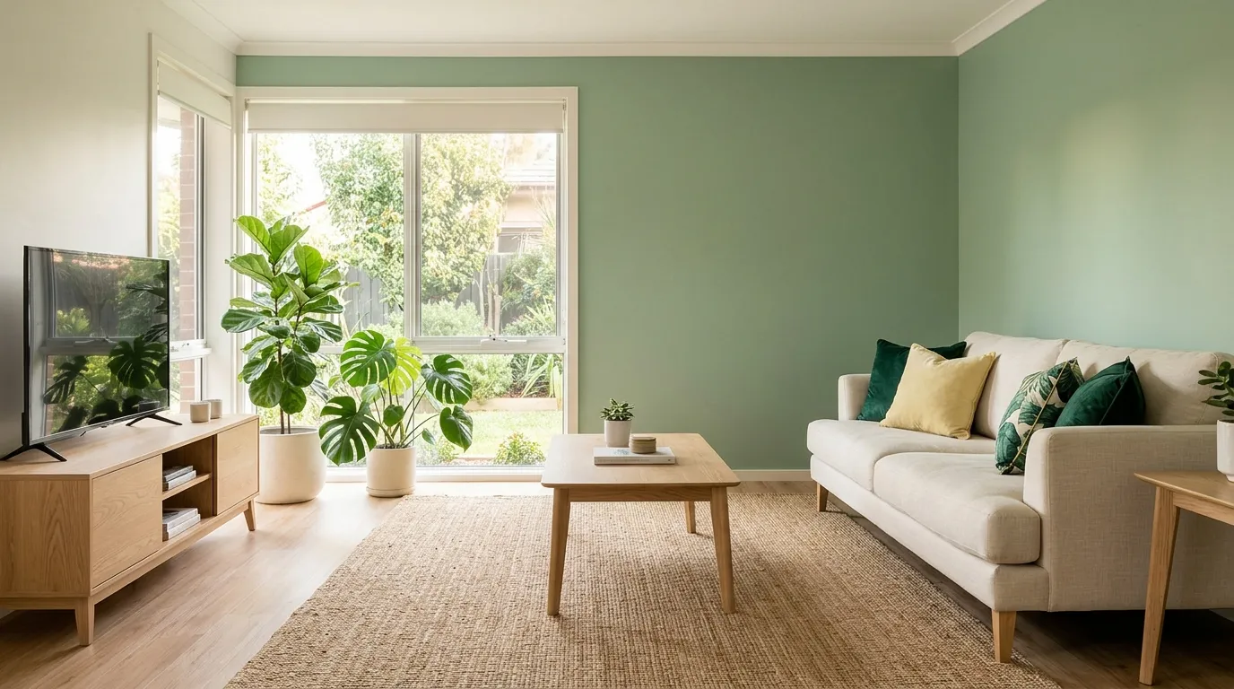
Ready to give your home a completely fresh look without a major renovation? These home wall colors ideas can instantly transform ordinary rooms into stylish, inviting spaces that feel modern and luxurious.
The right paint color does more than change a wall it changes the entire mood of a room. Whether you’re looking to brighten a dark corner, create a cozy retreat, or add a designer-inspired touch, choosing the perfect shade can make a dramatic difference. In my experience, paint is one of the easiest and most affordable ways to refresh a space while creating a high-end look. In this collection, you’ll discover beautiful color inspirations ranging from soft neutrals to bold statement tones, helping you find the perfect style for every room in your home.
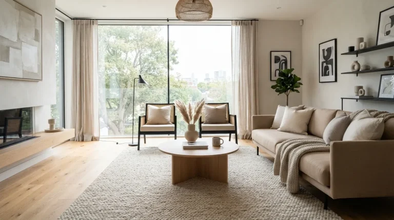
1. Warm Cashmere Beige
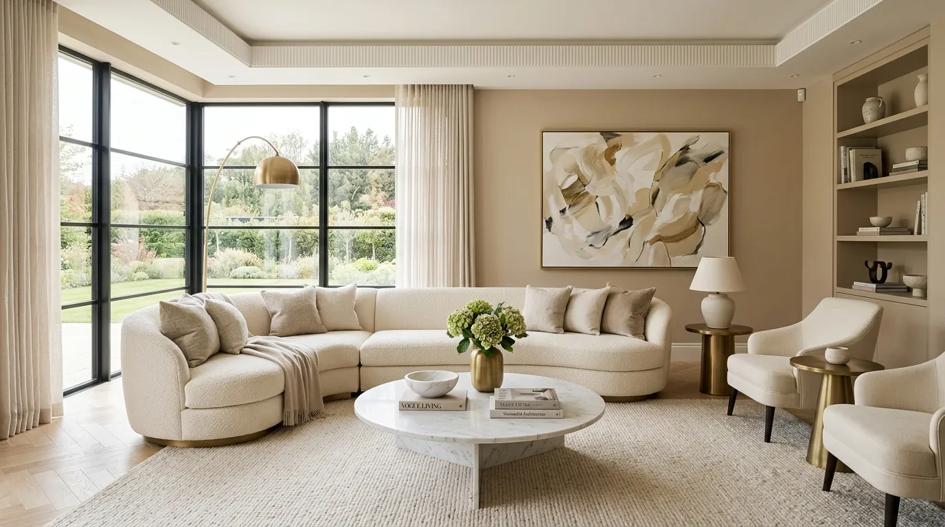
Nothing transforms a space faster than a rich neutral shade that feels both elegant and welcoming. Warm cashmere beige brings a refined softness that instantly upgrades living rooms, bedrooms, and open-concept spaces. Unlike basic beige tones, this elevated color has subtle depth that changes beautifully throughout the day. Morning light highlights its creamy warmth, while evening lighting creates a cozy glow. That’s why many designers recommend it for homeowners seeking a sophisticated look that remains timeless and adaptable as trends evolve.
The beauty of this color lies in its versatility and ability to support luxurious design details. Marble surfaces, brass fixtures, black accents, and textured fabrics all stand out against this calming backdrop. In my experience, rooms painted in warm cashmere tones often appear larger and more polished without feeling cold. The result is a balanced environment that feels expensive yet comfortable enough for daily living. This approach works especially well for anyone exploring fresh home wall colors ideas that combine style, comfort, and long-term appeal.
2. Smoky Taupe Elegance
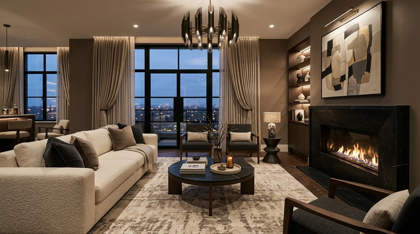
A deeper neutral can create remarkable visual impact without overwhelming the room. Smoky taupe introduces richness and character while maintaining a calm, sophisticated feel. This shade works especially well in spaces that receive plenty of natural light because it adds contrast and dimension. The subtle blend of gray and brown undertones makes it highly adaptable across different decorating styles. Whether paired with sleek contemporary furniture or warmer organic materials, it creates a polished setting that feels intentional and thoughtfully designed.
Many luxury interiors rely on layered neutrals rather than bold colors, and smoky taupe demonstrates why that strategy works so well. The color provides enough depth to create visual interest while still allowing furniture, artwork, and architectural details to shine. I’ve noticed this work particularly well in larger rooms that need added warmth and structure. The finished look feels curated, balanced, and upscale. Homeowners looking for current interior color inspiration often find this shade delivers both elegance and everyday practicality.
3. Soft Mushroom Gray
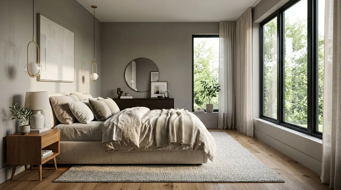
Some shades instantly create a sense of calm, and soft mushroom gray is one of them. This contemporary color sits between warm gray and earthy beige, offering a refined alternative to traditional neutrals. It adds subtle character while remaining understated enough for long-term use. Bedrooms, reading spaces, and living areas benefit from its soothing appearance. The color also responds beautifully to changing light conditions, creating gentle variations that keep the room visually interesting without becoming distracting or overpowering.
Designers frequently use mushroom-inspired tones because they bridge the gap between modern and timeless aesthetics. Layered with natural wood, soft textiles, and warm lighting, the result feels welcoming and effortlessly elegant. I’ve seen this work well in both compact apartments and spacious homes because the color creates balance rather than dominating the room. For homeowners searching for updated home wall colors ideas, this shade offers a fresh yet practical solution that supports many decorating styles while maintaining a clean, luxurious appearance.
4. Ivory Sand Glow
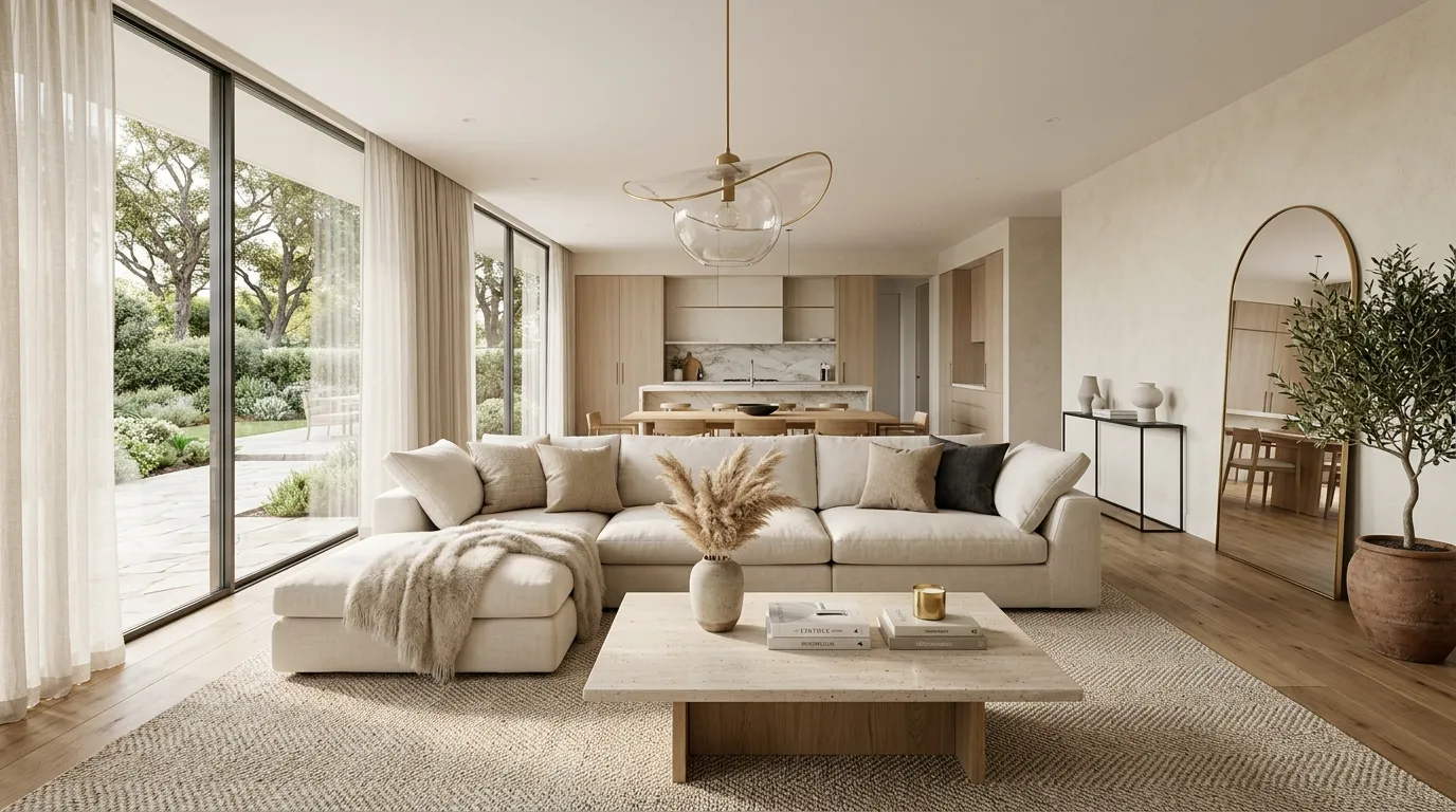
Few paint shades create instant brightness while still feeling warm and inviting. Ivory sand delivers that perfect balance by combining creamy undertones with subtle beige warmth. The result is a color that reflects light beautifully and creates an airy environment throughout the home. Unlike stark white walls that can sometimes feel sterile, this softer tone introduces comfort and elegance. It works particularly well in living rooms, dining spaces, and entryways where a welcoming first impression matters most.
This color also provides incredible flexibility when decorating. Furniture, artwork, and accent pieces become more noticeable because the walls create a calm visual backdrop. That’s why many designers recommend ivory-based neutrals for homeowners who frequently update their décor. I’ve noticed rooms painted in this shade often appear more expensive simply because the color enhances natural light and architectural details. Combined with layered textures and modern furnishings, it creates a polished interior that feels fresh, luxurious, and effortlessly timeless.
5. Charcoal Accent Walls
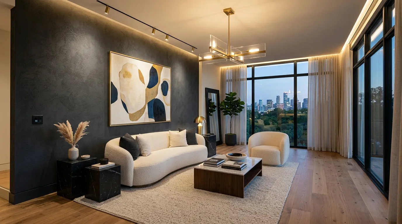
A bold accent wall can completely transform an ordinary room into a memorable space. Charcoal gray delivers powerful contrast while maintaining a sophisticated and modern appearance. Rather than overwhelming the room, a single dark feature wall creates depth that draws the eye naturally. This approach works especially well behind sofas, fireplaces, beds, or dining areas where visual focus is needed. The rich tone adds character while helping lighter furnishings stand out with greater impact.
Luxury interiors often rely on contrast to create visual interest, and charcoal is one of the most effective ways to achieve it. Paired with soft neutrals, natural wood, or metallic finishes, the result feels balanced and refined. In my experience, homeowners are often surprised by how elegant a darker wall can look when surrounded by lighter elements. The dramatic effect creates dimension and sophistication without requiring major design changes, making it an excellent upgrade for contemporary homes.
6. Sage Mist Tones
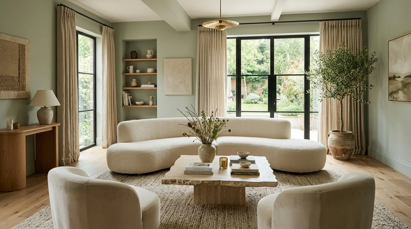
Nature-inspired shades continue to dominate luxury interiors, and sage mist remains one of the most versatile choices available. This gentle green-gray tone introduces color in a subtle and sophisticated way. The shade feels calming while still offering enough personality to refresh a room. Natural materials such as wood, linen, stone, and woven textures pair beautifully with it, creating a balanced environment that feels modern yet connected to nature.
One reason this color remains popular is its ability to feel both current and timeless. It brings softness to contemporary spaces while maintaining a refined appearance that won’t quickly feel dated. I’ve seen this work well in living rooms, bedrooms, and home offices where a peaceful atmosphere is important. The gentle green undertones create visual freshness that helps spaces feel more relaxing and inviting. For homeowners seeking updated home wall colors ideas, sage mist offers a stylish and highly livable option.
7. Mocha Luxe Walls
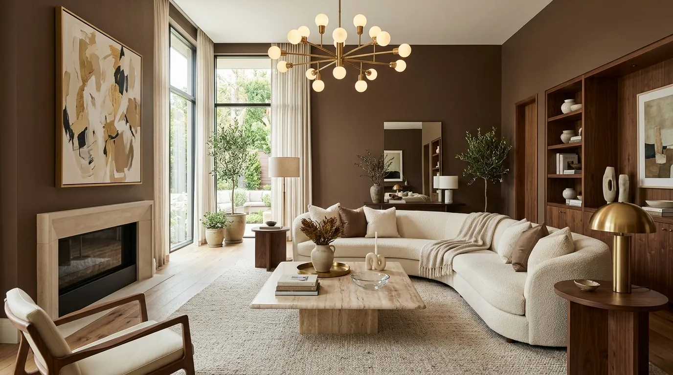
Rich earthy tones are making a strong comeback in luxury interior design, and mocha brown is leading the trend. This sophisticated shade introduces warmth and depth while creating an atmosphere that feels both refined and welcoming. Unlike darker colors that can sometimes feel heavy, mocha carries enough warmth to maintain comfort and balance. It works especially well in living rooms and entertaining spaces where a cozy yet elevated mood is desired. The color naturally adds character, making interiors feel more layered and thoughtfully designed.
One of the biggest advantages of mocha walls is how beautifully they complement lighter furniture and premium materials. Cream upholstery, brass accents, marble surfaces, and warm woods all gain greater visual impact against this rich backdrop. I’ve noticed this combination often creates the luxurious look people admire in designer homes and boutique hotels. The contrast feels intentional without becoming overwhelming. When paired with soft lighting and textured fabrics, mocha tones deliver a timeless sense of elegance that remains stylish year after year.
8. Pale Clay Neutrals
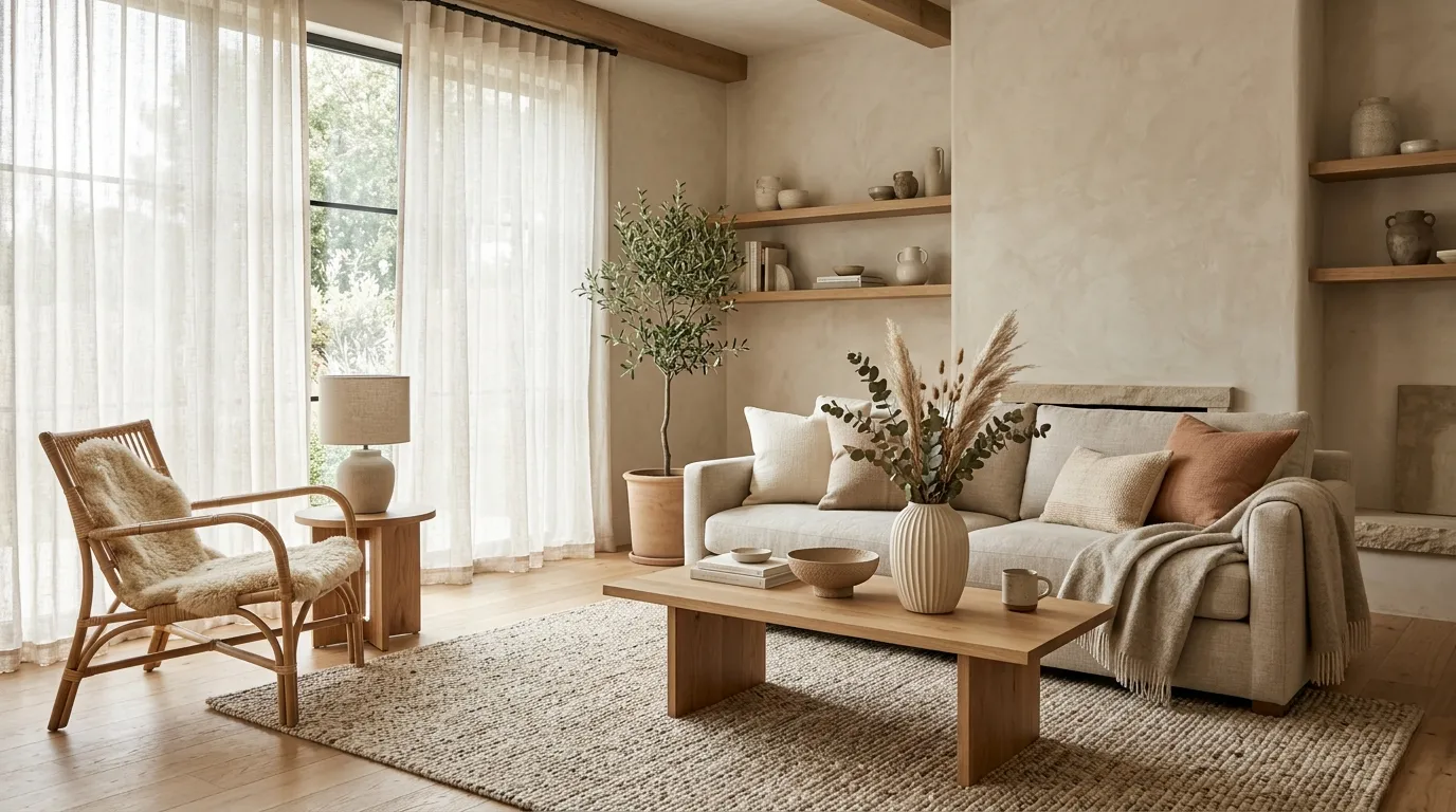
Some colors instantly make a home feel more inviting, and pale clay is one of those rare shades. Inspired by natural earth tones, it brings gentle warmth while remaining light and versatile. The soft undertones help create a relaxed atmosphere that feels comfortable throughout the year. Unlike cooler neutrals, pale clay introduces a subtle sense of coziness that works beautifully in modern homes. Its understated appearance allows furniture, lighting, and decorative details to remain the visual focus.
This shade has become increasingly popular because it bridges the gap between traditional beige and contemporary neutrals. The color feels current without chasing short-lived trends. That’s why many designers recommend clay-inspired tones for homeowners who want a timeless update. Layered with wood, linen, stone, and handcrafted décor, the result feels organic and sophisticated. The warmth of the walls creates a welcoming foundation that enhances both minimalist interiors and more richly styled spaces with equal success.
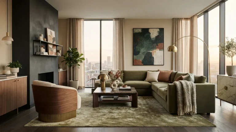
9. Deep Olive Elegance
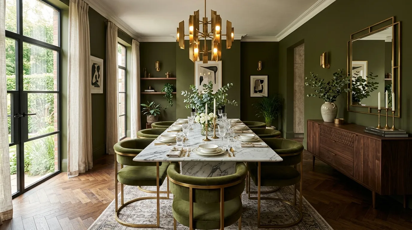
A dramatic color choice can completely elevate the character of a room when used thoughtfully. Deep olive green delivers richness and sophistication while maintaining a strong connection to nature. The color feels luxurious without appearing flashy, making it ideal for homeowners who want something distinctive yet timeless. Large living rooms, dining spaces, and reading areas benefit especially from its depth. The earthy undertones help the room feel grounded while adding a layer of visual interest that lighter colors cannot achieve.
Luxury interiors frequently incorporate deeper shades because they create contrast, mood, and architectural emphasis. Deep olive works particularly well alongside walnut wood, brass finishes, marble accents, and warm lighting. In my experience, this color often surprises people with how versatile it becomes once furniture and décor are added. Rather than making a room feel smaller, it creates a cocooning atmosphere that feels elegant and inviting. Carefully balanced with lighter elements, it delivers a refined look that feels modern and enduring.
10. Pearl White Layers
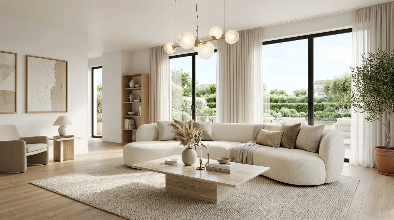
A beautifully layered white interior never goes out of style, especially when the shade has subtle warmth and depth. Pearl white offers a softer alternative to stark bright white, creating a refined atmosphere that feels clean without appearing cold. The gentle undertones help reflect natural light while maintaining warmth and comfort. This makes the color especially effective in open-concept layouts and smaller rooms that benefit from a brighter appearance. The result is an interior that feels airy, elegant, and effortlessly sophisticated.
The secret to making pearl white look luxurious lies in layering textures and materials throughout the room. Linen fabrics, natural woods, stone surfaces, and sculptural lighting all stand out beautifully against this understated backdrop. I’ve seen this work well in homes where owners want flexibility for future decorating updates. Because the color remains neutral yet refined, it adapts easily to changing furniture and seasonal accents. The overall effect feels polished, spacious, and remarkably timeless without requiring bold design choices.
11. Dusty Blue Serenity
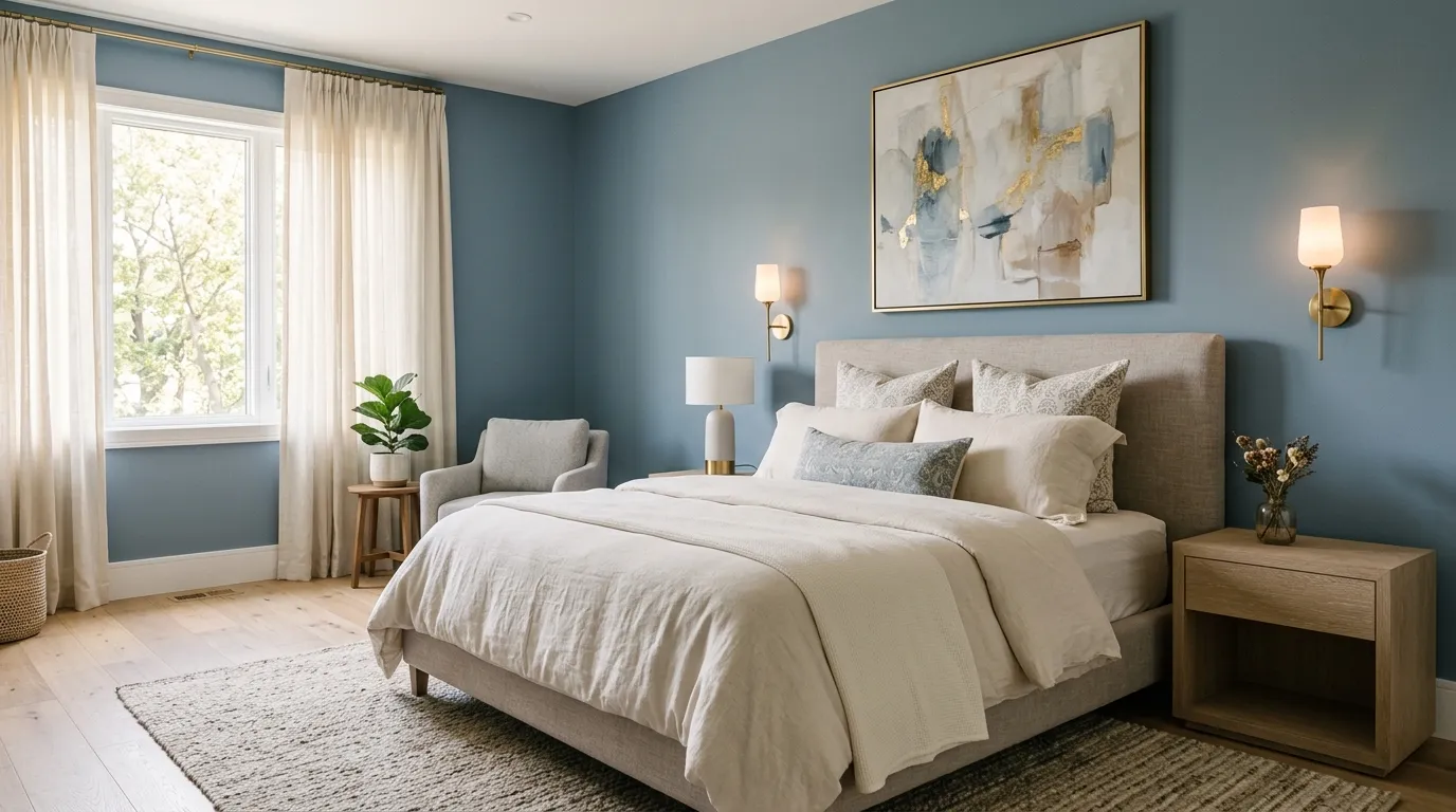
Some shades instantly create a feeling of relaxation, and dusty blue is one of the most effective choices for that purpose. Its muted appearance feels sophisticated rather than overly colorful, making it suitable for modern interiors seeking subtle personality. The gentle blue undertones bring freshness while maintaining a calm and balanced environment. Bedrooms, reading corners, and quiet living spaces especially benefit from its soothing presence. The shade creates visual interest while remaining soft enough to support a restful atmosphere.
What makes dusty blue particularly appealing is its ability to complement both warm and cool design elements. Brass lighting, cream upholstery, oak furniture, and natural fabrics all work beautifully alongside this color. That’s why many designers recommend it for homeowners looking to introduce color without sacrificing elegance. The finished result feels refined and welcoming rather than trendy. When paired with layered textures and thoughtful lighting, dusty blue creates a space that feels effortlessly comfortable and visually polished.
12. Stone Gray Balance
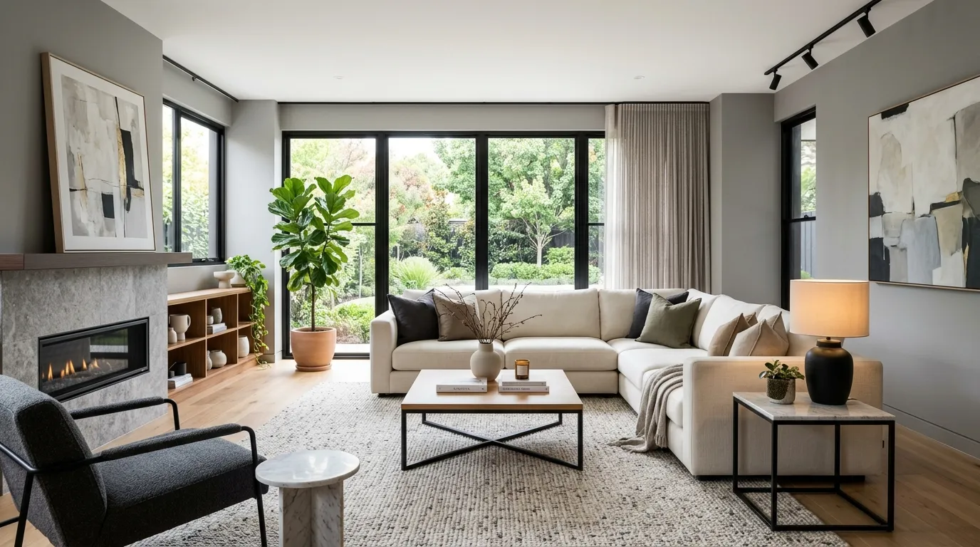
Finding a color that feels modern, timeless, and highly versatile can be challenging, but stone gray achieves all three. This balanced neutral sits comfortably between warmer and cooler shades, making it adaptable across many interior styles. The color introduces enough depth to create visual interest while remaining understated and elegant. Living rooms, hallways, and open-plan spaces particularly benefit from its refined appearance. Its flexibility allows homeowners to update furnishings and accessories without worrying about major color conflicts.
One reason stone gray continues to remain popular is its ability to enhance surrounding materials. Natural wood tones appear richer, metallic accents feel more defined, and textured fabrics gain additional visual appeal. In my experience, this shade works especially well in contemporary homes where a clean and organized aesthetic is desired. It creates a sophisticated backdrop that never competes with furniture or artwork. For anyone exploring premium home wall colors ideas, stone gray remains a practical and stylish choice.
13. Champagne Beige Glow
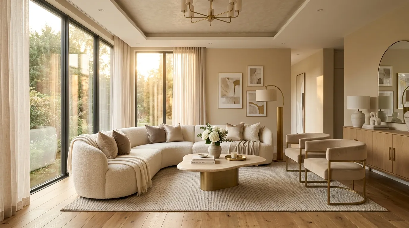
Some colors instantly make a room feel more refined, and champagne beige is a perfect example. This elevated neutral combines warmth with sophistication, creating an atmosphere that feels both luxurious and approachable. The gentle undertones catch light beautifully throughout the day, helping rooms feel brighter and more welcoming. Unlike traditional beige shades that can sometimes appear flat, champagne beige offers subtle depth and richness. It creates an ideal backdrop for contemporary interiors while maintaining enough softness to feel comfortable and relaxed.
The versatility of this shade is one of its greatest strengths. It complements everything from modern furniture to classic decorative pieces without losing its elegant character. I’ve noticed that spaces painted in champagne-inspired tones often feel more polished because the color enhances surrounding textures and finishes. Gold lighting, marble surfaces, and layered fabrics appear even more sophisticated against this backdrop. The overall effect is calm, balanced, and effortlessly luxurious, making it a favorite choice for high-end residential interiors.
14. Forest Green Drama
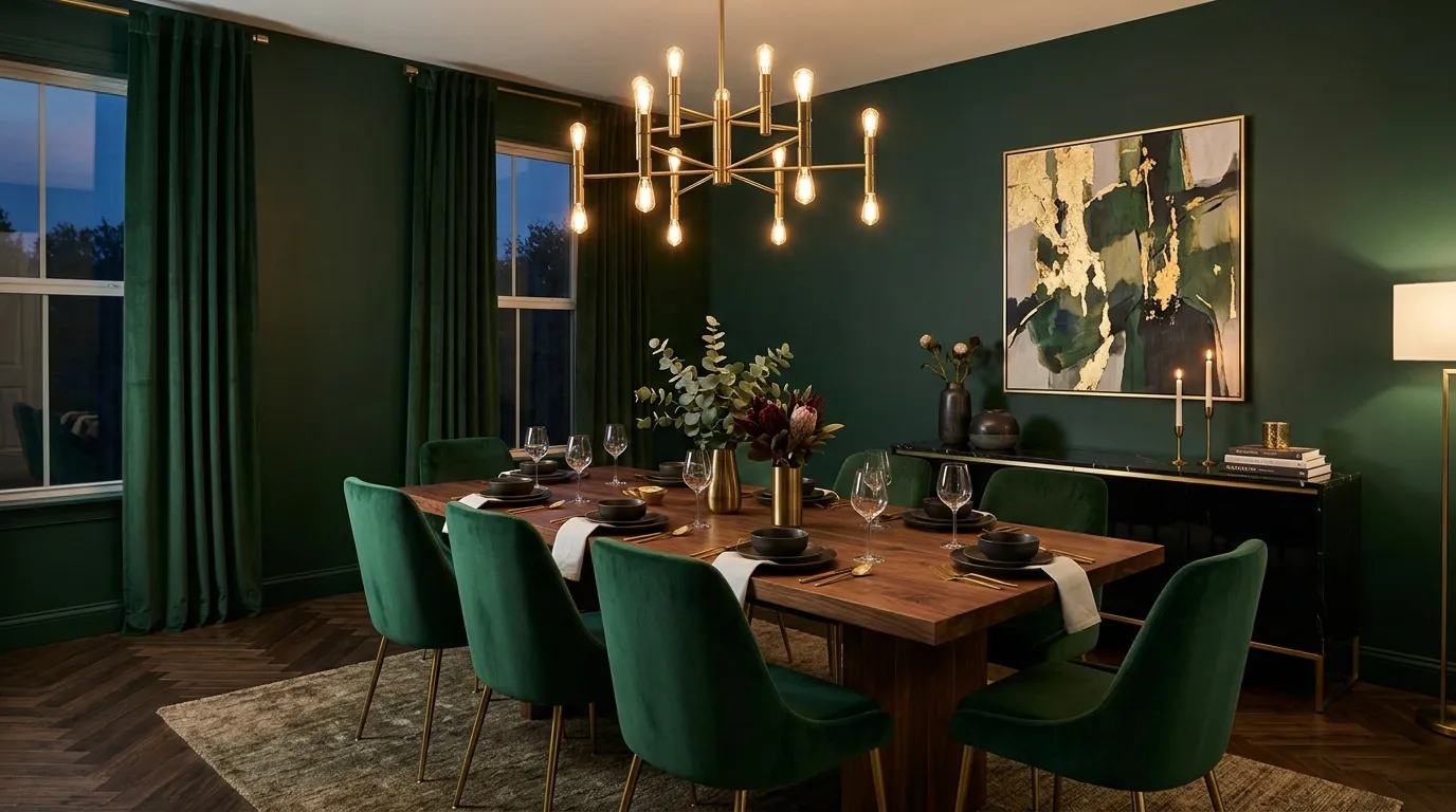
Bold color choices often create the most memorable interiors, and forest green delivers exceptional visual impact. This rich shade introduces depth and personality while maintaining an elegant, timeless appearance. The connection to nature helps the color feel grounded rather than overwhelming. Dining rooms, libraries, and statement living spaces benefit particularly well from its dramatic character. The shade creates a luxurious backdrop that highlights furniture, artwork, and architectural features while adding a sense of sophistication and warmth.
Luxury designers frequently use deeper greens because they offer both richness and versatility. Forest green pairs beautifully with brass fixtures, walnut furniture, marble surfaces, and textured fabrics. I’ve seen this work remarkably well in homes where owners want something distinctive without relying on trendy colors. The result feels bold yet refined, creating a room that stands out while remaining highly livable. Balanced with lighter furnishings and warm lighting, the color delivers a dramatic look that feels elegant rather than excessive.
15. Warm Terracotta Wash
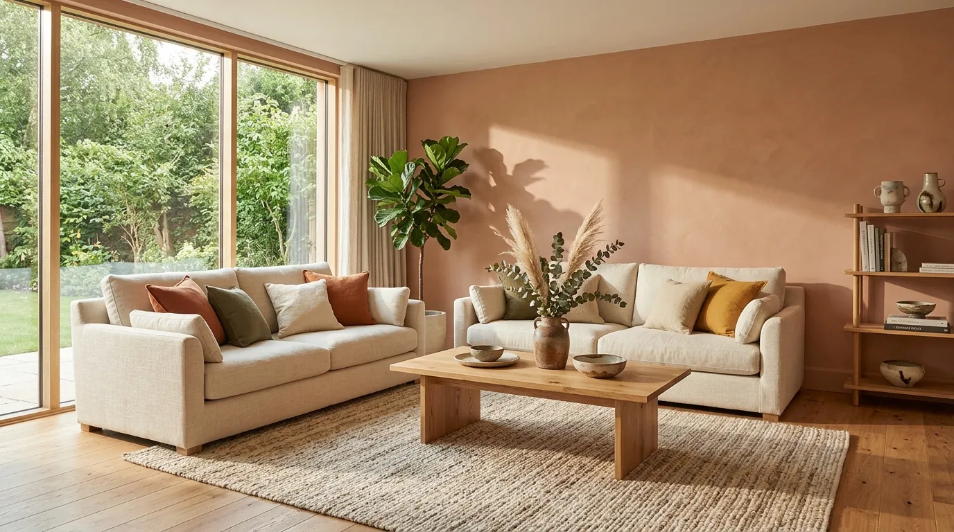
Earth-inspired colors continue to influence luxury interiors, and warm terracotta remains one of the most stylish options available. This refined version of traditional clay tones introduces warmth while maintaining a sophisticated appearance. The soft earthy character helps spaces feel inviting and relaxed without becoming overly colorful. Living rooms, dining spaces, and creative areas particularly benefit from its welcoming presence. The color creates visual interest while offering enough versatility to work with many decorating styles.
One reason terracotta has remained popular is its ability to bring personality into a room without dominating the design. Combined with natural wood, stone textures, linen fabrics, and contemporary furnishings, the result feels fresh and modern. That’s why many designers recommend earthy shades when creating interiors that feel both current and timeless. The warmth encourages a cozy atmosphere while still supporting clean lines and elegant décor. Properly styled, terracotta creates spaces that feel comfortable, sophisticated, and visually memorable.
16. Midnight Navy Accent
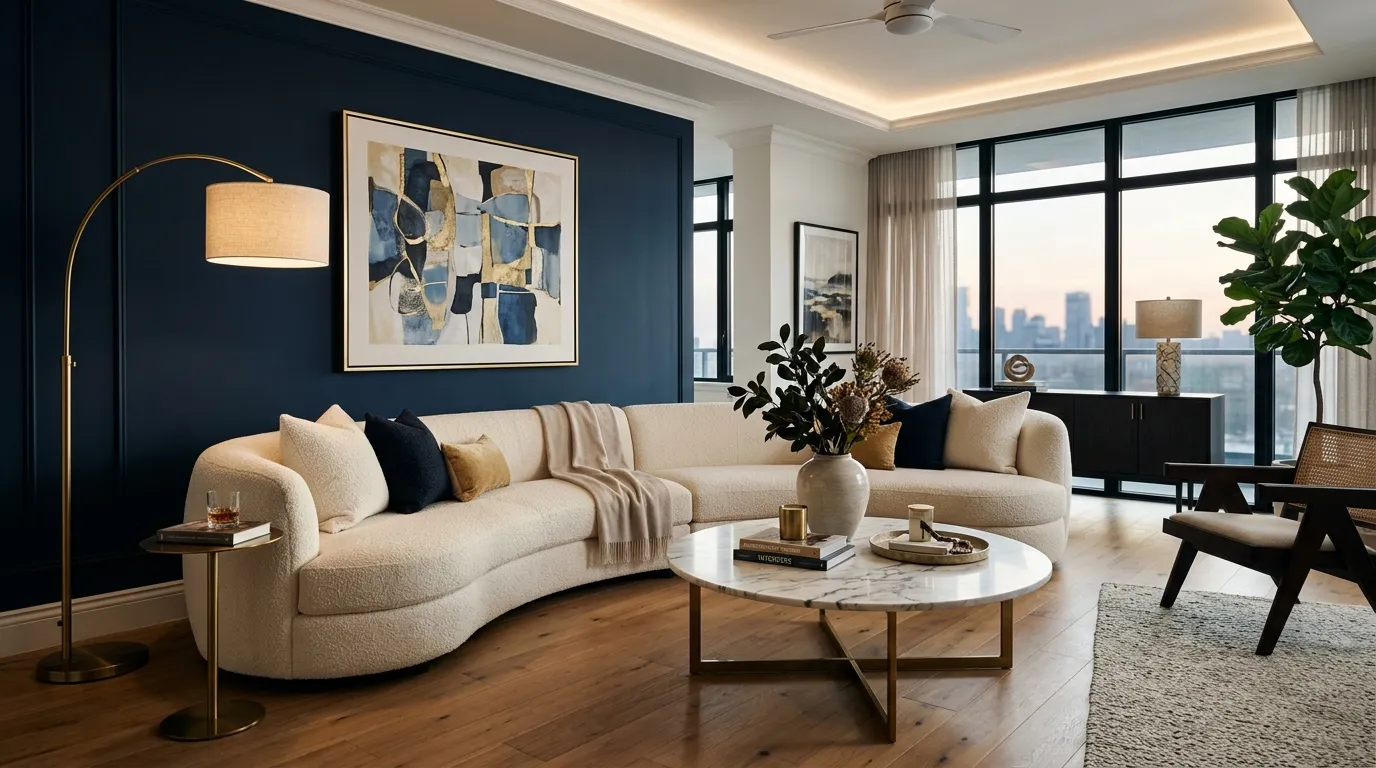
A rich navy wall can instantly elevate a room and create a sense of refined luxury. Midnight navy offers depth and drama while maintaining a polished appearance that feels timeless rather than trendy. The color provides strong contrast against lighter furnishings, helping architectural details and decorative accents stand out beautifully. Living rooms, bedrooms, and home offices all benefit from its sophisticated presence. The result is a space that feels intentional, stylish, and visually balanced without becoming overly dark or overwhelming.
One of the reasons designers continue to favor navy tones is their versatility. The shade pairs effortlessly with brass, marble, warm woods, and soft neutral fabrics. In my experience, a navy feature wall often delivers the same dramatic impact as black while feeling softer and more welcoming. Natural light enhances the richness of the color during the day, while evening lighting creates a cozy atmosphere. This combination makes midnight navy a reliable choice for homeowners seeking an upscale and modern transformation.
17. Almond Cream Finish
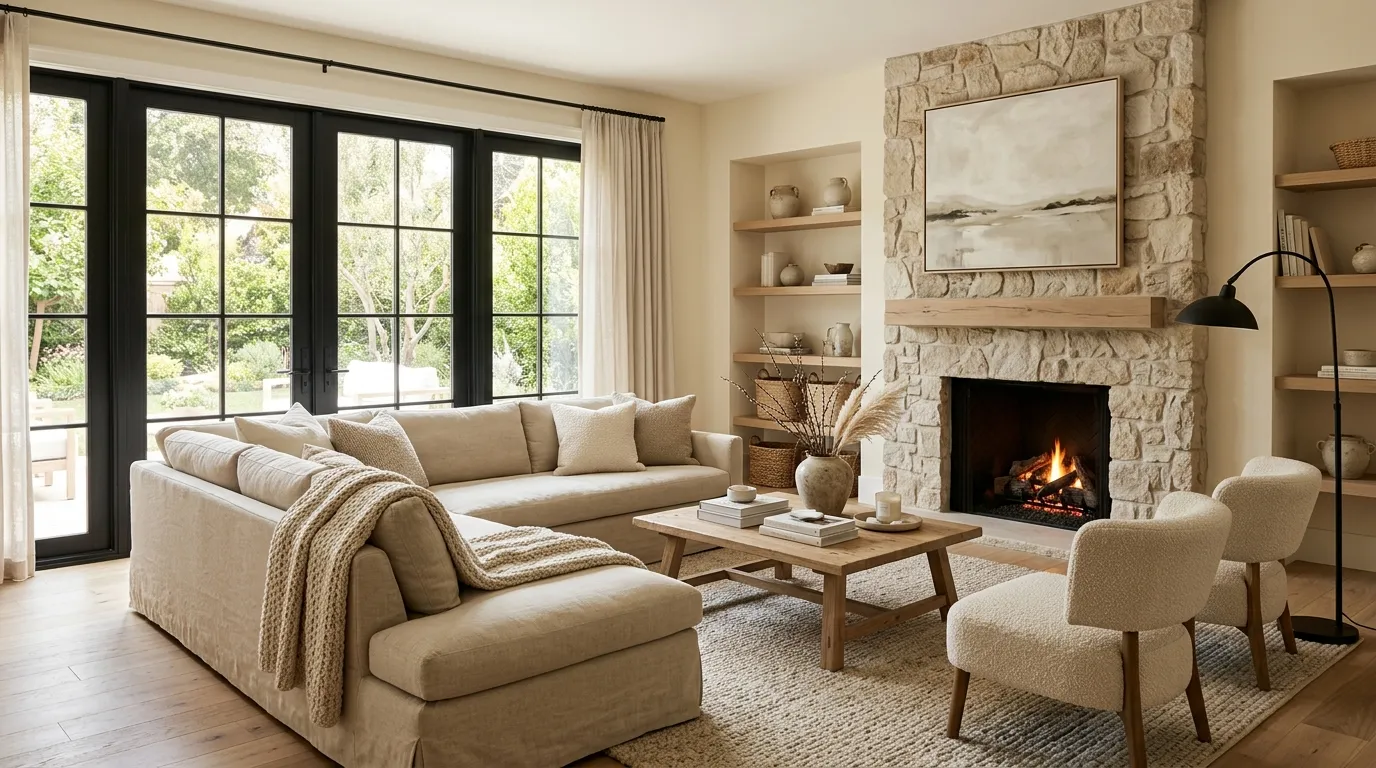
Creating a warm and inviting interior often starts with choosing the right neutral shade. Almond cream introduces softness and brightness while avoiding the stark appearance of pure white. The subtle warmth helps rooms feel comfortable and welcoming throughout the year. This versatile color adapts beautifully to changing décor styles and seasonal updates. Whether paired with contemporary furnishings or more traditional pieces, it creates a balanced backdrop that supports a wide range of design choices without competing for attention.
Many homeowners appreciate almond cream because it feels timeless while still looking fresh and updated. The shade reflects natural light effectively, helping spaces appear larger and more open. I’ve noticed that rooms painted in warm cream tones often feel more relaxing because the color creates visual softness throughout the environment. Layered with wood accents, natural fabrics, and textured décor, the result feels elegant and approachable. The overall effect is bright, comfortable, and effortlessly sophisticated.
18. Graphite Gray Luxury
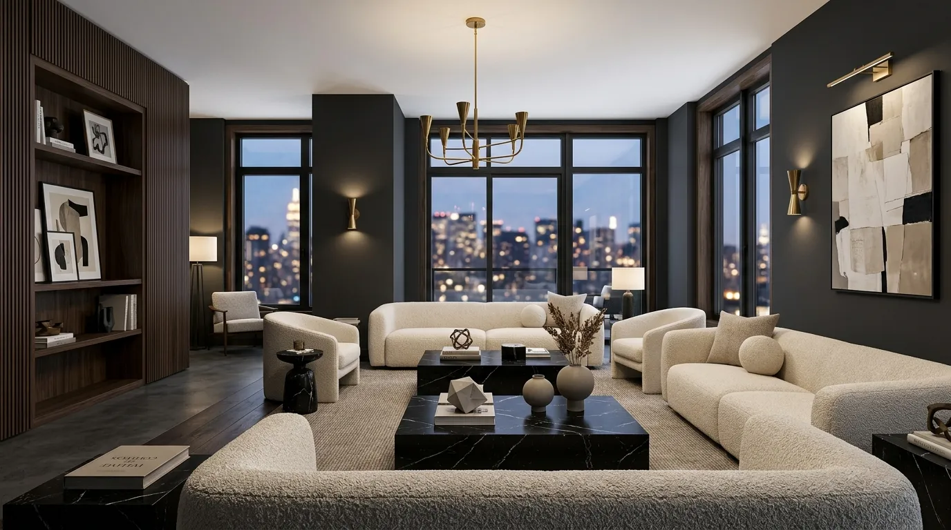
Some interiors achieve their impact through bold simplicity, and graphite gray is a perfect example. This deep neutral introduces structure, depth, and contemporary elegance without relying on bright colors. The rich tone creates a dramatic backdrop that makes furniture and decorative elements stand out with greater clarity. Large living areas, entertainment rooms, and statement spaces benefit particularly well from its sophisticated appearance. The color feels modern yet timeless, making it a practical investment for long-term design appeal.
Luxury spaces often use darker neutrals to create visual contrast and emphasize premium finishes. Graphite gray works exceptionally well with marble, brass, black accents, and warm wood tones. I’ve seen this work well in many homes because the color adds richness while maintaining a clean and organized look. When balanced with lighter furnishings and layered lighting, the room feels elegant rather than heavy. The finished result delivers a refined atmosphere that feels curated, stylish, and unmistakably upscale.
19. Misty Lavender Gray
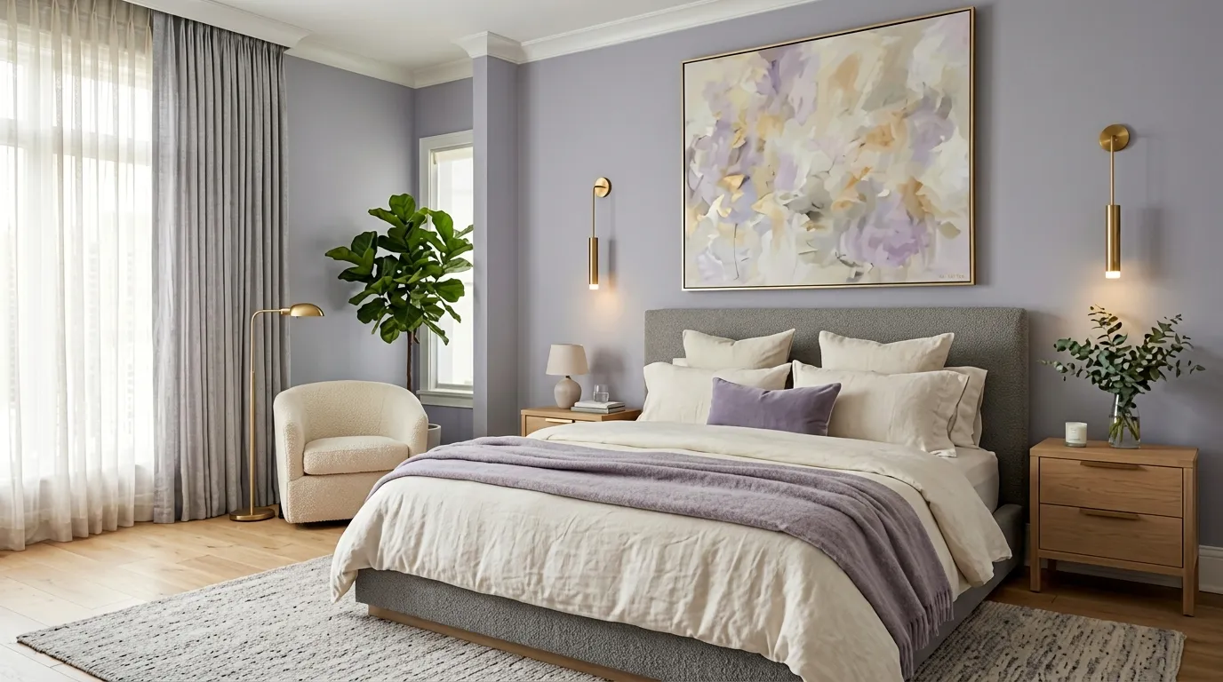
Some of the most memorable interiors use color in subtle and unexpected ways. Misty lavender gray introduces a gentle hint of color while maintaining the sophistication of a neutral palette. The muted undertones create depth and softness, helping rooms feel more relaxed and visually interesting. Bedrooms, dressing areas, and cozy sitting spaces benefit particularly well from this elegant shade. Unlike brighter purples that can feel overwhelming, this refined version remains calm, balanced, and highly versatile for modern living.
What makes this color especially appealing is its ability to change beautifully throughout the day. Natural sunlight highlights its soft lavender influence, while evening lighting reveals a warmer gray appearance. I’ve noticed this creates a layered effect that keeps interiors feeling dynamic without becoming distracting. Paired with cream furnishings, brass accents, and textured fabrics, the result feels luxurious and contemporary. The color delivers personality while preserving the sophisticated atmosphere that many homeowners want in a carefully designed space.
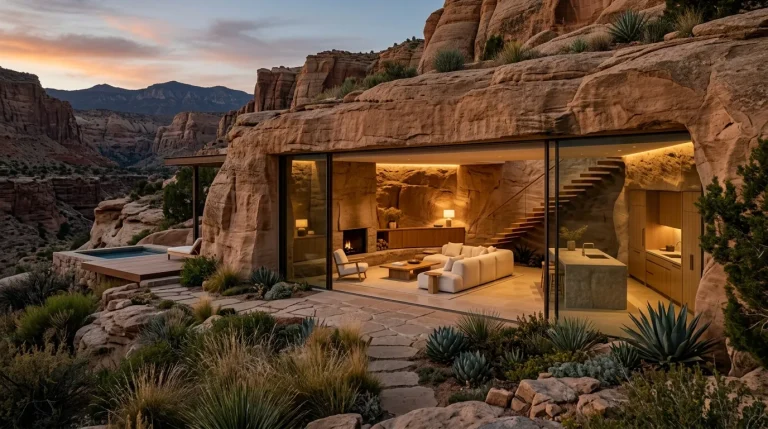
20. Sandstone Modern Beige
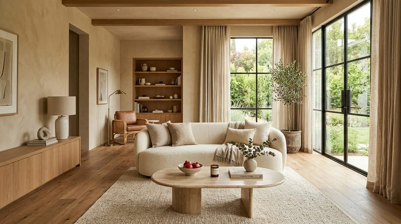
Warm neutrals continue to dominate luxury interiors, and sandstone beige remains one of the most practical choices available. This sophisticated shade offers enough warmth to make a room feel inviting while maintaining a clean and contemporary appearance. The earthy undertones create a natural connection between walls, furniture, and decorative elements. Living rooms, bedrooms, and open-plan spaces all benefit from its balanced character. The result is a comfortable environment that feels stylish without relying on short-lived design trends.
The strength of sandstone beige lies in its ability to complement nearly every material and finish. Wood tones appear richer, stone surfaces feel more organic, and soft fabrics gain additional warmth. That’s why many designers recommend this color for homeowners seeking long-term flexibility. It creates a beautiful backdrop for evolving décor choices while maintaining a refined appearance. For anyone researching home wall colors ideas, sandstone beige offers a reliable combination of comfort, elegance, and modern appeal that works in almost any setting.
21. Soft Black Contrast
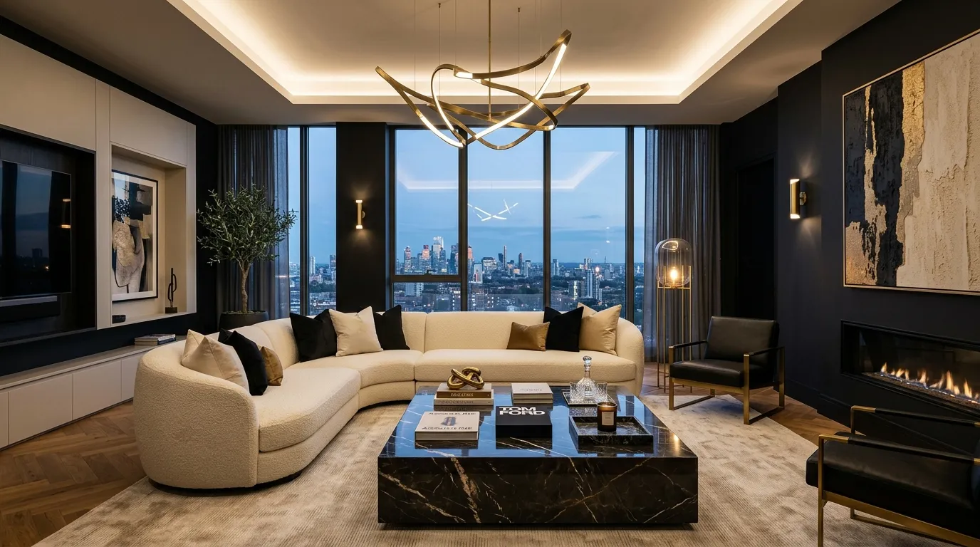
Dark walls are becoming increasingly popular in luxury design, and soft black offers one of the most sophisticated ways to embrace the trend. Unlike harsh black finishes, this refined shade contains subtle undertones that create depth without making a room feel severe. The color immediately establishes contrast, helping furniture, artwork, and decorative details become more prominent. Large living rooms, media spaces, and statement areas often benefit most from its bold character and architectural presence.
When balanced correctly, soft black creates a surprisingly welcoming atmosphere. Cream upholstery, warm wood finishes, brass accents, and layered lighting prevent the room from feeling heavy. In my experience, homeowners are often amazed by how elegant and spacious darker interiors can appear when natural light is incorporated effectively. The contrast adds drama while maintaining sophistication, creating a space that feels custom designed. As one of today’s most luxurious interior trends, soft black delivers a bold yet timeless finish that stands apart from traditional neutrals.
Closing Thoughts
A beautiful paint color has the power to completely change how a space looks and feels. From warm neutrals and calming earth tones to dramatic modern shades, these ideas offer inspiration for creating rooms that feel brighter, more elegant, and uniquely yours. Whether you’re planning a full makeover or simply updating one room, the right choice can make a lasting impact.
I’ve seen how small changes like these can completely transform a space and make it feel fresh again. Save these home wall colors ideas to Pinterest for future inspiration, try your favorite look at home, and share this article with friends or family who are planning their next home refresh.
Emma Williams
Emma Williams is an interior design expert and decor editor at Lady Home Decor. She specializes in modern, cozy, and functional home styling, helping readers discover inspiring decorating ideas that are easy to recreate. Her work focuses on timeless design, practical solutions, and the latest home decor trends.