22 Bedroom Color Palette Ideas for a Stylish Home Makeover

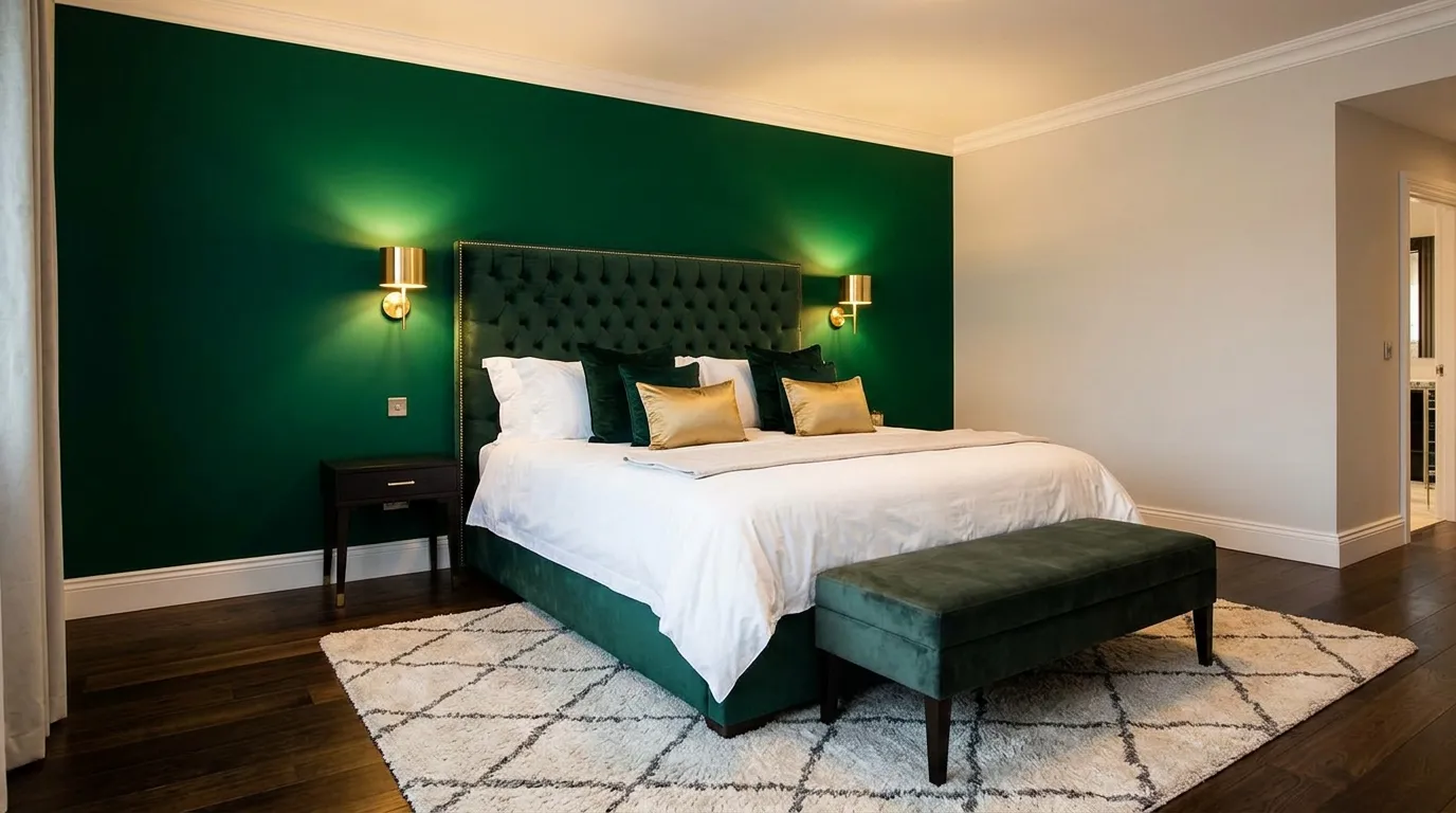
Ready to give your bedroom a completely new look without a full renovation? These bedroom color palette ideas for a stylish home makeover can instantly change the mood, beauty, and comfort of your space.
The right color palette does more than make a room look pretty. It helps create a space that feels relaxing, luxurious, welcoming, and uniquely yours. Whether your bedroom feels outdated, lacks personality, or simply needs a fresh update, choosing the right combination of colors can make a dramatic difference. From rich moody tones to elegant neutrals and modern designer-inspired palettes, the ideas in this collection are designed to inspire real transformations.
In my experience, color is often the one change that delivers the biggest visual impact for the least amount of effort. I’ve noticed that even simple updates to wall colors, bedding, and accent tones can make a bedroom feel larger, brighter, and more sophisticated. These carefully selected ideas will help you discover fresh inspiration, create a cohesive look, and design a bedroom you’ll love waking up in every day.
1. Mocha Luxe
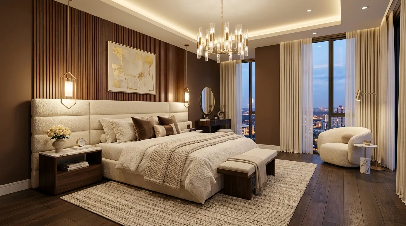
Nothing elevates a bedroom quite like a sophisticated mocha-inspired palette layered with soft creams and warm metallic accents. The deep earthy tone instantly adds character while creating a comfortable environment that feels refined rather than overwhelming. When paired with plush textiles and subtle lighting, the room gains visual depth from every angle. Many homeowners love this combination because it balances warmth and elegance effortlessly. The contrast between rich brown surfaces and lighter furnishings creates a polished look that feels professionally designed while remaining practical for everyday living.
The beauty of mocha tones lies in their ability to make a space feel luxurious without relying on excessive decoration. I’ve seen this work well in many homes because the color naturally highlights architectural details, textured fabrics, and statement furniture. Adding brushed gold hardware, layered bedding, and warm wood finishes helps strengthen the designer-inspired appearance. This approach works especially well for homeowners seeking bedroom color palette ideas for a stylish upgrade that feels current, sophisticated, and easy to personalize over time. Soft ambient lighting completes the look and enhances the overall sense of comfort.
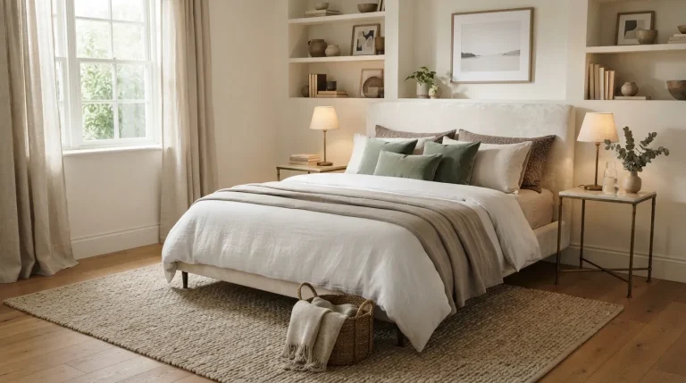
2. Soft Olive Elegance
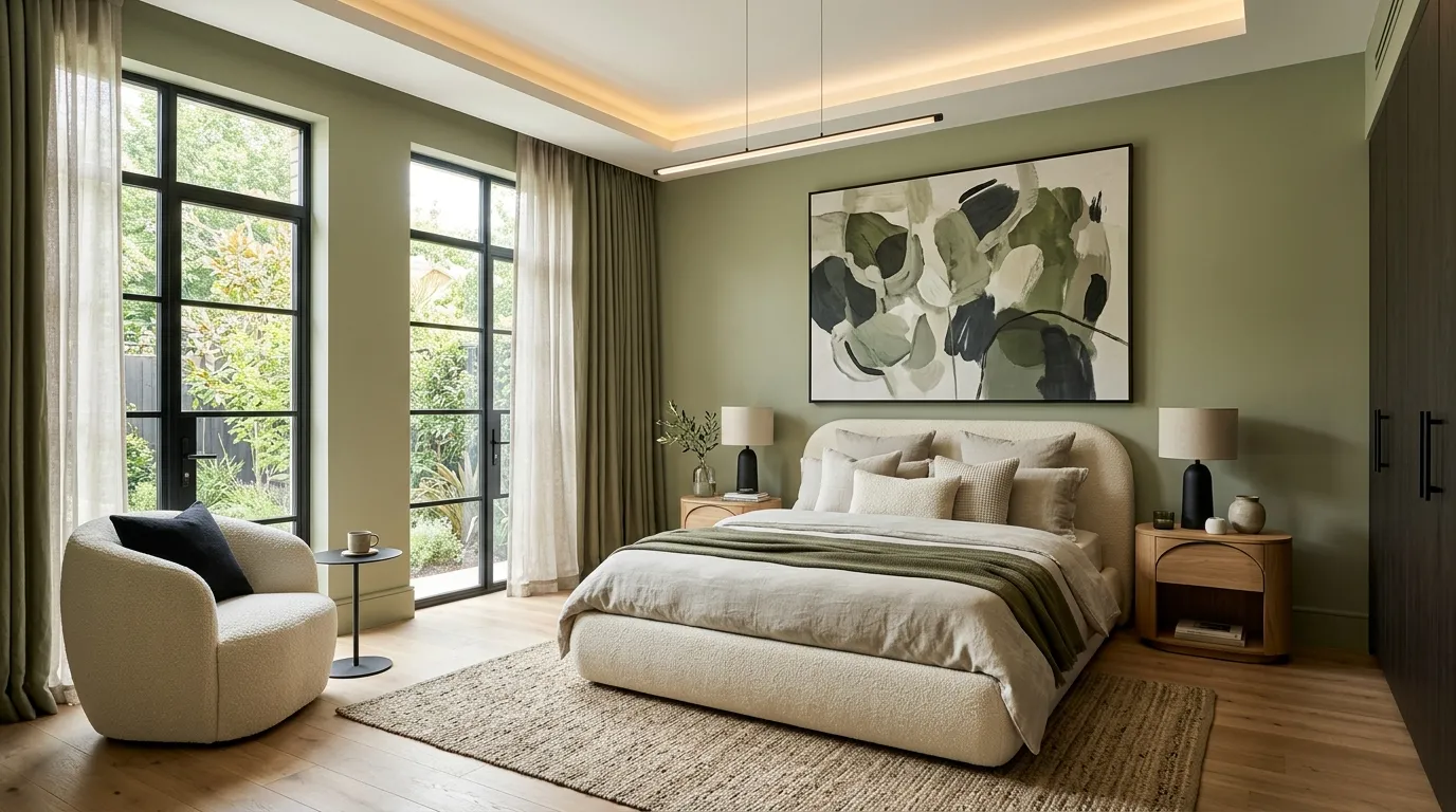
A soft olive palette brings a refreshing balance between earthy comfort and modern elegance. Unlike brighter greens, olive feels grounded and mature, making it ideal for bedrooms designed around relaxation and style. The muted tone pairs beautifully with creamy textiles, natural wood, and subtle black accents that create visual contrast. This combination delivers enough color to feel distinctive while maintaining a peaceful environment. The result is a bedroom that feels thoughtfully curated and welcoming throughout every season without requiring frequent design updates.
One reason designers continue recommending olive shades is their versatility across different furniture styles and room sizes. In my experience, this color works especially well when natural light enters the space, allowing subtle undertones to shift throughout the day. Layering warm neutrals alongside olive walls prevents the room from feeling too cool while enhancing its overall sophistication. Homeowners often notice that the space feels calmer and more organized simply because the palette creates visual harmony. The effect is modern, elegant, and perfectly suited to contemporary living.
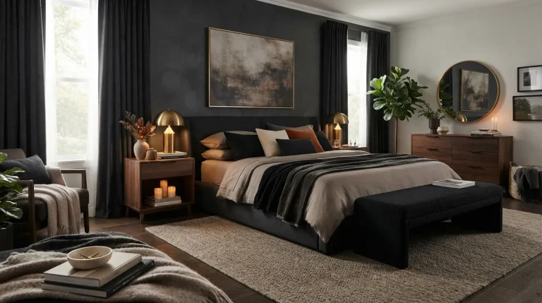
3. Charcoal Champagne
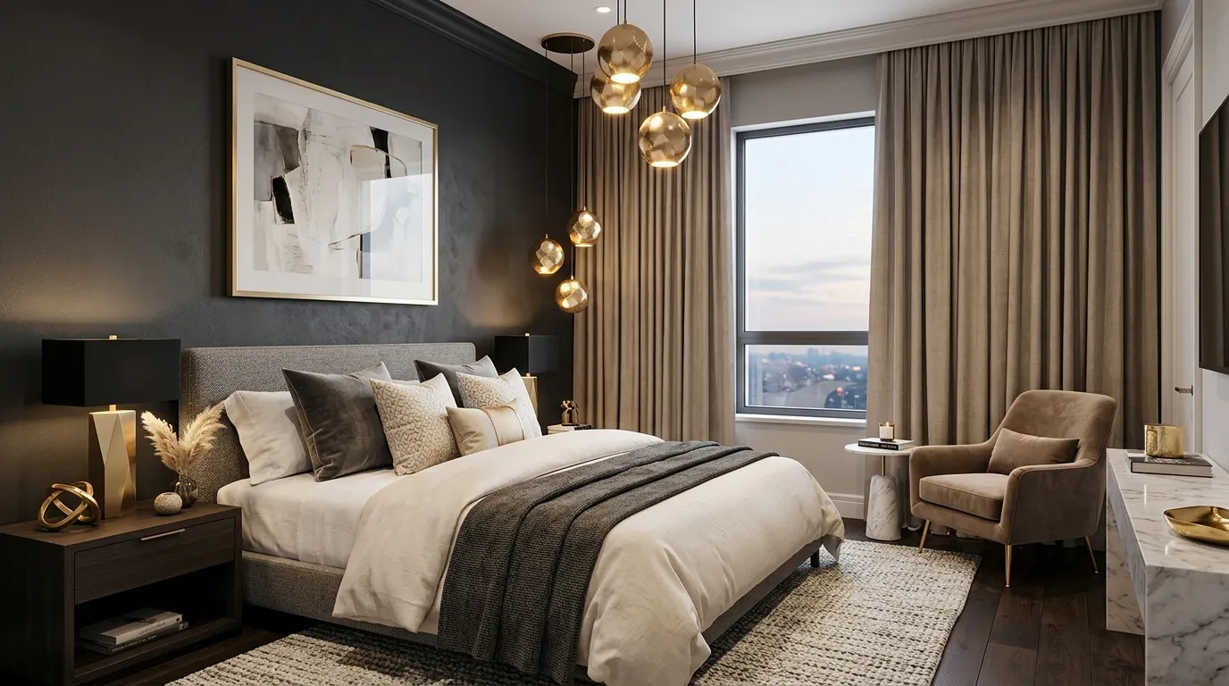
Few color combinations feel as striking as charcoal and champagne accents working together in one space. The darker foundation introduces depth and sophistication while metallic details soften the overall appearance. This balance prevents the room from feeling heavy and instead creates a polished designer aesthetic. Large upholstered furniture, layered bedding, and warm lighting help maintain comfort while enhancing the luxurious atmosphere. The palette feels current yet timeless, making it a reliable option for homeowners looking to create a more upscale bedroom environment.
I’ve noticed that darker palettes often appear more expensive when balanced with lighter textures and reflective finishes. That’s why many designers recommend pairing charcoal surfaces with champagne-toned metals, soft fabrics, and warm lighting sources. The contrast highlights important design features while keeping the room visually interesting from every angle. For those exploring bedroom color palette ideas for a stylish transformation, this combination offers a bold yet approachable solution that delivers both elegance and everyday comfort without feeling trendy or temporary.
4. Cashmere Beige
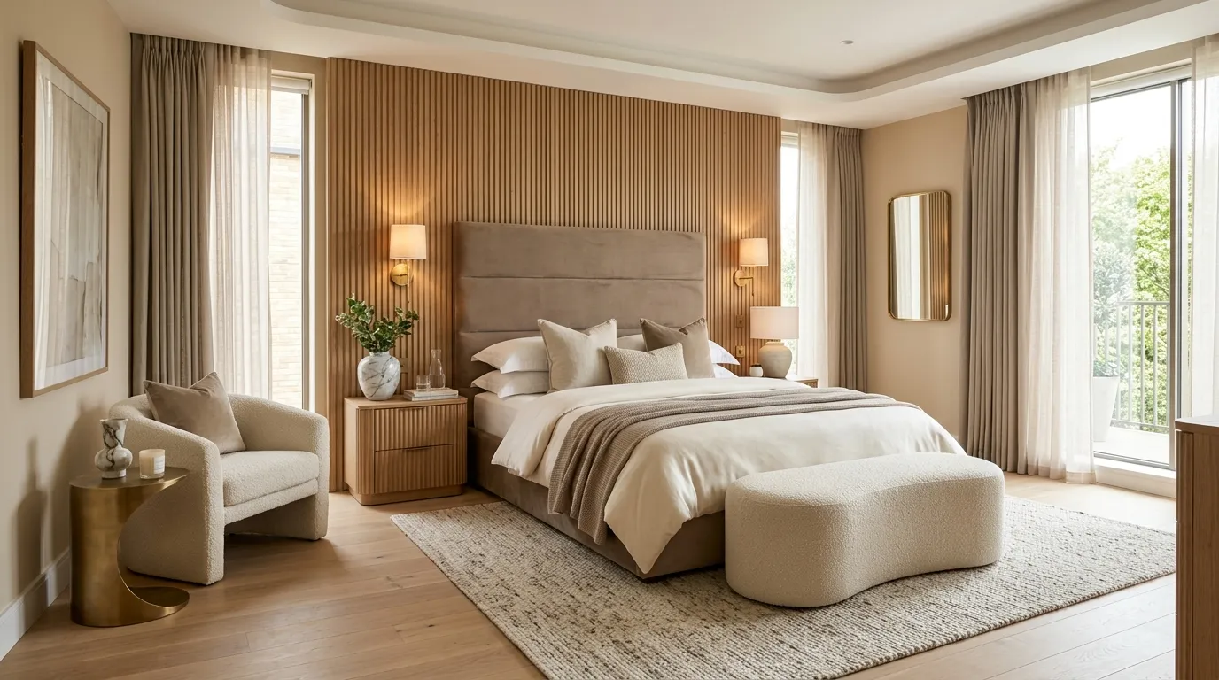
A cashmere beige palette offers a sophisticated alternative to plain white interiors while maintaining a bright and airy appearance. The subtle warmth creates a welcoming environment that feels comfortable throughout the year. When combined with layered fabrics, natural wood, and metallic details, the room gains visual depth without relying on bold colors. This approach works especially well in bedrooms where relaxation is the priority. The soft neutral foundation also allows statement furniture and decorative accents to stand out naturally while preserving a calm and balanced atmosphere.
What makes cashmere beige so appealing is its ability to look expensive without feeling overly styled. I’ve noticed that bedrooms using several shades of beige often feel more cohesive because the transitions between surfaces remain smooth and effortless. Layering textures such as boucle, linen, velvet, and wood introduces interest while keeping the overall palette refined. Homeowners frequently appreciate how adaptable this color scheme remains over time. Whether paired with modern furniture or classic pieces, the result feels elegant, welcoming, and suitable for a stylish bedroom refresh.
5. Dusty Blue Serenity
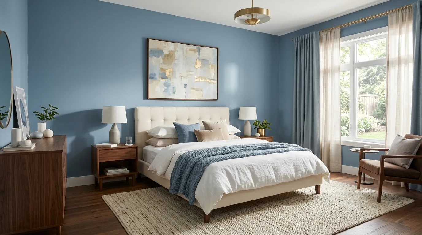
A dusty blue palette introduces subtle color while maintaining the peaceful feeling most people want in a bedroom. The muted shade feels softer than navy and more sophisticated than pastel blue, making it a versatile option for modern interiors. Combined with creamy neutrals and warm wood elements, it creates a balanced environment that feels fresh yet relaxing. The gentle contrast between blue surfaces and lighter furnishings adds dimension throughout the room. This combination works particularly well in spaces designed to feel calm, comfortable, and visually uncluttered.
Bedrooms often benefit from colors that encourage relaxation, and dusty blue consistently delivers that effect. In my experience, this shade performs beautifully in both large and small rooms because it adds personality without dominating the design. Natural light helps reveal subtle undertones that shift throughout the day, creating additional visual interest. Layering textured bedding, upholstered furniture, and warm metallic accents enhances the overall look. The result feels polished and contemporary while maintaining the comfort and tranquility that homeowners value most in a personal retreat.
6. Black And Ivory
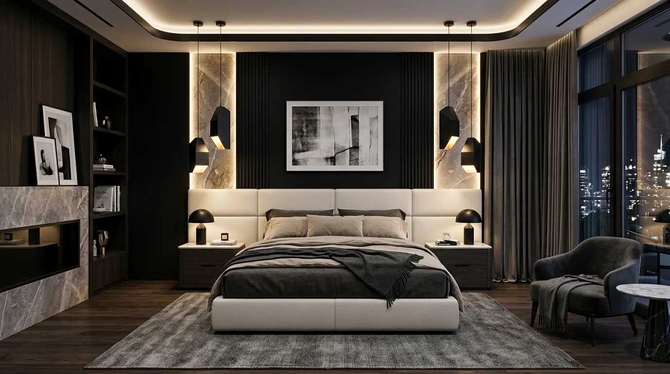
A black and ivory palette transforms an ordinary bedroom into a sophisticated statement space. The dramatic contrast creates immediate visual interest while maintaining a refined and balanced appearance. Black surfaces add depth and definition, while ivory furnishings keep the room feeling bright and inviting. This pairing works especially well when combined with clean-lined furniture and premium materials. The result feels modern, confident, and effortlessly luxurious without requiring excessive decoration. Every element stands out more clearly because the color contrast naturally draws attention to important design features.
Many homeowners hesitate to use darker tones, but black can feel surprisingly welcoming when balanced correctly. I’ve seen this work well in many homes where soft textiles, warm lighting, and layered neutral accents prevent the room from feeling harsh. The contrast also helps showcase artwork, decorative pieces, and architectural details more effectively. Adding touches of marble, brass, or textured fabrics further elevates the overall design. For those wanting a bedroom makeover that feels current and luxurious, black and ivory remains one of the most impactful combinations available.
7. Taupe Stone Harmony
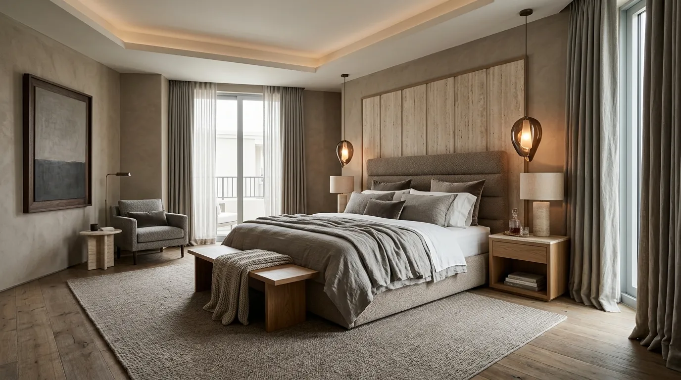
A taupe and stone-inspired palette creates a refined environment that feels both modern and timeless. The balanced mix of warm and cool undertones gives the room depth while maintaining a soft, relaxing mood. Layering multiple shades within the same family helps create visual movement without making the design feel busy. Natural materials such as wood, stone, and linen complement the palette effortlessly. This approach is especially effective for homeowners who want a luxurious bedroom that remains versatile enough to evolve with changing decor preferences over time.
The beauty of this combination lies in its subtle sophistication. I’ve noticed that layered taupe interiors often photograph beautifully because every texture becomes more noticeable against the neutral backdrop. Upholstered furniture, woven accents, and natural materials gain extra character without competing for attention. Soft lighting further enhances the elegant appearance by creating gentle shadows throughout the space. The result feels polished, calming, and intentionally designed, making it an excellent choice for anyone seeking a high-end aesthetic that remains comfortable and practical for everyday living.
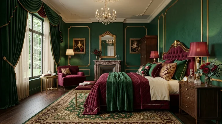
8. Emerald Gold Glamour
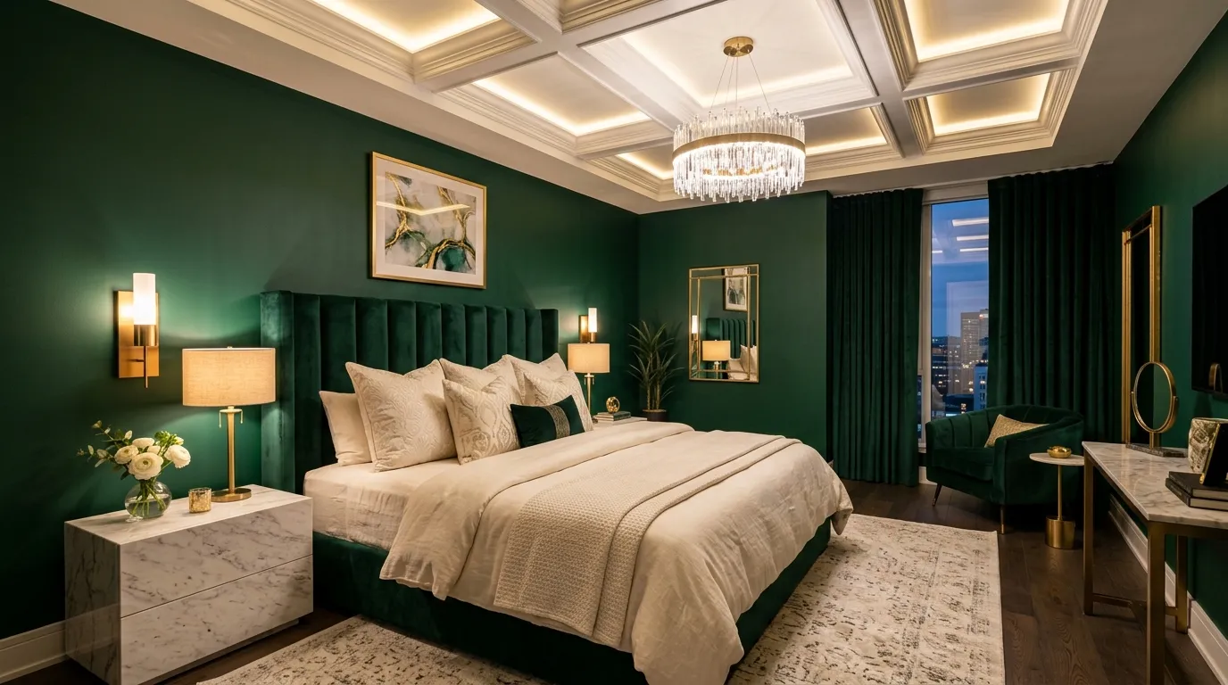
Emerald green instantly brings richness and character to a bedroom while maintaining an upscale appearance. The jewel-toned color creates a bold foundation that feels sophisticated rather than overwhelming when paired with lighter furnishings. Gold accents add warmth and elegance, helping the palette feel balanced and intentional. Luxurious fabrics such as velvet and linen further enhance the overall effect. Together, these elements create a space that feels glamorous and inviting while remaining comfortable enough for everyday living. The combination works especially well in bedrooms designed to make a strong visual statement.
Designers frequently use emerald green because it introduces depth while maintaining a timeless appeal. In my experience, this shade works best when balanced with neutral bedding and carefully chosen metallic details. Too many competing colors can reduce the impact, while a focused palette allows the green to remain the star of the room. Soft ambient lighting also plays an important role by highlighting the richness of the color throughout the evening. The finished space feels luxurious, dramatic, and thoughtfully curated from every angle.
9. Silver Mist Luxury
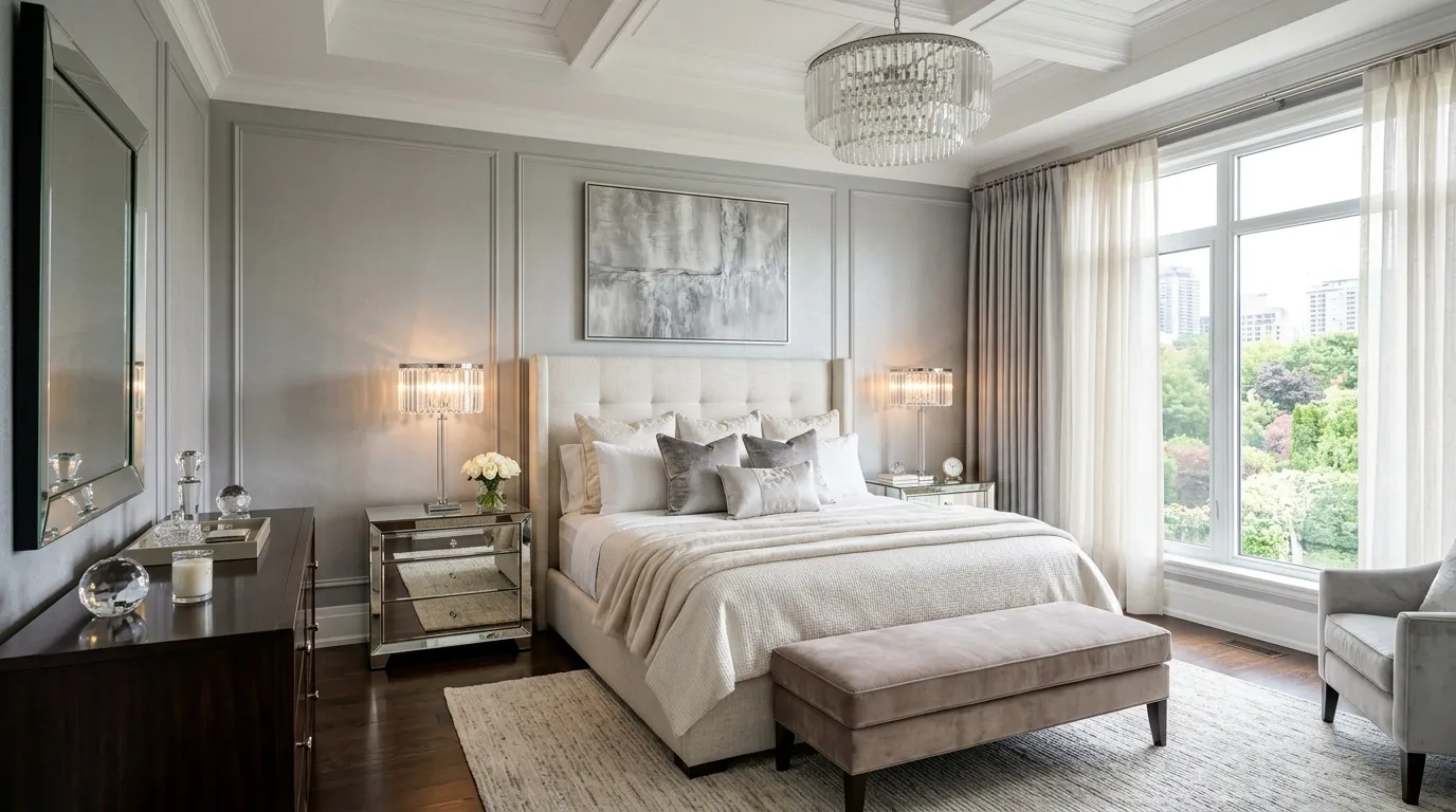
A silver mist palette offers a fresh interpretation of luxury by combining soft gray tones with reflective surfaces and plush textures. The color creates a bright foundation that feels elegant and refined while remaining soothing enough for a restful bedroom. When paired with creamy textiles and subtle metallic accents, the space gains dimension and sophistication. The gentle palette also allows decorative details to shine without overwhelming the overall design. This balanced approach creates a bedroom that feels polished, comfortable, and effortlessly stylish.
One of the biggest advantages of silver-gray tones is their ability to maximize light within a space. I’ve seen this work particularly well in bedrooms where homeowners want a brighter appearance without using stark white walls. Layering multiple textures helps prevent the room from feeling flat while adding warmth and visual interest. Decorative lighting, mirrored accents, and soft fabrics contribute to the luxurious atmosphere. The final result feels modern, upscale, and welcoming, making it an excellent option for contemporary bedroom transformations.
10. Cocoa Cream Contrast
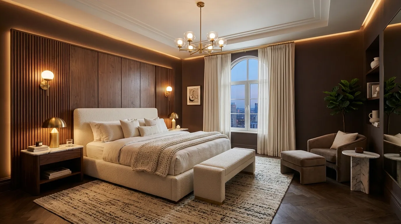
A cocoa and cream palette creates the perfect balance between warmth and sophistication. The deeper brown tones provide visual grounding while lighter furnishings keep the space bright and inviting. This contrast naturally highlights architectural features, decorative details, and premium materials throughout the room. Layered fabrics and warm metallic accents enhance the overall look even further. The combination feels luxurious without becoming overly formal, making it suitable for a wide range of interior styles. It is a practical choice for homeowners seeking elegance with everyday comfort.
The success of this palette comes from its ability to create visual depth through simple color contrast. I’ve noticed that rooms designed around rich brown shades often feel more intimate and polished. Pairing those tones with soft cream textiles prevents the design from feeling heavy while maintaining a sophisticated atmosphere. Warm lighting adds another layer of comfort by emphasizing the richness of the materials. The final result is a bedroom that feels expensive, timeless, and effortlessly welcoming from the moment you enter.
11. Lavender Smoke
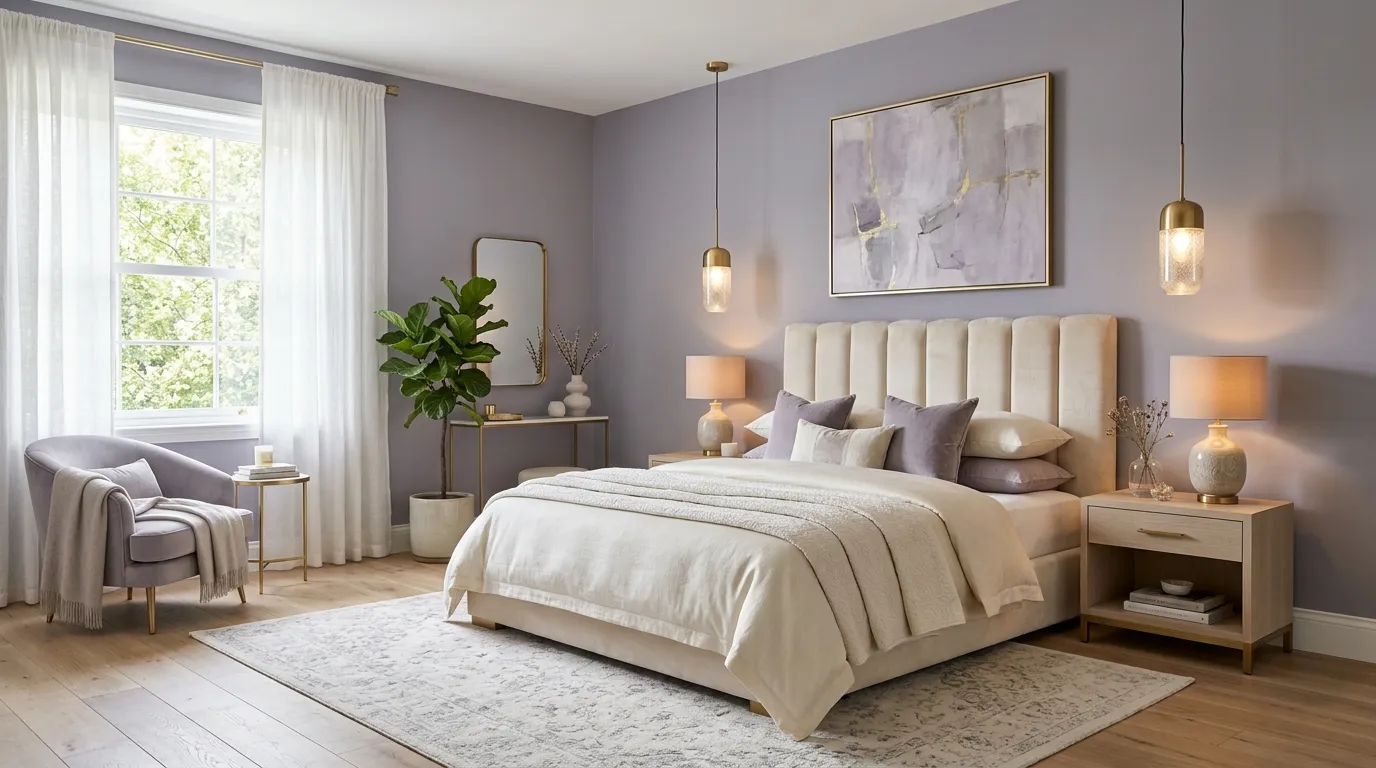
Lavender smoke combines muted purple and gray undertones to create a bedroom that feels elegant, modern, and unexpectedly sophisticated. Unlike brighter purple shades, this softer version introduces character while maintaining a calm atmosphere. The gentle color works beautifully with cream textiles, light wood finishes, and metallic details that enhance its luxurious appearance. Because the shade remains understated, it can easily serve as the foundation for both minimalist and decorative interiors. The result is a bedroom that feels unique while preserving a sense of balance and comfort.
Many people are surprised by how versatile lavender-gray tones can be within modern homes. In my experience, the palette performs especially well when paired with warm lighting that softens the cooler undertones. Layering textures such as velvet, linen, and boucle adds richness without requiring additional colors. Designers often recommend this approach for homeowners seeking something distinctive yet timeless. The finished room feels calm, polished, and visually memorable while remaining practical enough for long-term use and evolving design preferences.
12. Midnight Navy Luxe
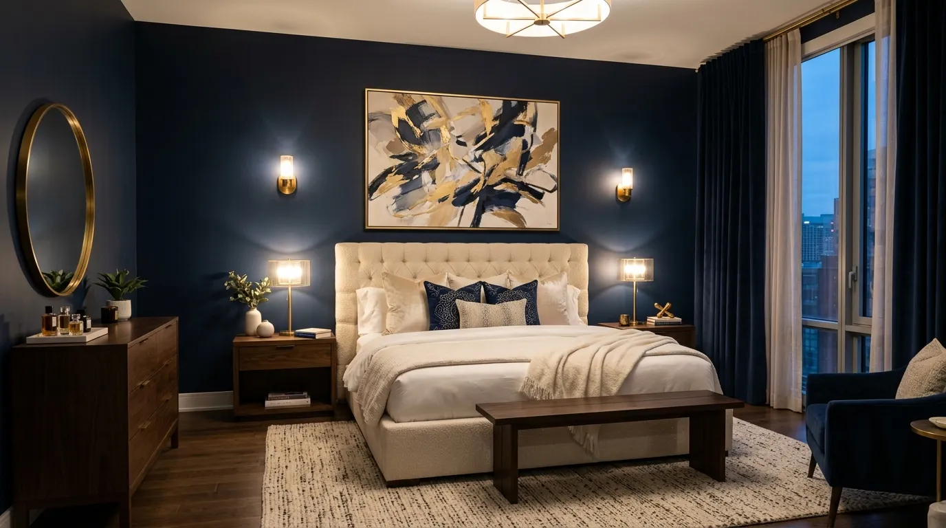
Midnight navy remains one of the most elegant colors for creating a sophisticated bedroom environment. The deep tone introduces dramatic depth while maintaining a timeless appeal that never feels trendy. Paired with cream furnishings and warm metallic finishes, navy becomes surprisingly inviting and comfortable. The strong foundation allows decorative details to stand out while creating a sense of structure throughout the room. This palette works particularly well in bedrooms where homeowners want a bold design that still feels refined and balanced.
That’s why many designers recommend navy as an alternative to black when creating upscale interiors. The color offers similar depth but often feels softer and more approachable. Layering warm woods, textured fabrics, and ambient lighting helps balance the darker walls while preserving visual warmth. For homeowners searching for bedroom color palette ideas for a stylish makeover, midnight navy delivers both luxury and versatility. The finished space feels elegant, dramatic, and carefully designed without sacrificing comfort or everyday livability.
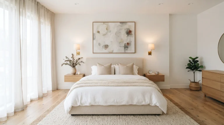
13. Pearl White Layers
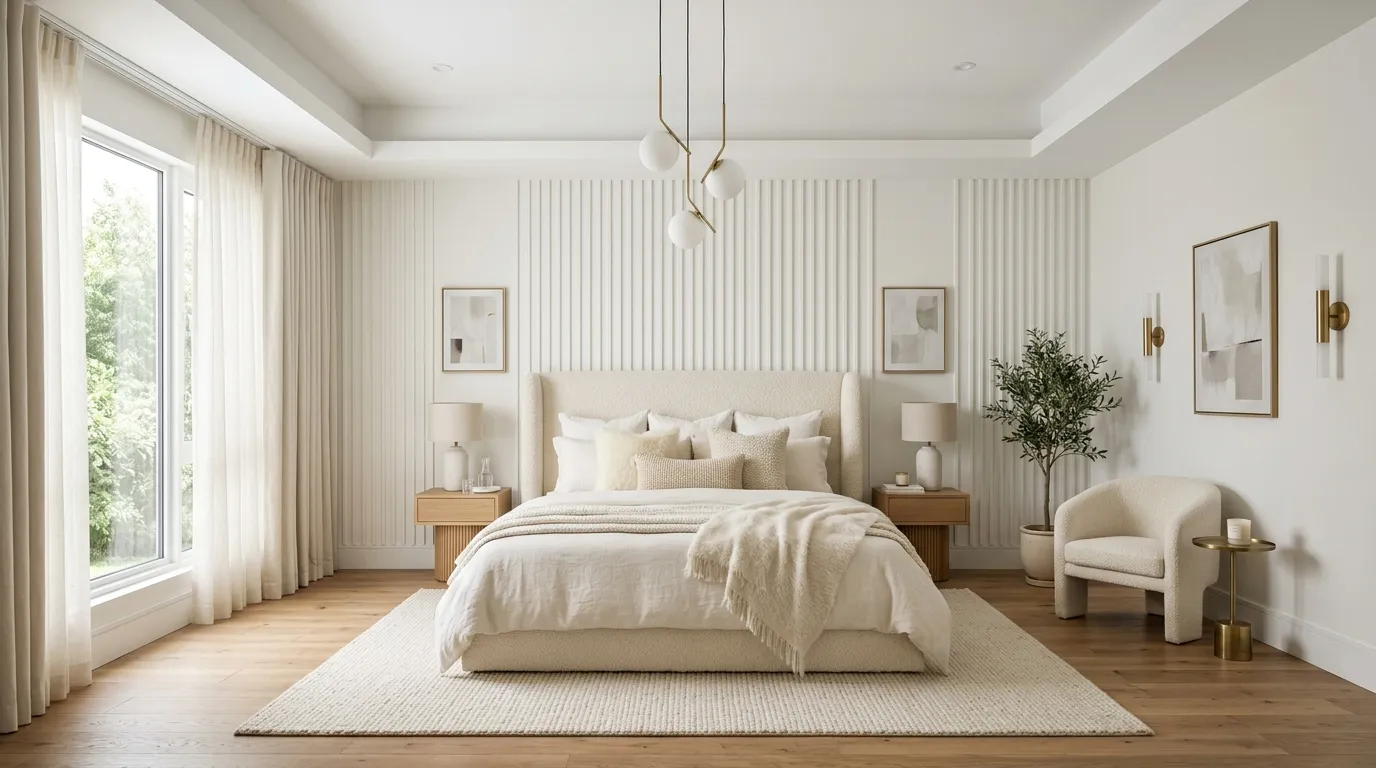
A pearl white palette transforms a bedroom into a calm retreat filled with light and elegance. Unlike stark white interiors, pearl tones contain subtle warmth that creates a softer and more welcoming appearance. Layering multiple shades of ivory, cream, and white introduces depth without disrupting the peaceful atmosphere. This approach allows furniture, lighting, and decorative textures to become focal points while maintaining a cohesive look. The result feels sophisticated and luxurious while remaining practical for homeowners who appreciate clean and timeless design.
The secret to making white interiors feel expensive is texture rather than color. I’ve seen this work well in many homes where linen bedding, boucle upholstery, natural wood accents, and layered fabrics create visual interest throughout the space. Soft lighting further enhances the subtle variations within the palette, adding dimension without clutter. Homeowners often appreciate how adaptable this design remains over time because new decor pieces blend effortlessly into the existing scheme. The finished room feels fresh, elegant, and comfortably luxurious.
14. Terracotta Modern Chic
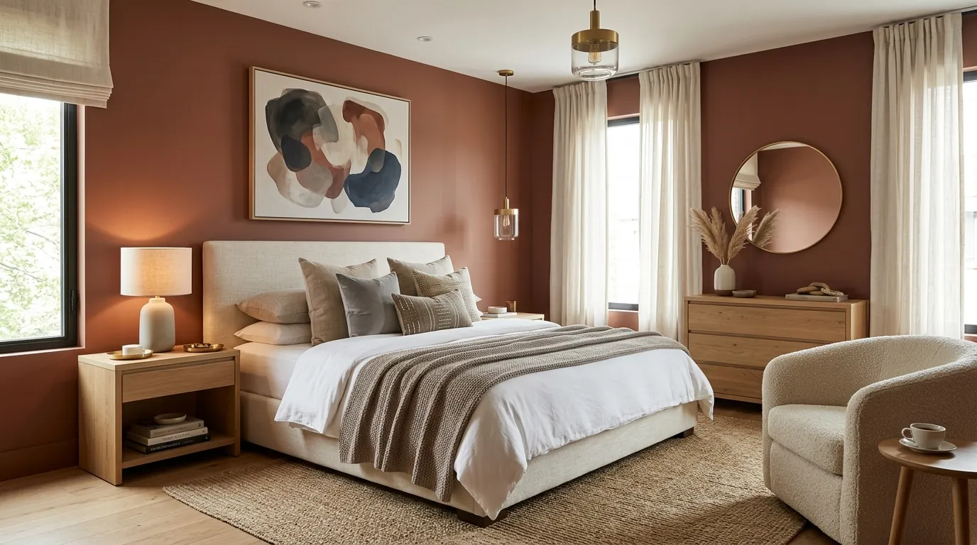
Terracotta continues to grow in popularity because it introduces warmth without overwhelming a room. The earthy tone creates an inviting backdrop that feels stylish, grounded, and contemporary. Paired with cream textiles and natural wood elements, it delivers a balanced appearance that blends comfort with sophistication. The color also complements organic textures exceptionally well, allowing woven accents and handcrafted details to stand out naturally. This combination creates a bedroom that feels welcoming while maintaining the polished appearance often associated with luxury interiors.
One reason terracotta works so effectively is its versatility across different design styles. In my experience, the color adapts beautifully to both modern and transitional spaces when paired with carefully selected neutral accents. Warm lighting helps emphasize its rich undertones while preserving a soft atmosphere. Layering subtle variations of beige, ivory, and clay tones enhances the overall look without creating visual clutter. The result is a bedroom that feels current, comfortable, and full of character while remaining sophisticated enough for long-term appeal.
15. Graphite Bronze Elegance
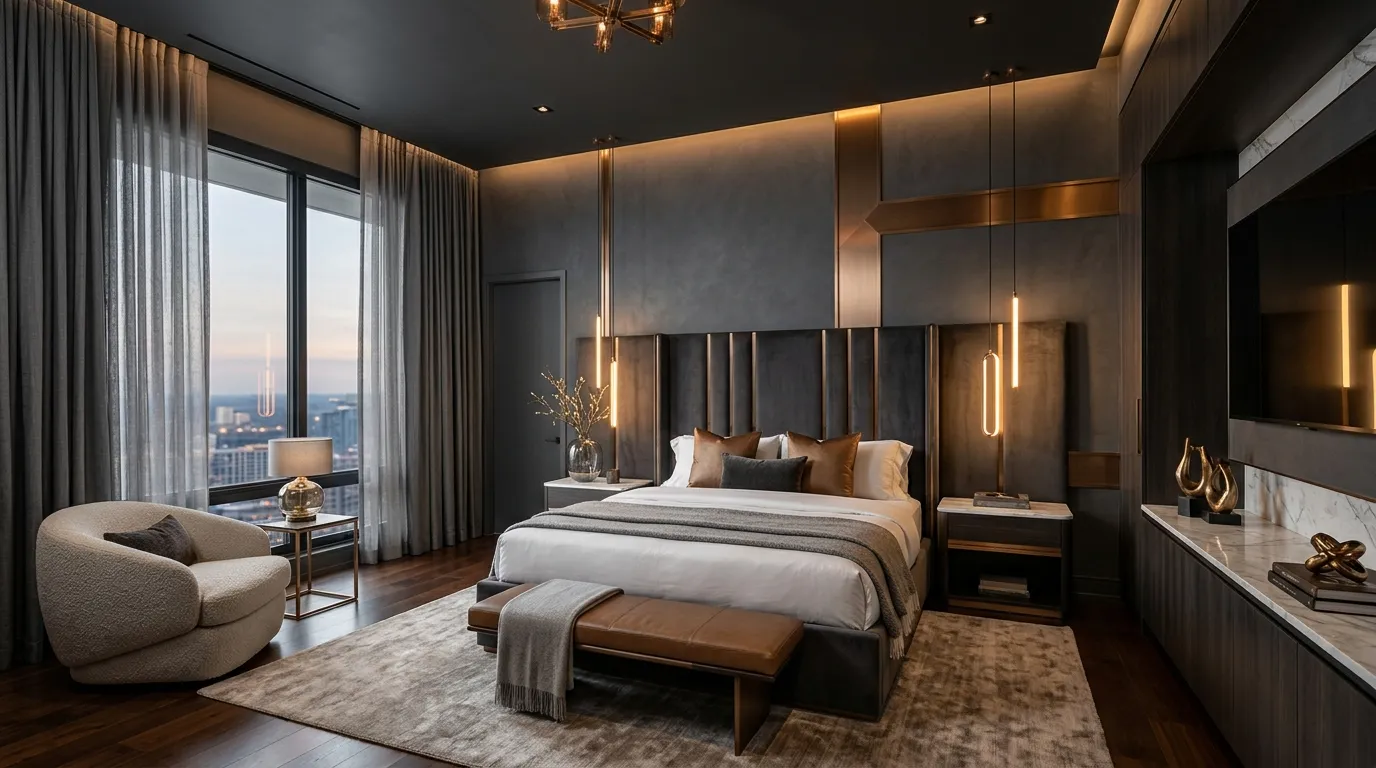
Graphite gray paired with bronze accents creates a sophisticated palette that feels bold, refined, and highly contemporary. The darker backdrop establishes depth throughout the room while warm metallic details prevent the design from feeling cold. This combination works especially well with streamlined furniture and high-quality materials that contribute to a luxury aesthetic. Layered textiles and carefully placed lighting help soften the stronger tones, creating a balanced environment that remains comfortable. The overall effect feels polished and intentionally curated from every angle.
I’ve noticed that graphite tones often make architectural features appear more dramatic and visually striking. Bronze finishes complement the darker foundation by introducing warmth and subtle contrast without overpowering the design. Adding textured fabrics, natural stone surfaces, and soft neutral bedding further elevates the space. For homeowners seeking a more upscale bedroom transformation, this palette provides an excellent balance between modern sophistication and everyday comfort. The result feels elegant, current, and capable of remaining stylish for many years.
16. Champagne Blush Glow
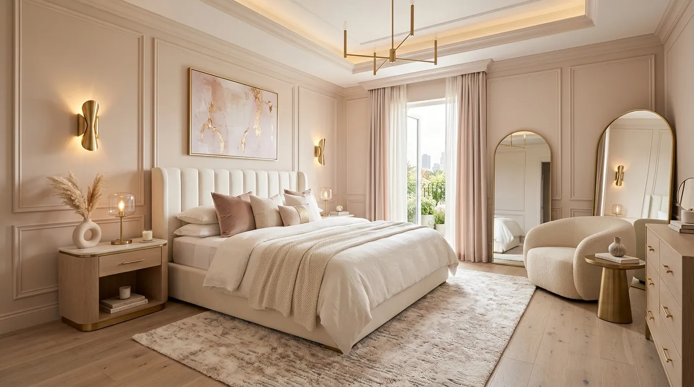
A champagne blush palette introduces warmth and elegance while maintaining a light and airy atmosphere. The delicate blend of soft blush and warm neutral tones creates a refined backdrop that feels inviting throughout the day. When paired with cream textiles, brushed gold details, and natural wood finishes, the room develops a layered appearance that feels luxurious yet approachable. The subtle color variation adds visual interest without becoming distracting. This combination works especially well for homeowners who want a sophisticated bedroom with a softer, more elevated personality.
The appeal of champagne blush lies in its ability to feel both modern and timeless. I’ve seen this color scheme transform ordinary bedrooms into spaces that resemble high-end boutique hotels. Layering textured fabrics and elegant lighting fixtures helps amplify the luxurious effect while preserving comfort. Because the palette remains neutral at its core, it adapts easily to changing decor styles over time. The result is a bedroom that feels bright, polished, and effortlessly stylish without relying on bold or overpowering colors.
17. Forest Green Luxe
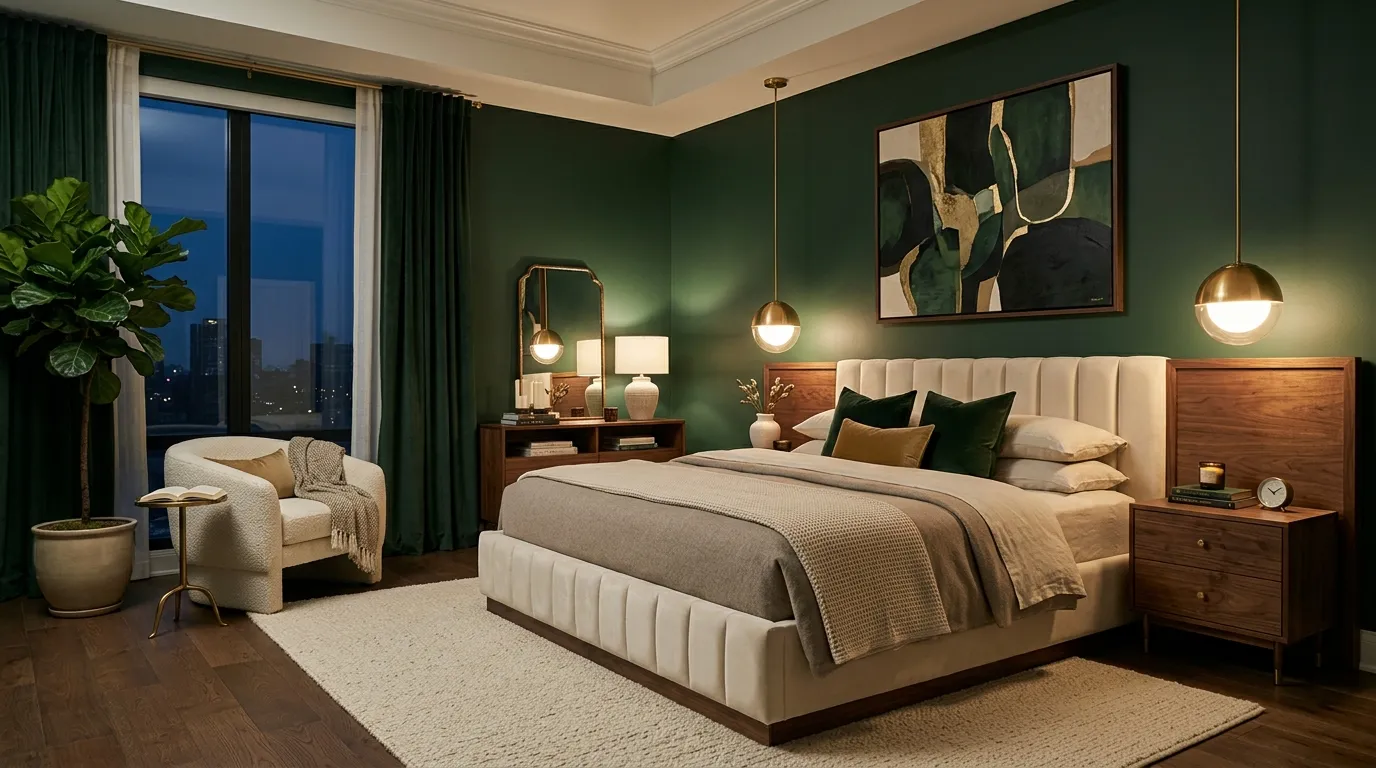
Forest green creates a dramatic yet calming atmosphere that instantly elevates a bedroom. The rich color brings depth and character while maintaining a connection to natural elements that help the space feel balanced. Combined with warm wood finishes and soft neutral textiles, the palette feels sophisticated rather than overwhelming. The darker backdrop also enhances artwork, lighting fixtures, and decorative accents, making every detail stand out more clearly. This approach is ideal for homeowners who want a bold design that still feels welcoming and comfortable.
Many luxury interiors use deep green shades because they offer timeless appeal and remarkable versatility. In my experience, forest green works particularly well when layered with warm metallic accents and soft fabrics that balance its richness. Natural light reveals subtle undertones throughout the day, creating additional dimension within the room. Evening lighting enhances the cozy atmosphere while preserving the palette’s elegant character. The finished space feels refined, grounded, and thoughtfully designed for both visual impact and relaxation.
18. Sandstone Serenity
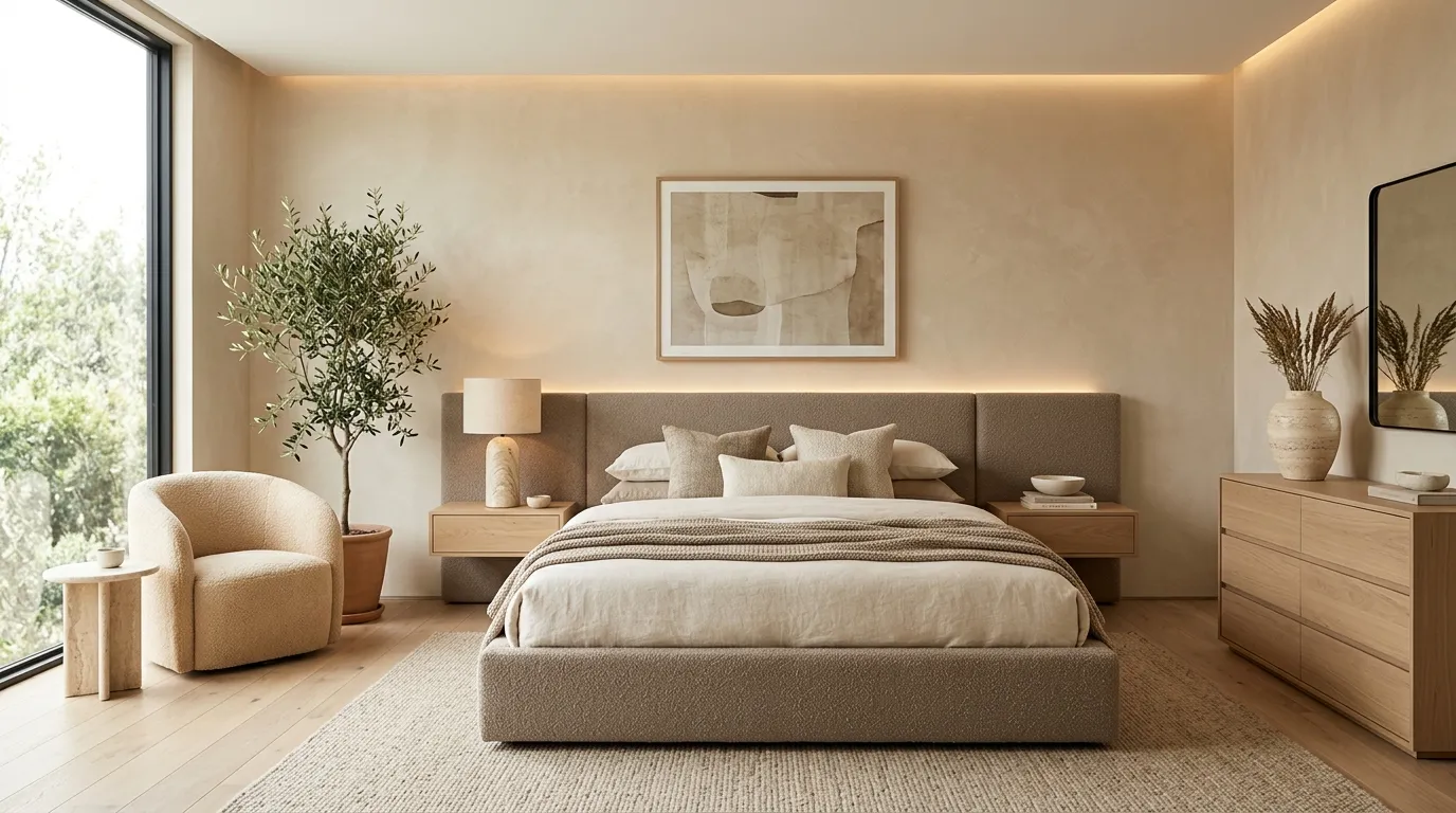
A sandstone-inspired palette delivers understated elegance through warm neutral tones that feel inviting and timeless. The gentle color creates a soft foundation that allows textures and materials to become the focus of the design. Layering beige, ivory, and light taupe shades helps build depth while maintaining a clean and uncluttered appearance. Natural materials such as wood, stone, and woven accents complement the palette perfectly. The overall effect feels balanced, comfortable, and sophisticated without requiring bold colors or dramatic contrasts.
That’s why many designers recommend sandstone tones for creating peaceful bedroom environments. The palette reflects light beautifully, helping rooms appear brighter and more spacious. I’ve noticed that homeowners often appreciate how easy it is to decorate around these warm neutrals because nearly every accent color pairs well with them. Adding textured bedding, organic decor, and soft lighting enhances the sense of comfort while preserving the luxurious appearance. The result is a bedroom that feels serene, elegant, and effortlessly welcoming every day.
19. Slate Blue Sophistication
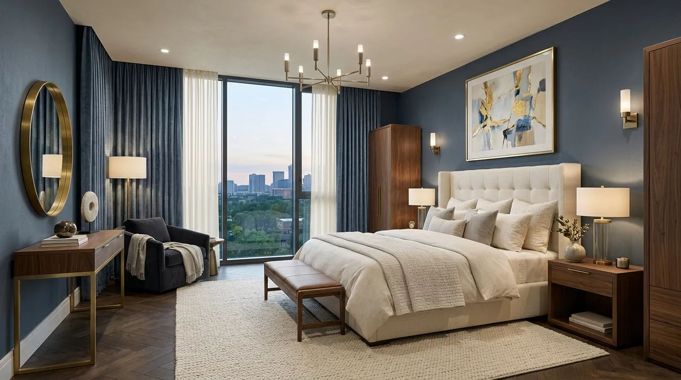
Slate blue offers the perfect balance between bold color and everyday elegance. The muted tone feels richer than traditional neutrals while remaining versatile enough for a wide range of interior styles. Paired with cream textiles and warm wood finishes, it creates a sophisticated environment that feels both stylish and relaxing. The subtle contrast helps define furniture and architectural features while maintaining visual harmony throughout the room. This palette is particularly effective for homeowners who want color without sacrificing a luxurious and polished appearance.
One of the reasons slate blue remains popular is its ability to adapt to changing design trends. I’ve seen this work beautifully in contemporary bedrooms where layered textures and warm metallic accents soften the cooler undertones. Natural daylight reveals depth within the color, while evening lighting creates a cozy atmosphere. Decorative elements become more noticeable against the elegant backdrop without feeling overpowering. The final result feels balanced, upscale, and designed with long-term style in mind rather than short-lived trends.
20. Warm Walnut Tones
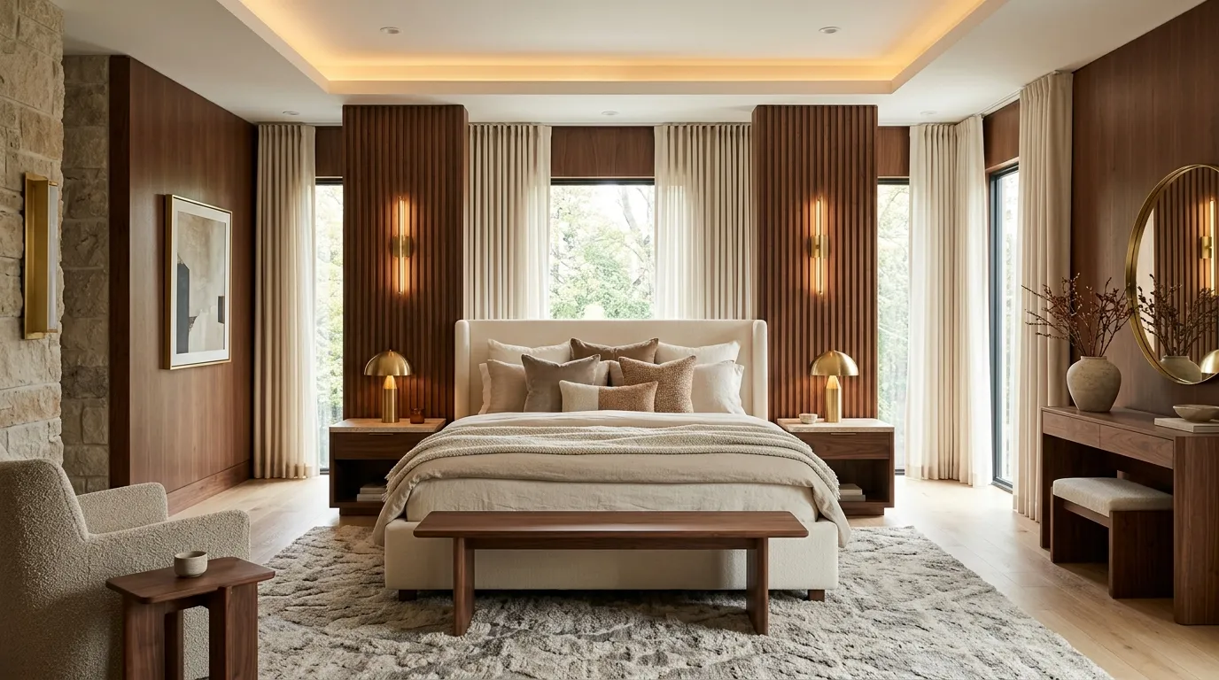
Warm walnut tones bring depth, comfort, and sophistication to a bedroom without making it feel heavy. The rich earthy color establishes a welcoming foundation that works beautifully alongside lighter furnishings and layered textures. Natural wood details enhance the palette while creating visual continuity throughout the space. Soft lighting further highlights the warmth of the design, helping the room feel inviting at every hour. This combination strikes a balance between luxury and comfort, making it ideal for everyday living.
In my experience, walnut-inspired palettes often create a stronger sense of comfort than cooler color schemes. The warmth naturally encourages relaxation while adding visual richness to the room. Pairing the color with cream fabrics, stone accents, and subtle metallic finishes helps elevate the overall design. Homeowners frequently appreciate how timeless the look feels because it avoids overly trendy elements. The finished bedroom appears elegant, grounded, and carefully curated while remaining practical for years to come.
21. Marble Gray Retreat
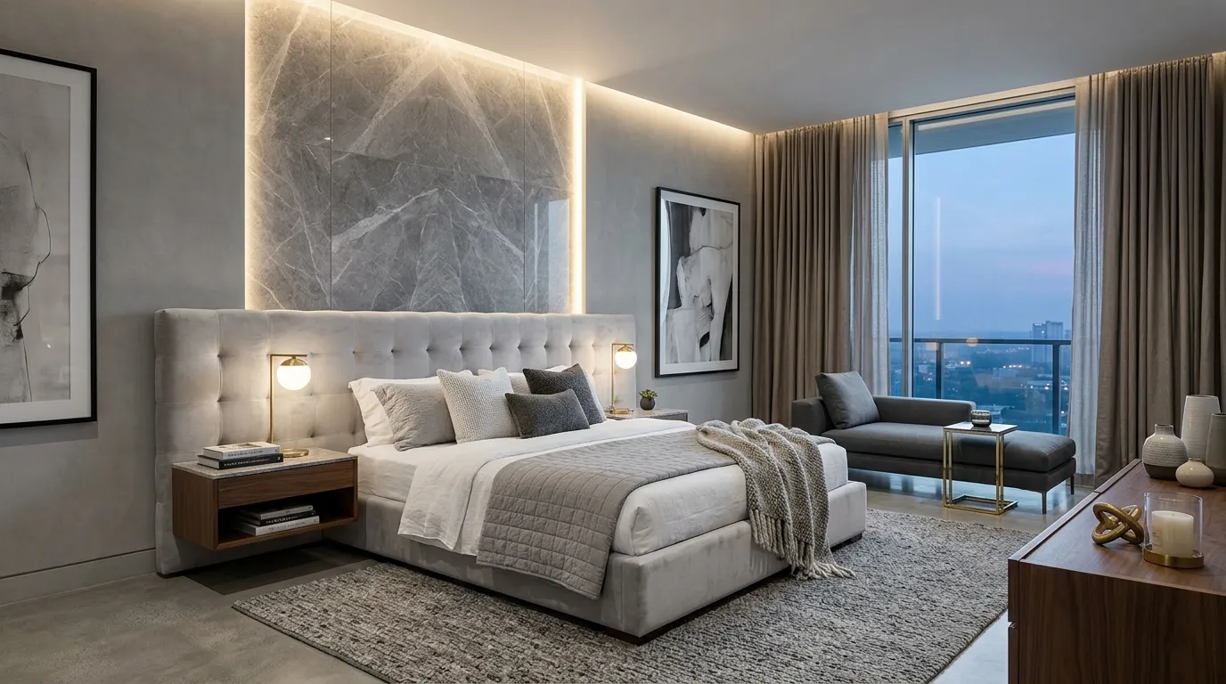
Marble gray introduces a refined sense of elegance that feels modern without becoming cold or sterile. The versatile tone provides a sophisticated backdrop for premium materials, layered textiles, and statement furniture pieces. Soft contrasts between gray, ivory, and warm accents help maintain a welcoming atmosphere while preserving the clean appearance associated with contemporary interiors. The palette feels polished and balanced, making it a popular choice for homeowners who prefer understated luxury over dramatic color statements.
A well-designed gray bedroom relies on texture and lighting to create depth and personality. I’ve noticed that combining marble-inspired tones with warm wood elements and plush fabrics prevents the space from feeling flat. Subtle metallic details and carefully selected lighting fixtures further enhance the upscale appearance. For those exploring bedroom color palette ideas for a stylish and luxurious retreat, marble gray offers a timeless solution that feels sophisticated, versatile, and effortlessly elegant while remaining highly functional for everyday use.
22. Ivory Gold Grandeur
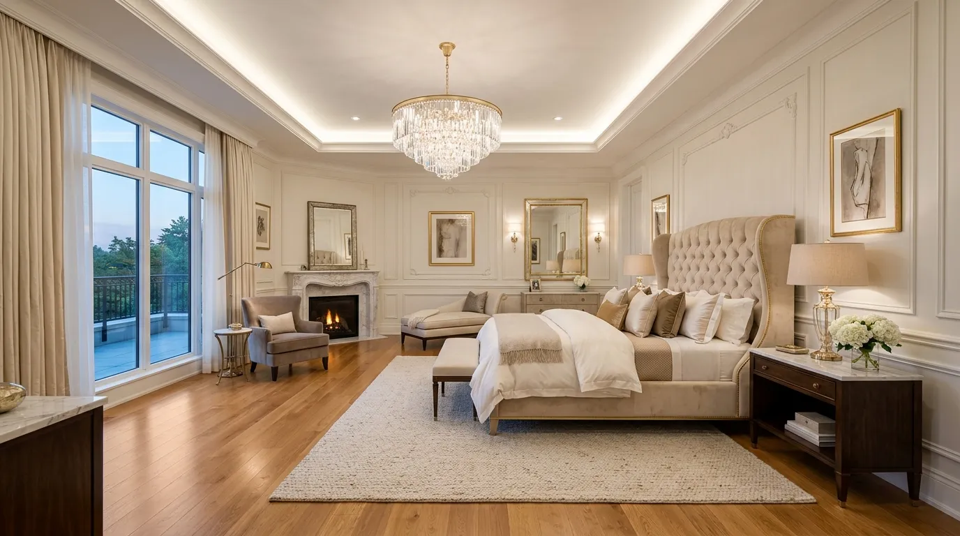
Few color combinations communicate luxury as naturally as ivory and gold. The soft ivory foundation keeps the bedroom feeling bright, open, and welcoming, while gold accents introduce elegance and visual warmth. Together, these colors create a refined environment that resembles the comfort and sophistication of a luxury hotel suite. Layered textiles, premium materials, and carefully selected lighting fixtures enhance the effect even further. The palette remains timeless because it relies on balanced neutrals rather than trend-driven colors, making it a reliable choice for long-term style and comfort.
That’s why many designers recommend ivory and gold when creating bedrooms intended to feel upscale without appearing overly decorative. I’ve seen this work well in many homes where subtle metallic finishes elevate the space while maintaining a calm atmosphere. Warm lighting enhances the richness of the gold accents and highlights the soft textures throughout the room. The result is a bedroom that feels polished, elegant, and inviting every day. As a finishing touch to these bedroom color palette ideas for a stylish home makeover, ivory and gold deliver enduring luxury with remarkable versatility.
In the End
A beautiful bedroom starts with a color palette that reflects your style while creating the atmosphere you want to enjoy every day. Whether you prefer soft neutrals, dramatic dark tones, earthy warmth, or luxury-inspired combinations, these bedroom color palette ideas for a stylish makeover offer inspiration for every taste and space.
Start with one idea that speaks to you and build from there. Small color updates can create surprisingly powerful results. I’ve seen how thoughtful color choices can completely transform the look and feel of a room. If you found inspiration here, save this post on Pinterest for future reference, share it with friends who are planning a bedroom refresh, and start creating a space that feels beautifully designed and uniquely yours.
Olivia Carter
Olivia Carter is the founder of Lady Home Decor and a passionate home decor expert. She shares practical, stylish ideas to help homeowners create beautiful, comfortable, and welcoming spaces. Her expertise covers bedrooms, kitchens, living rooms, bathrooms, and small-space decorating.